
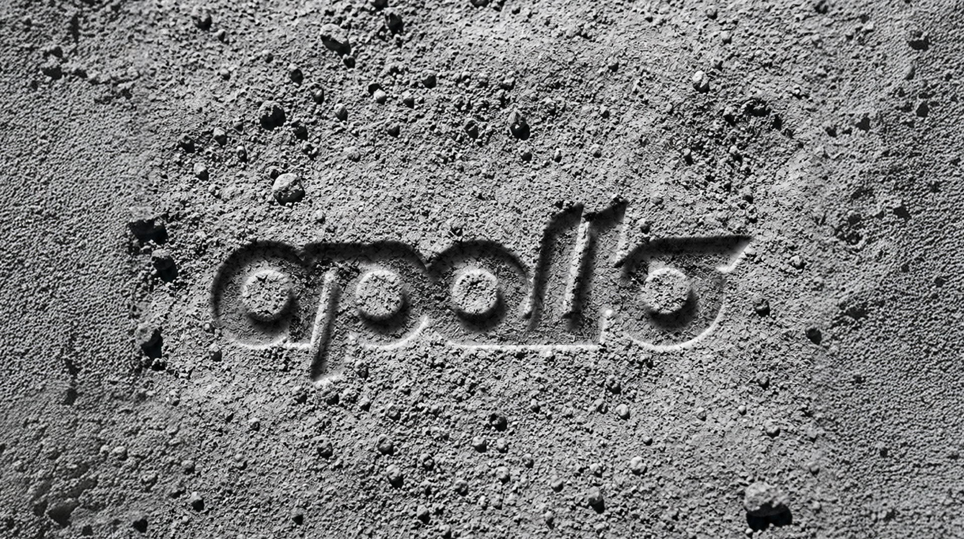
Apollo | Brand Identity
Brand identity for a specialty coffee shop
Team: Egor Bogomolov, Valerii Egorov, Dmitrii Mironov, Alexandra Arsenteva, Leonid Basargin, Sonya Anikina
Team: Egor Bogomolov, Valerii Egorov, Dmitrii Mironov, Alexandra Arsenteva, Leonid Basargin, Sonya Anikina
2026
Before the design, there was a universe.
Apollo is a specialty coffee shop in Paris built around pour-over coffee, classic recipes, signature drinks, and seasonal specials. The name immediately suggested a larger narrative: Apollo, the spacecraft on a mission to the Moon, became the starting point for transforming the café into a journey through deep space.
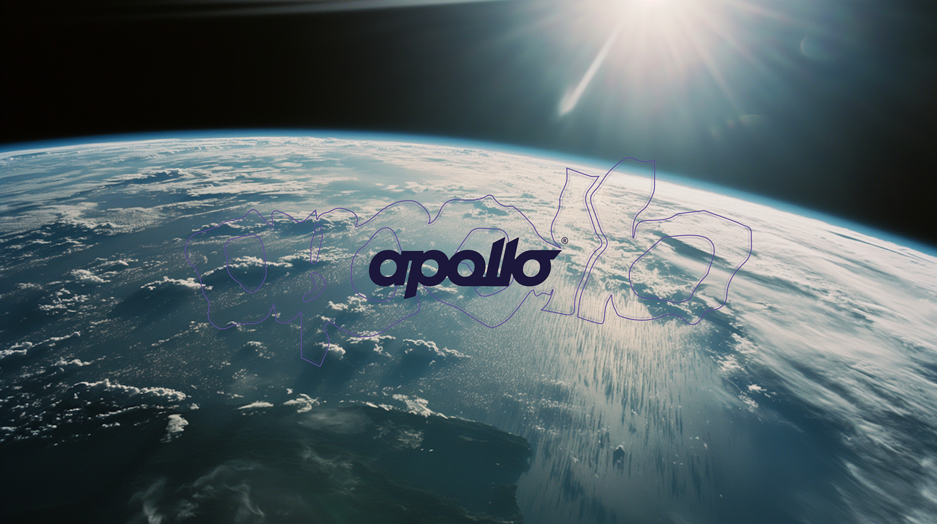
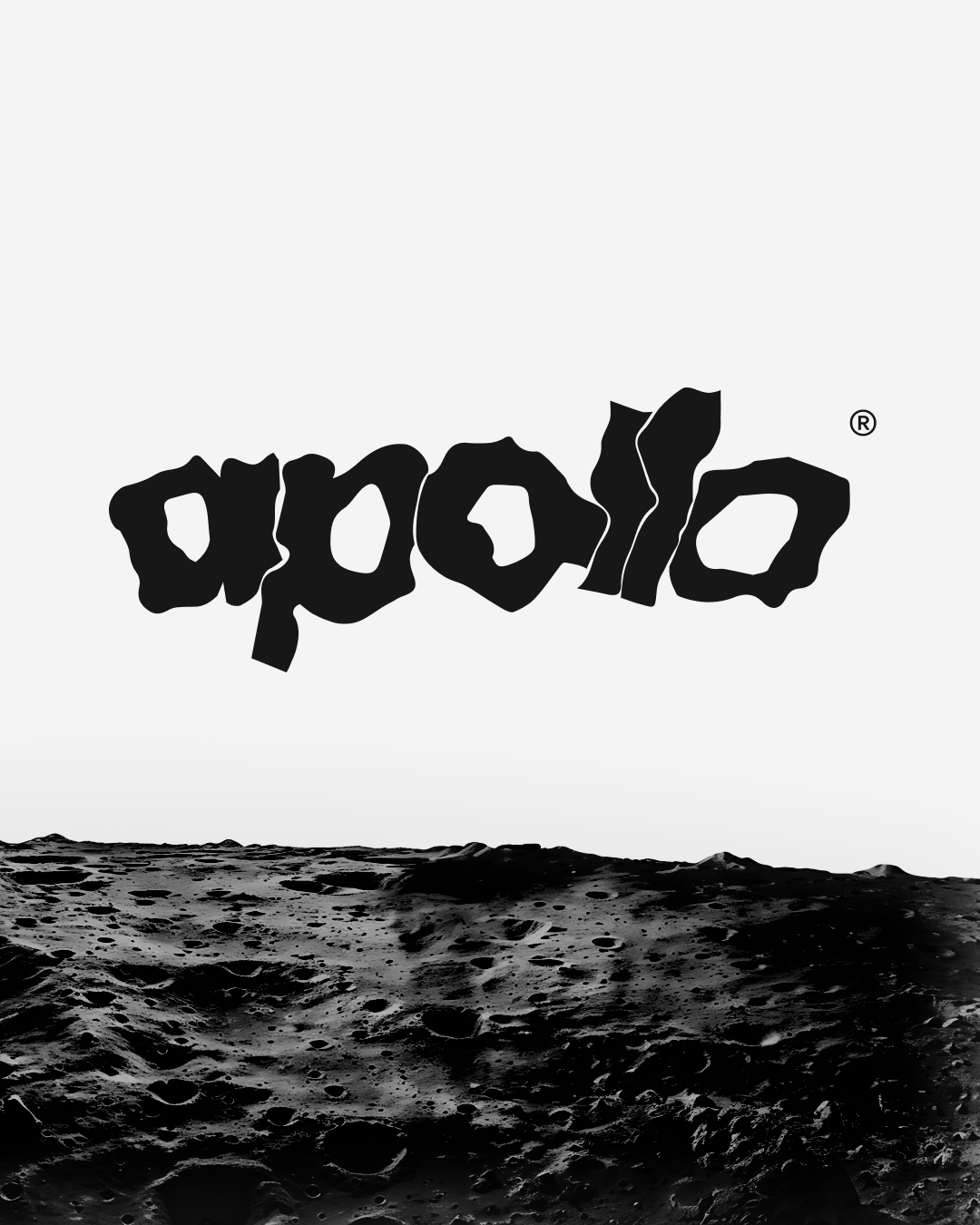
The concept grew around a fascination with the endless, the unknown, and the unseen side of the Moon. We were searching for galaxies, exploding stars, comets, collisions, and the infinite darkness of space. The question was how far we could push the name itself — and how much meaning could be built around it.
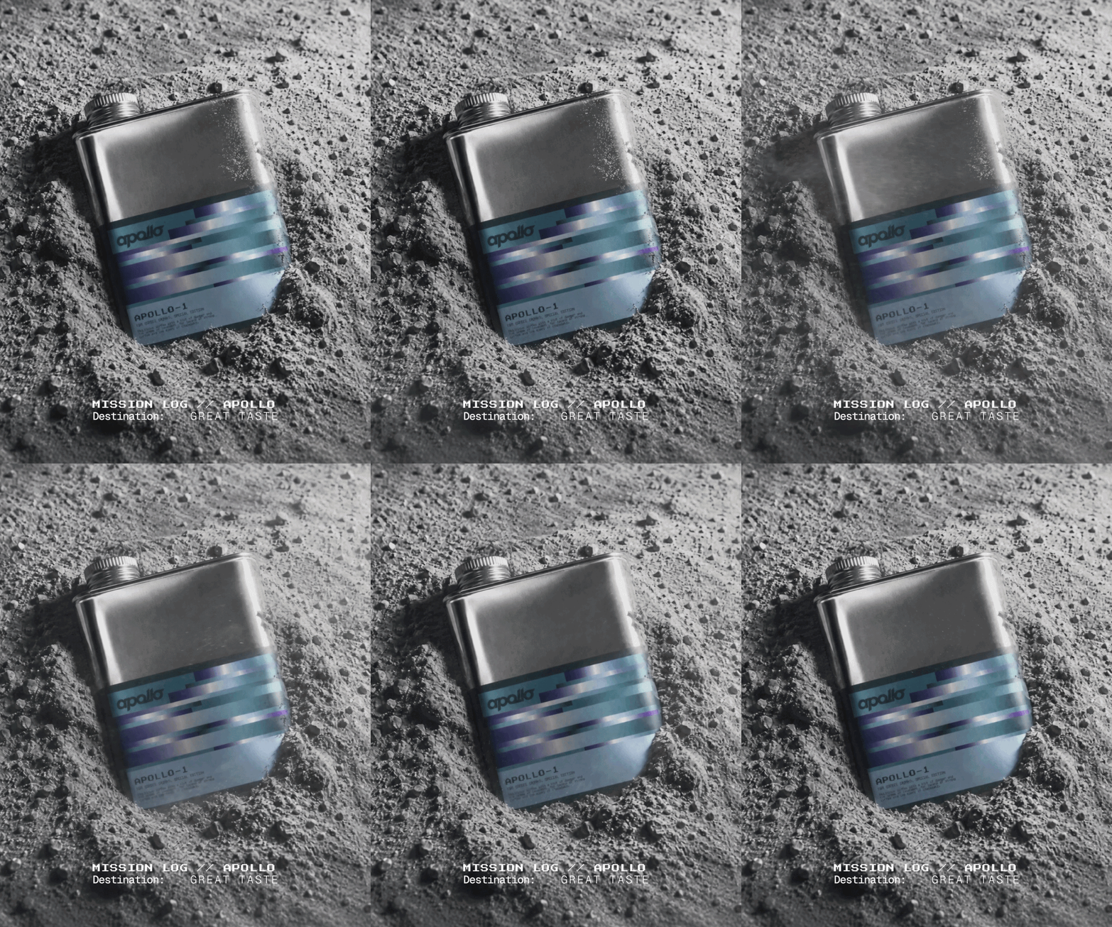
↑ flask
Apollo became more than an identity. It became a universe.
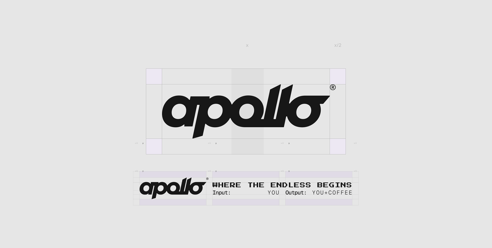
The visual language combines the energy and movement of a spacecraft with the stillness of an endless starry sky. The main logo uses a bold, contrasting typeface that references speed, movement, travel, and exploration. Its proportions and structure became the foundation for the entire identity, with typography, descriptors, graphic elements, and layouts all built around a strict modular grid.
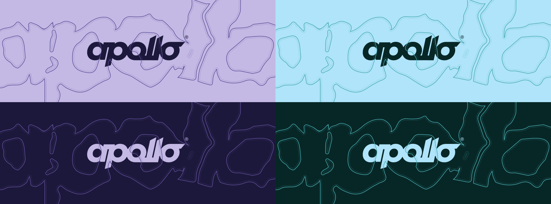
A secondary logo explores another side of the same idea. Based on the main typeface but transformed into an outline, it represents the dark side of the Moon and introduces a more mysterious, dimensional character to the identity.
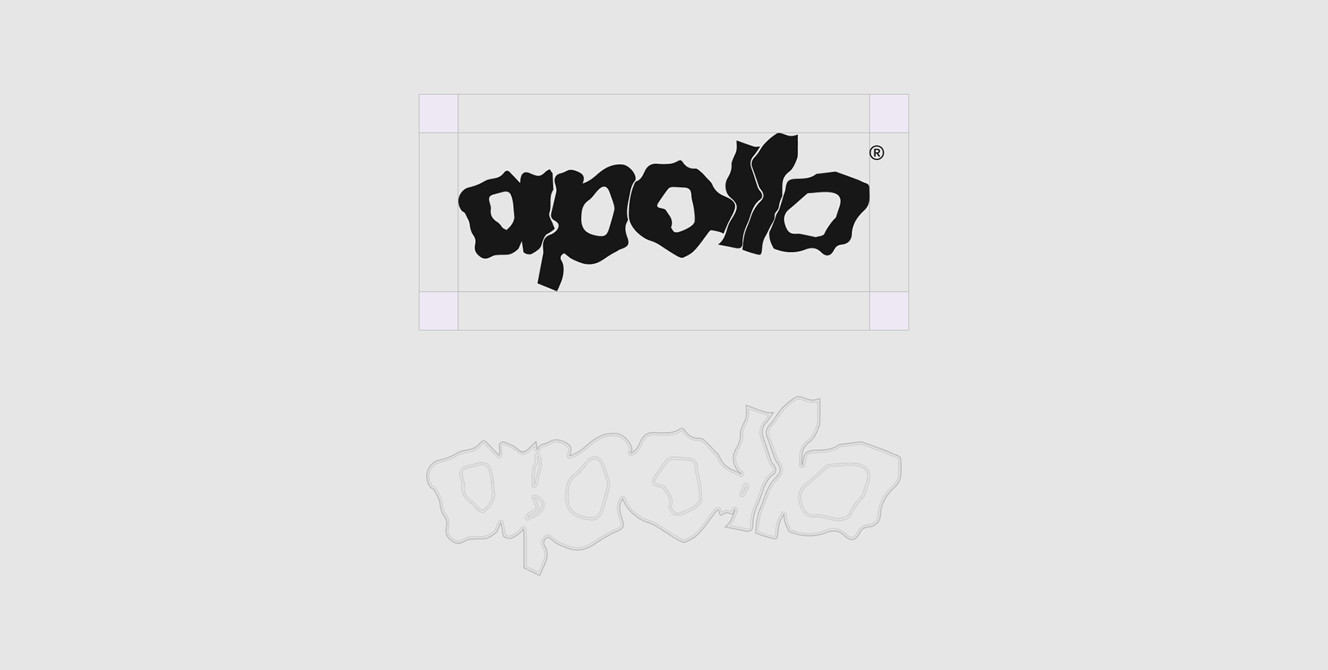
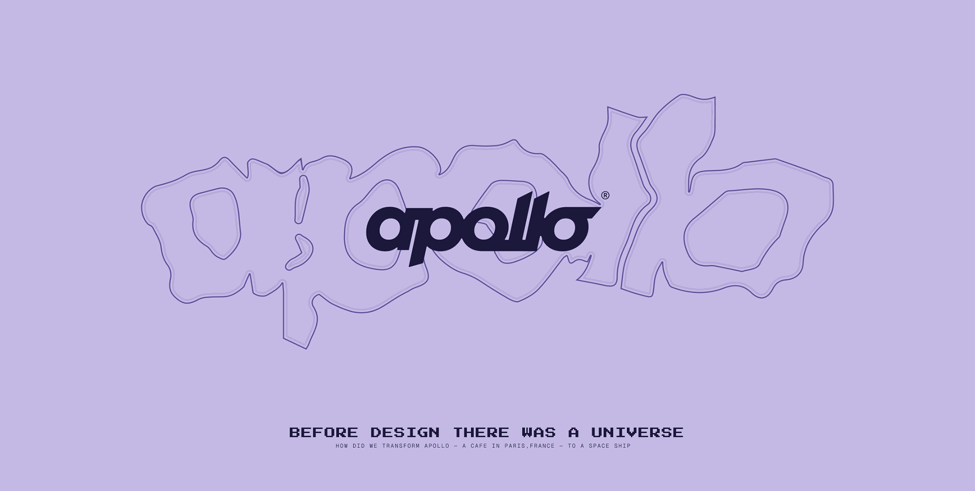
It can appear independently, work together with the primary logo, or become a graphic element within compositions. Its contour lines create a sense of volume and movement, as if the logo itself were travelling through space.
The characteristic dot became a foundation for the broader visual language, evolving into a flexible system of markers, navigation elements, and product identifiers.
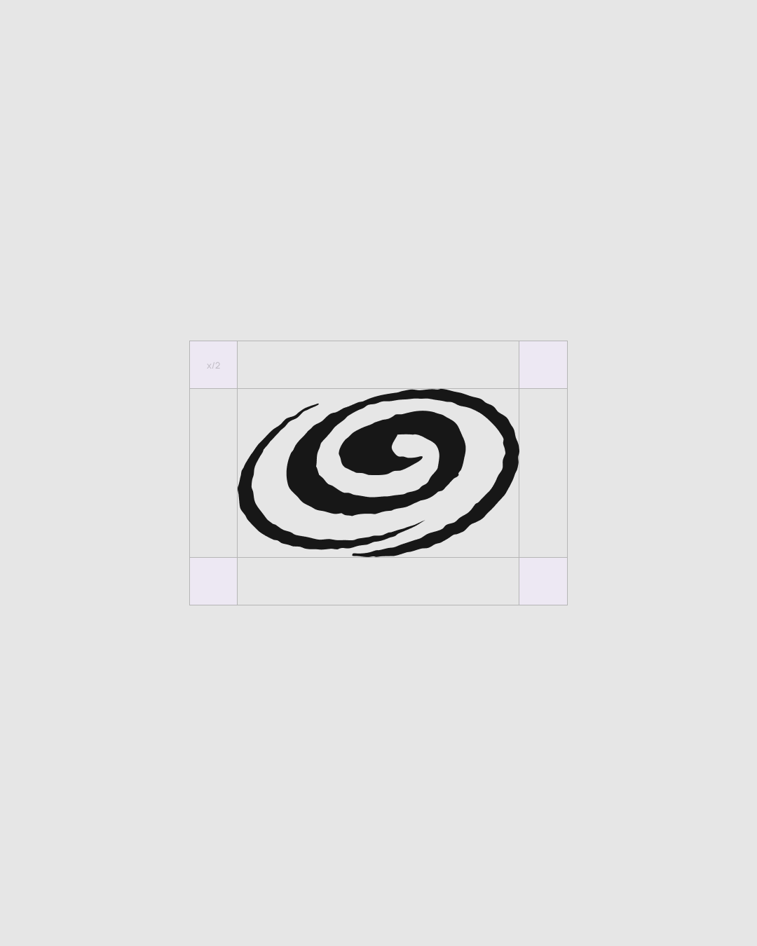

↑ additional graphic character
The colour system starts with a simple foundation of black, white, and metallic tones, reflecting the technological and material language of spacecraft. The extended palette introduces multiple shades and undertones, with purple playing a dominant role.
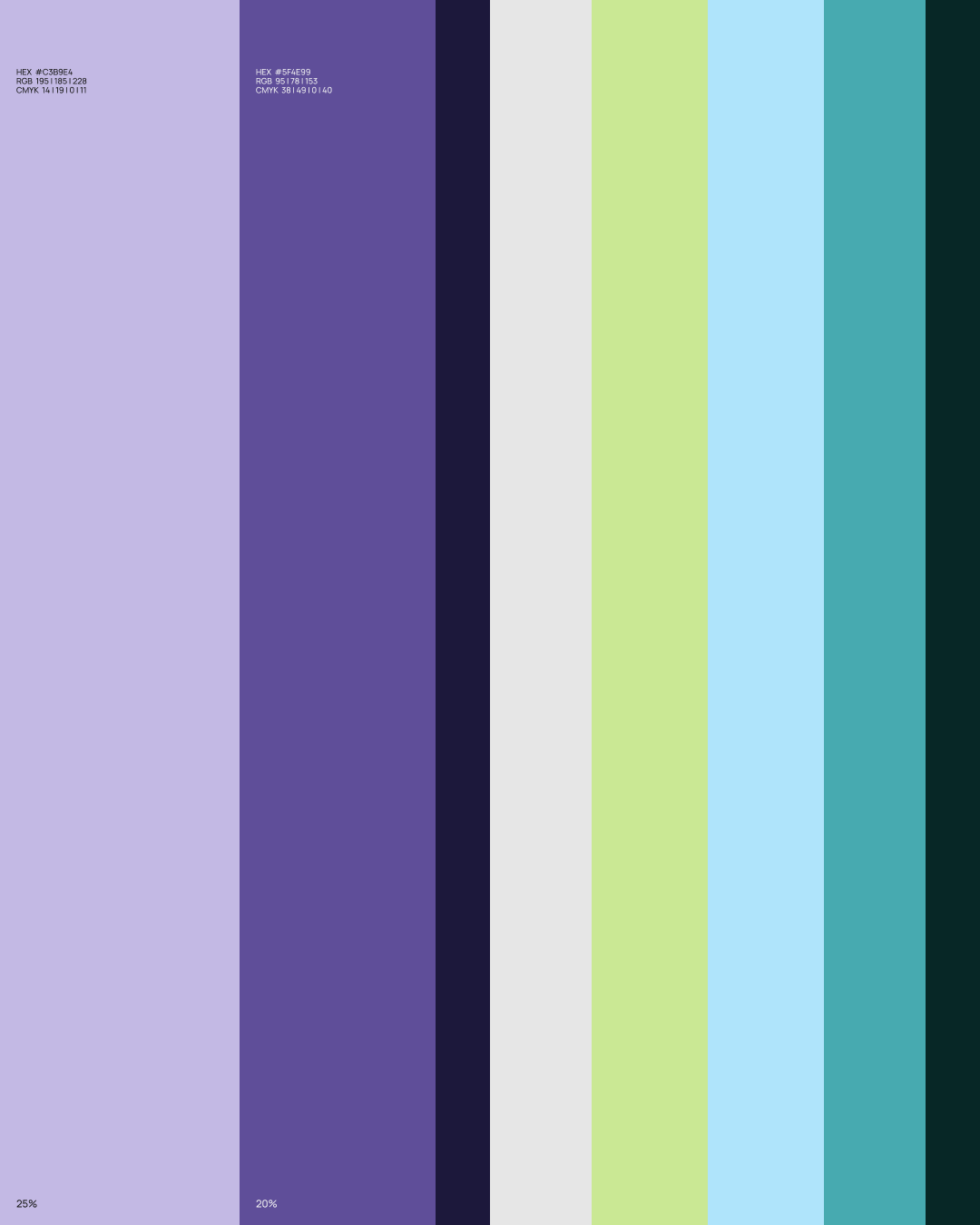
Together, the colours balance the energy of a spacecraft in motion with the depth of the cosmic environment, while also creating a subtle connection between outer space and the natural world of Earth.
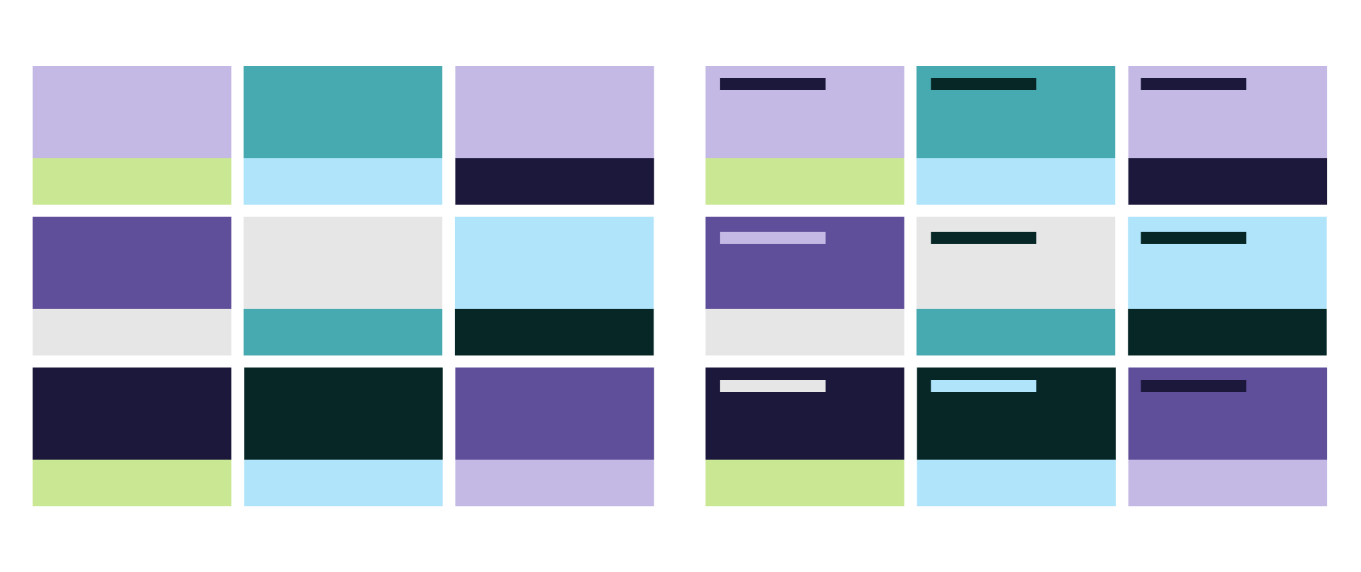
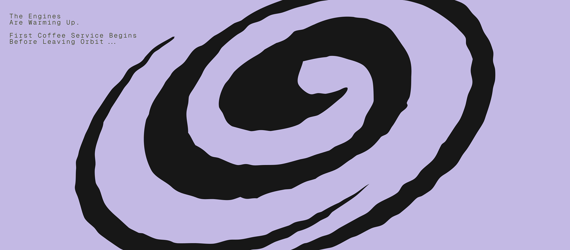
Large colour fields and gradients form the basis of the graphic language, creating a sense of movement, weightlessness, and travelling through cosmic space. The combinations evoke geological and satellite maps — fragments of an unknown journey translated into the identity.
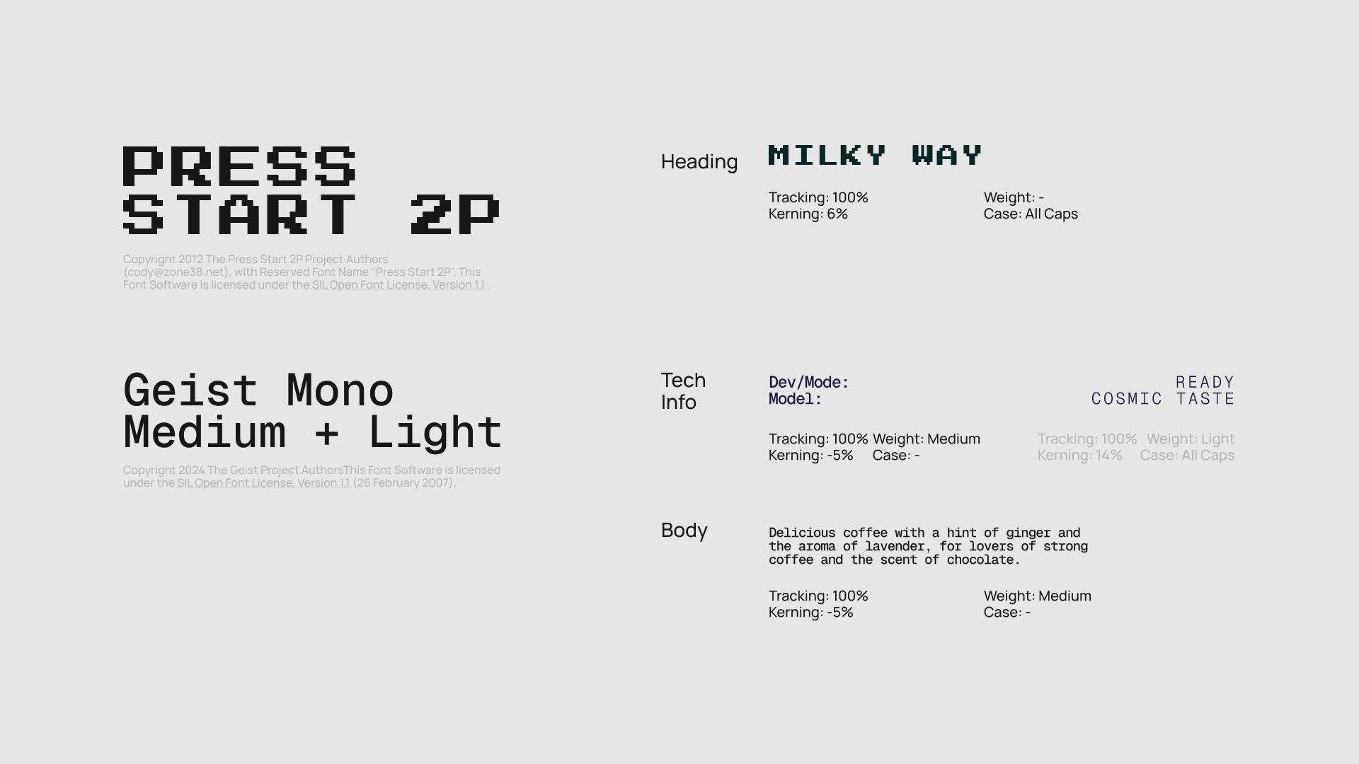
Typography reinforces the brand’s technological character. Monospaced, computer-selected typefaces reference spacecraft interfaces, programming, and laboratory environments. Short technical messages and position titles become graphic elements, while larger text blocks follow the logo’s proportions.
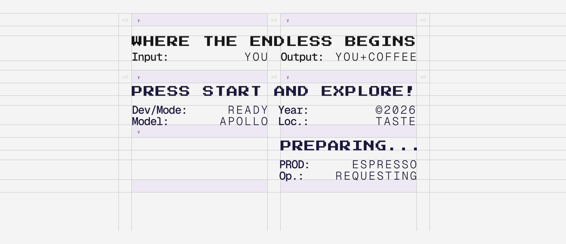
Repeated, movable text structures form a modular system where elements can shift, overlap, and interact.
The imagery follows the same principle. Accent photography focuses on astronauts, planets, products, and technological environments, combining a sense of scientific documentation with a slightly surreal, memorable quality.
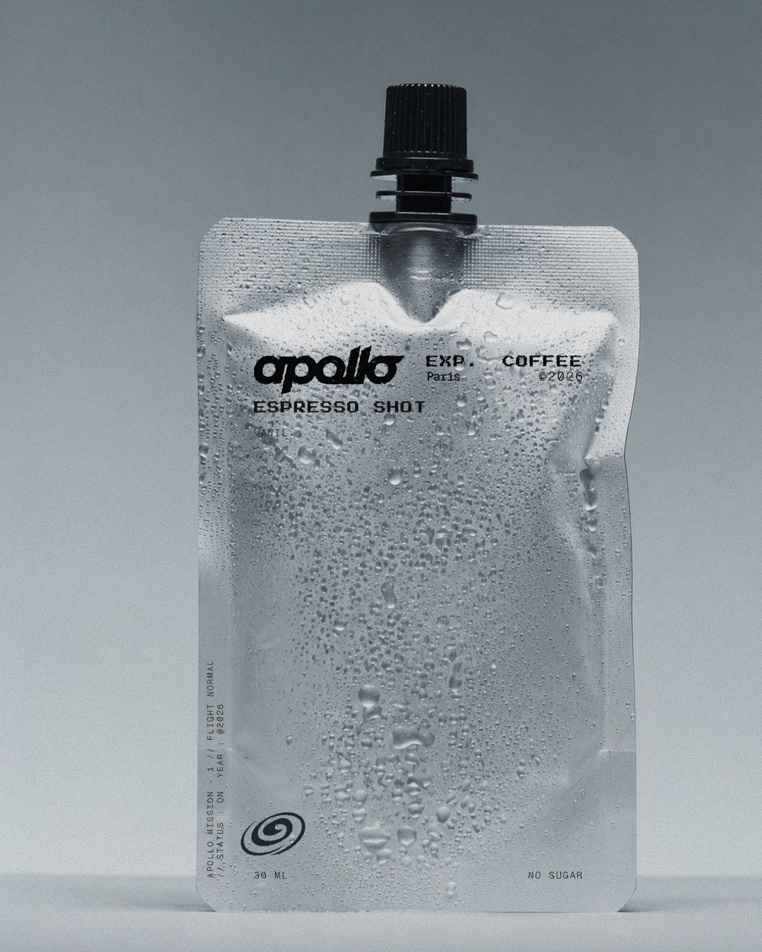
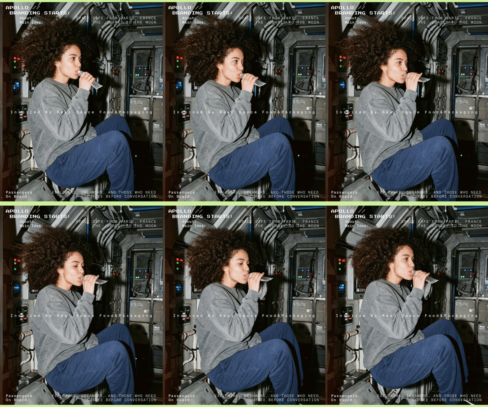
Images are treated as fragments of the Apollo universe, with the logo always placed within a contrasting area to maintain clarity and recognition.
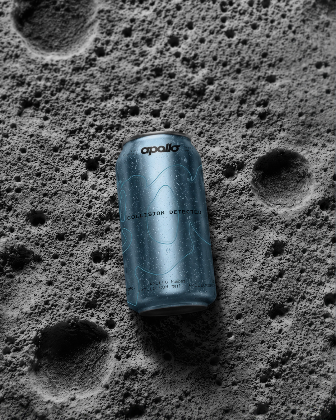
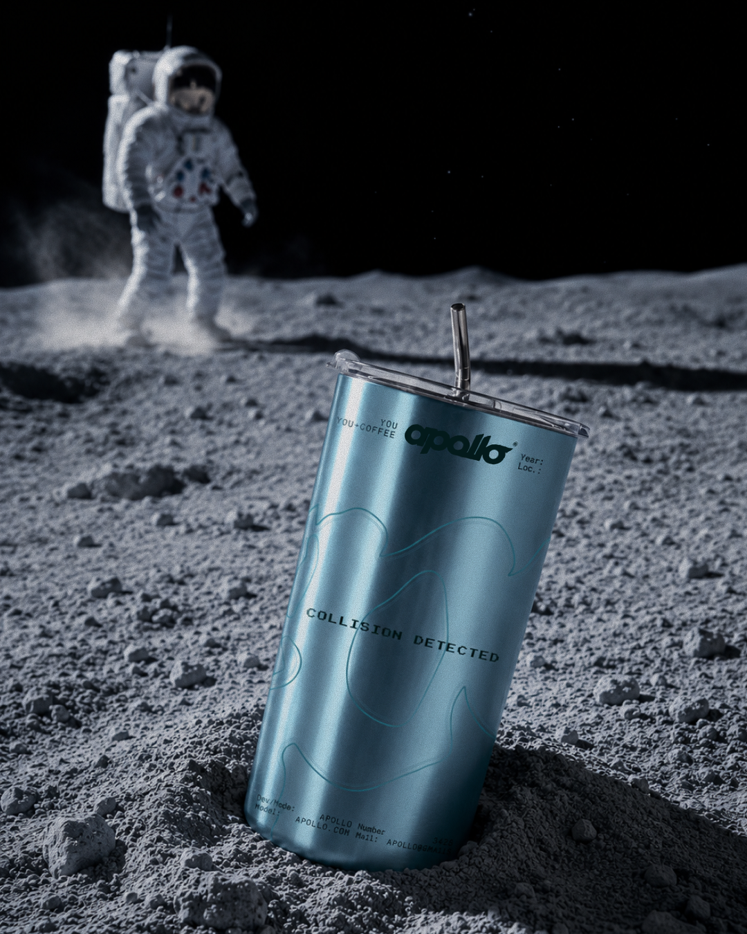
aluminium can and a cup ↑
The result is an identity that treats Apollo not simply as a coffee shop, but as a point of departure — a small space in Paris connected to something much larger. A place to explore, discover, and travel a little further with every cup.
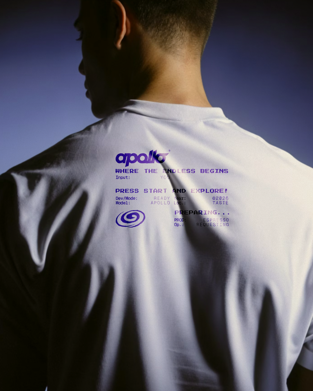
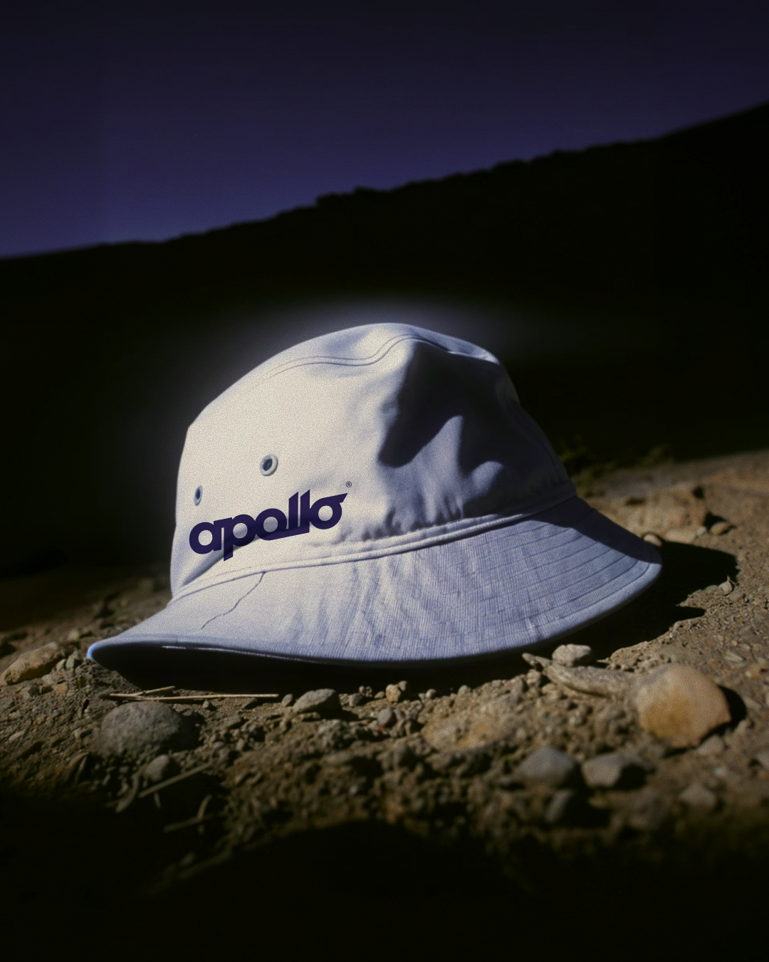
T-shirt and bucket hat ↑
↓ project team