Balance Coffee | Cafe
cafe | 100 sq.m.
Architects: Arianna Mikaya, Sofya Plyusnina, Ruslan Polinsky, Olga Gorbunova
Photo: Dmitrii Suvorov
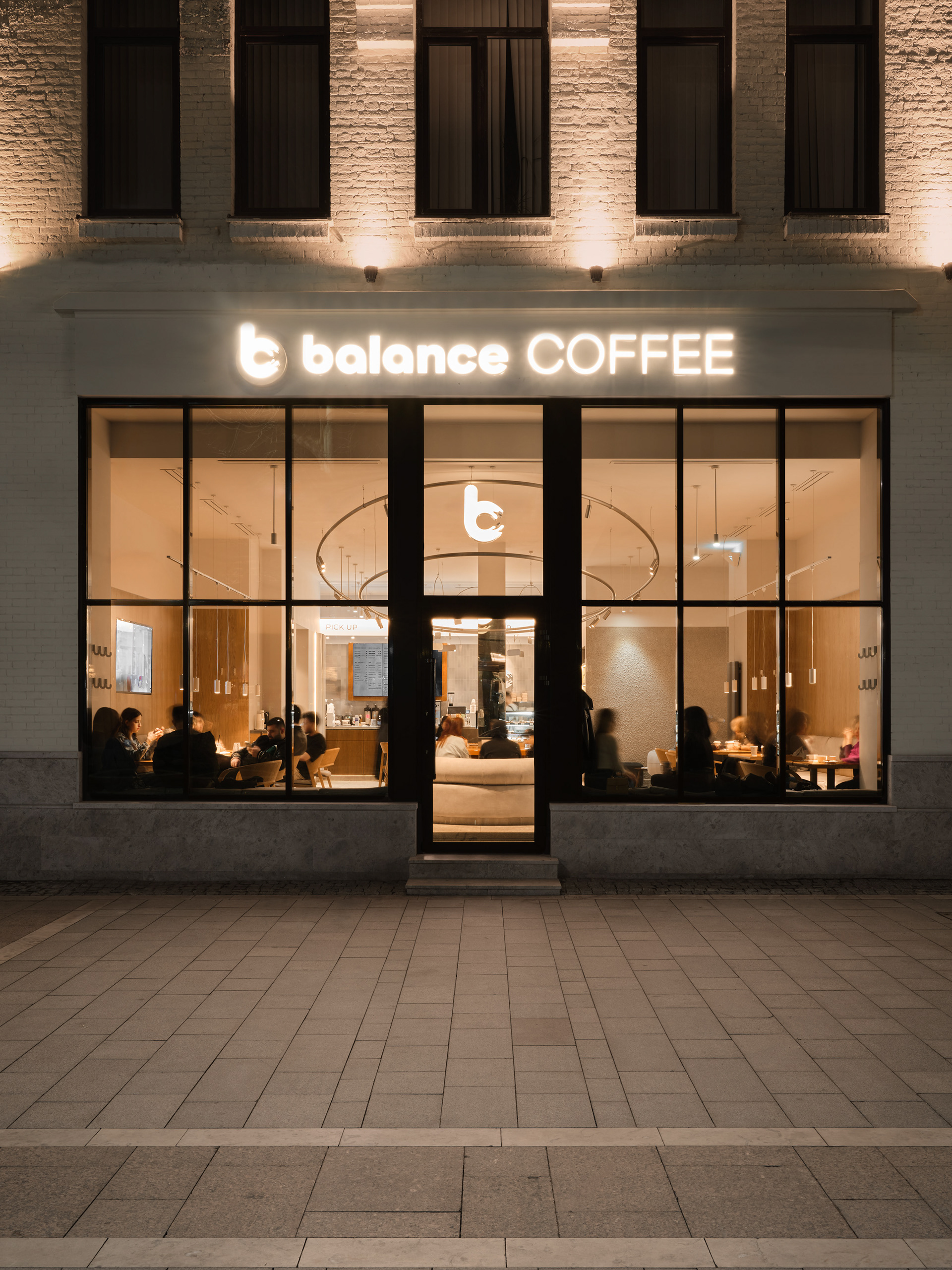
The idea behind Balance Coffee is to create a special atmosphere that makes people want to come back. The interior of each coffee shop is designed to accommodate both casual meetings with friends and family (which is particularly important in this region due to the strong culture of family and social interaction) and work. This way, the brand has met several audience needs at once and quickly earned their trust through sincerity and approach.
At the time of this project, there were already five Balance Coffee locations with a sixth being planned in a new location. Our task was to develop the seventh, flagship location. Before implementing the design of each coffee shop, a thorough analysis of the area and target audience is conducted. Since another coffee shop was already being developed in the same city with its own unique typology, it was especially important to conduct research on the flagship location. We were working with the most attractive spot in the city, the main pedestrian thoroughfare. It was crucial to create a point of attraction while catering to multiple scenarios.
plan
Based on this mission and research, the key concept for the project became the fusion of the core idea of the brand—balance—and the functional requirements of the client. We immediately focused on the name. What is balance? Who embodies it? How do people use it in their daily lives? How can we reflect the brand’s sincerity in the interior and enhance the effect? Pondering these questions, we delved into themes of harmony, symmetry, and balance, searching for answers in every detail of the interior design about what visitors need.
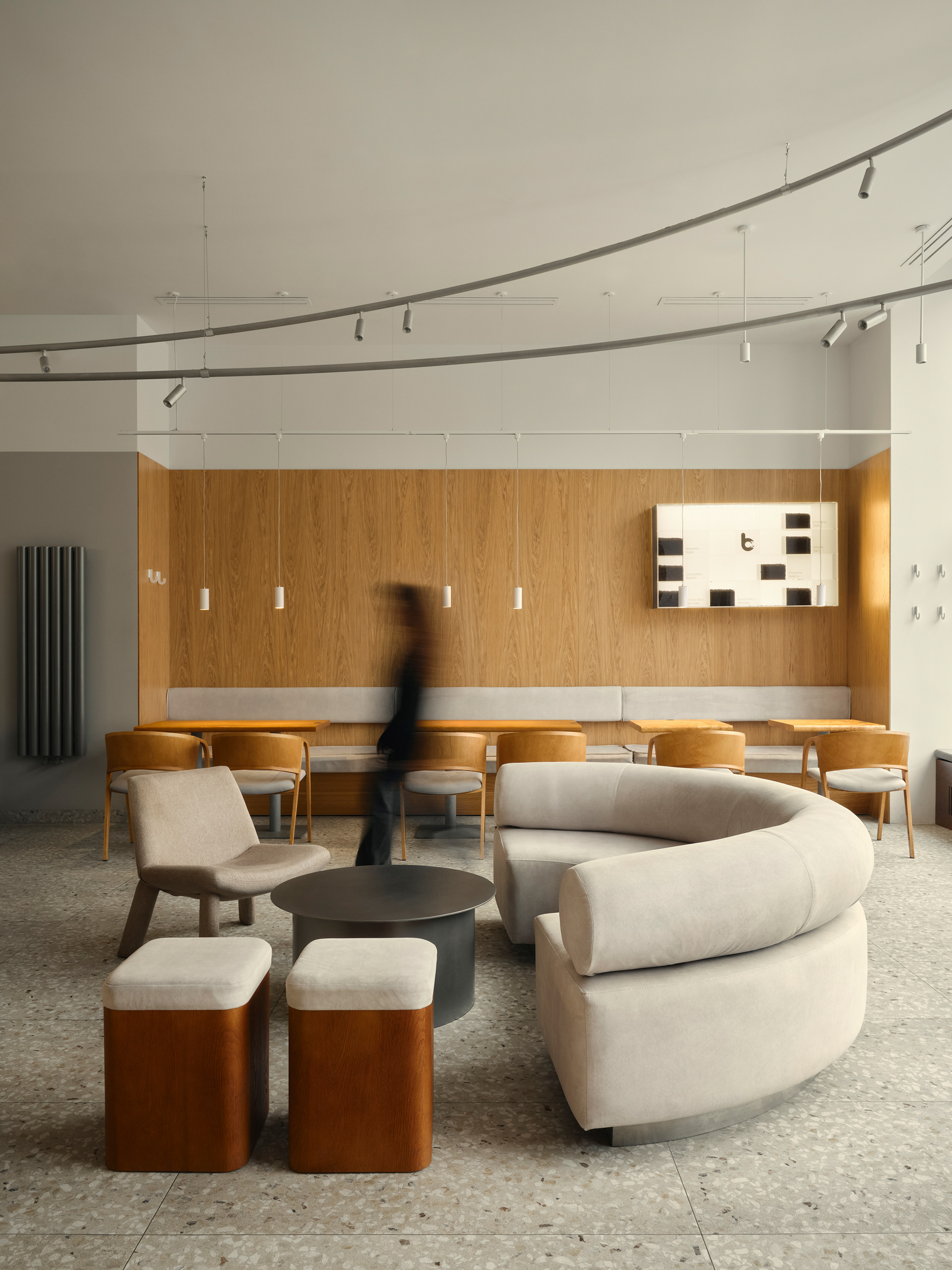
This led us to a figure who embodies these key concepts: modern filmmaker and artist Wes Anderson.
Balance is about equilibrium, clarity of thought, and openness of heart, about coziness, transparency, and warmth.
Studying Anderson’s works, we grasped a fundamental idea—he takes all his knowledge and transforms it into something new and original. Through reimagining many well-known narratives, he manages to say something new in the world of cinema.
moodboard
This is what we wanted to say about the interior: “The interior is not just a beautiful picture; it is based on experience and reinterprets familiar stories.”
axonometry
Anderson also has techniques he frequently returns to.
The first is symmetry. In Anderson’s films, one can always spot meticulously framed shots and perspective.
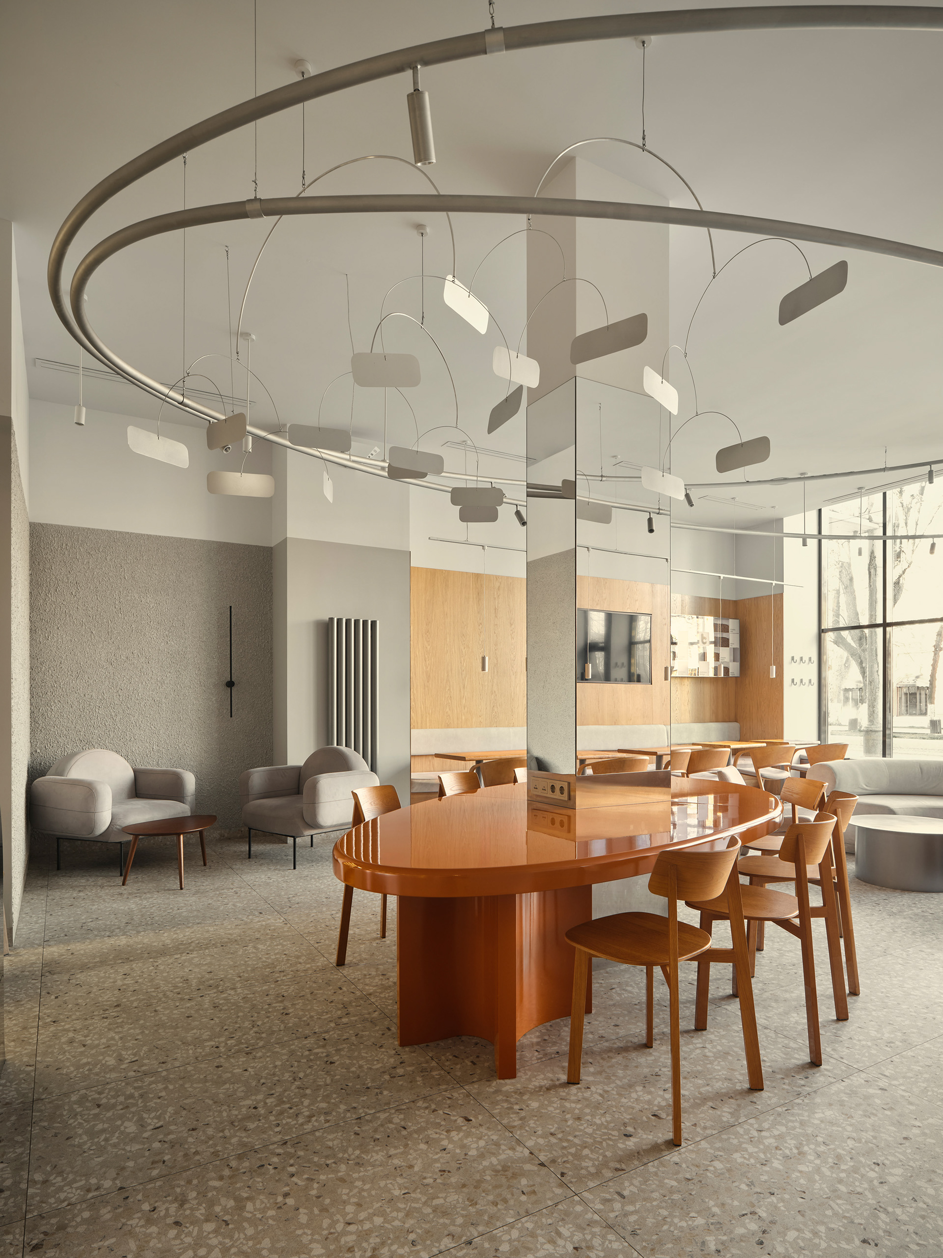
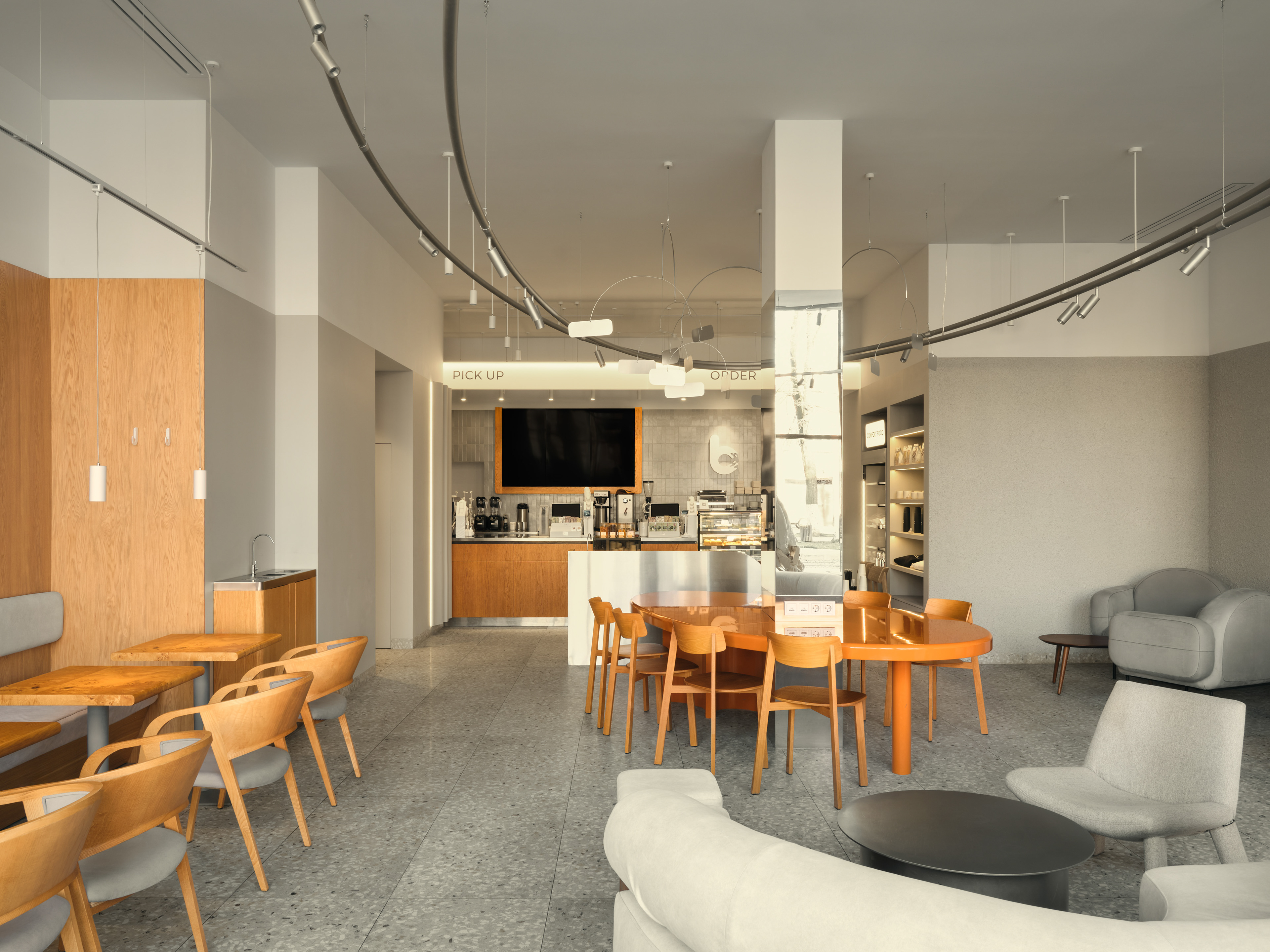
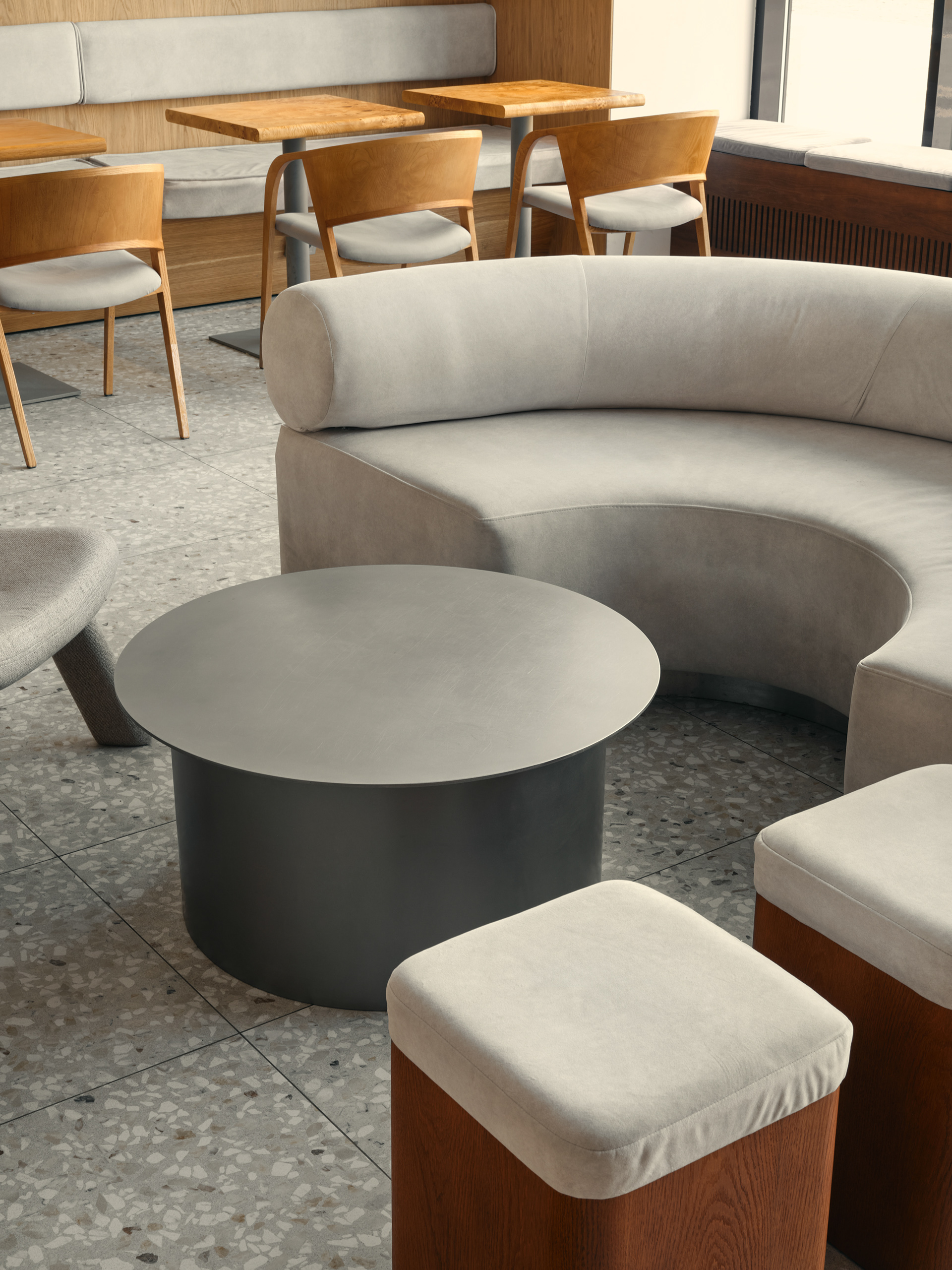
Here, a central column played into our hands, becoming the axis of the composition. To blend the axis into the space, we used mirrors, with seating on the left perfectly reflecting the seating on the right. A semicircular sofa welcoming visitors at the entrance further amplified this effect.
The second technique is color. In Anderson’s films, the color palette is given significant attention, with each new film featuring unique combinations.
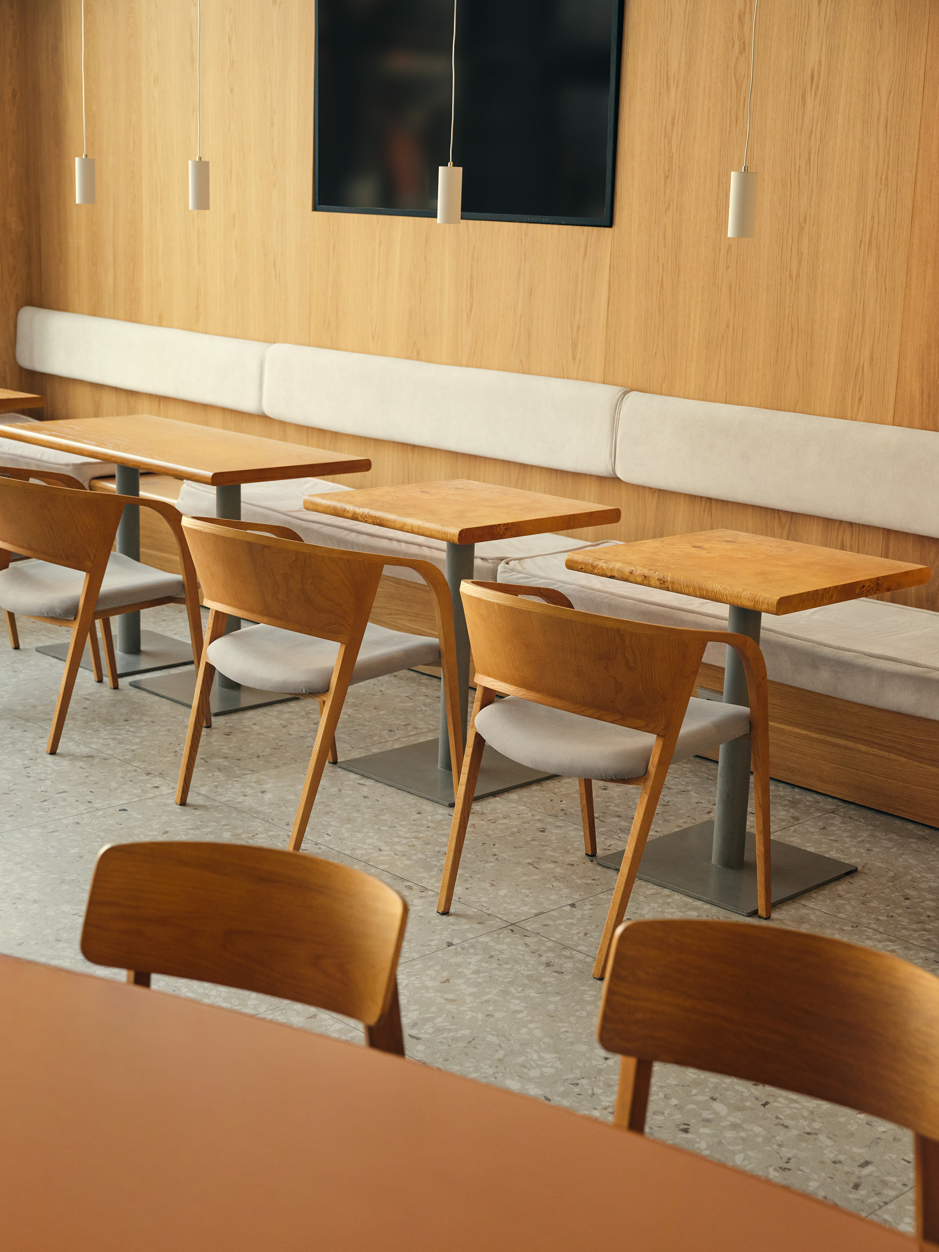
Since Balance is a minimalist coffee shop designed to captivate visitors, we opted for a more subdued color scheme, taking inspiration from the film Fantastic Mr. Fox. As a result, the entire space feels warm and muted, with the glossy communal table in a salted caramel shade serving as the focal point.
coffee display ↓
↑ lounge zone
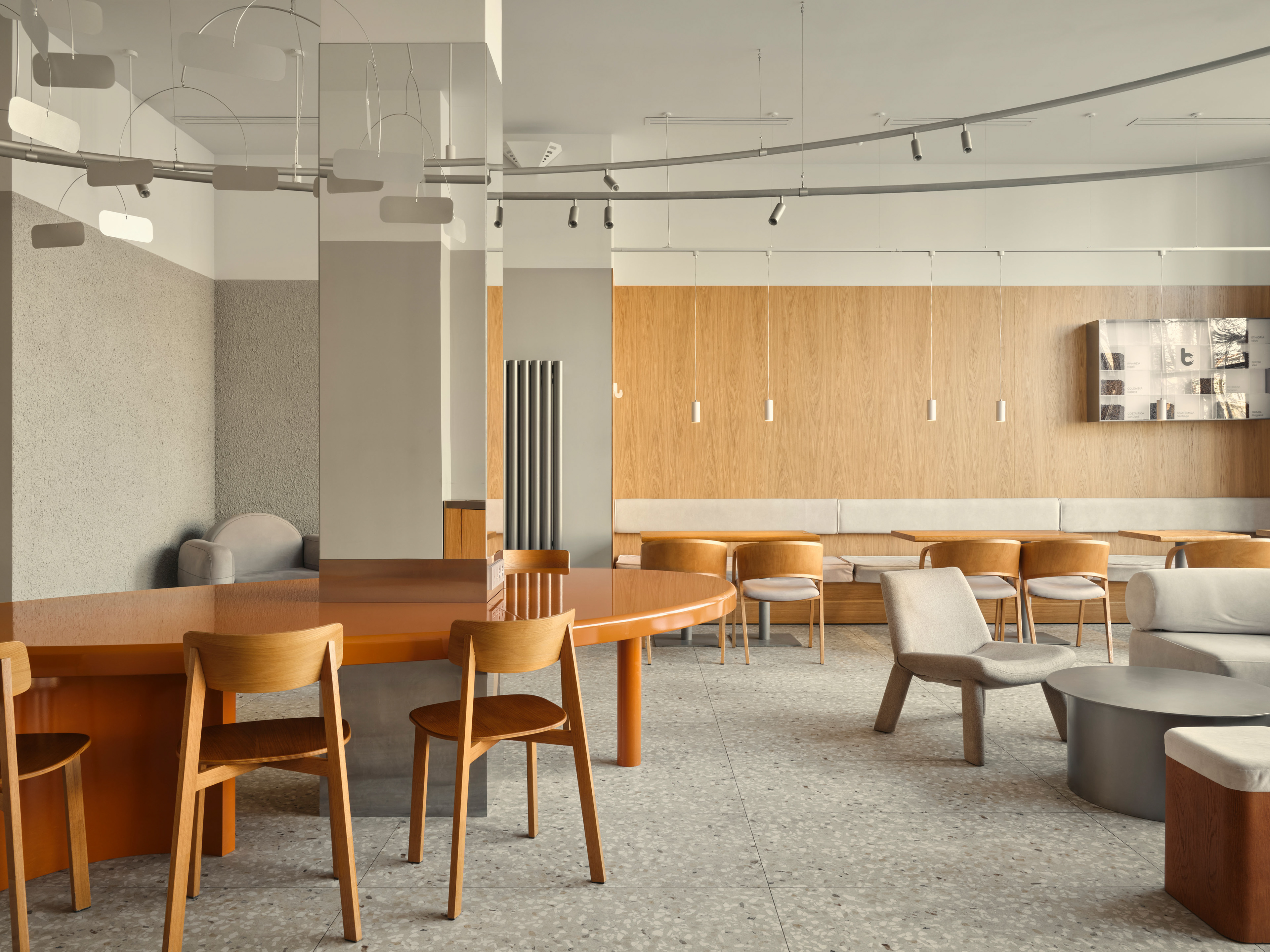
The third technique involves characters. We immediately divided them into types and found references in the interior.
The adult, pragmatic characters are reflected in the standard seating along the perimeter, the masculine in dominant, structured armchairs, and the feminine in the strong, independent communal table. The metaphor for childlike characters is embodied in the playful overhead installation with mobiles made of stainless steel swaying in the air. Anderson often includes animals in his works, and we interpreted this by integrating an unusual, slightly animalistic burl wood veneer on the tabletops.
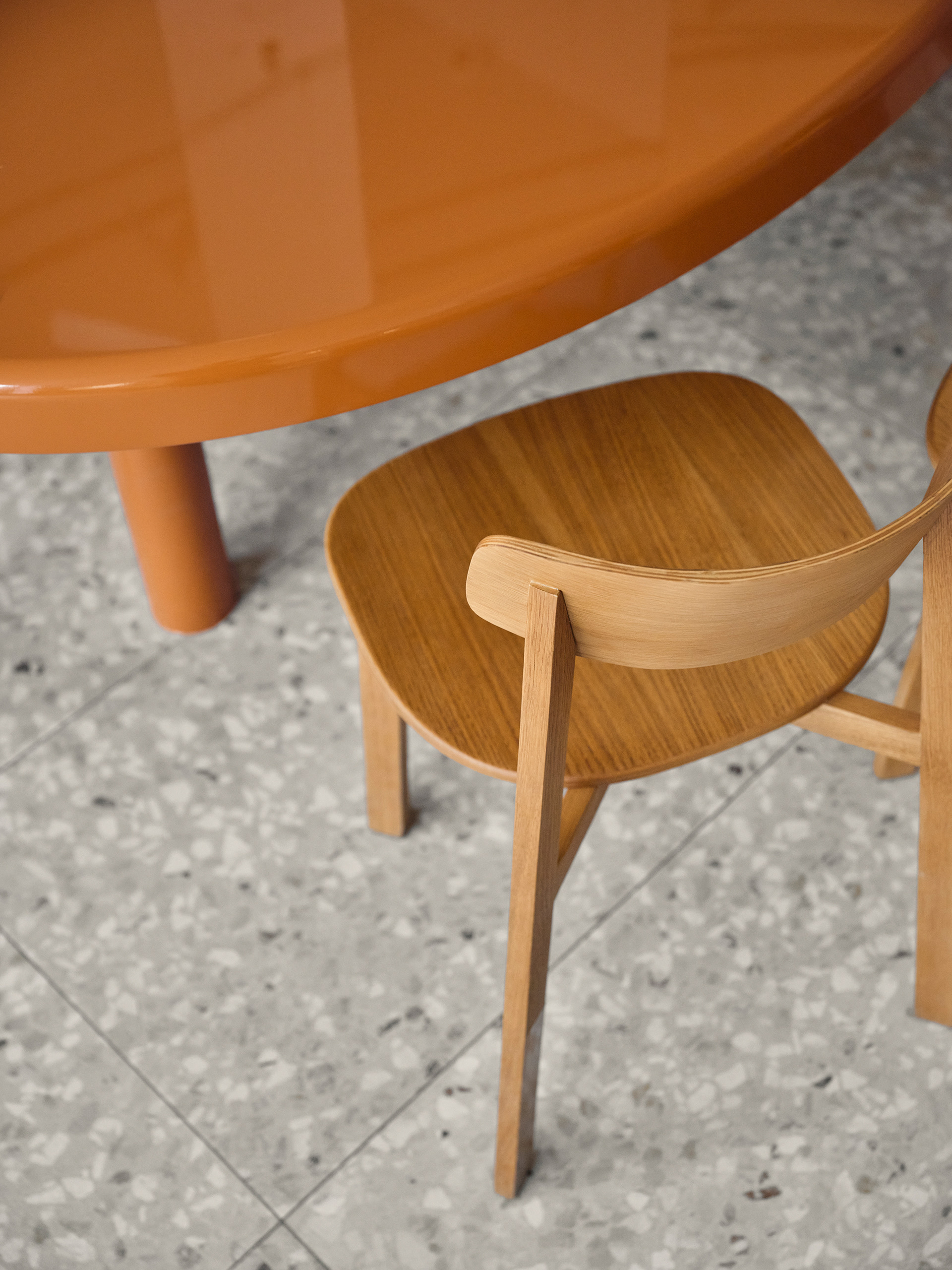
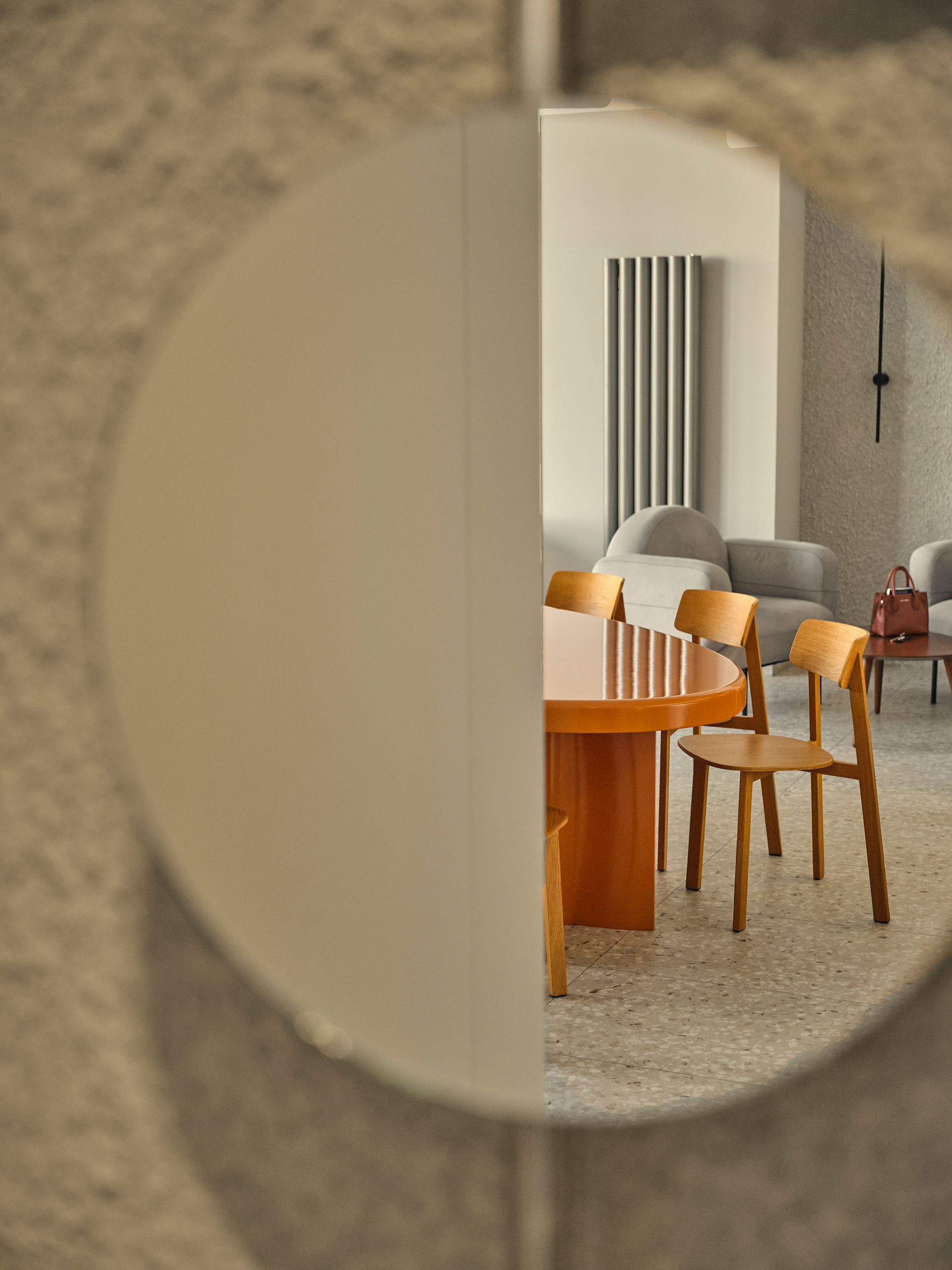
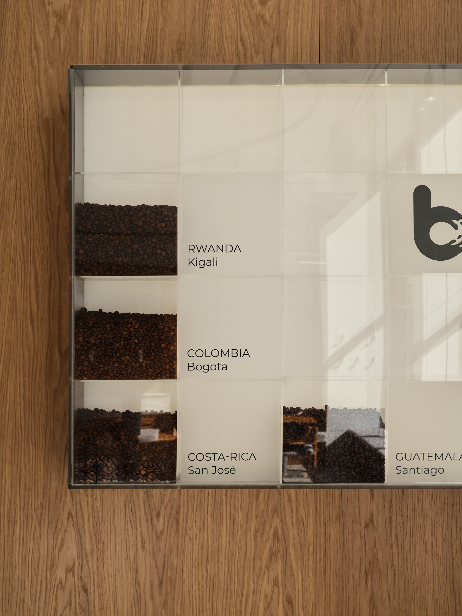
The clients asked us to pay special attention to detail and service, which is reflected in the carefully thought-out storage systems and shelving.
The space itself often “played along,” allowing us to fully realize the developed concept.
wooden tables ↓
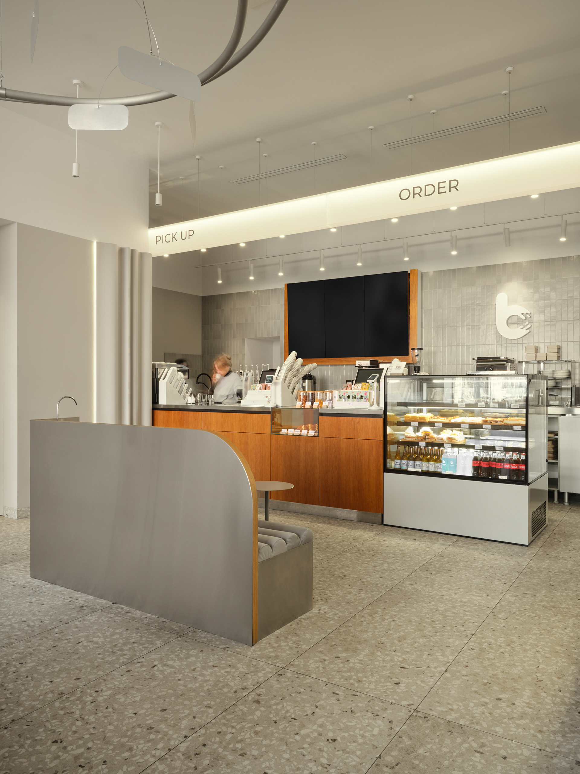
↑ order & pick up zone
↓ project team
