Cinnamood | Cafe
Barcelona | 2026 | 89,4 sq.m
Team: Egor Bogomolov, Valerii Egorov, Sonya Plusnina, Maria Soboleva, Antonina Polevaya, Oleg Kaigorodov, Alyona Minaeva
Photo: Enric Badrinas
Team: Egor Bogomolov, Valerii Egorov, Sonya Plusnina, Maria Soboleva, Antonina Polevaya, Oleg Kaigorodov, Alyona Minaeva
Photo: Enric Badrinas
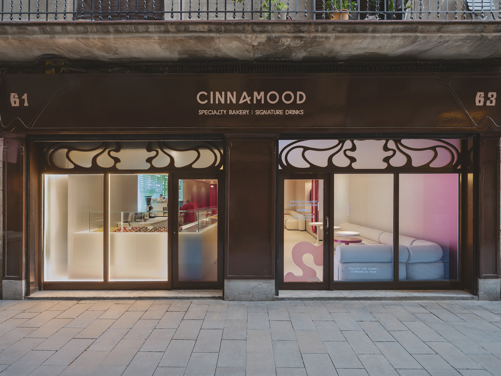
Cinnamood is an international coffee shop chain specializing in cinnamon rolls and specialty coffee, known for its strong visual identity and distinctive spatial concept.
The café is located at Carrer de l’Argenteria, 61, in the historic Ciutat Vella district, in El Born, next to the Basilica of Santa Maria del Mar, within a building from the first half of the 20th century embedded in the dense medieval urban fabric.
The café is located at Carrer de l’Argenteria, 61, in the historic Ciutat Vella district, in El Born, next to the Basilica of Santa Maria del Mar, within a building from the first half of the 20th century embedded in the dense medieval urban fabric.
We had previously collaborated with the brand, developing a storybook — a scalable concept adaptable across different locations. For the new Barcelona project, we were invited again, this time to design a specific space in a new country for Cinnamood.

moodboard ↑
The task was to adapt the established visual language of the brand to the architectural context of the site, preserving recognizability while integrating the concept organically into its surroundings.

concept ↑

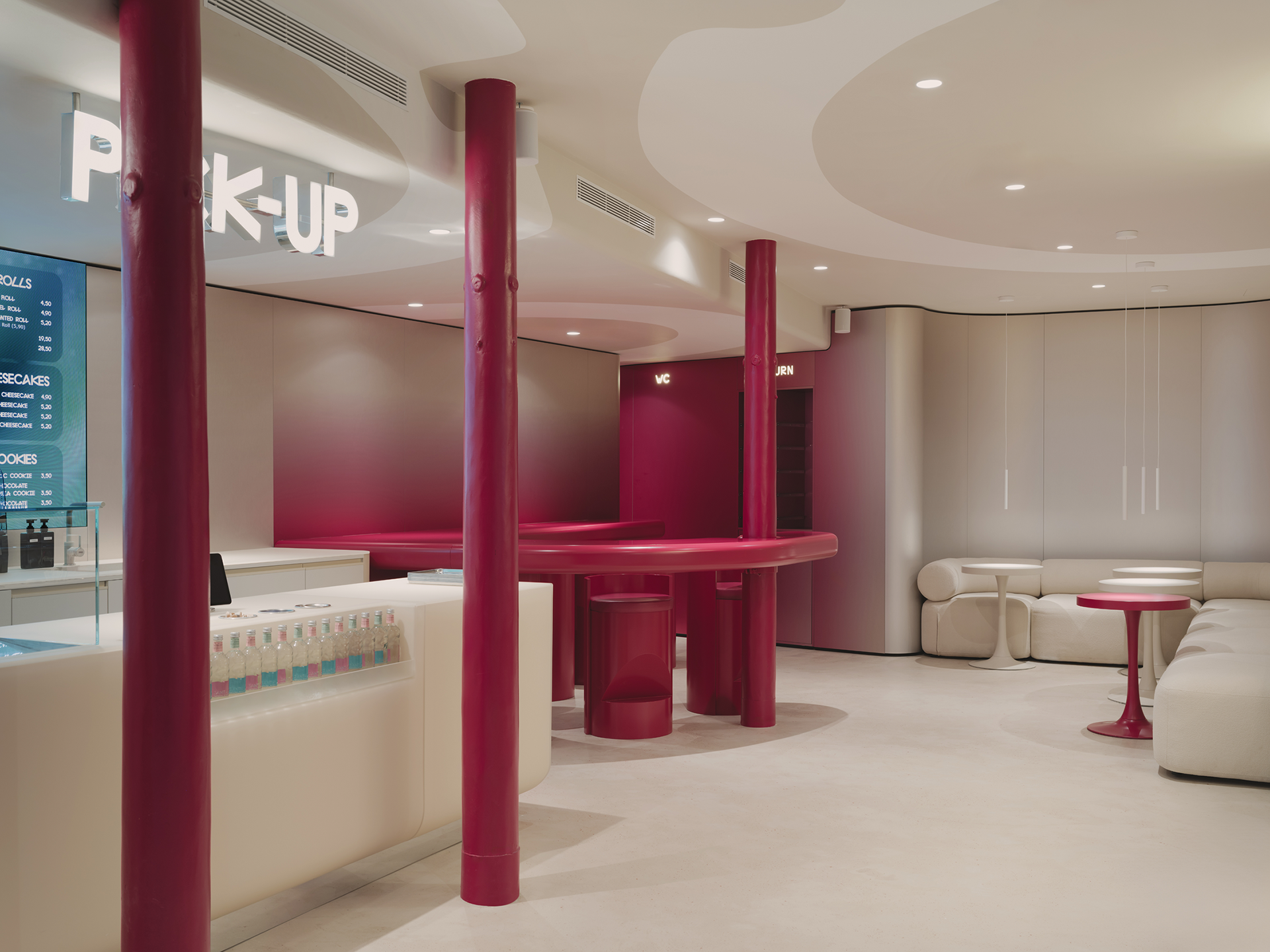
The project is based on Cinnamood’s signature vibrant palette, set against a minimalist, almost futuristic background. The expressiveness of color is enhanced through a neutral base, clean geometry, and precise accents, allowing the brand to feel cohesive and confident within the new space.
color palette ↓

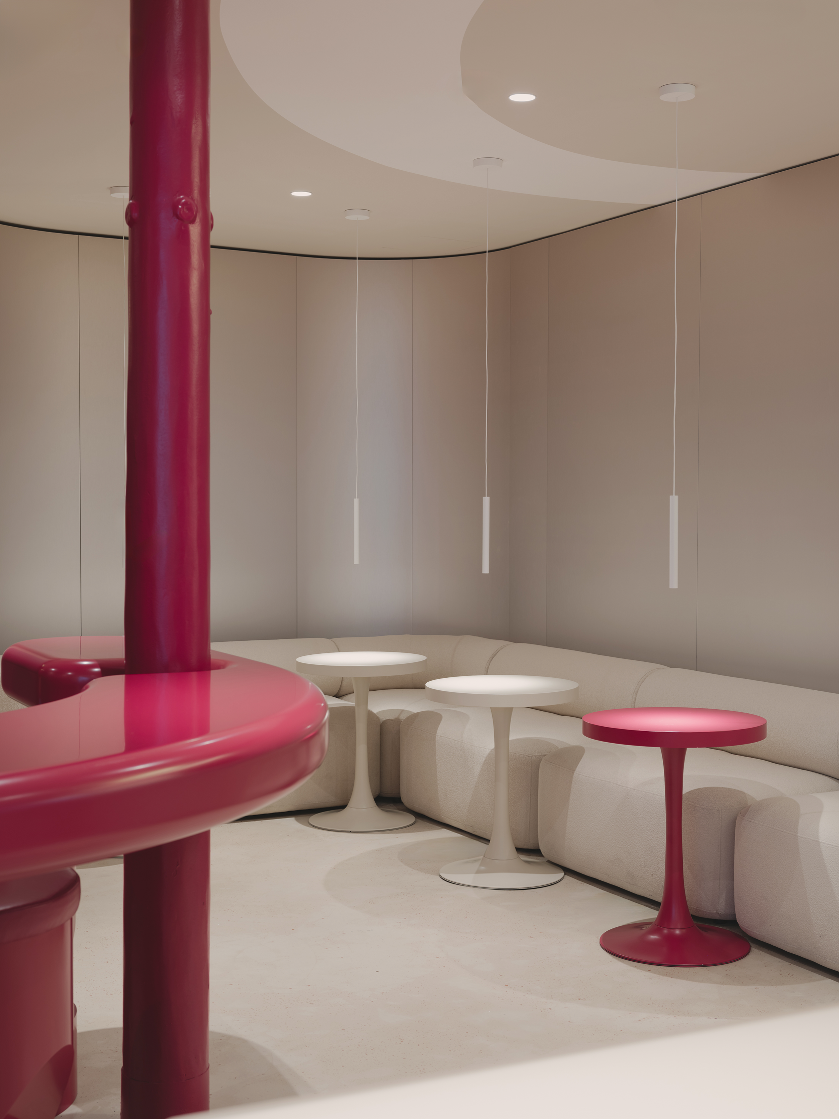
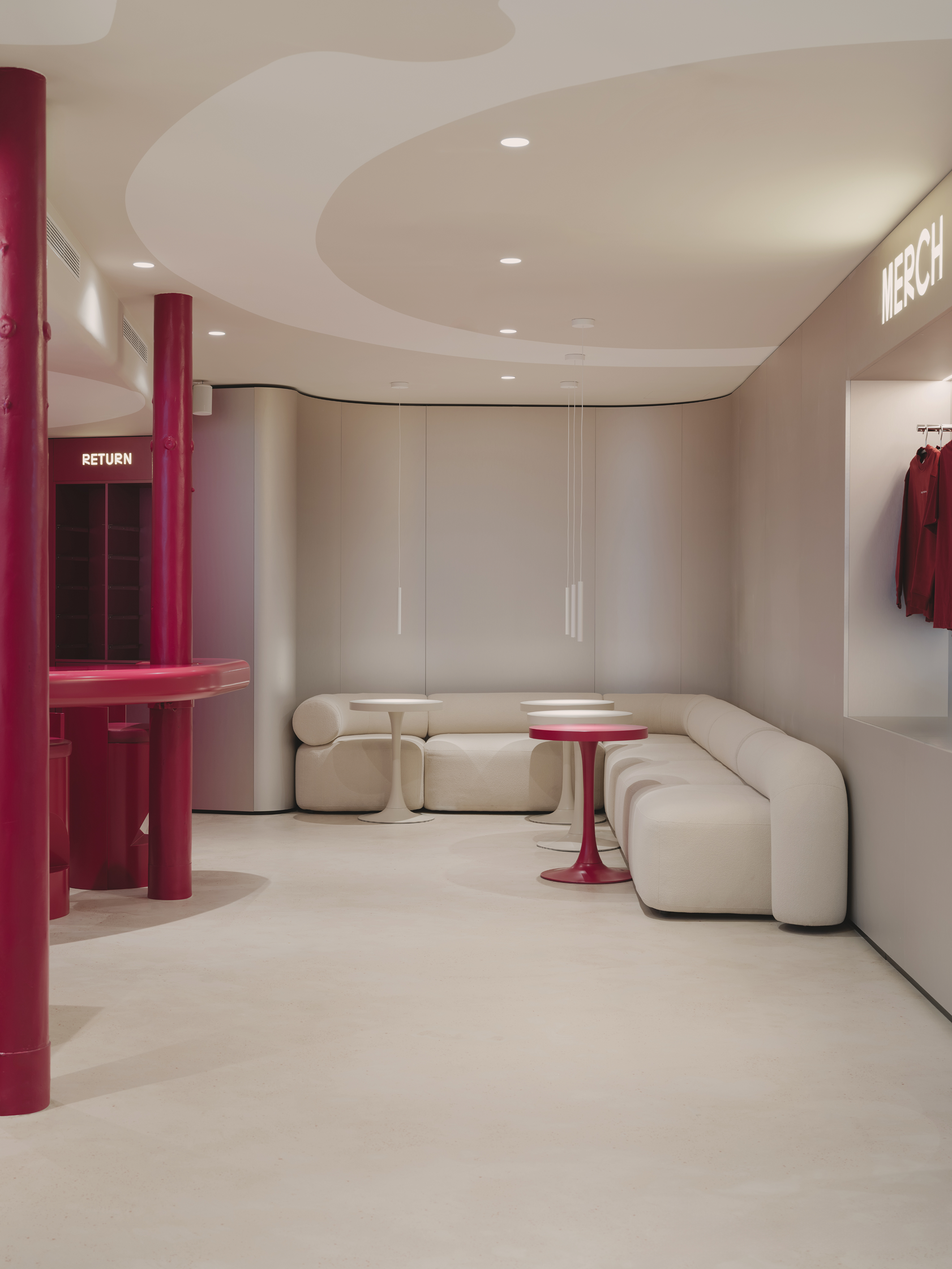
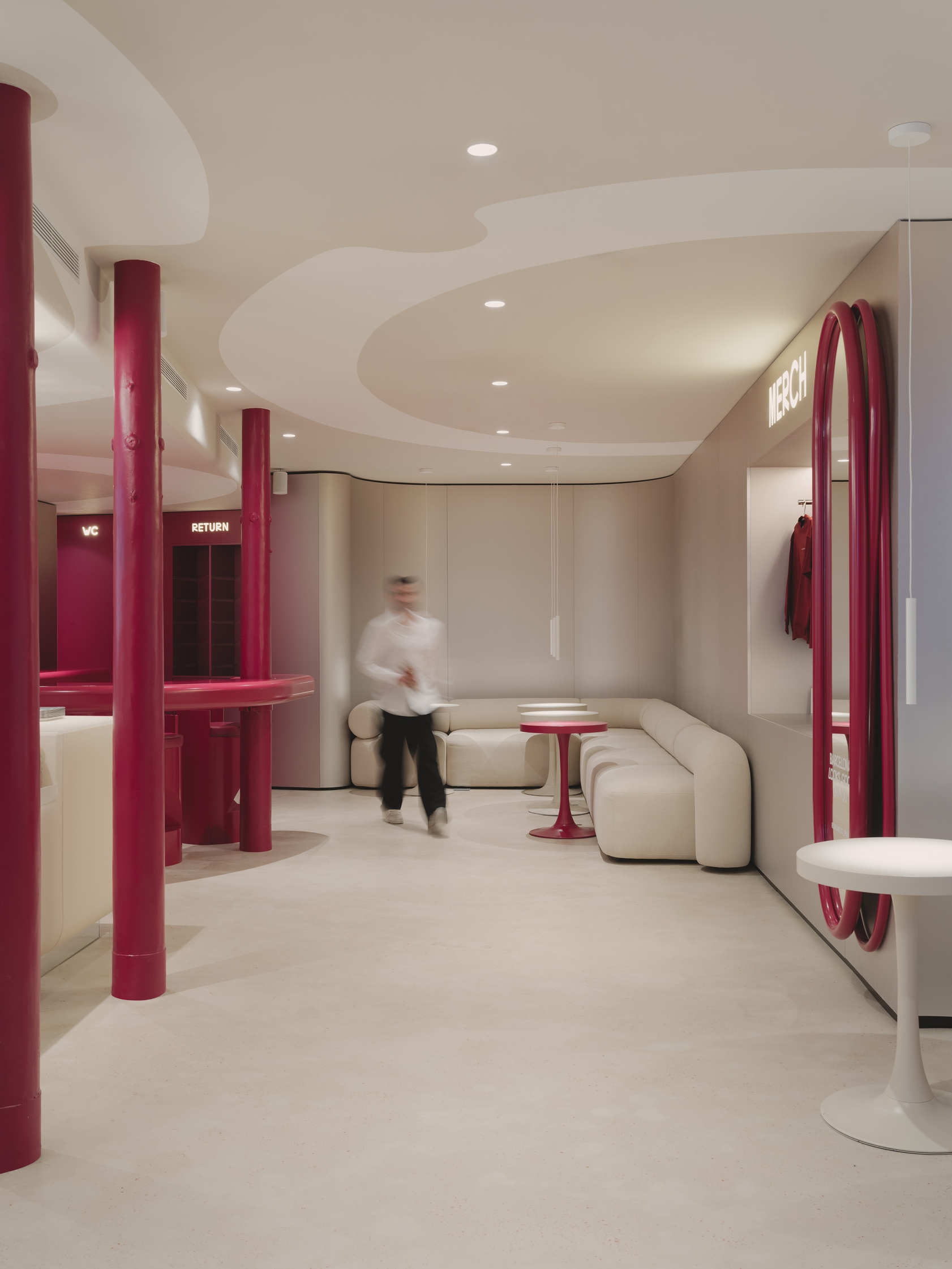
The layout was shaped around the existing columns inside the space. Instead of concealing them, we turned them into compositional anchors of the interior. The geometry of the counter is built around the columns, while the graphic ceiling pattern appears to “flow” outward from them, unifying the space into a single system.

plan ↑
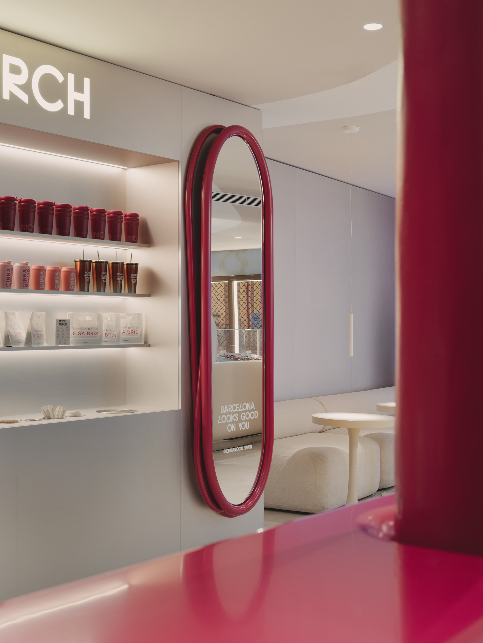
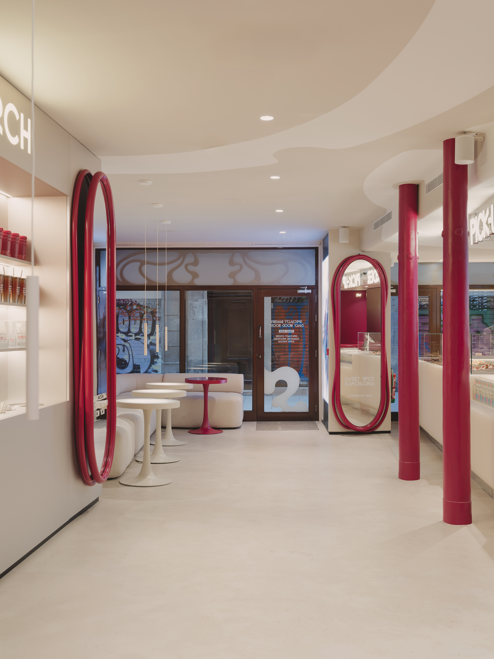
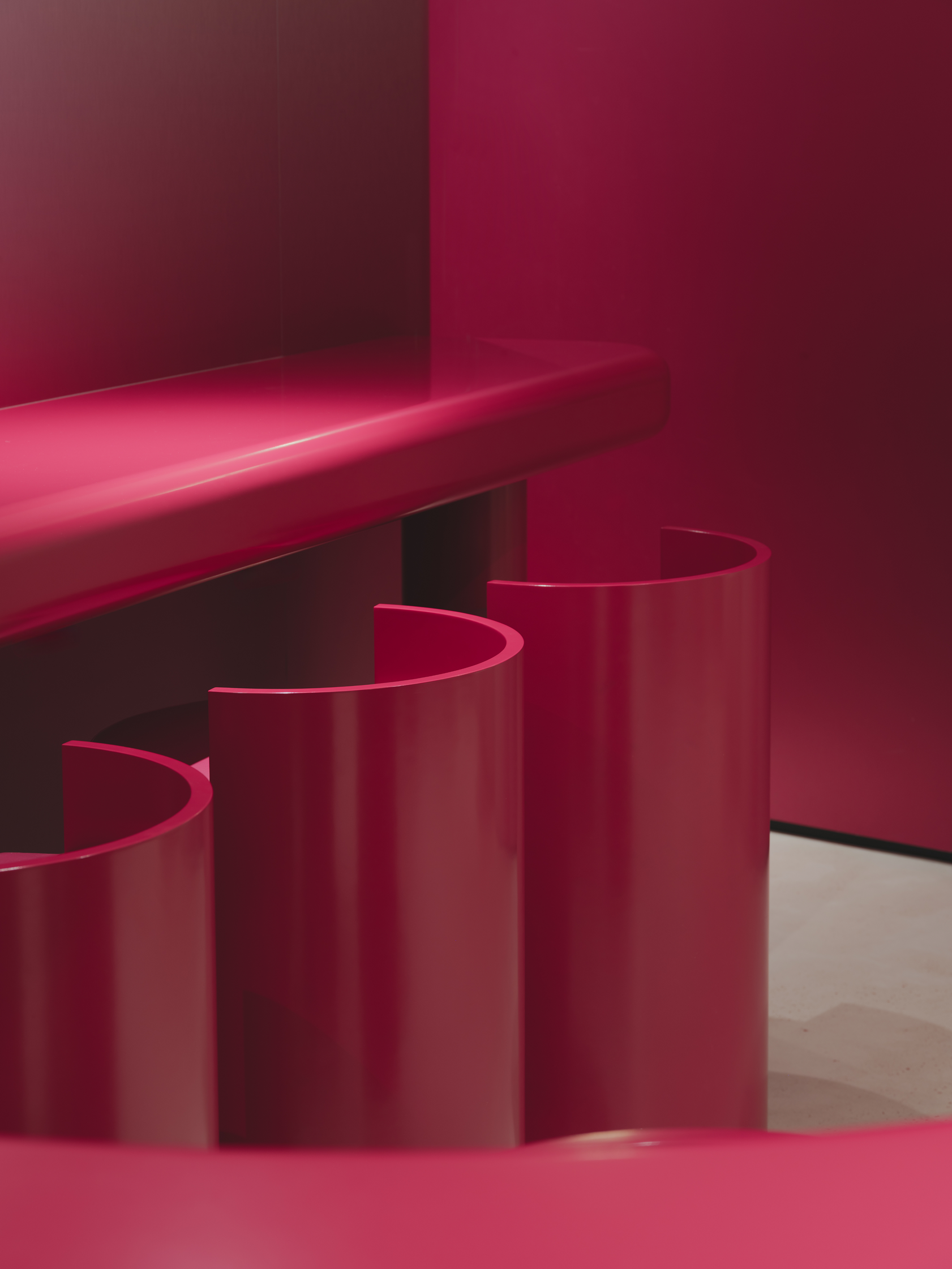
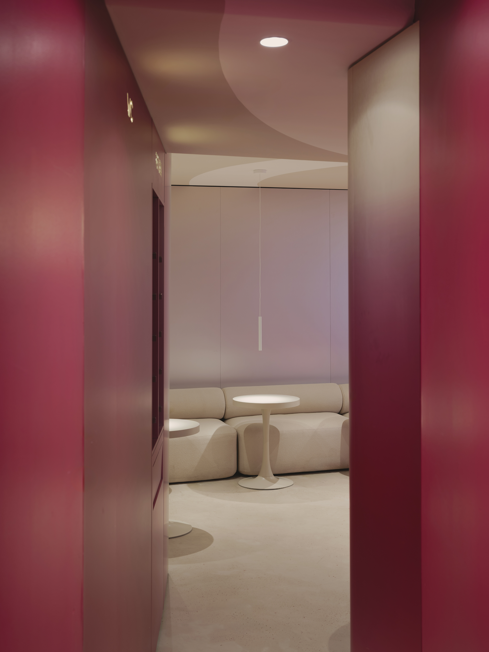
Seating is kept in neutral tones, while color is concentrated in wall finishes and built-in furniture. Gradient metal panels create a seamless transition between materials, with metal fading into vibrant color. This approach enhances the futuristic feel while maintaining a calm and cohesive interior.
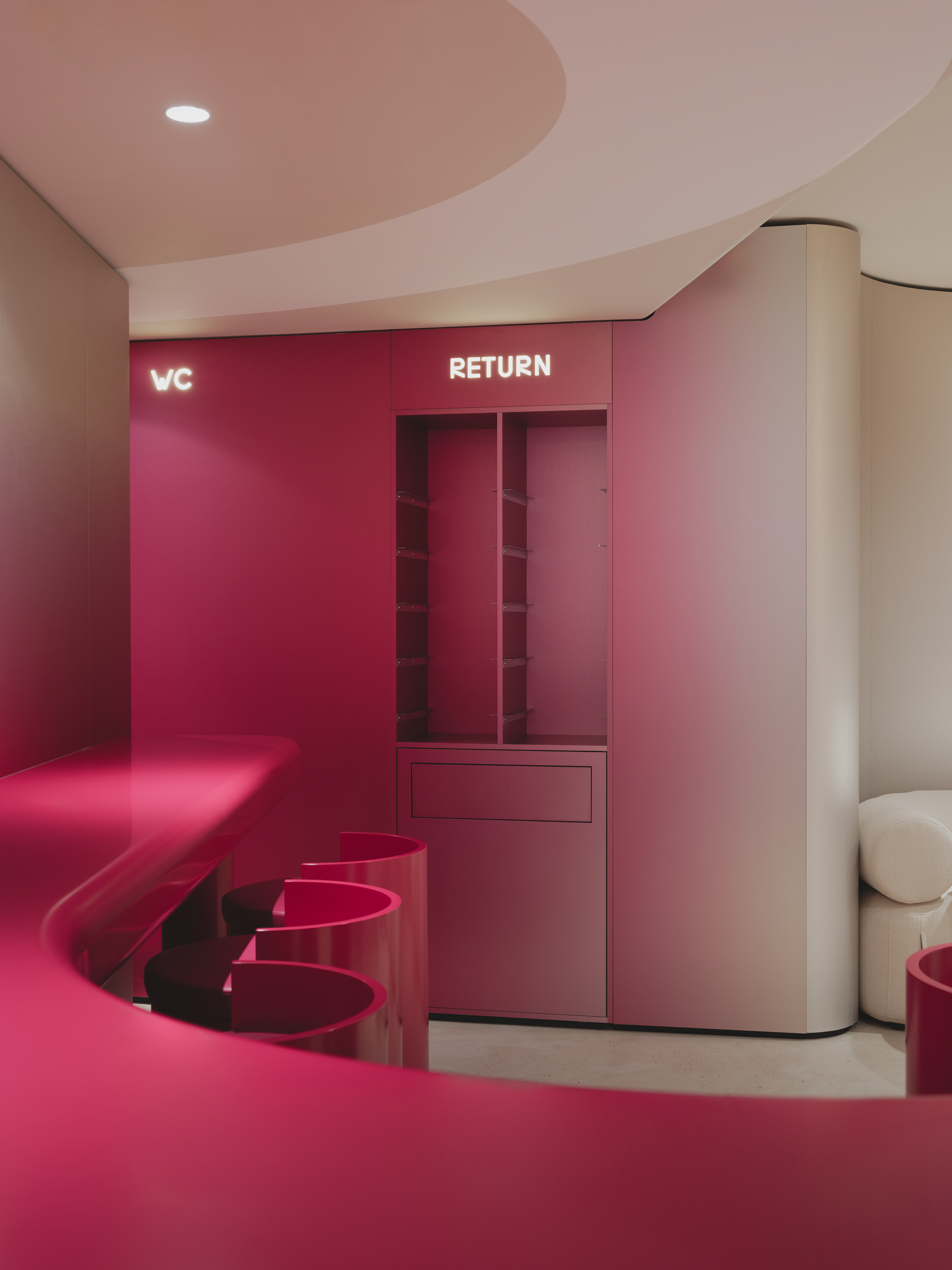
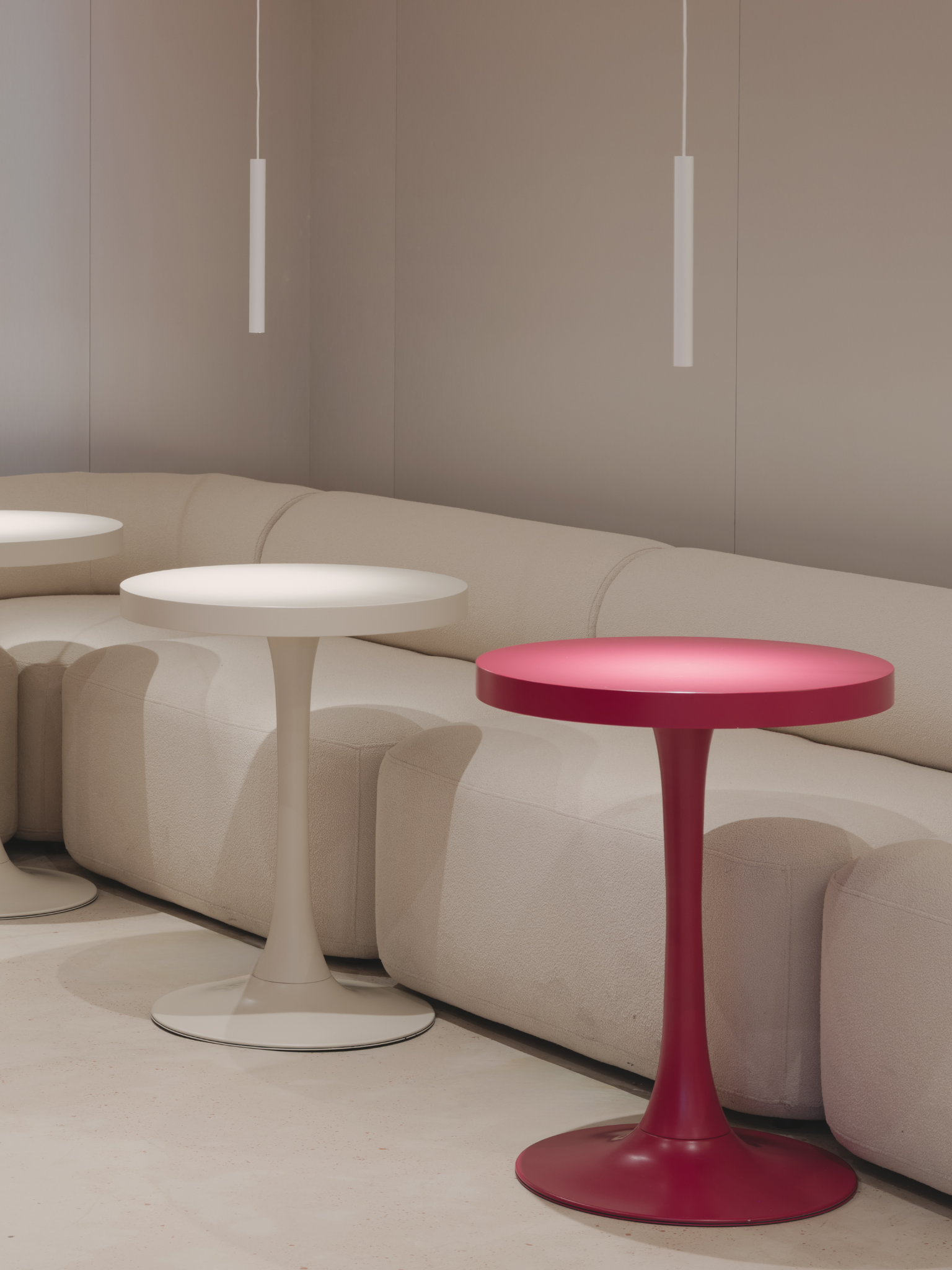
Sharp angles were intentionally avoided, resulting in a soft, enveloping space defined by fluid forms.

axonometry
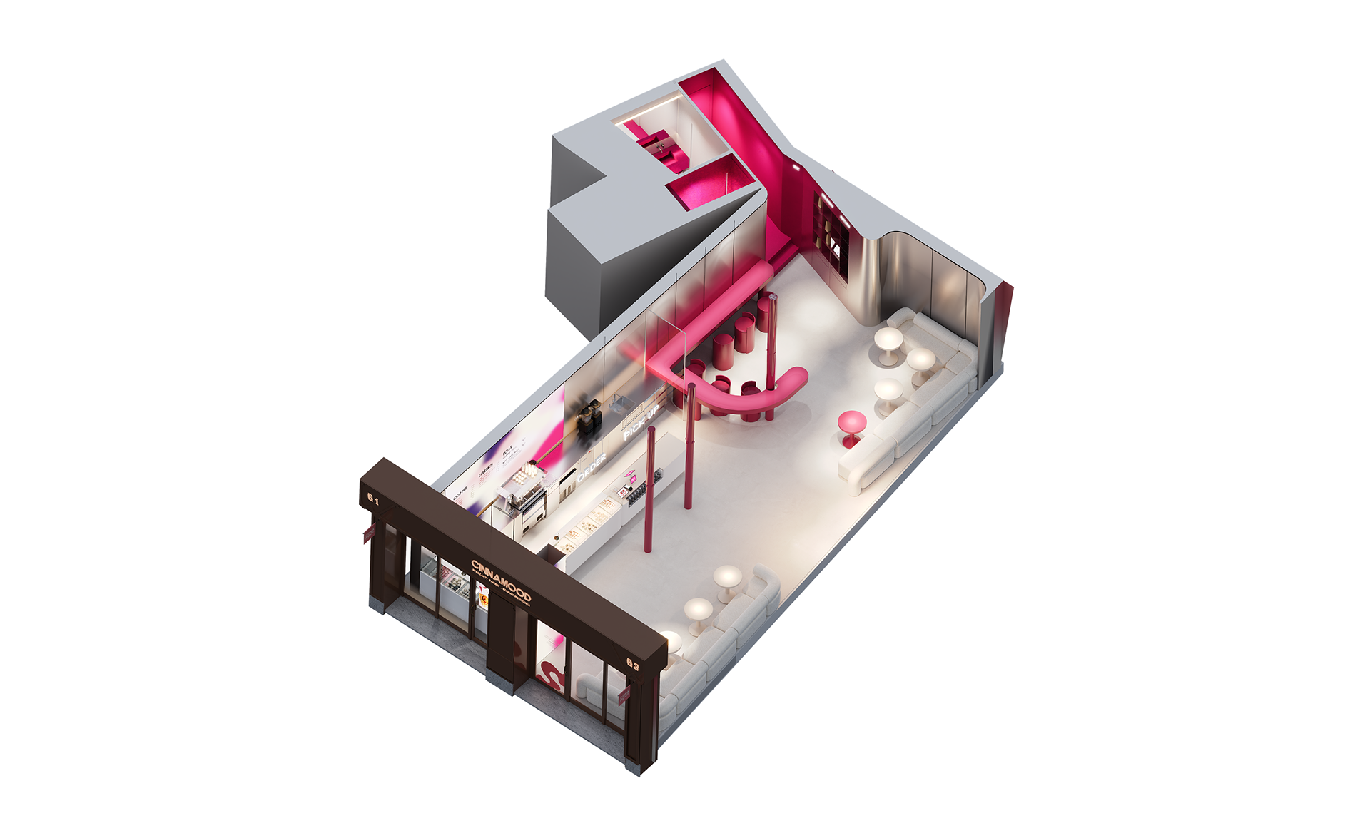
The main functional focus is the ordering and pick-up area. Particular attention is given to the display of pastries: the customer journey is designed so that guests gradually engage with the selection and spatial logic as they move toward the counter.


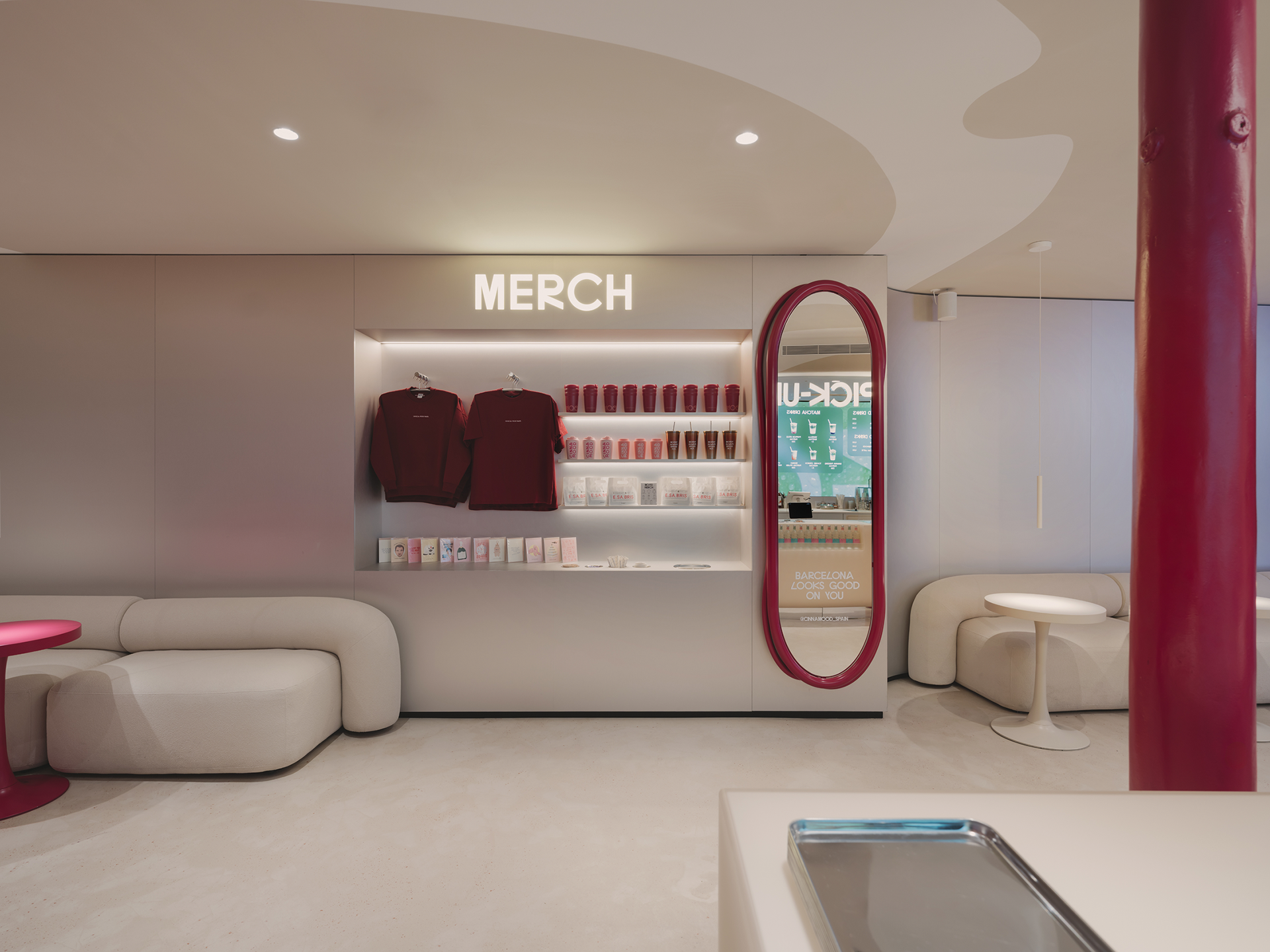
Seating is positioned away from potential queue zones, which are instead allocated for merchandise, preventing visual and functional congestion.

The counters are made of acrylic stone with rounded forms, reinforcing the overall soft geometry. Finishes combine gradient metal, vibrant color, and neutral surfaces that serve as a backdrop for brand accents.


The project incorporates seamless digital screens for menus and entry information. Integrated into the wall planes, they become part of the architecture rather than standalone elements, supporting the idea of a cohesive, technologically integrated environment.
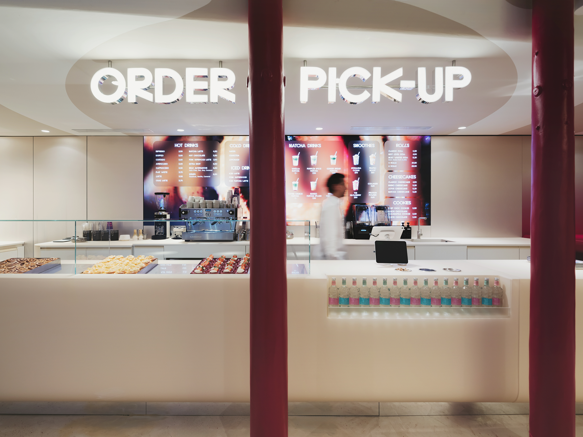
The interior is designed as a flexible system where architecture, graphics, and digital elements work together to enhance navigation and user experience. Durable materials, built-in solutions, seamless screens, and fluid forms create a functional, easy-to-maintain space while integrating existing structural elements without compromising visual clarity and lightness.
↓ project team