
Efsy | Brand Identity
Brand identity for Cafe in Prague, Czech Republic
Authors: Ruben Movsisian, Daniil Savinskiy
2024
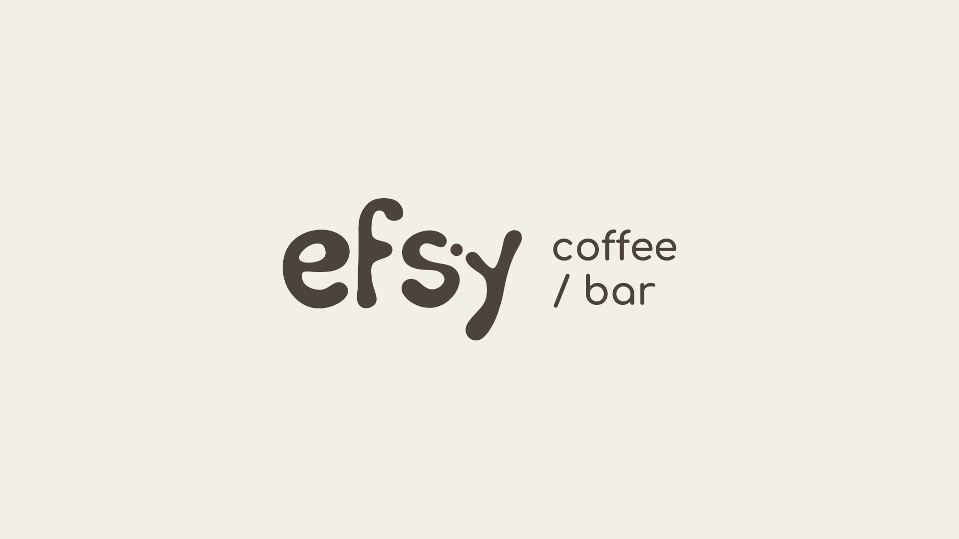
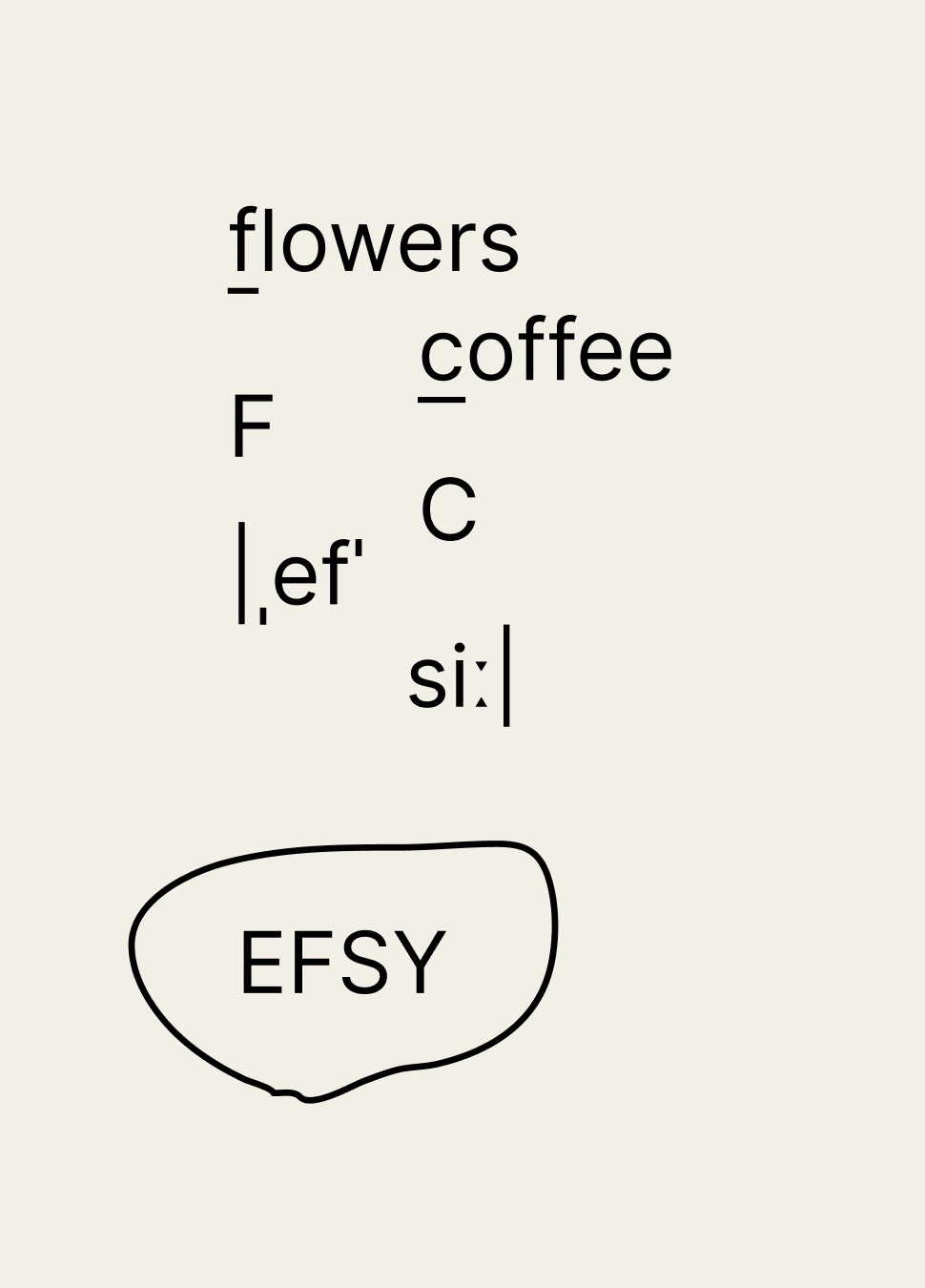
The story began when a client from Prague approached us with a request for interior design, as well as branding and identity design. The name “Efsy” represents a transcription of the abbreviation from the words Flowers & Coffee (FC), reflecting the idea of a close connection between nature and coffee culture.
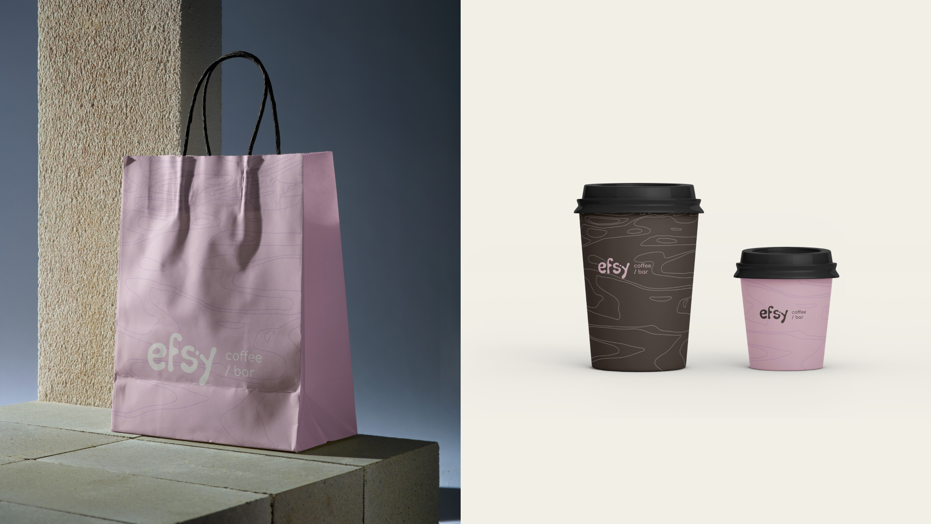
As part of developing the branding strategy, it was important for us to highlight the connection between nature and coffee and create a series of familiar coffee shop merchandise attributes for the client—such as bags, coffee cups, signage, interior navigation, and the menu.
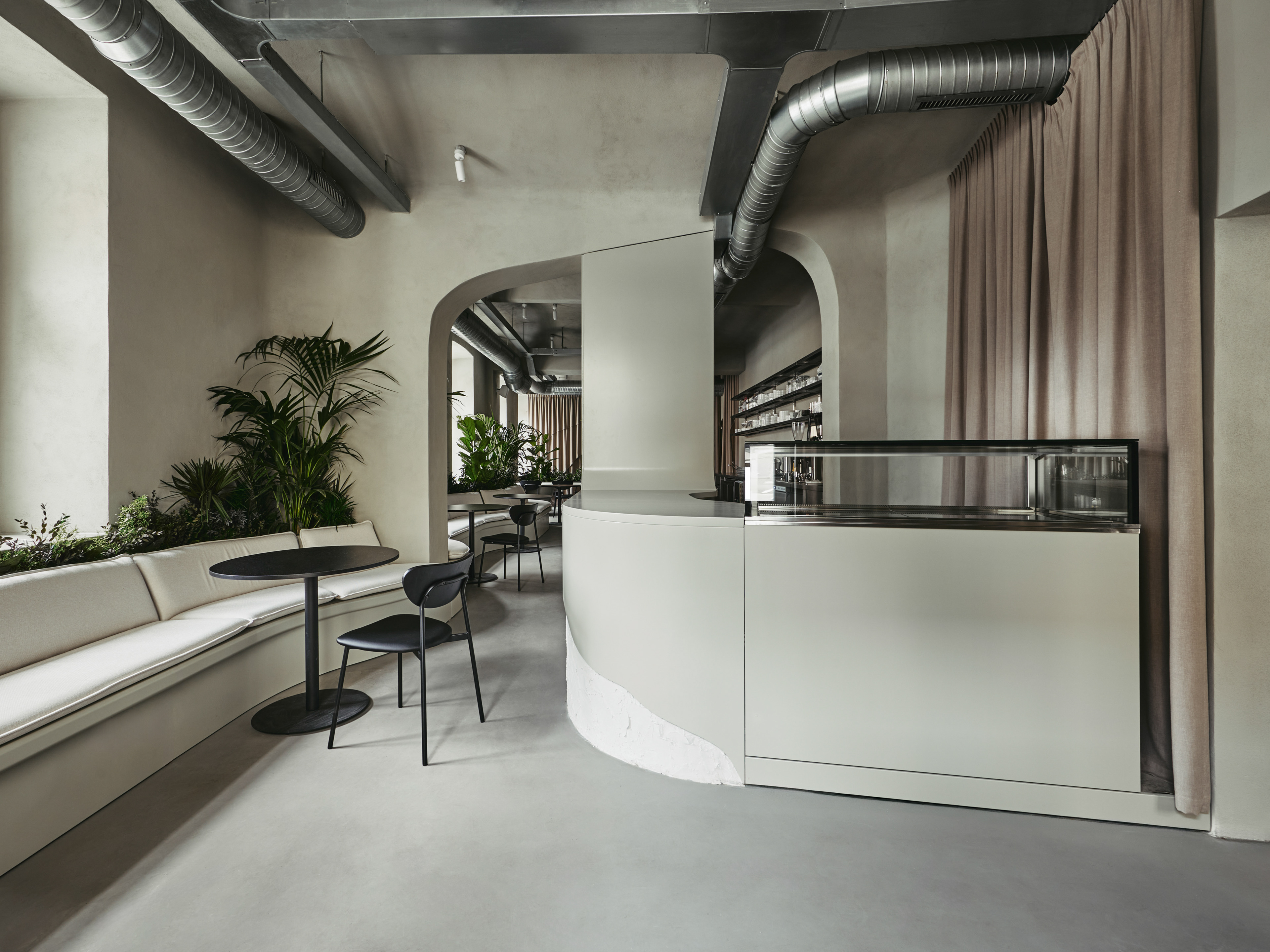
Efsy Café has a very broad target audience thanks to the “Fresh AM — Sexy PM” concept—during the day, it’s a place to spend time with friends or family, while in the evening, one can retreat to one of the rooms with drinks from the bar.
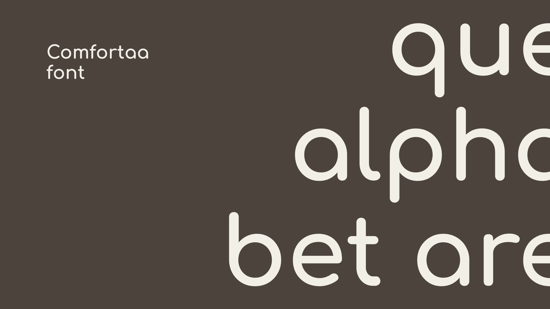
The selected Comfortaa font emphasizes the softness in the logo
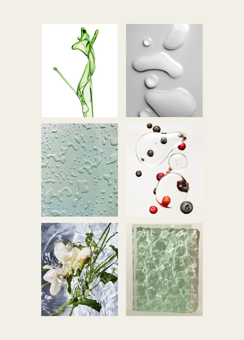
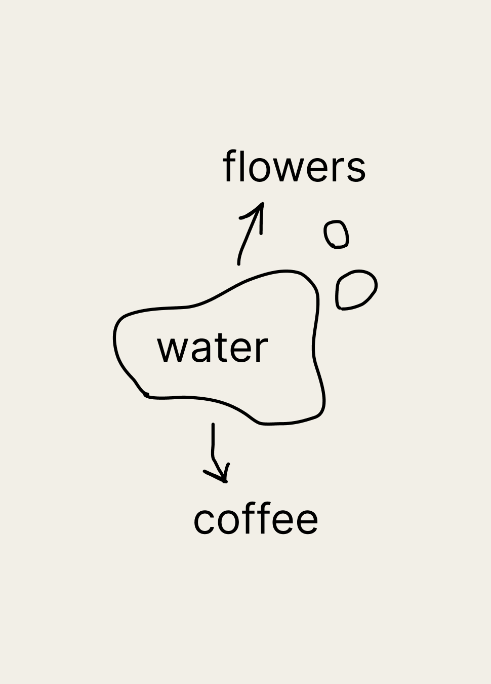
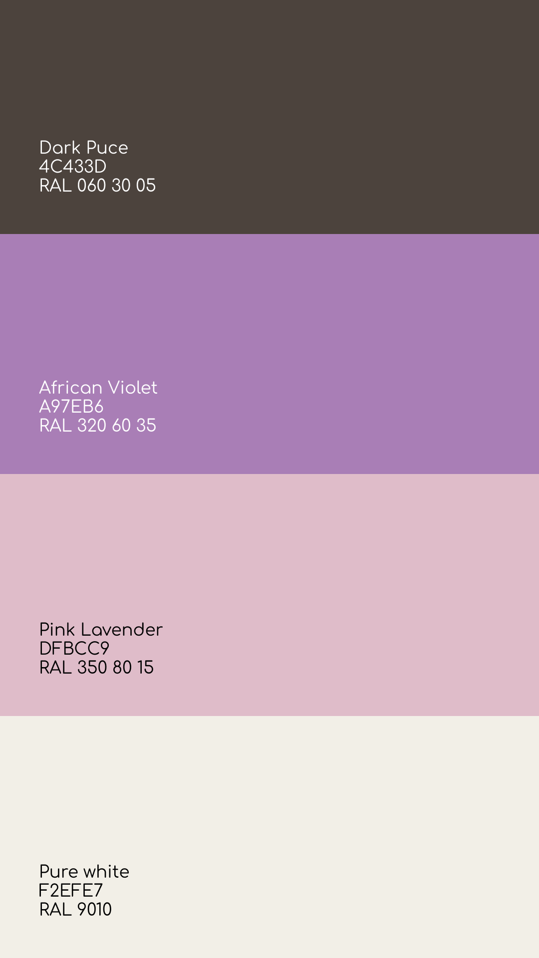
In our work on branding, we focused on very creative, artistic versions inspired by water spreading, coffee, and floral themes. The brand’s colors also reflect this connection: we used coffee tones (beige and brown) combined with floral shades (lavender and purple).
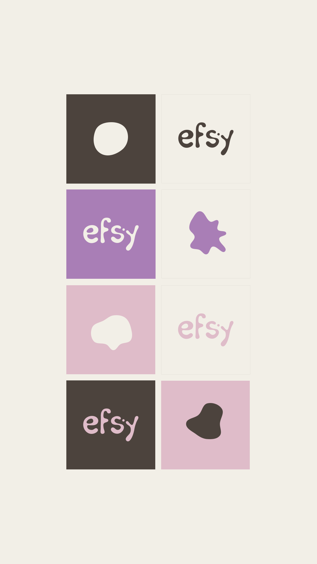
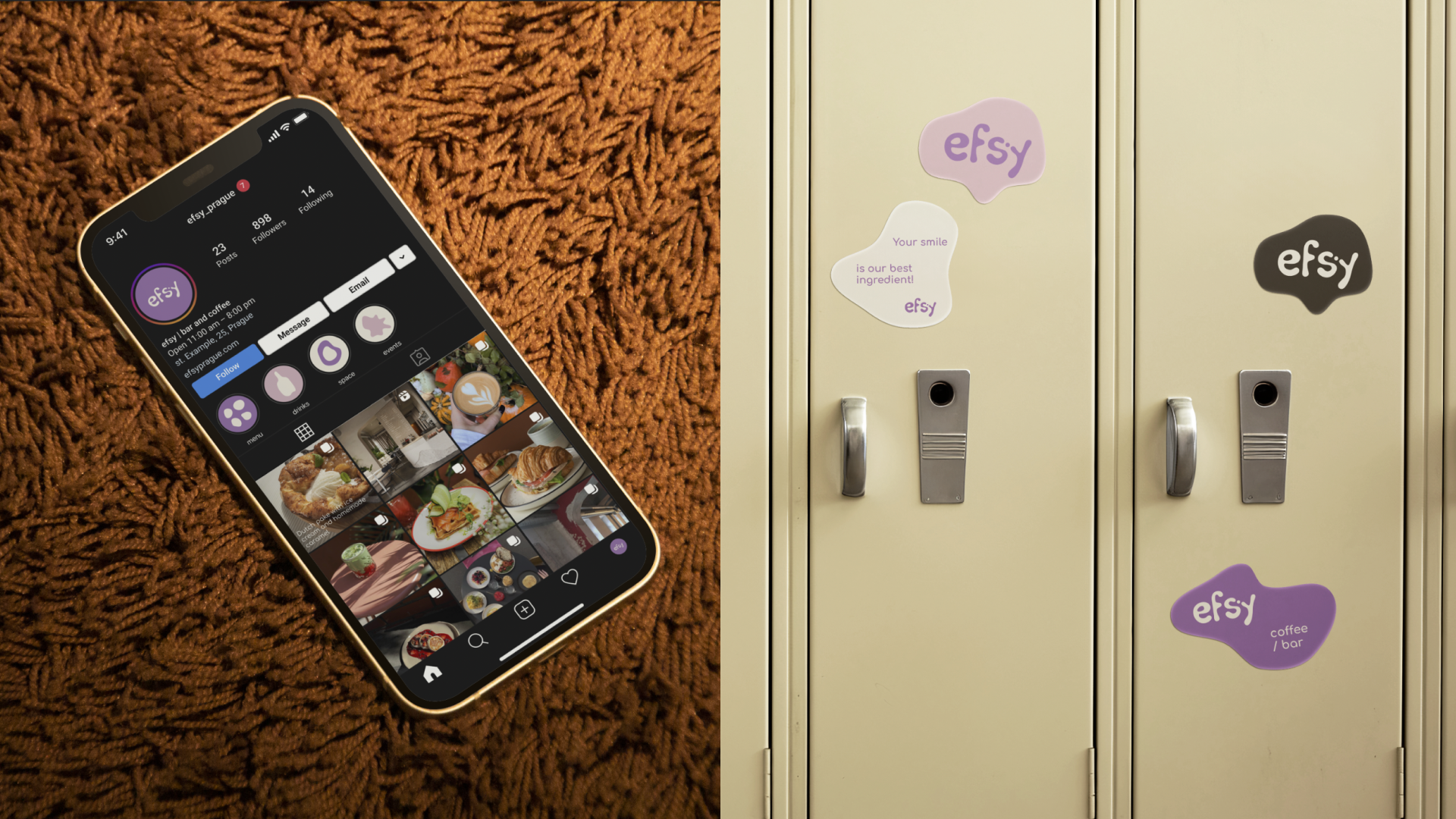
We used this color scheme in areas where more diverse color solutions were needed, such as social media and stickers.
speical background pattern inspired by water ↓

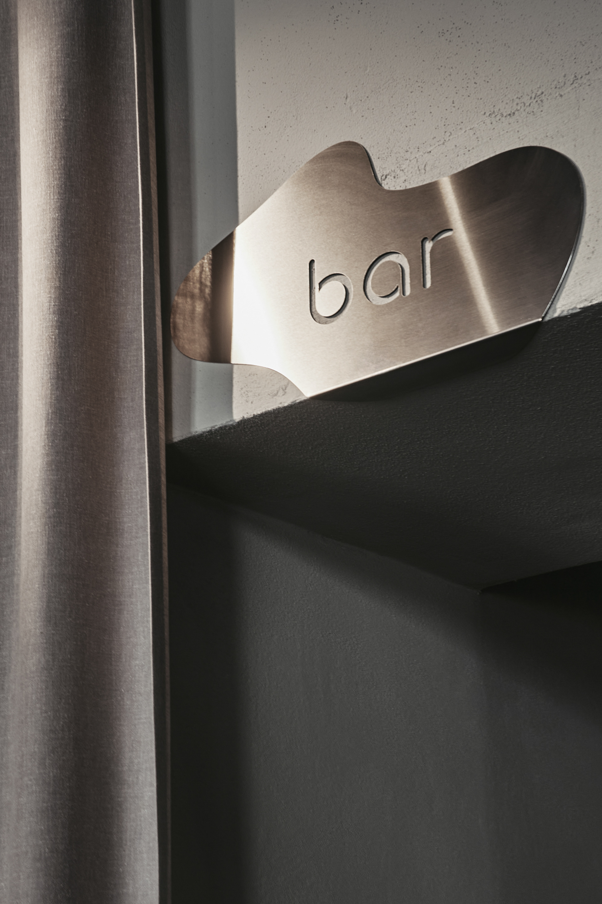
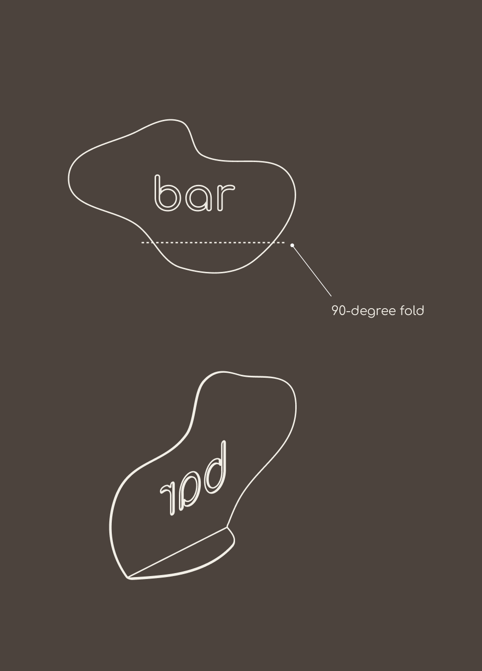
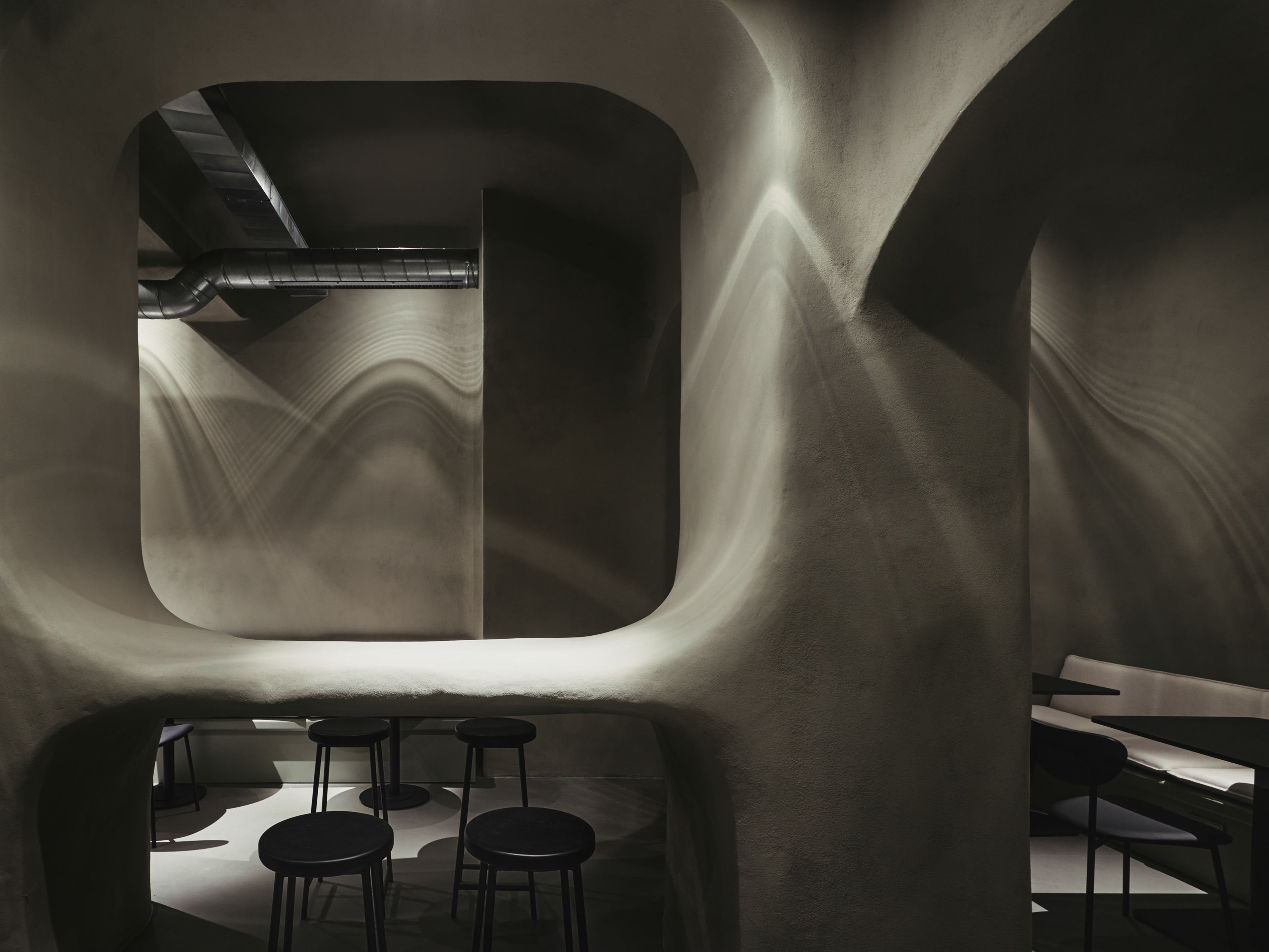
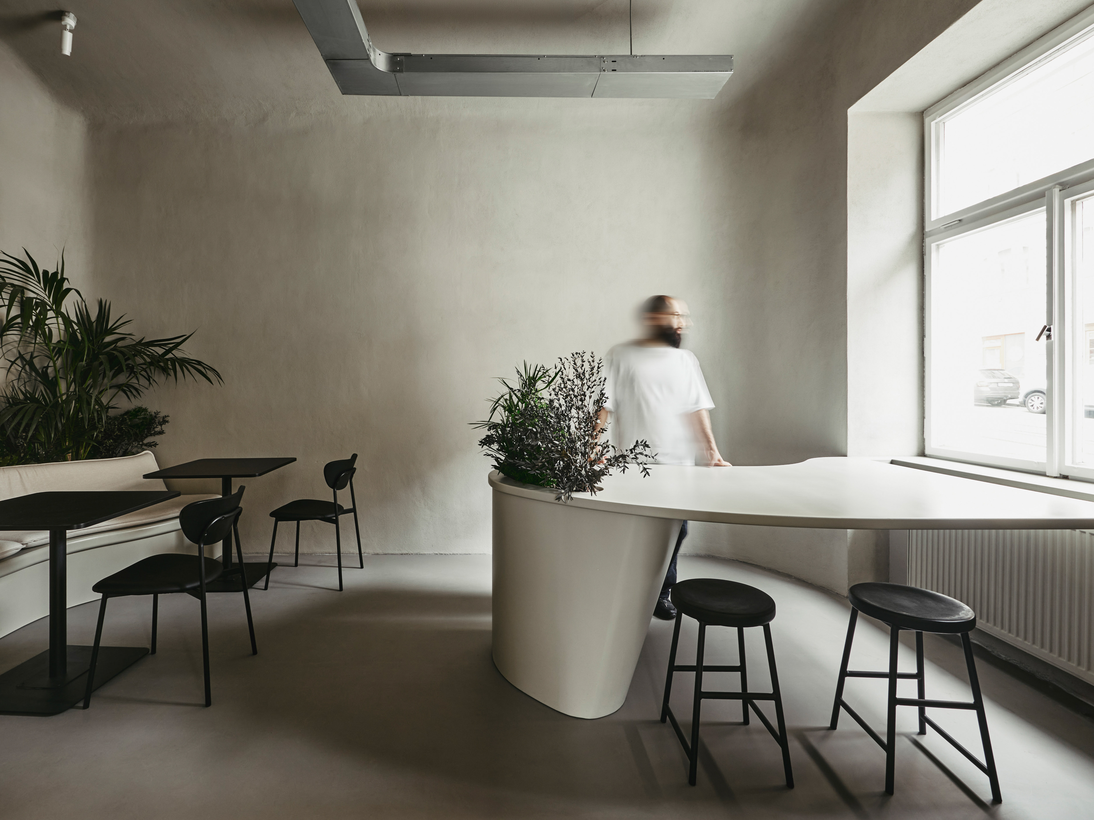
The branding ideas continued into the interior design—from very complex yet fluid, soft-shaped signage to wall finishes and an abundance of plants—everything in this project speaks of coffee and flower gardens.
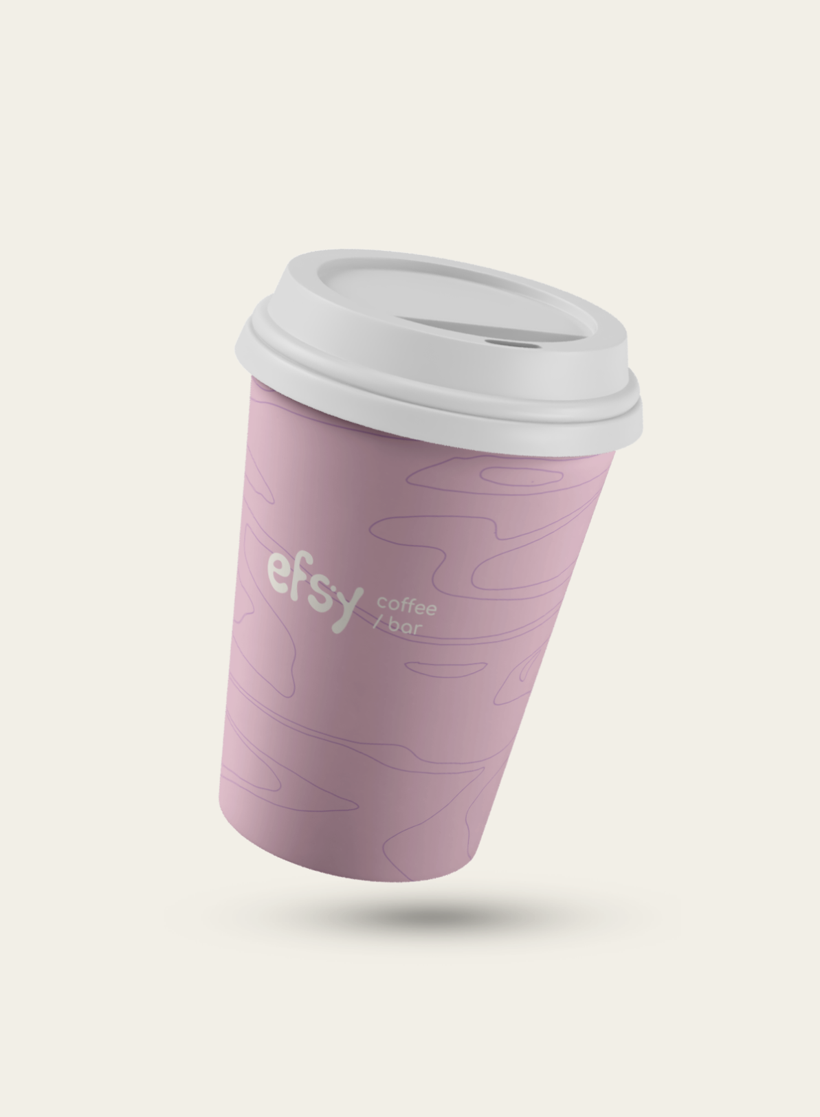
coffee cups ↓
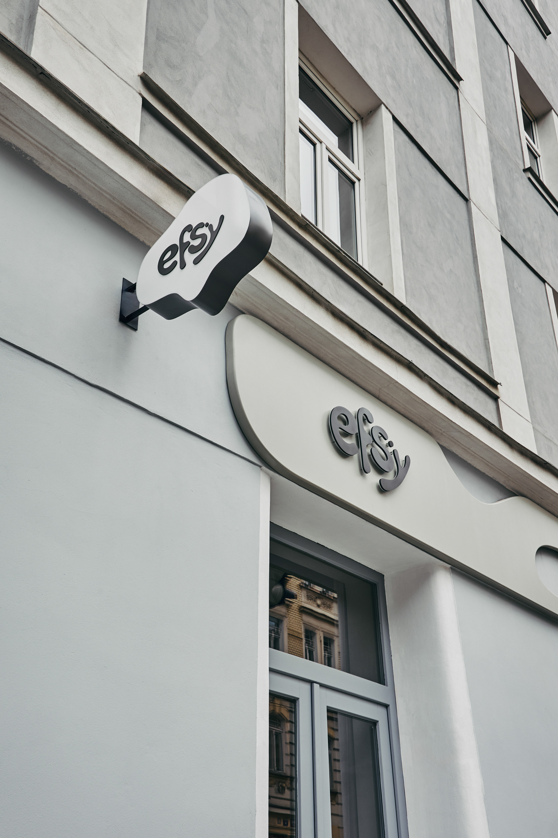
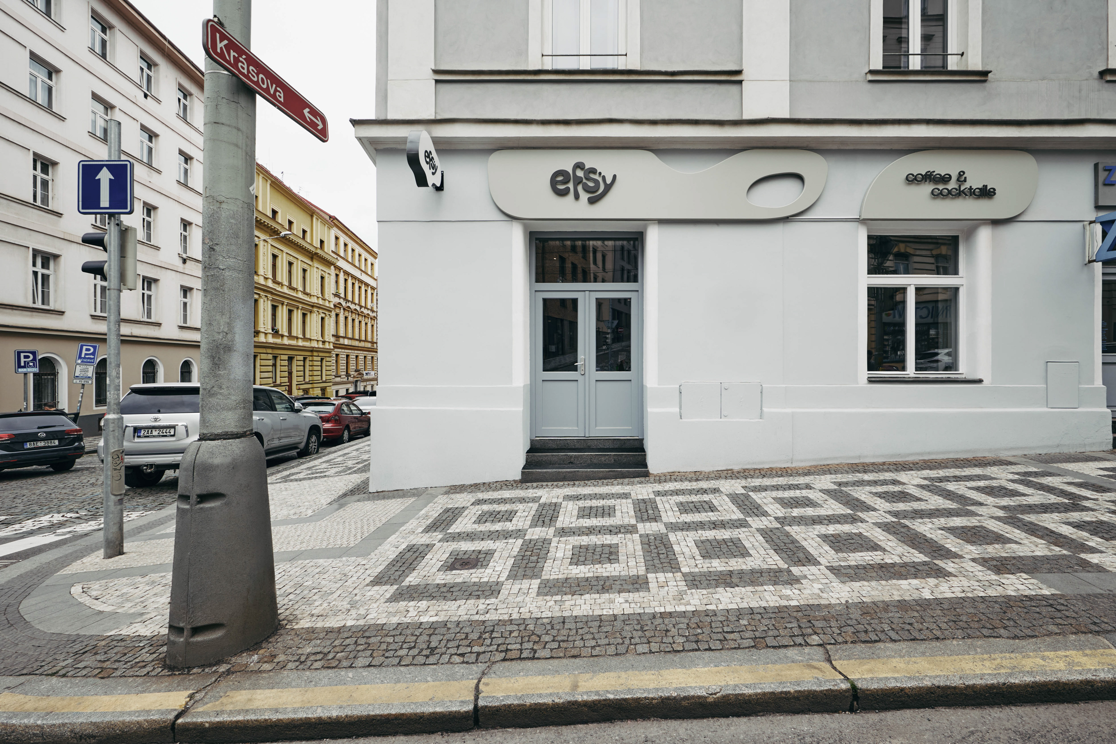
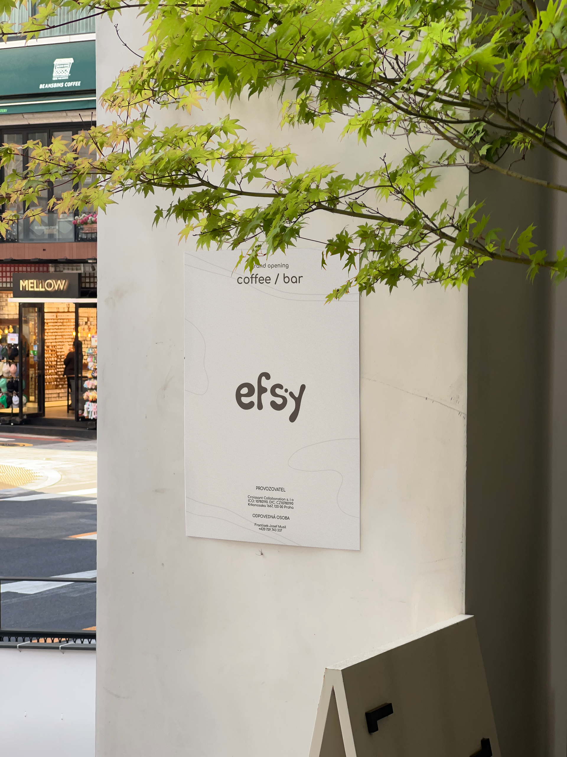
↑ street sign
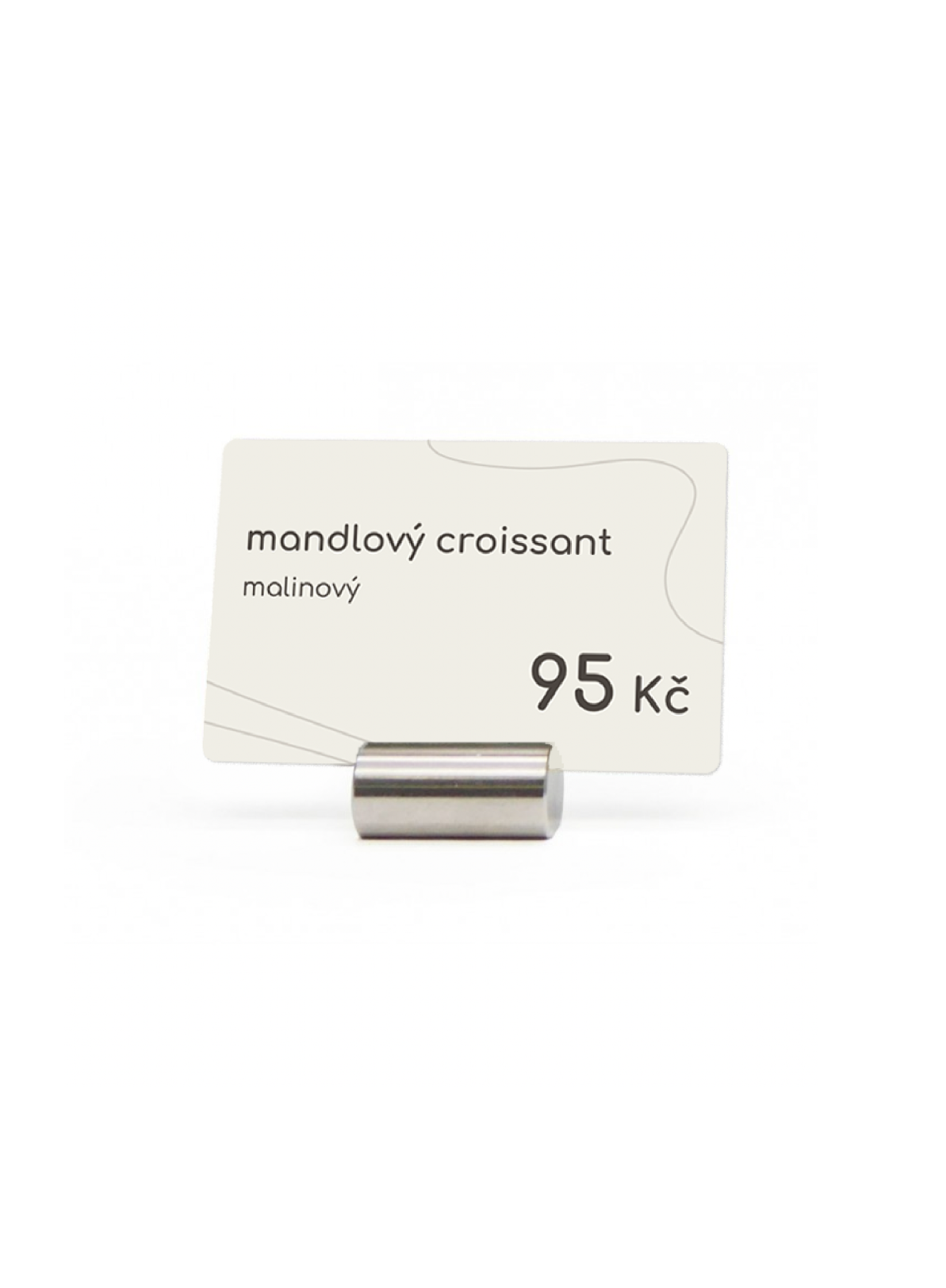
price sign ↓
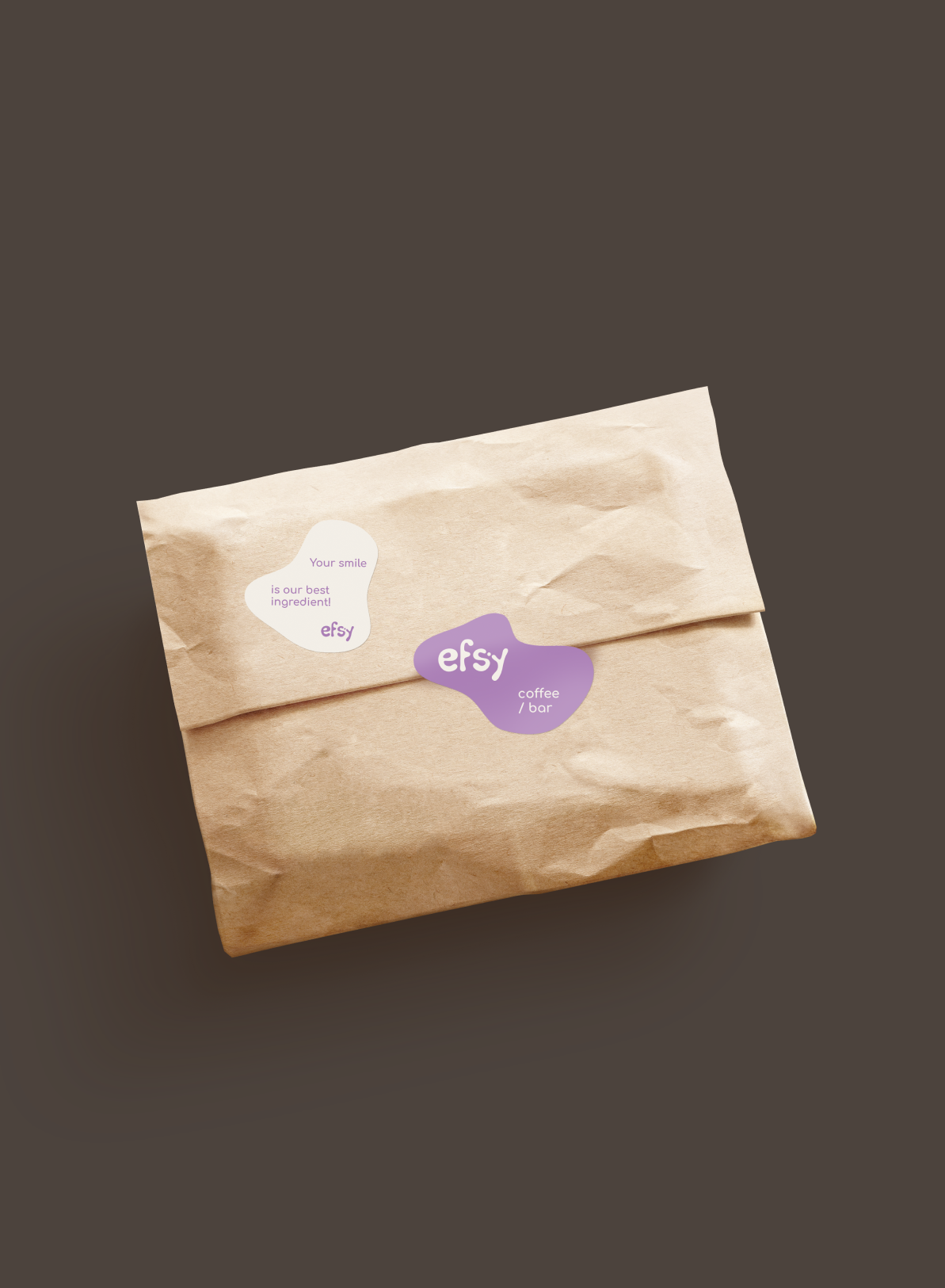
↑ craft paper package
↓ project team


final logo updated by Efsy team