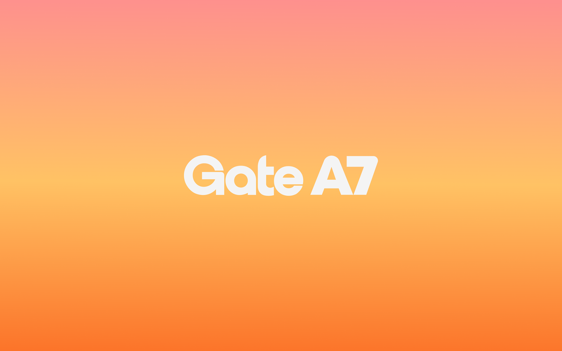
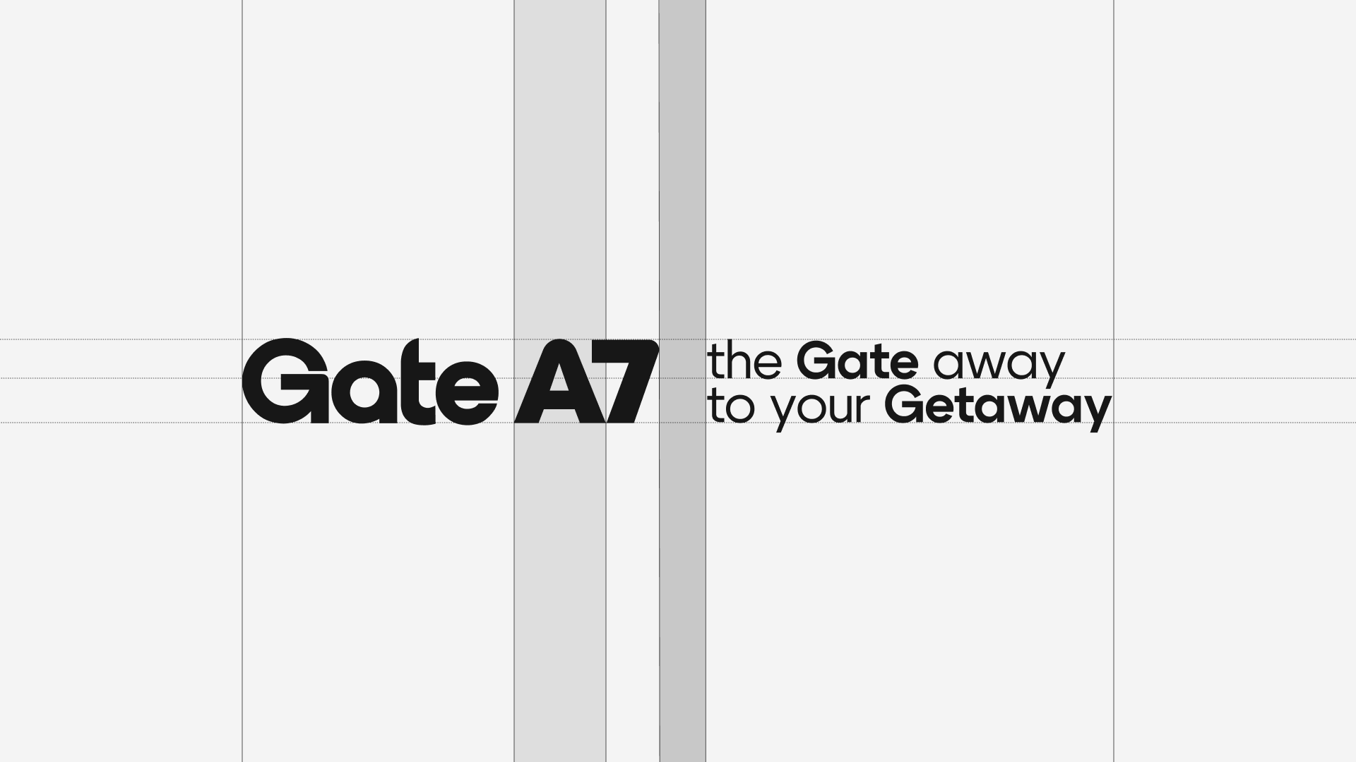
Gate A7 | Brand Identity
Brand identity for Café in USA
Team: Egor Bogomolov, Valerii Egorov, Dmitrii Mironov, Alexandra Arsenteva, Sonya Anikina
Team: Egor Bogomolov, Valerii Egorov, Dmitrii Mironov, Alexandra Arsenteva, Sonya Anikina
2026
Gate A7 Café is a travel-inspired, airport-themed café designed to immerse guests in the feeling of stepping
into an airport terminal. From the very first moment, visitors are transported into a familiar yet elevated atmosphere — a mix of modern sophistication, global visual language,
and the quiet excitement that comes with anticipation of travel.
into an airport terminal. From the very first moment, visitors are transported into a familiar yet elevated atmosphere — a mix of modern sophistication, global visual language,
and the quiet excitement that comes with anticipation of travel.
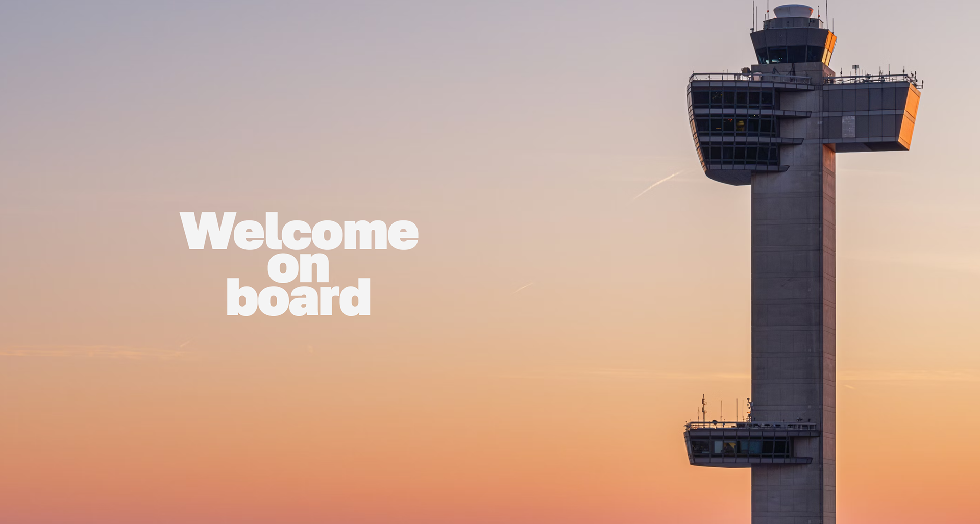
Gate A7 is an experience — one that evokes curiosity, connection, and a sense of wanderlust without the need to board a plane.
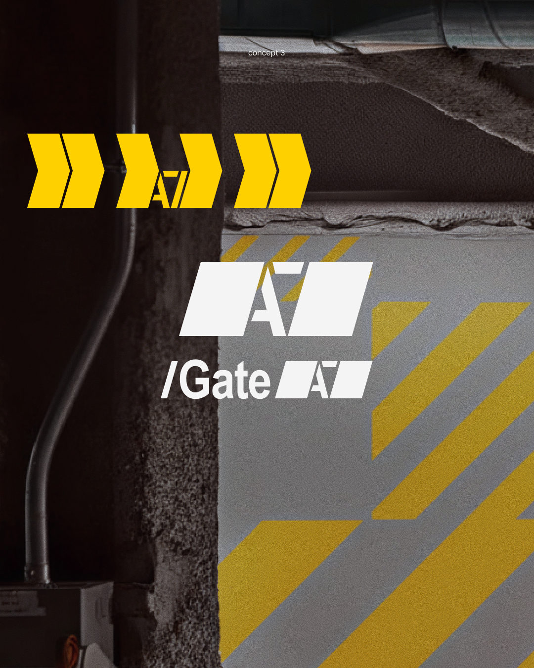
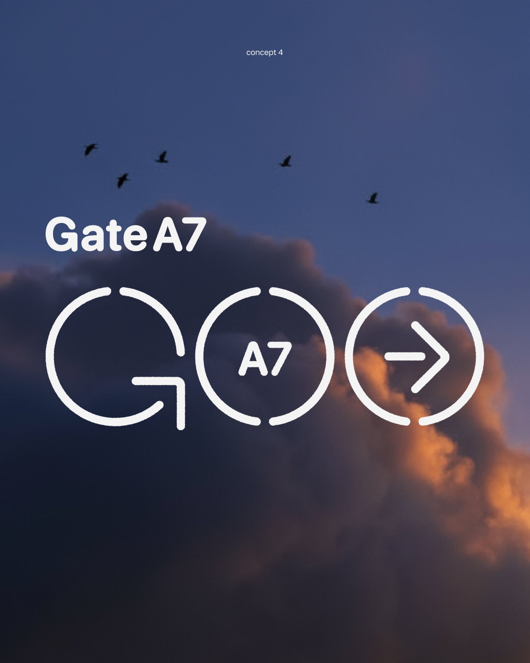
exploration phase ↓
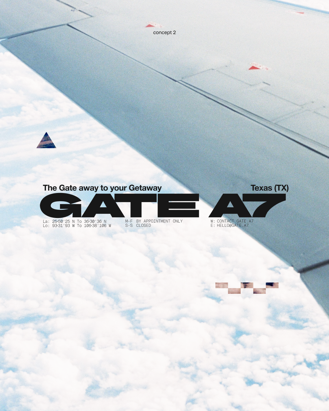
During the exploration phase, we approached the concept from multiple perspectives — from airport navigation systems and wayfinding logic to the pilot’s view with maps and coordinates. We also explored runway markings as a language of movement and direction, and passport stamps as a way to capture travel through moments and destinations.
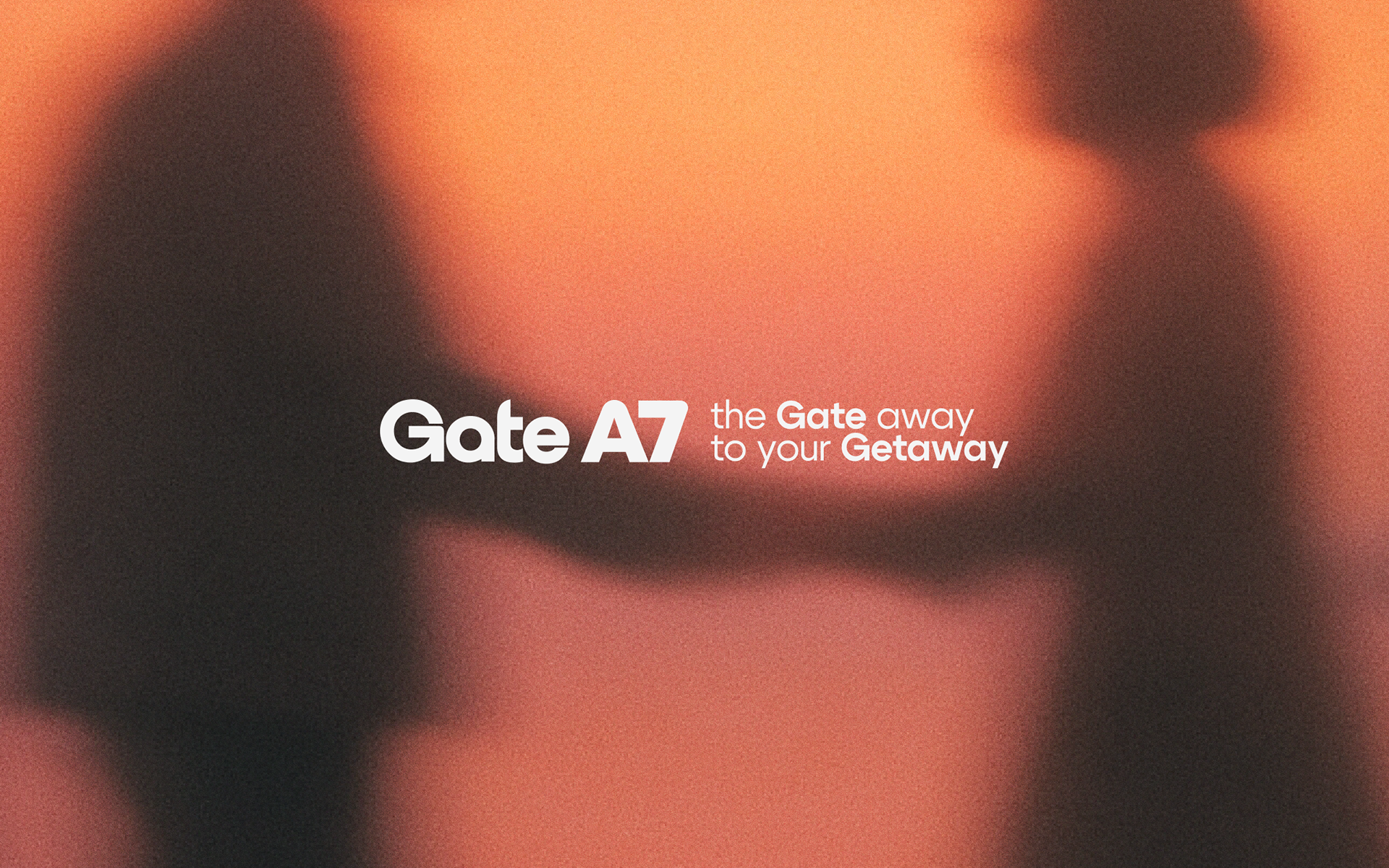
The final direction became a synthesis of these explorations. Gate A7 Café is inspired by the aesthetics of airports and airplanes, but it is driven by feeling rather than imitation. The name itself reflects a personal story — the founders’ meaningful meeting point at an airport gate — transforming a functional space into something intimate and memorable.
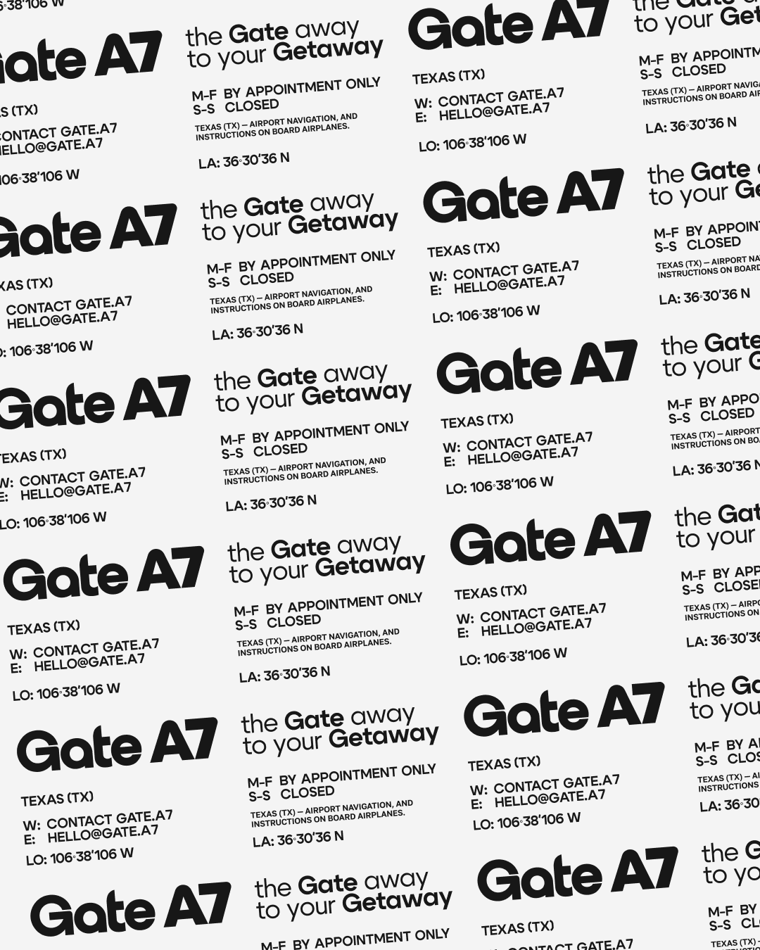
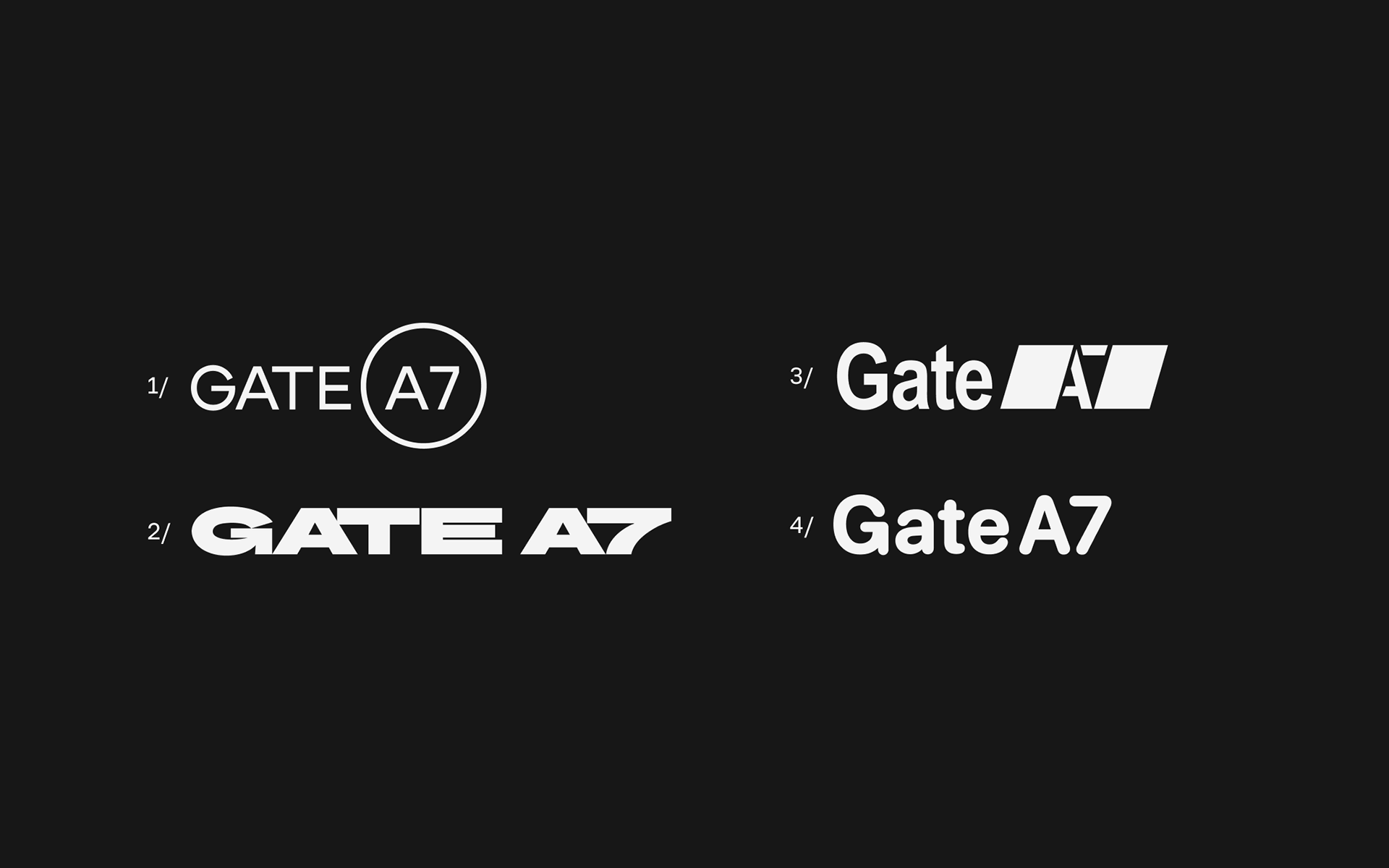
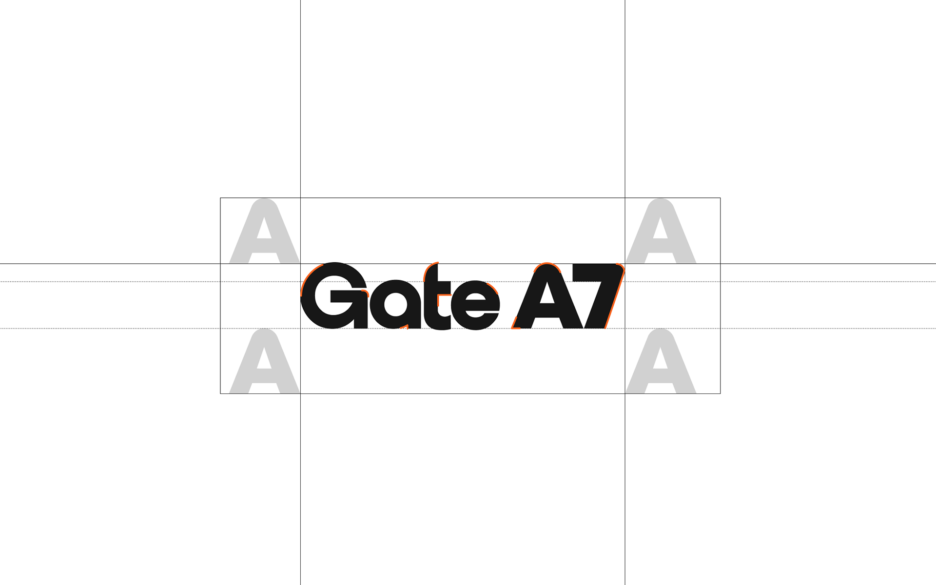
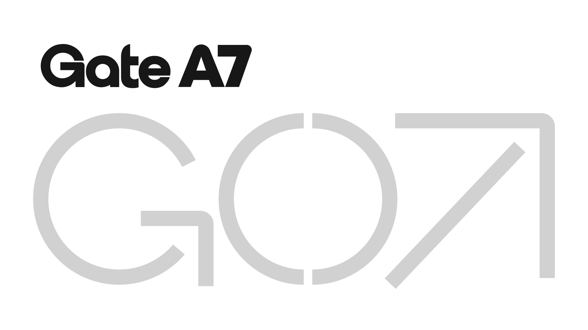
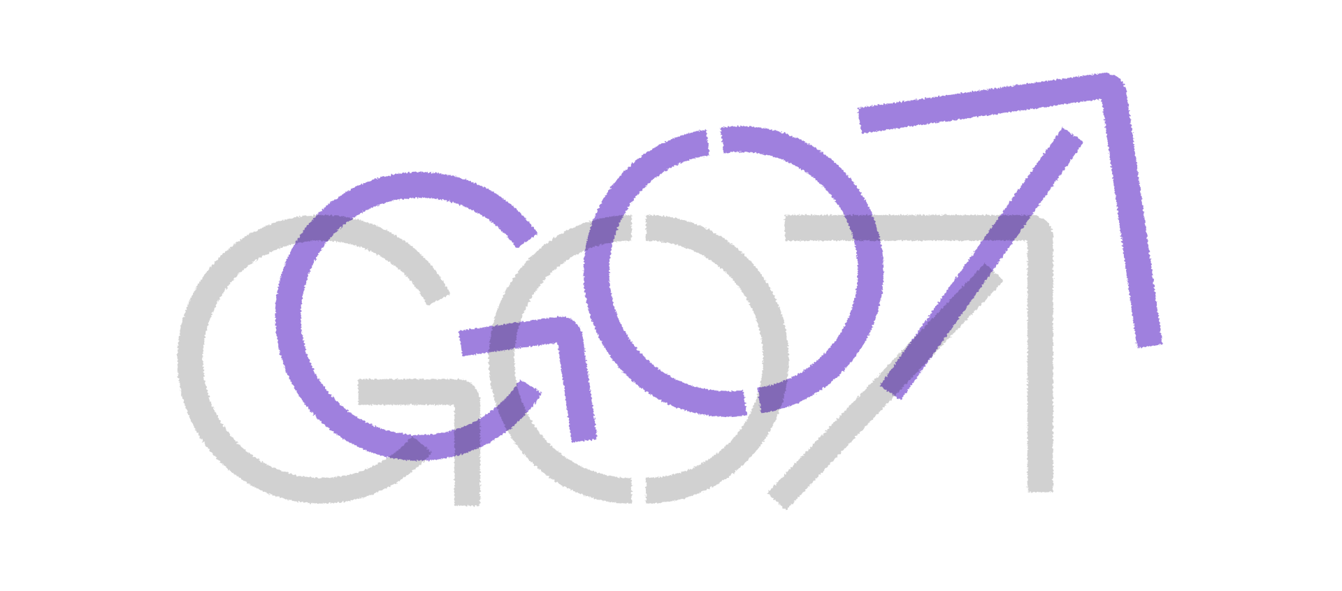
The identity is built on clarity and structure. The logotype is bold and confident, referencing the visual language of airline branding and airport signage. Each character feels precise and intentional, while the system introduces a “safe space” defined by the height of the capital letter “A”, creating a consistent internal logic across all layouts.
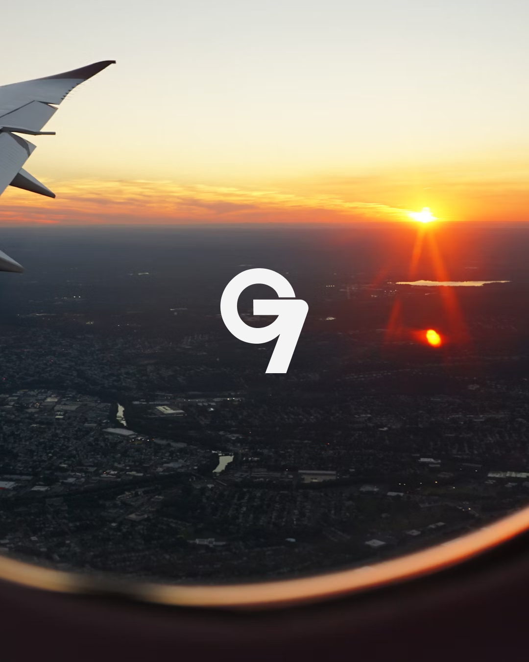
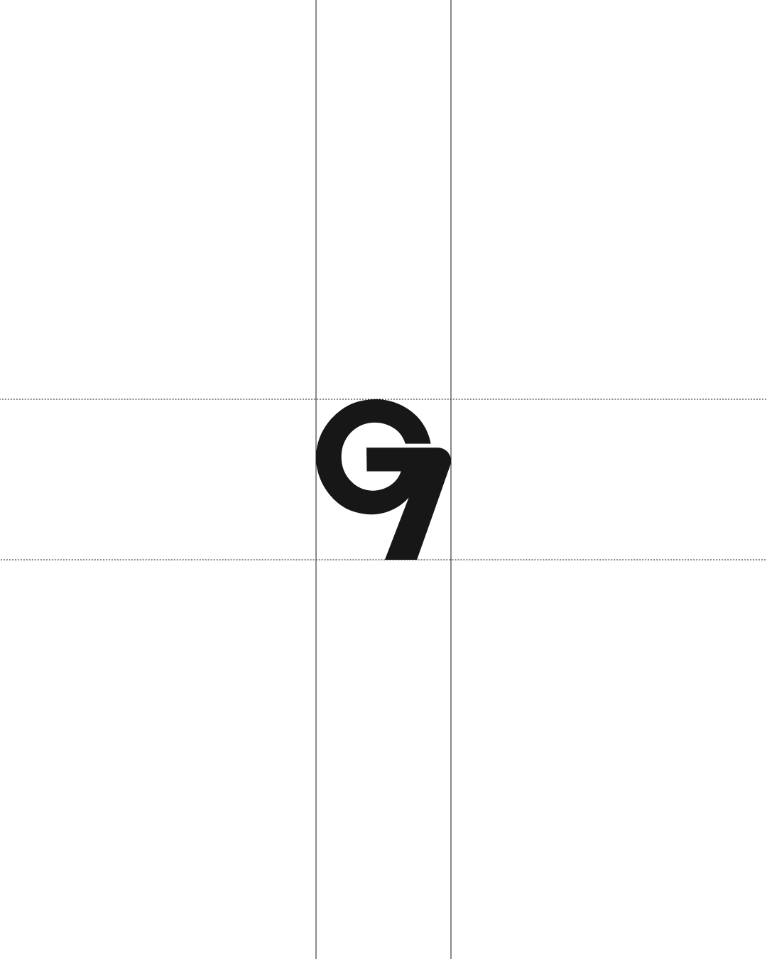
The logo can also be reduced to a compact sign combining the letter G and the number 7, allowing for flexibility across different applications.

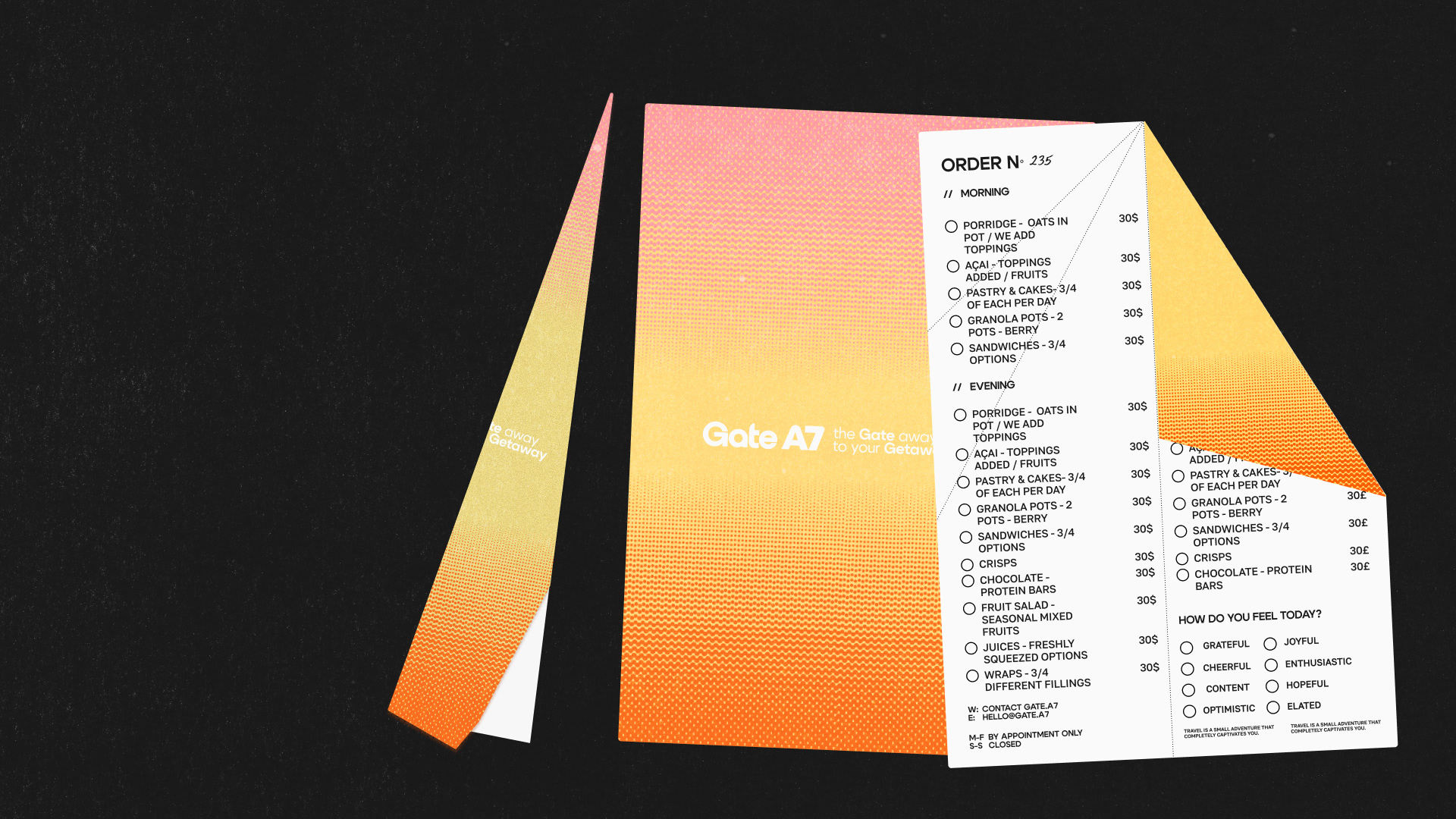
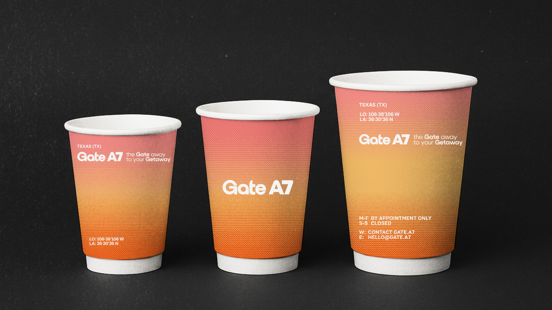
Color plays a central role in shaping the emotional layer of the brand. Inspired by sunsets seen through an airplane window, the palette captures the transitional moment between ground and sky. Warm tones — Pantone 177C, 1355C, and Bright Orange C — form a signature gradient that visually recreates the sensation of takeoff.
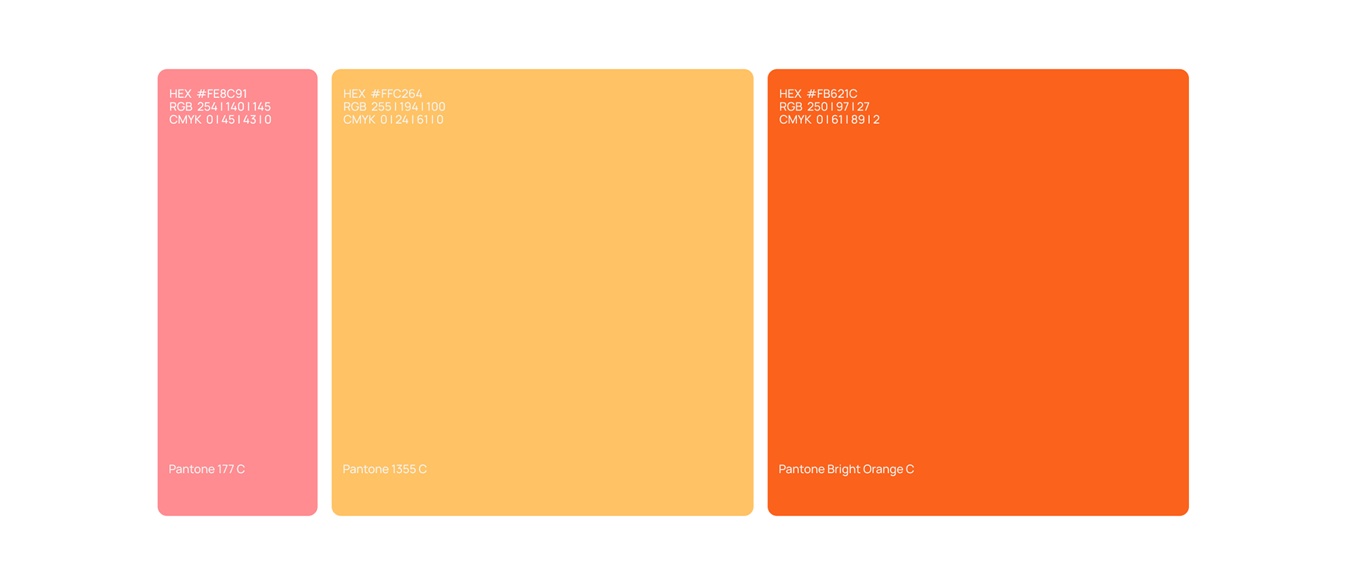
logo colors ↓

This gradient becomes a key brand element, adaptable across mediums, with alternative vector-based solutions for physical applications where gradients are harder to reproduce.

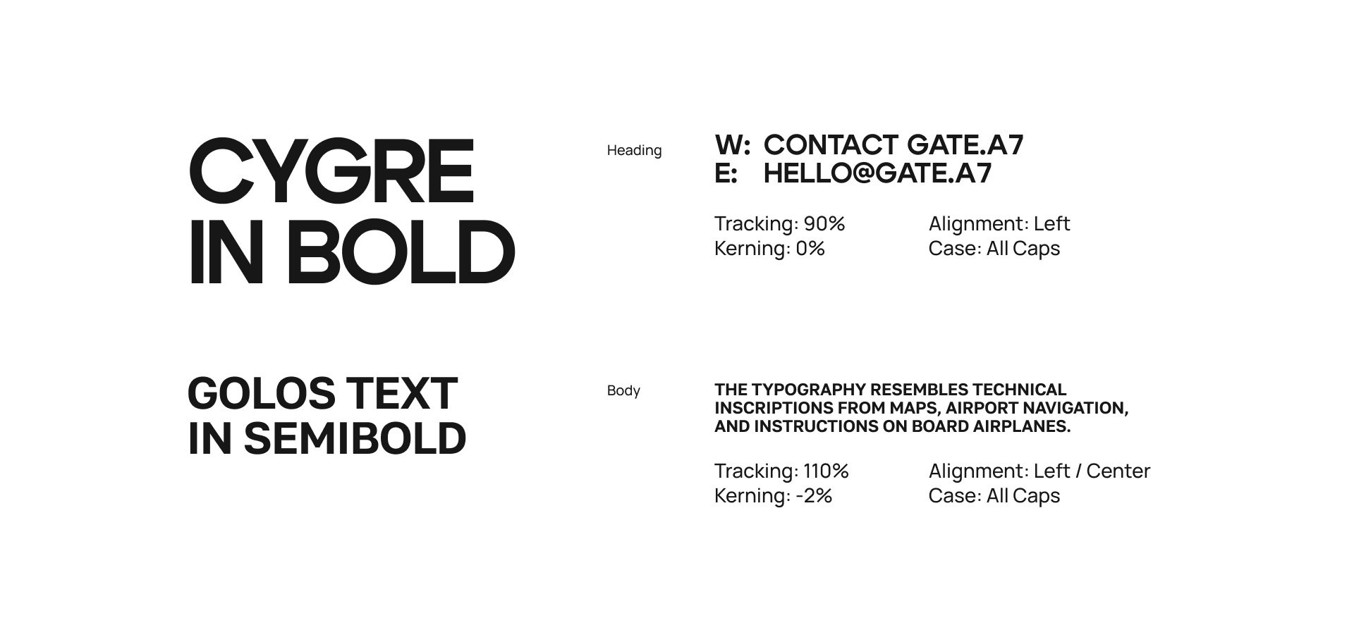
Typography reinforces the sense of navigation and precision. The primary typeface, Cygre, is a geometric grotesque designed for clarity and readability, referencing airport signage and pilot interfaces. All typographic decisions follow a simple principle: clarity first.
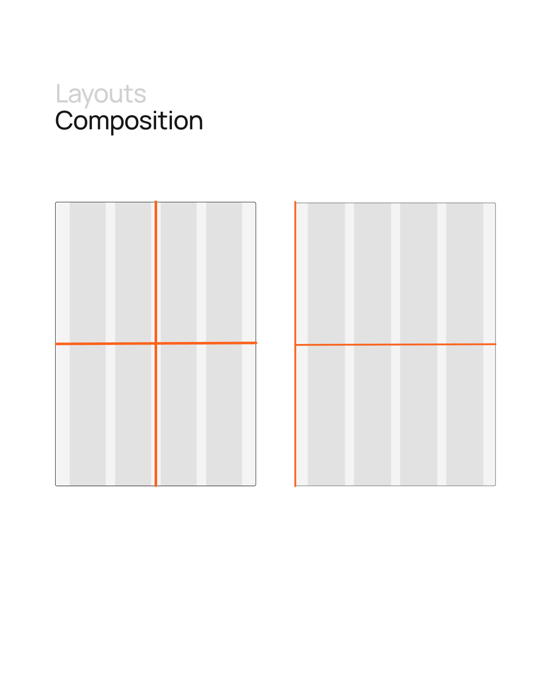
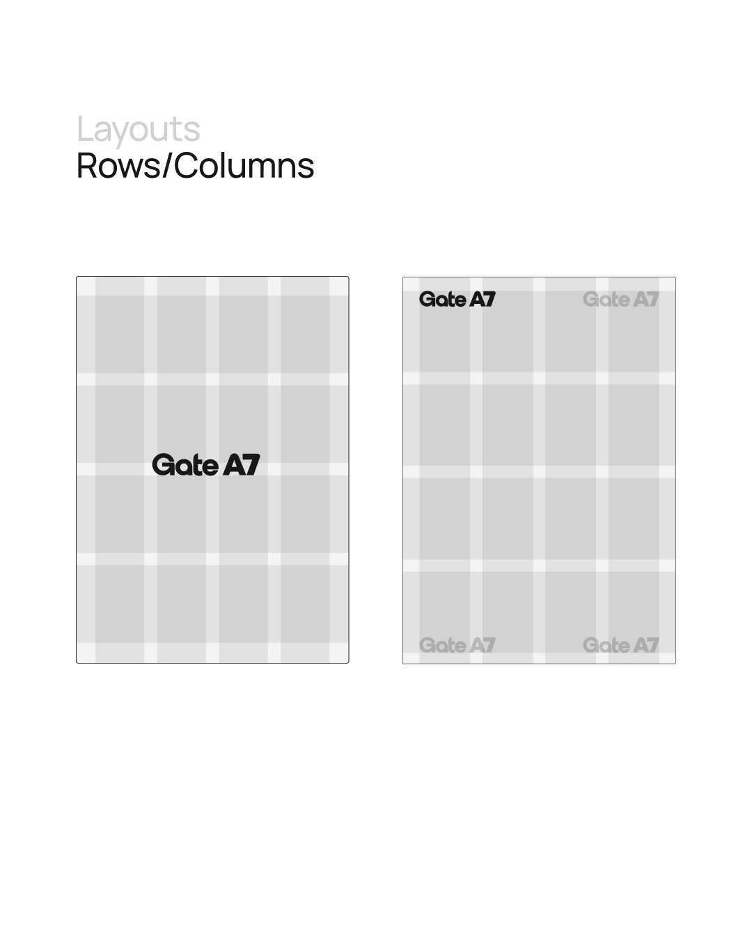
This approach extends into the layout system, which is built on the logic of movement through space. The grid provides structure and rhythm, but remains flexible — allowing elements to exist freely while maintaining balance, much like instruments on a pilot’s dashboard.
Technical symbols such as degrees, commas, arrows, and marks are integrated into the system, subtly reinforcing the language of navigation.
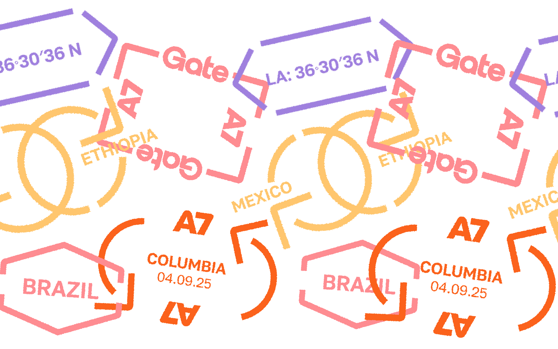
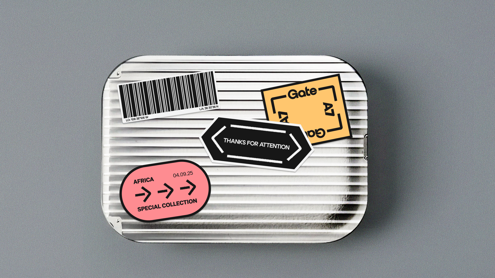
The graphic layer evolves from the core geometry of the logo. Modular shapes echo its structure and become the basis for a system of stamps and technical elements. These graphics can be layered and repeated, adding depth and tactility, especially in print.

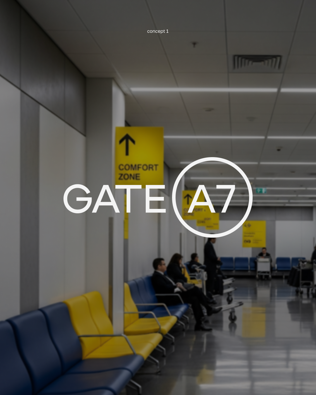
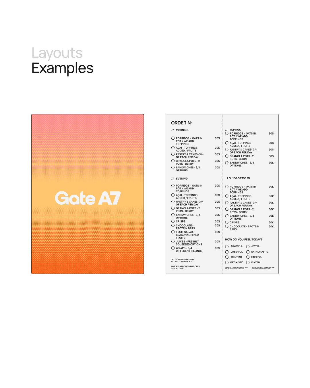
Applications of the identity extend the concept into the user experience. The menu is designed as an in-flight interface, where guests select items by ticking boxes, echoing the familiar ritual of ordering on a plane.
paper cups ↓
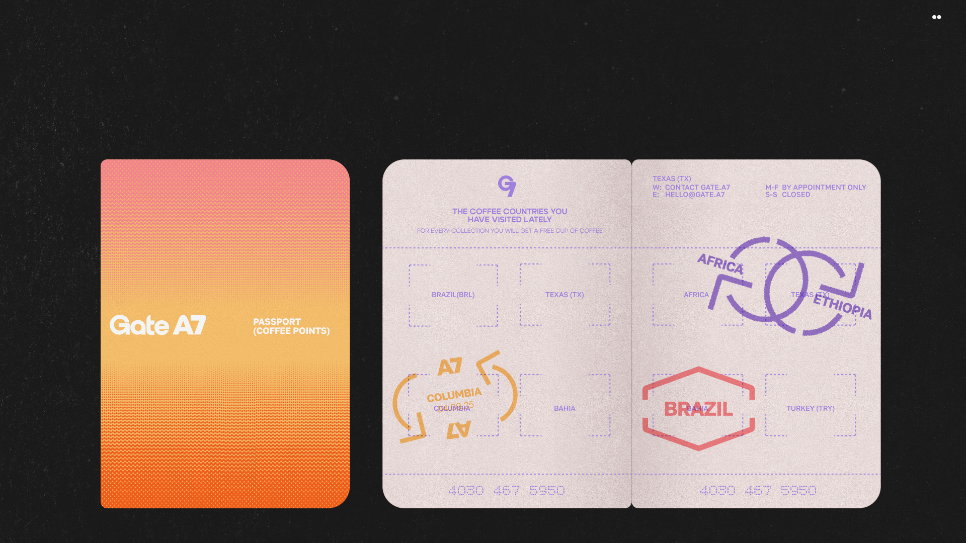
Stamp graphics reference coffee-producing countries, connecting each drink to a specific origin. This idea develops further into a passport-inspired stamp card, where guests collect destinations instead of points —
and once the journey is complete, the next drink becomes complimentary.
stamps ↓
↓ passport-inspired stamp card
Rather than recreating an airport, Gate A7 captures the emotional state of being in transit — a moment between departure and arrival, structure and freedom. A space where clarity and control coexist with ease and anticipation, allowing visitors to feel like they are going somewhere, even while staying in place.
↓ project team