
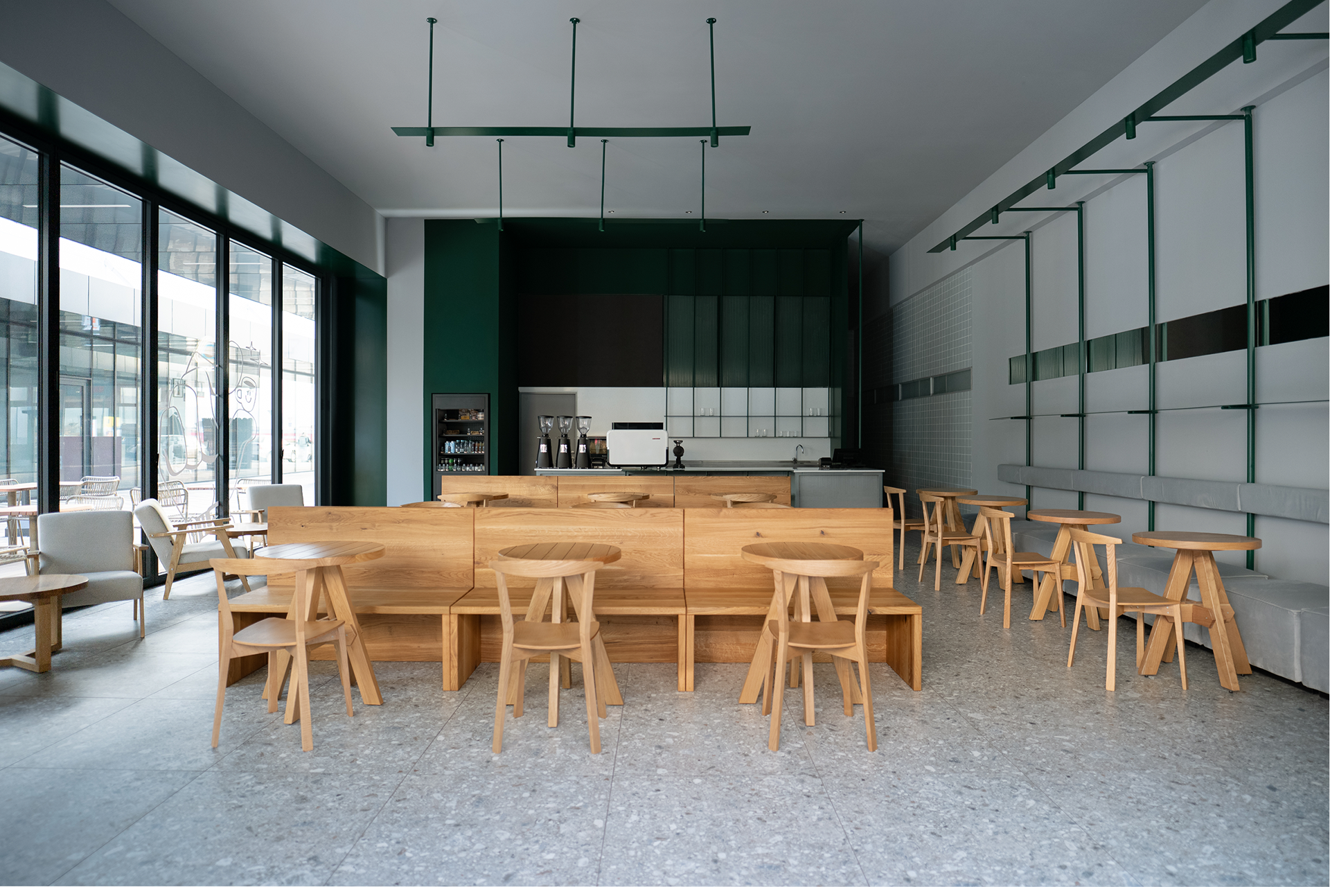
Kafeterija Čačak | Cafe
Čačak, Serbia | 2026 | 100 sq.m
Team: Egor Bogomolov, Valerii Egorov, Valeria Dzhigil, Katarina Dragojlovic, Maria Kolpacheva, Dmitry Ivanov
Photo: Ljubo Ašćerić
Team: Egor Bogomolov, Valerii Egorov, Valeria Dzhigil, Katarina Dragojlovic, Maria Kolpacheva, Dmitry Ivanov
Photo: Ljubo Ašćerić
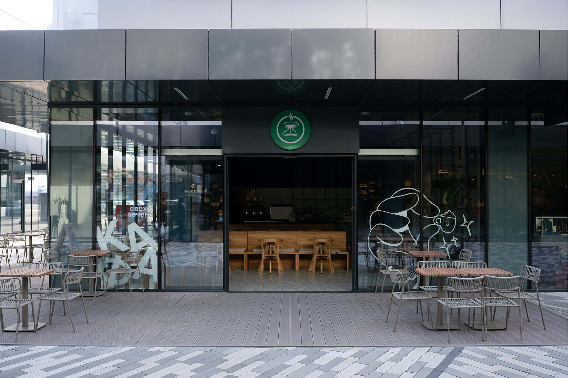
Kafeterija is the largest coffee chain in Serbia, with locations in most Serbian cities. In Belgrade alone, several cafés can often be found within the same neighbourhood. Due to this wide geographic presence and the brand’s long history, a unified visual identity for the interiors had not been established. Each location was developed in response to its specific context.
At the beginning of the project, the client did not set the task of creating a unified spatial language. In response, we defined this as an internal objective: to develop a design system — and ultimately a guideline — that would allow cafés to differ in mood and atmosphere while remaining visually connected through shared materials, colours, and typical furniture elements.

The Kafeterija café in Čačak defines the visual code for locations situated in contemporary environments such as shopping centres, airports, and newly developed residential areas. For this type of context, the design language is bright and contemporary, with an active use of colour as a primary spatial tool.

colors and materials ↑
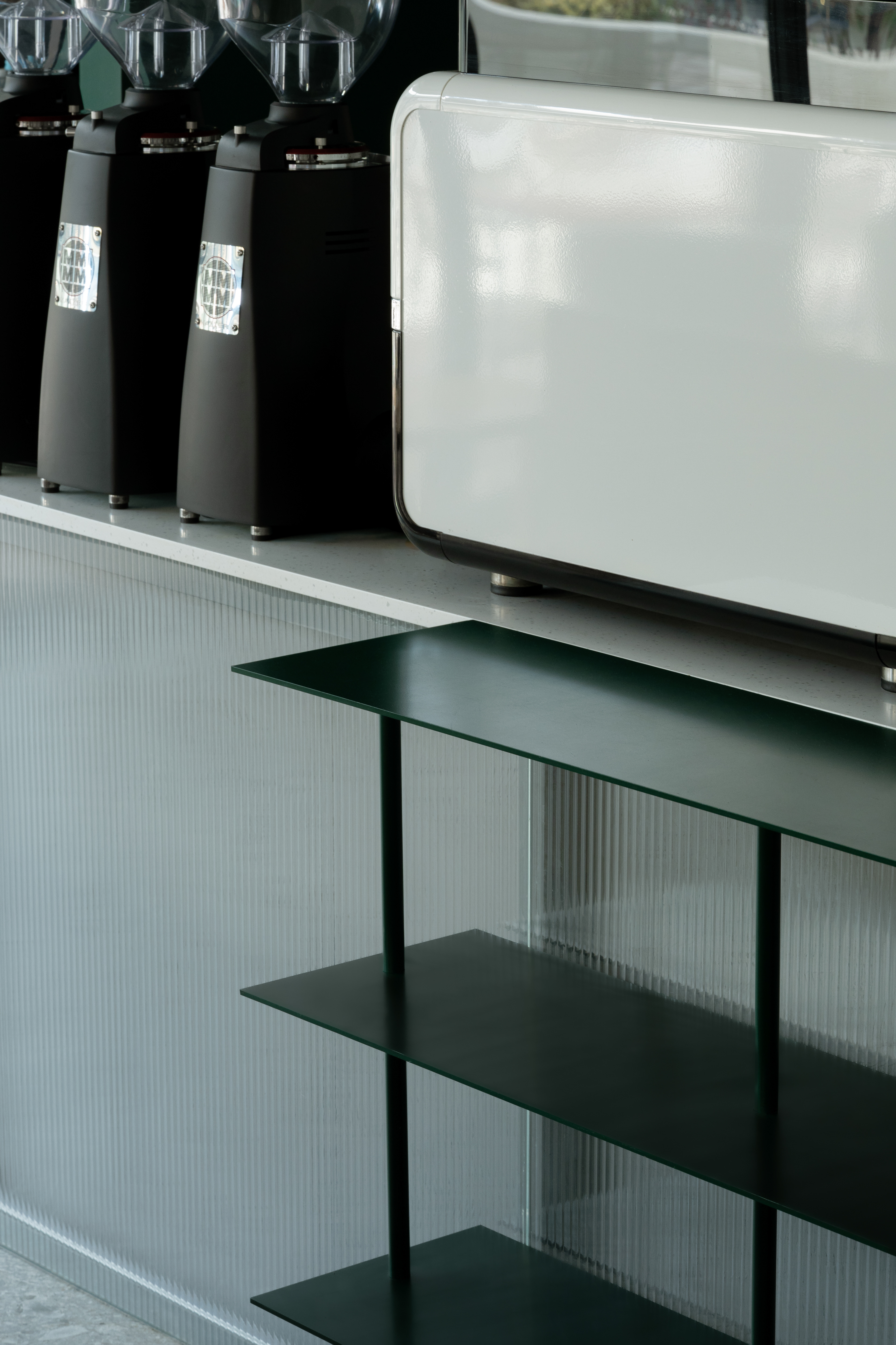
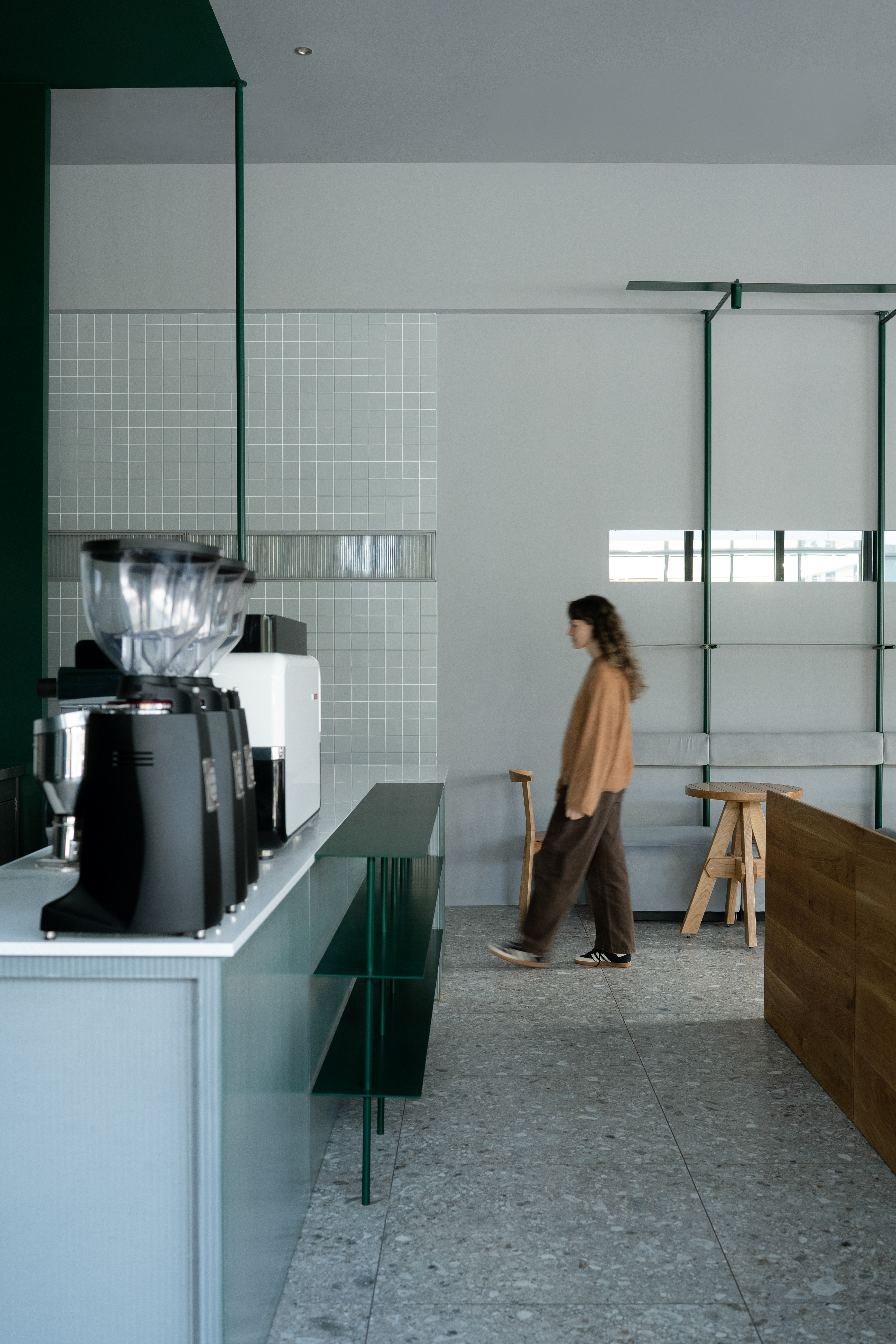
The objective of this typology within the network is to attract attention, stand out within commercially saturated surroundings, and support a relatively fast service format.

plan ↓
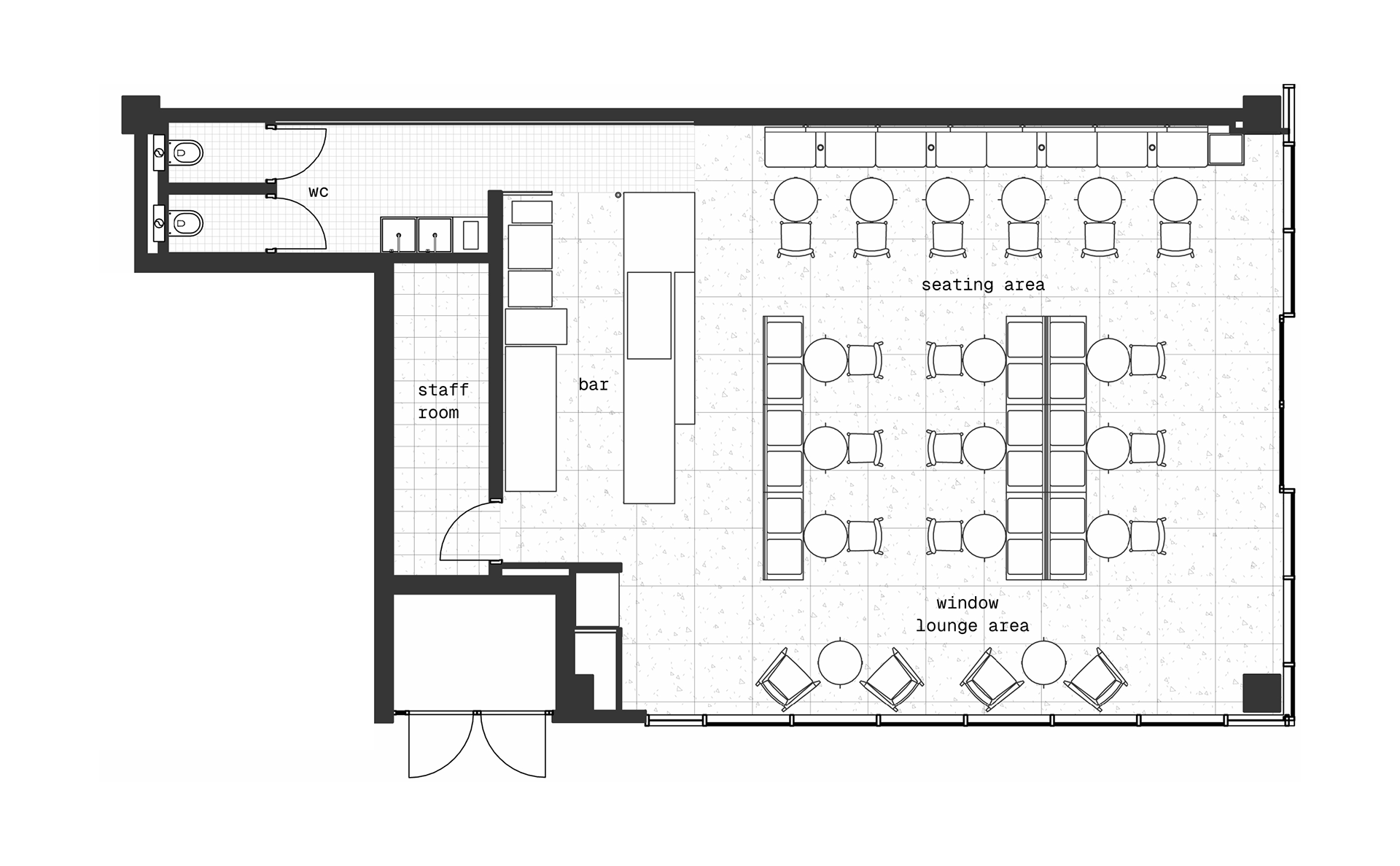
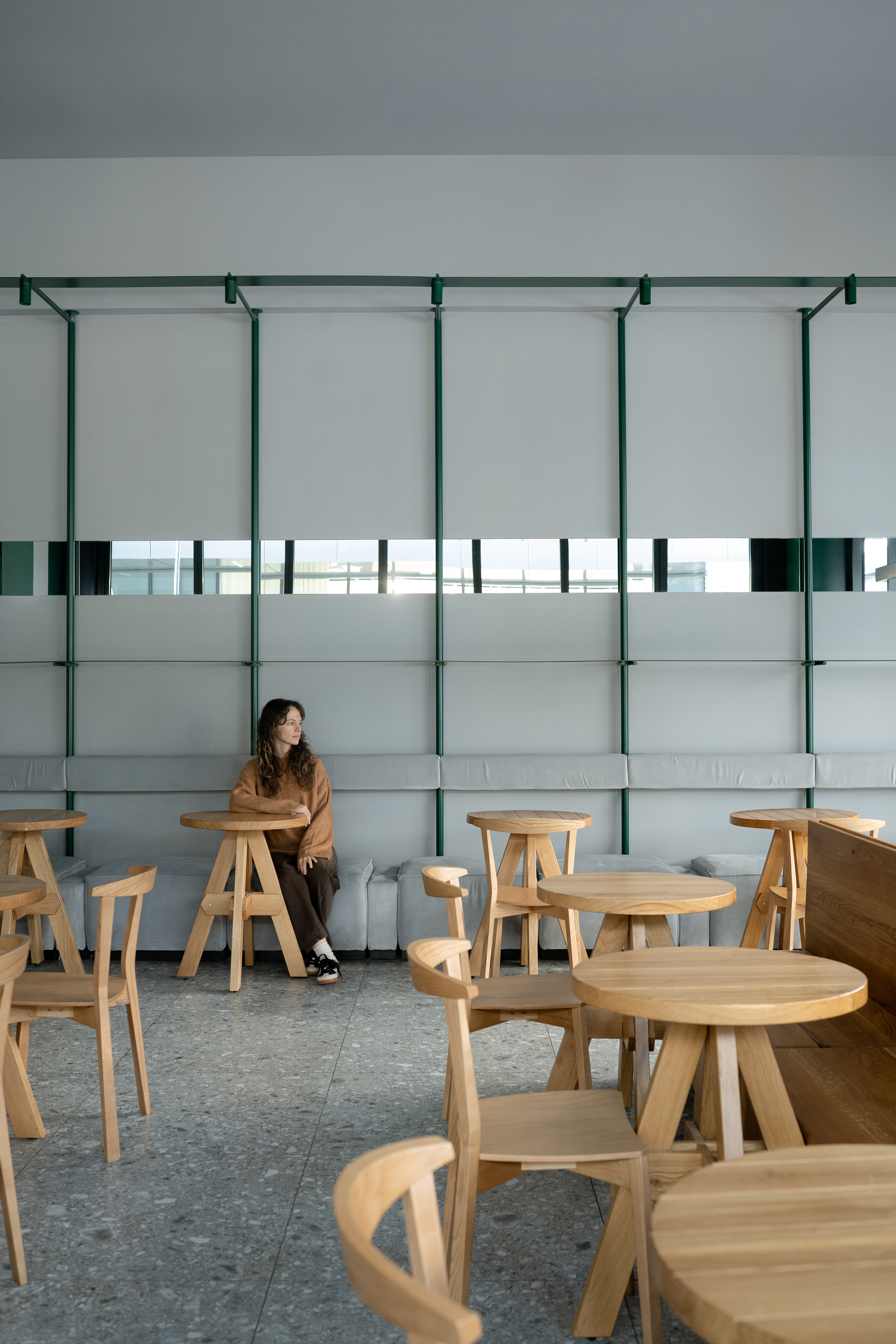
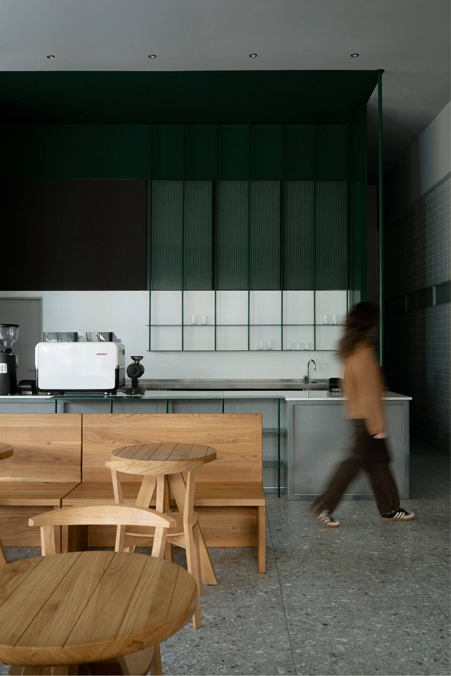
The concept of the café is built around the idea of the vitrine. With panoramic glazing as a given, the layout places part of the seating area directly along the façade, making the activity inside visible from the street.

moodboard ↑


Deeper areas of the interior are organised to provide a more enclosed and evenly lit atmosphere, creating a balanced spatial structure within a compact footprint.
axonometry

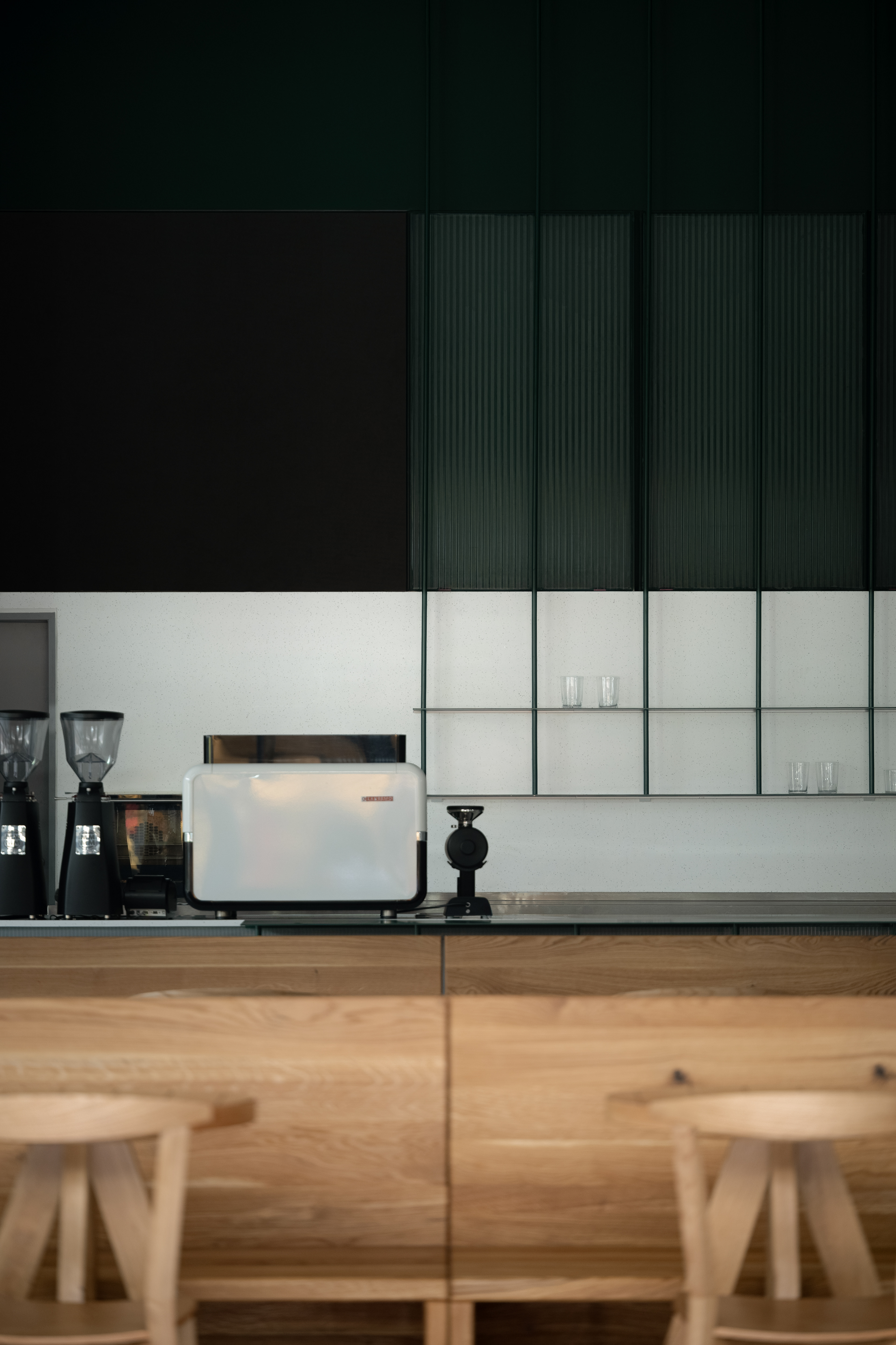
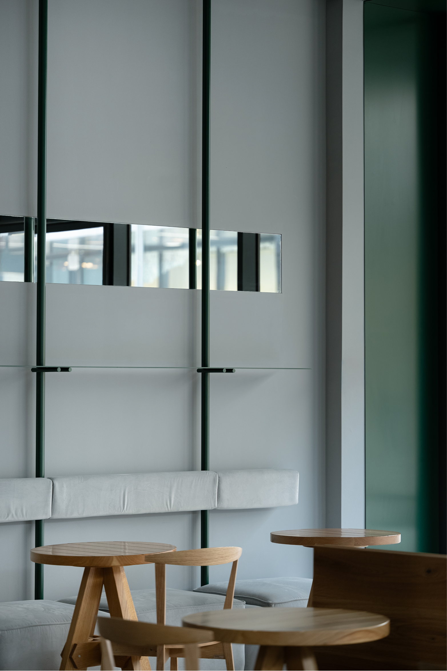
The vitrine logic is reinforced through metal framing that outlines the glass façades and structures the interior rhythm. Rows of wooden benches organise seating efficiently, supporting the quick-visit format typical for the brand.

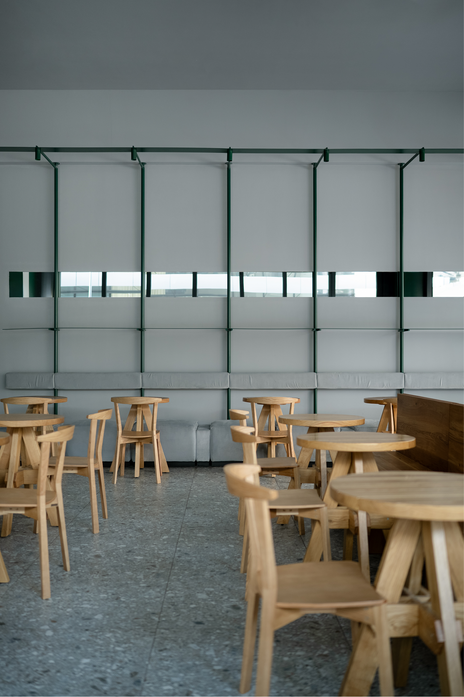
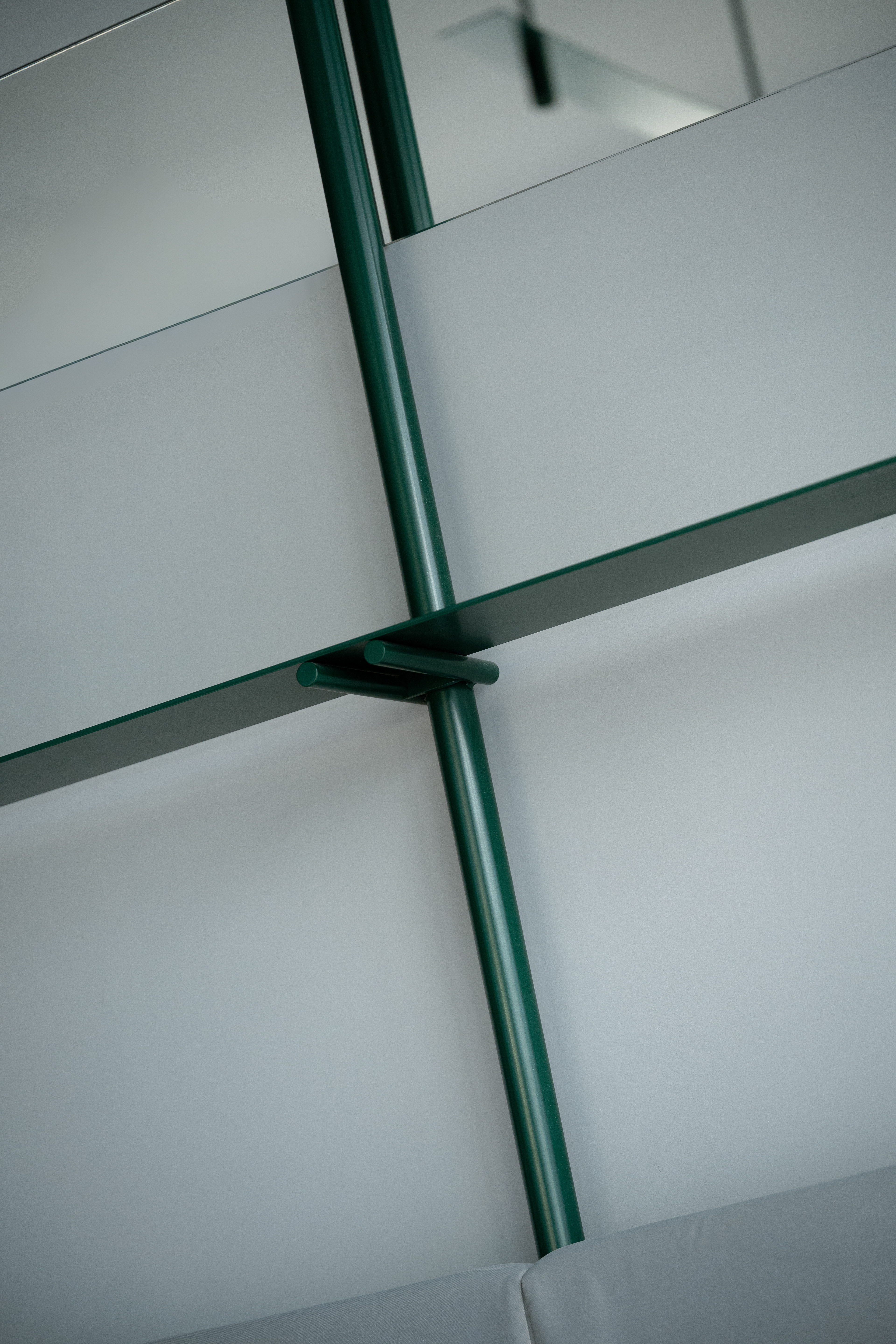
Custom metal shelving systems are integrated into the architecture of the space. They function as part of the overall spatial framework and are designed to accommodate brand merchandise, while remaining visually consistent with the rest of the interior. In the completed café, these elements operate as both storage and display infrastructure.
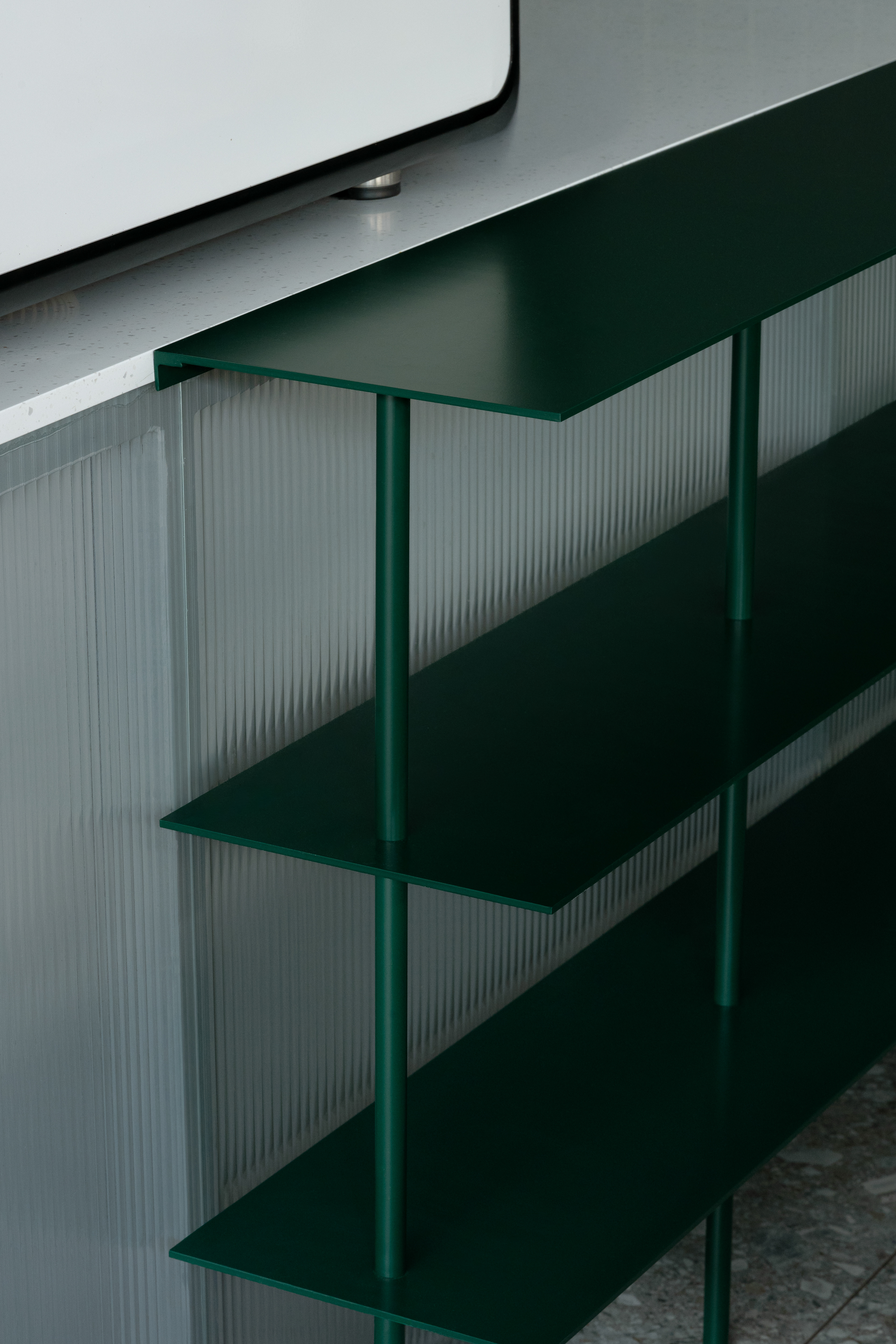

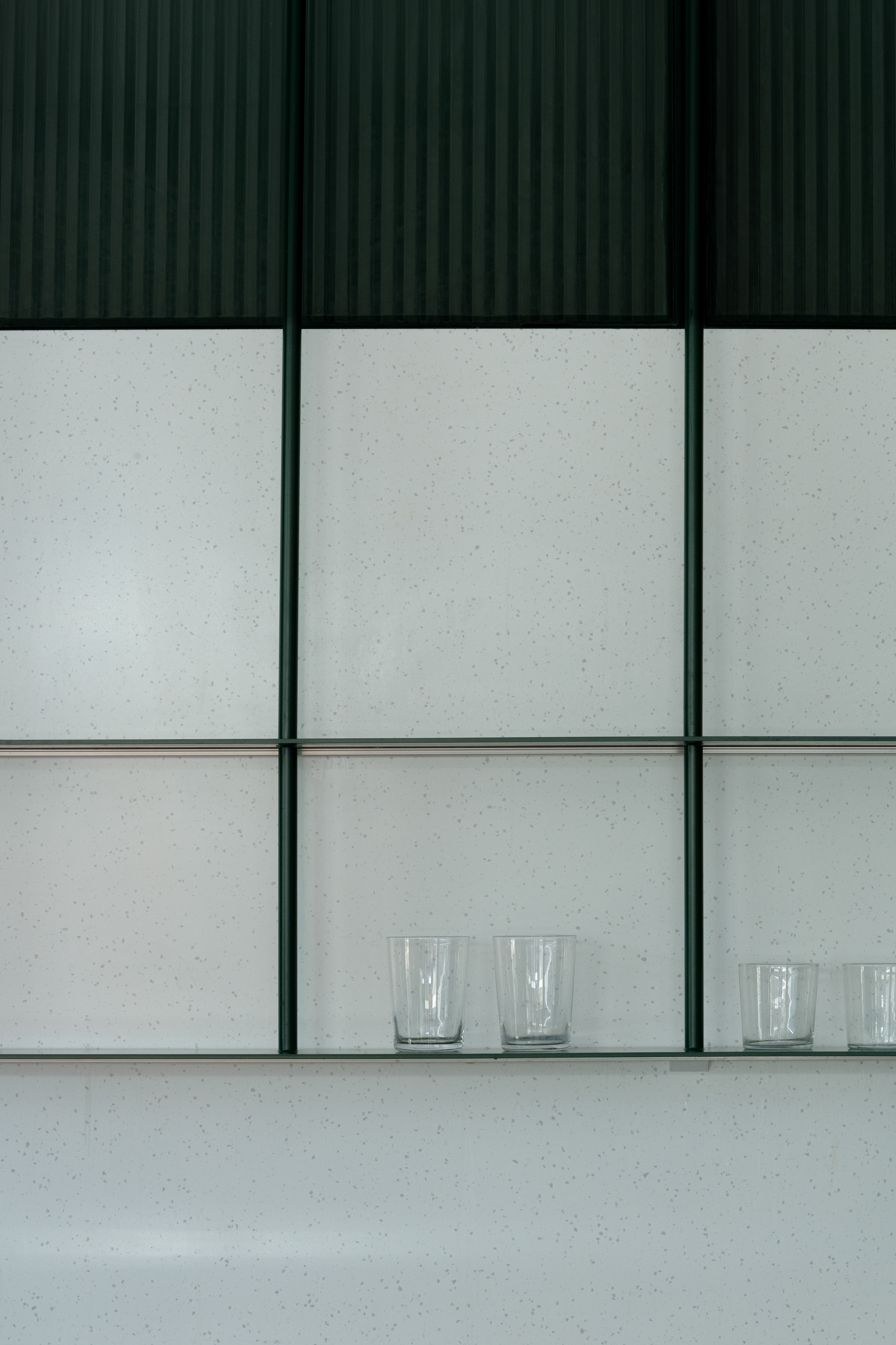
Material and colour decisions were made within the boundaries of the overall system, combining ceramic tiles, mirrors, ribbed glass surfaces and metal elements into a coherent contemporary language.
LED menu panels, including a full LED screen used as the primary menu display, introduce a clear and updated communication tool for the brand.

A narrow strip of mirrors placed on the wall opposite the panoramic glazing reinforces the visual connection between interior and exterior, reflecting fragments of the surrounding urban environment into the space.

The project results in a compact café developed through a structured design system. The interior demonstrates how a clear spatial framework can be implemented under similar constraints while maintaining visual consistency and recognisability for the brand.
process ↓
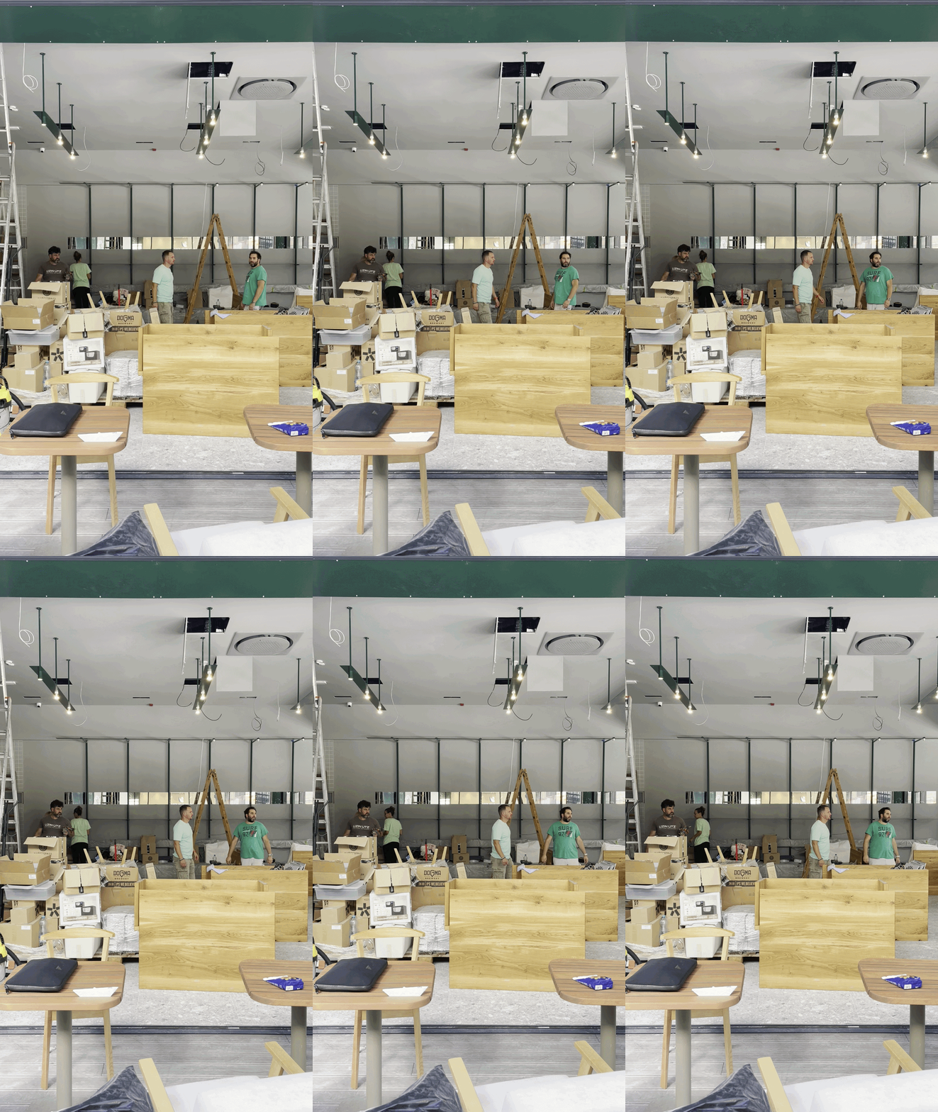
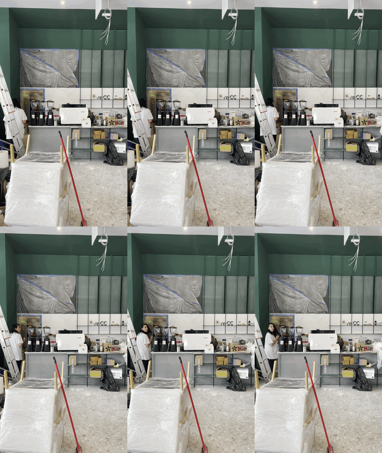

↓ project team