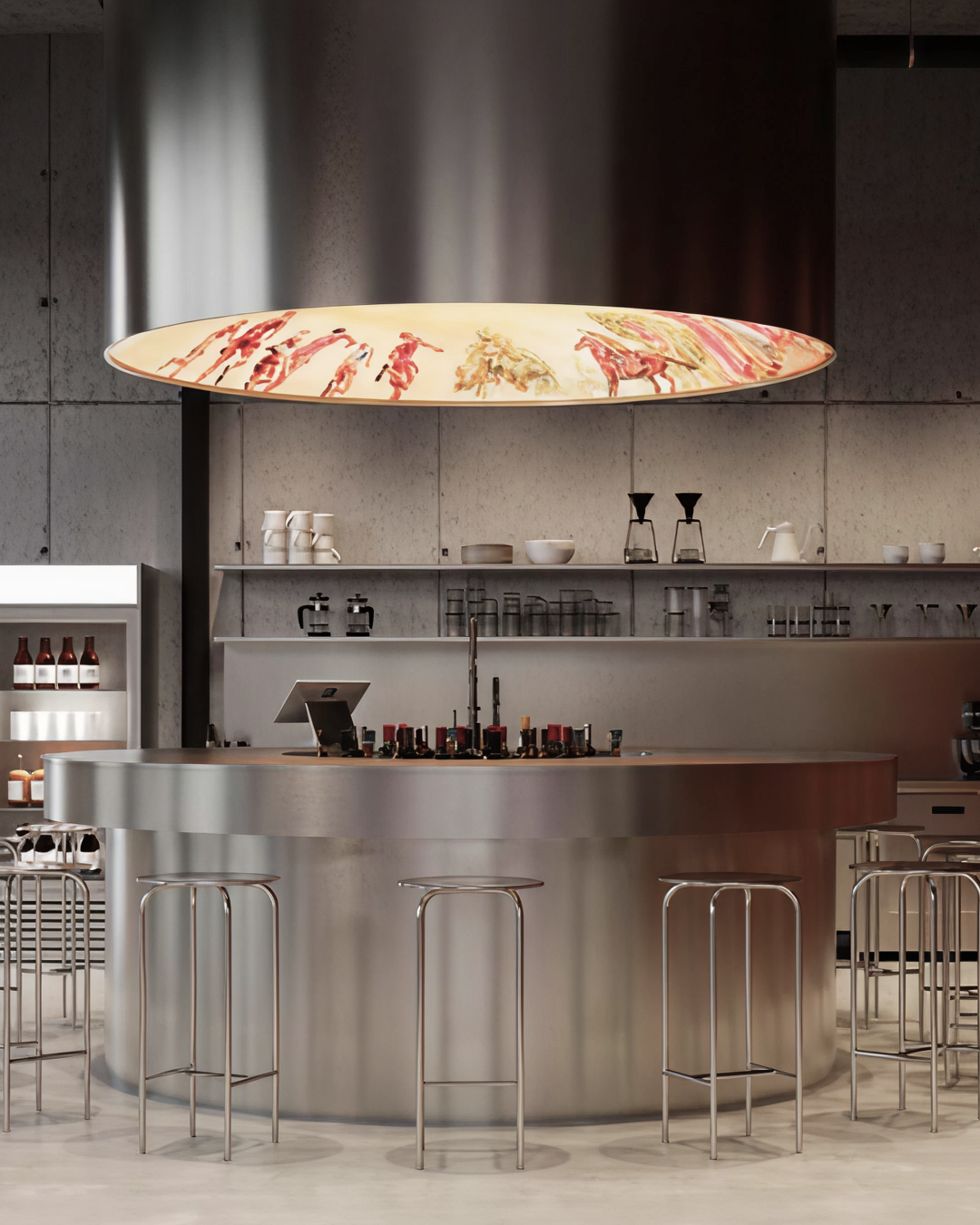
KIK | Brand Identity
Brand identity for Billiard bar in Belgrade, Serbia
Authors: Alexandra Arsenteva, Dima Mironov, Egor Bogomolov
2025
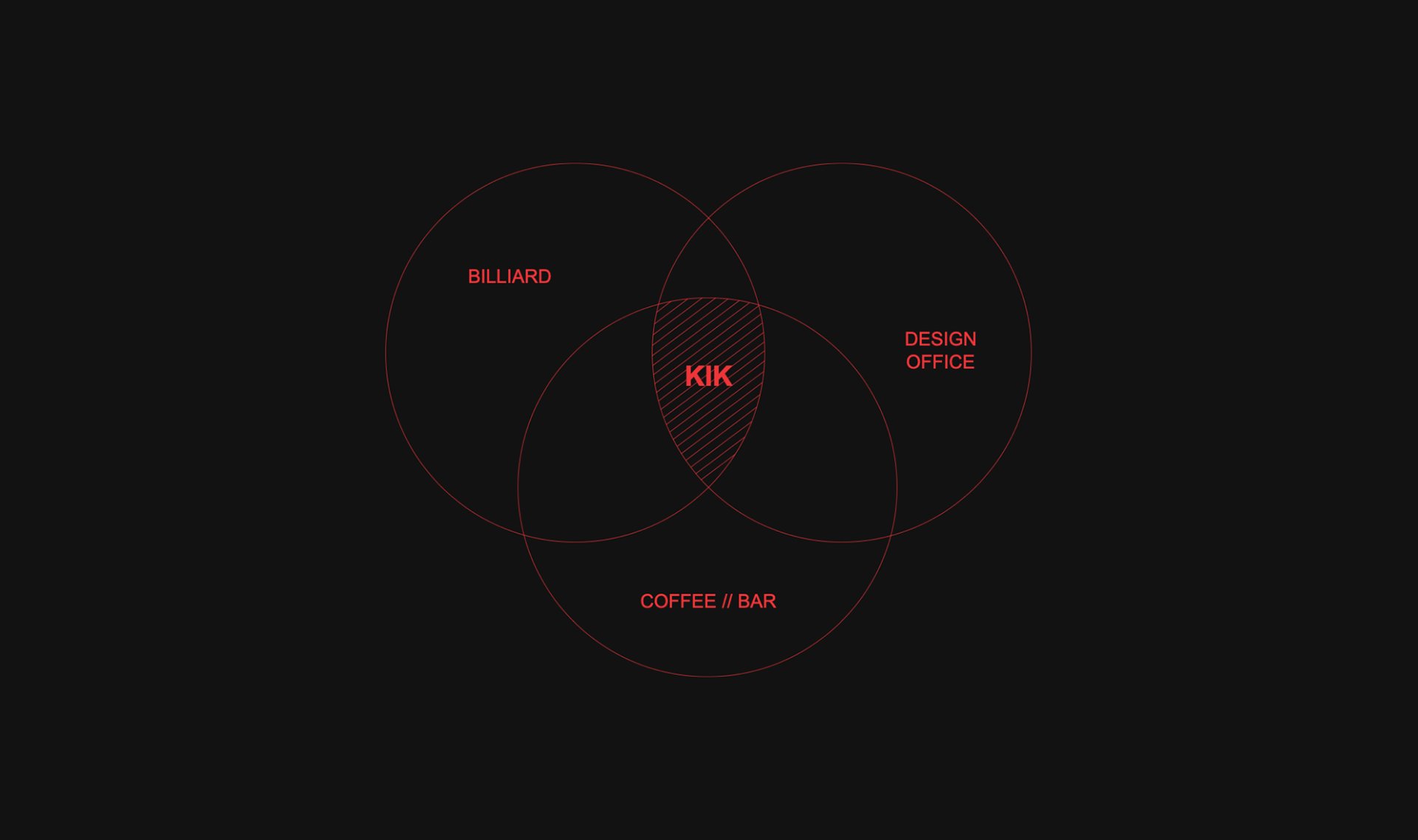
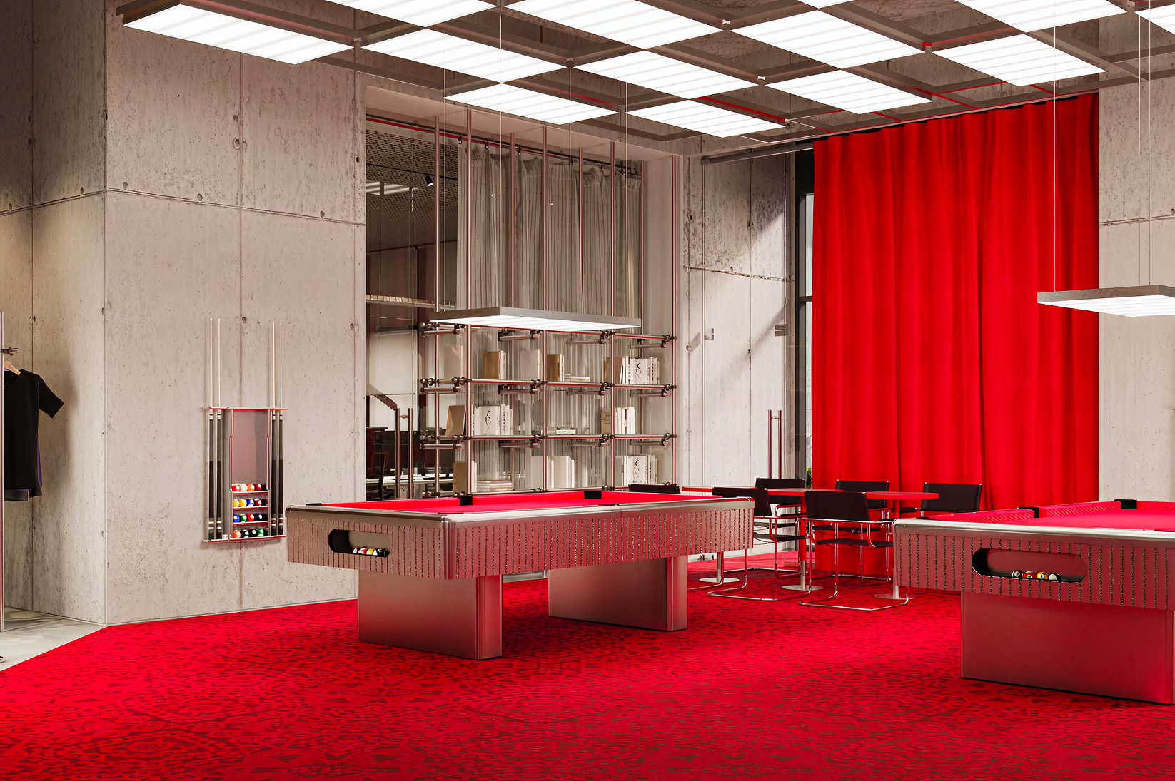
The KIK is a collaboration between KIDZ and Kafeterija — a hybrid space that brings together a billiard hall, a coffee bar, and a design studio under one roof. From the start our intention was simple and ambitious: to design a brand that feels like a lived moment, a place where style meets energy and creativity takes shape.
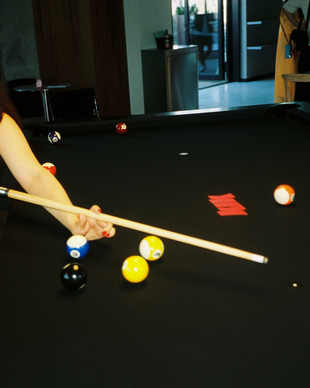
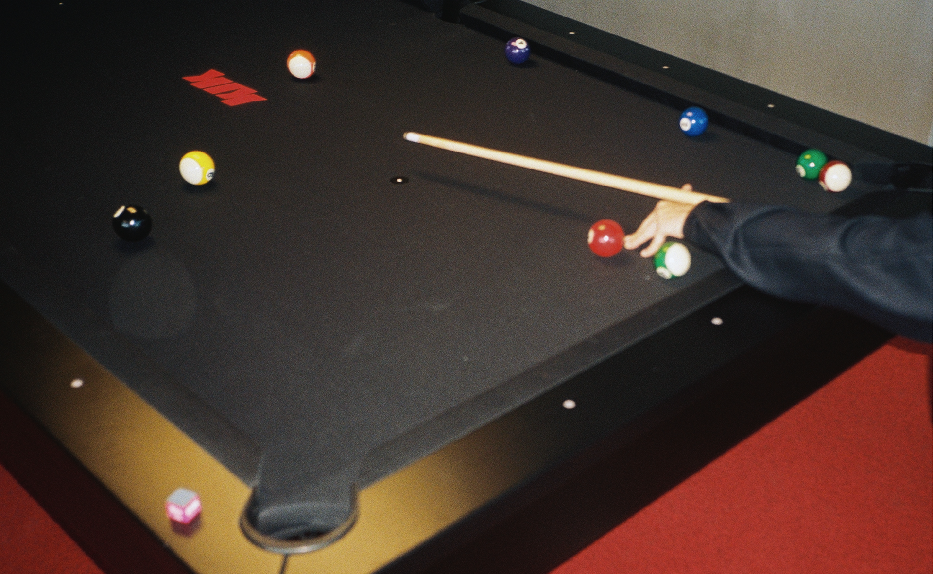
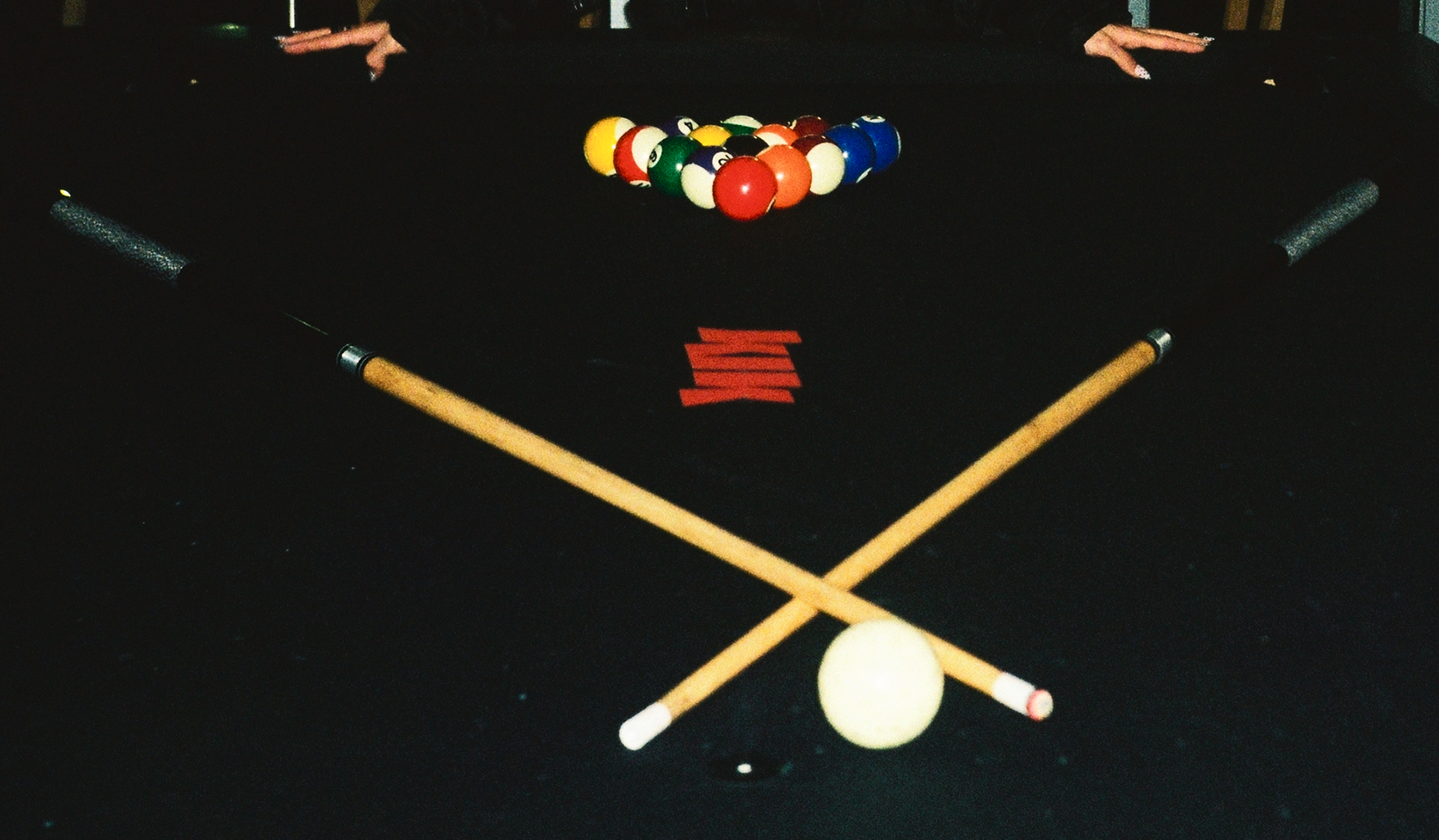
KIK is conceived as a meeting point for like-minded people, a cultural node where encounters spark new ideas, and where the physical and the social intersect in a single, unforgettable instant. The name itself carries that instant: the click of balls, the brief physical touch, a sound that marks a moment that can never be repeated. That transience — charged, kinetic, poetic — became our guiding idea.
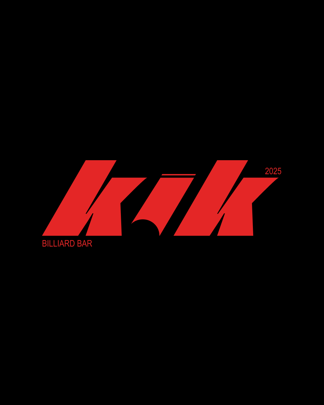
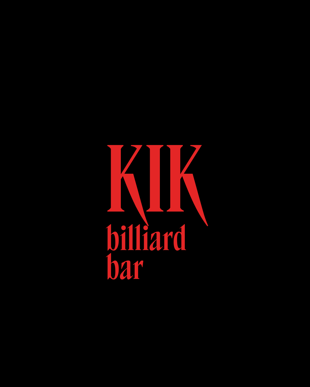
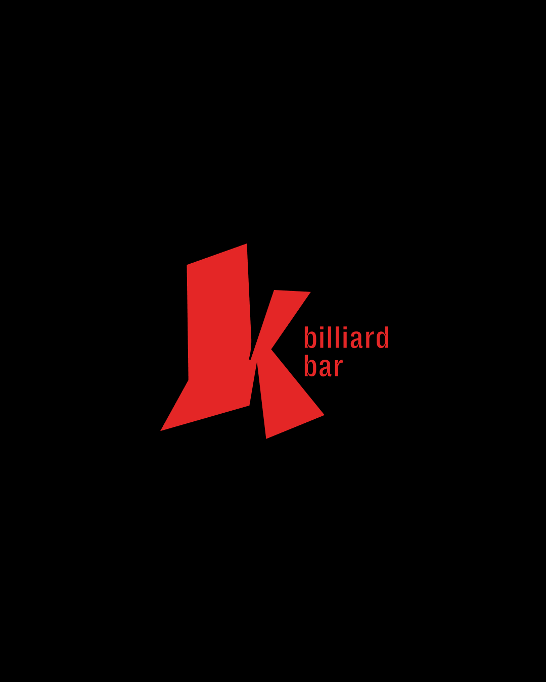
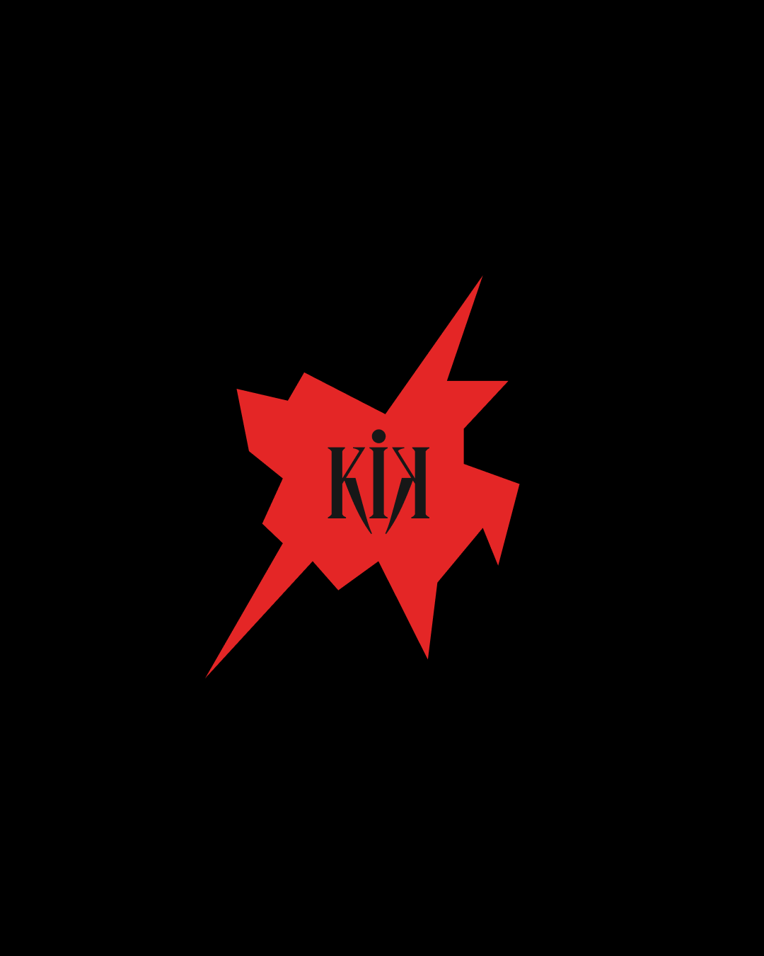
Our exploration of the logo began from the image of motion itself. We tried several directions: in some versions we leaned into the energy of a sports community and the feeling of speed. In others we focused on a rebellious mood, treating KIK as a clash or spark, and in some cases we moved toward minimalism, where the form itself became the main storytelling tool.
the logo exploration ↓
Each approach revealed a different side of the brand and gradually brought us closer to the final solution.
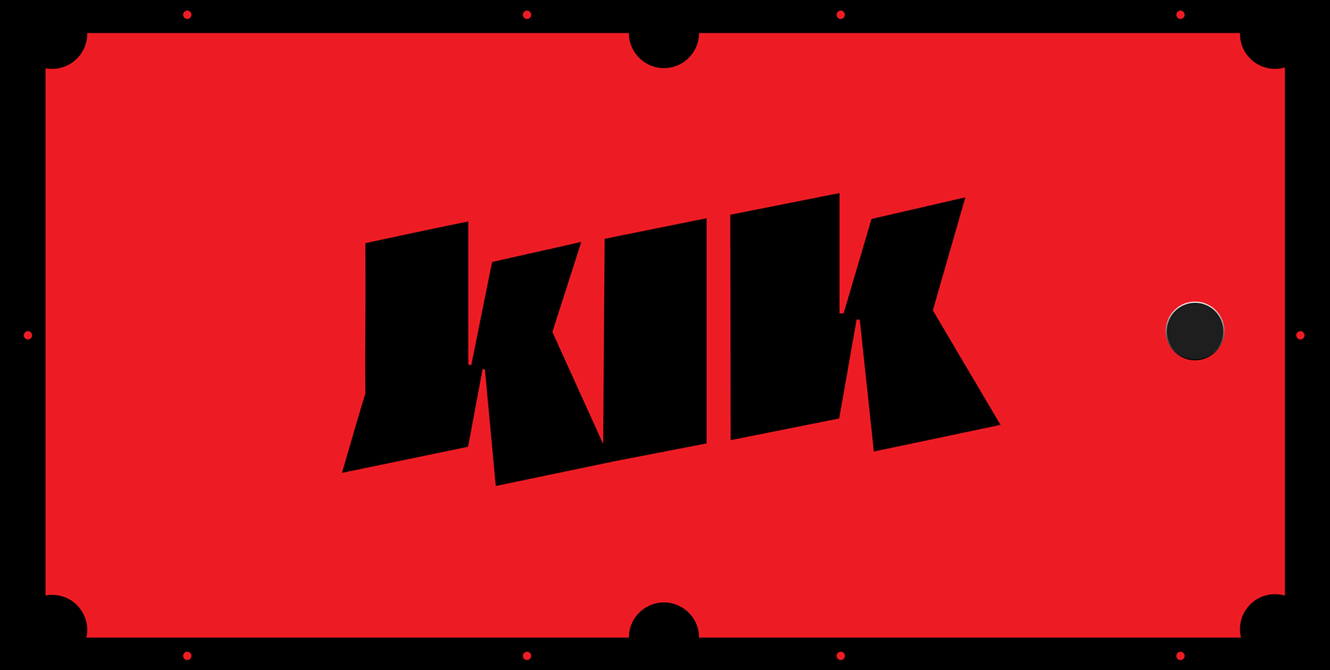
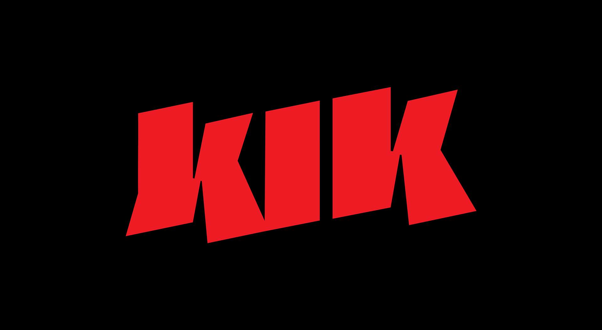
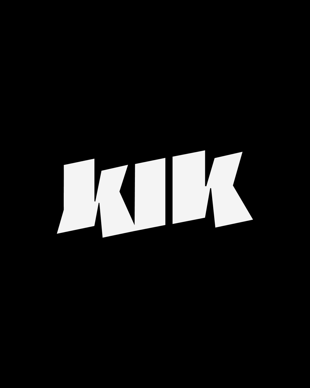
The final logo synthesizes those lessons into a single, distinctive sign. Graphically it captures the fleeting moment of connection — the exact fraction of a second when paths cross and energy transfers. We developed the mark by tracing imagined trajectories of billiard balls, turning motion into line and rhythm so the identity could communicate dynamism without relying on literal imagery.
the final concept ↓

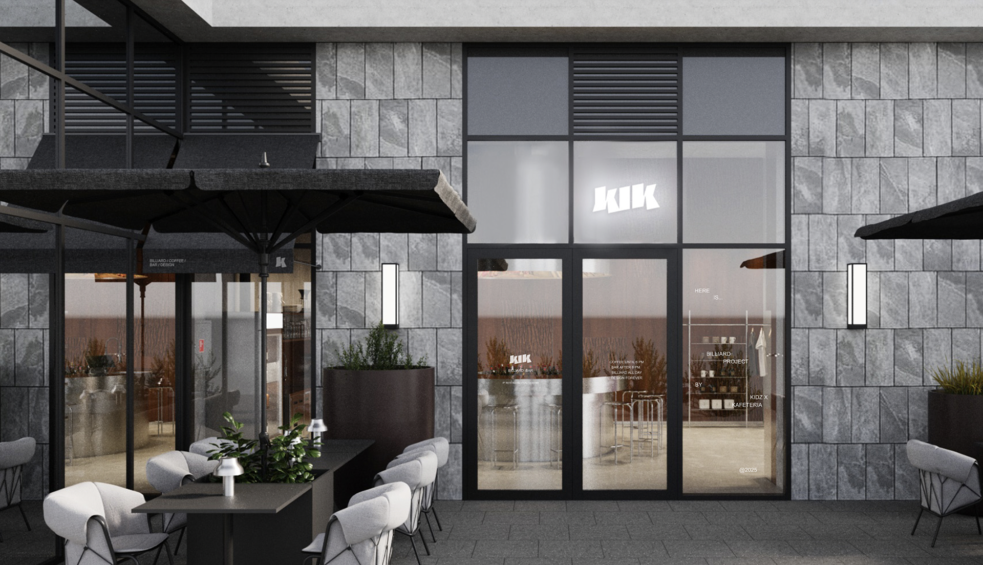
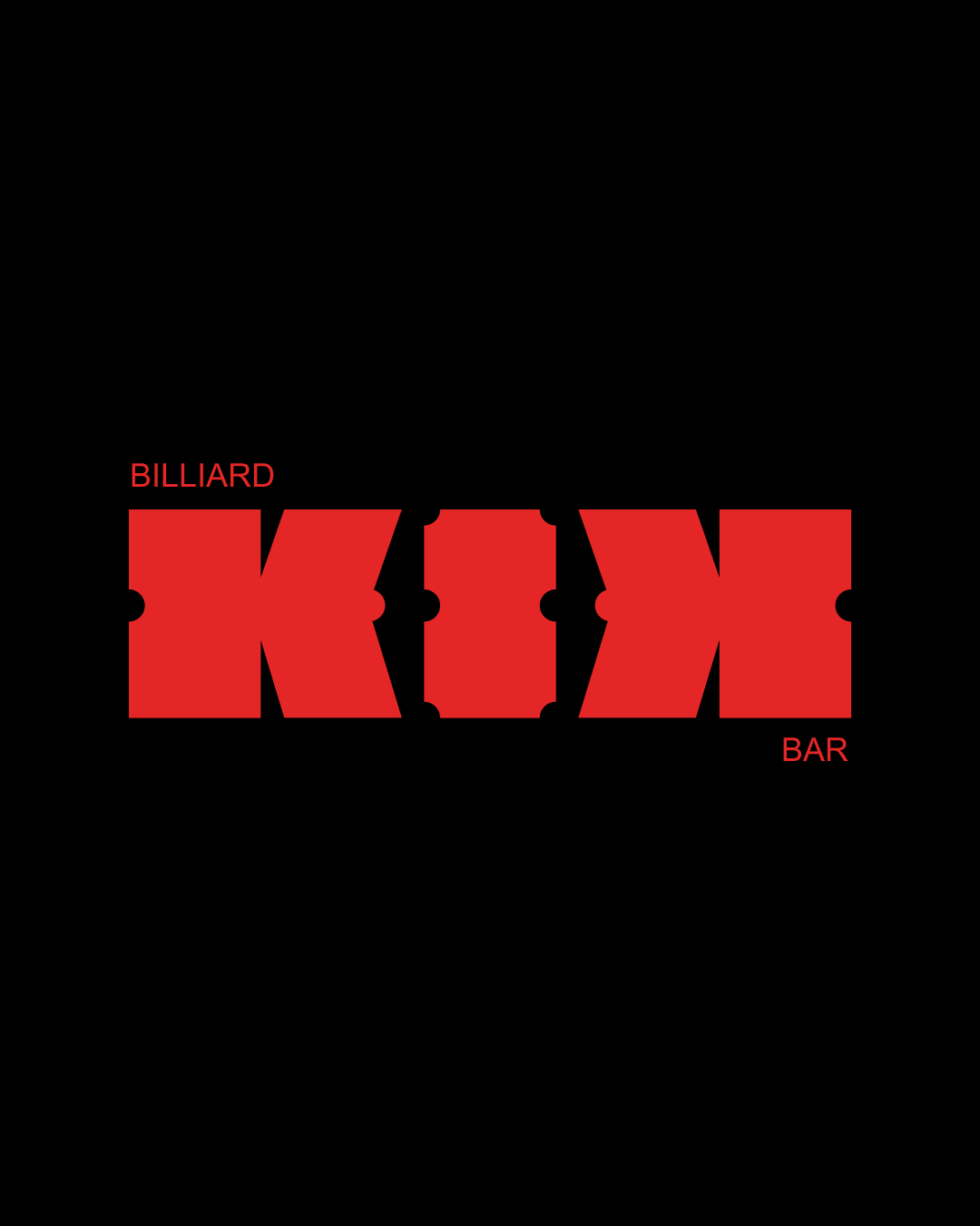
The logo reads as a name, but the letter K also functions independently as a mark and a graphic element, flexible for use across signage, merch, and digital touchpoints. More than a sign for a bar, the logo signals a culture: a space for people who seek expression, welcome experimentation, and prize the freedom to create.


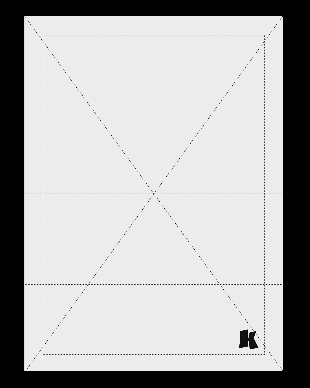
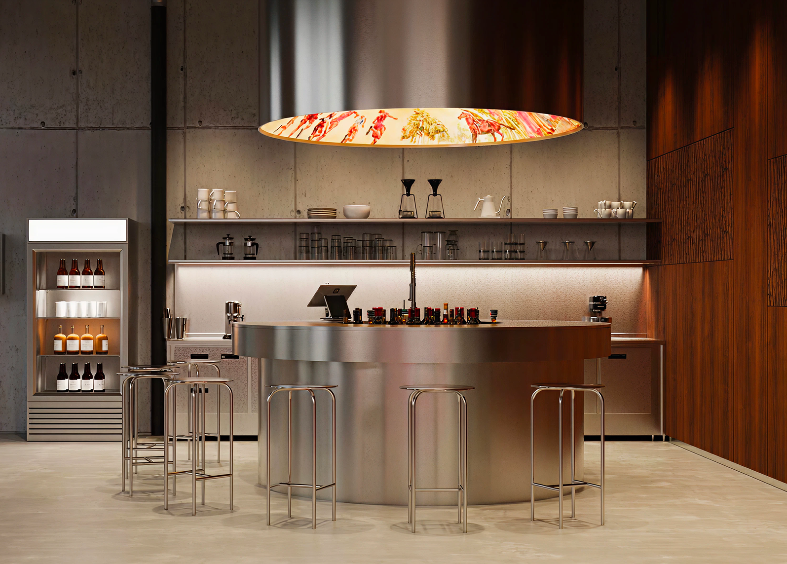
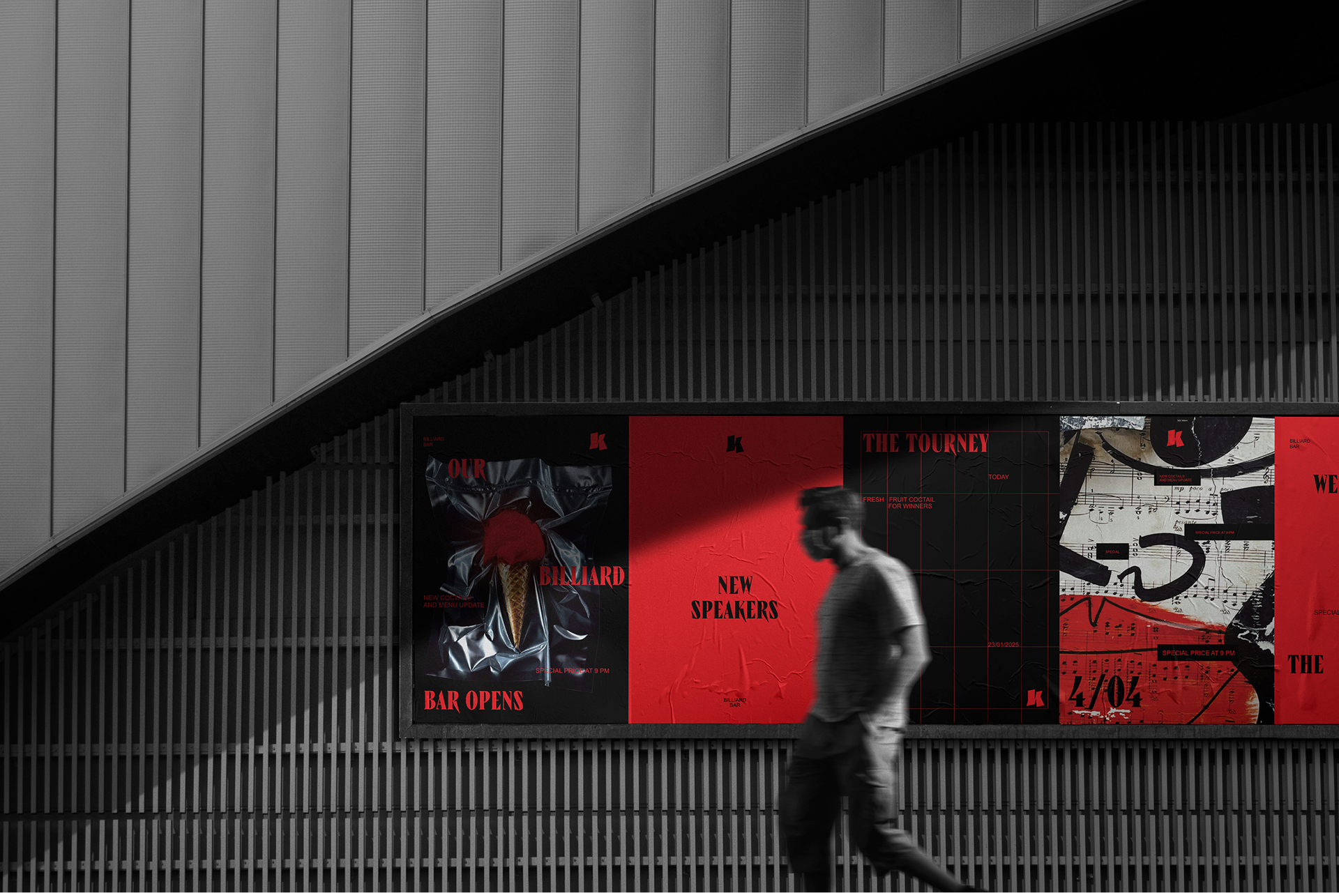
To make the system work consistently across media we devised a structural logic borrowed from the table itself. Every application is built around a modular field divided into four vertical segments and six horizontal segments — a grid that references the table’s six pockets and allows compositions to feel like views from above.
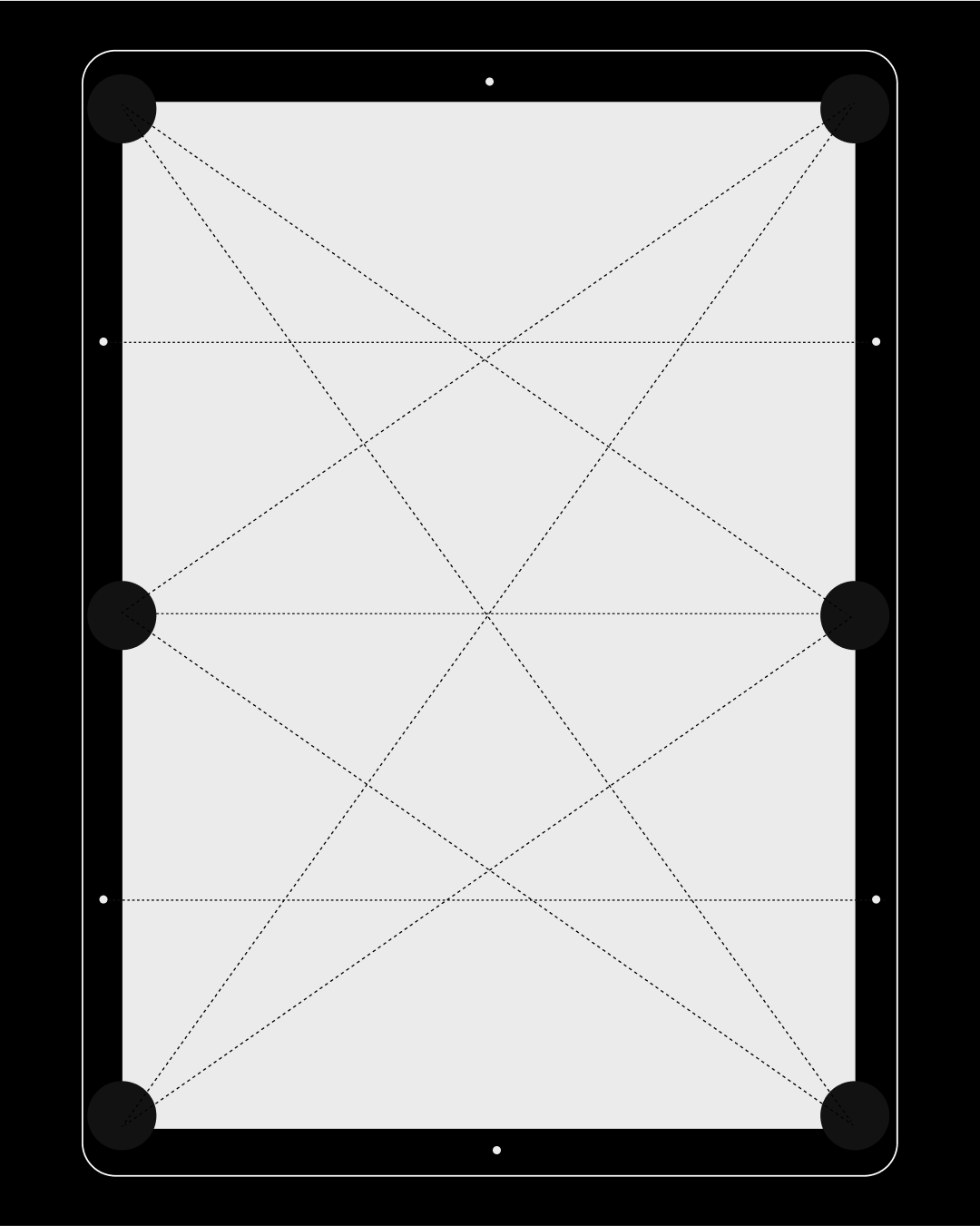
Two primary compositions govern the visual language: a central composition that reads like the table before the first strike, arranged and anticipatory, and a left-aligned composition that reads like the active game, with elements scattering and colliding.
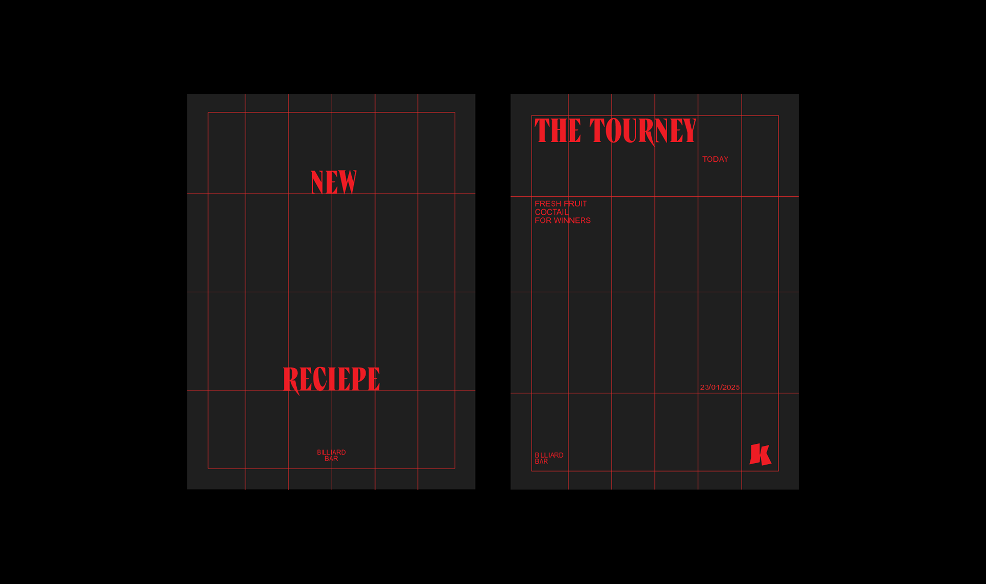
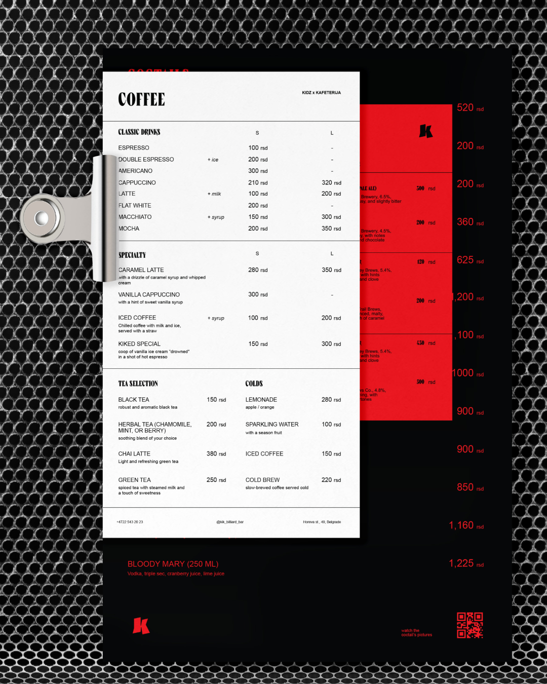
This approach lets us translate billiard chaos into a disciplined, repeatable layout system, where posters, menus, and merch become small tables in which narrative plays out.
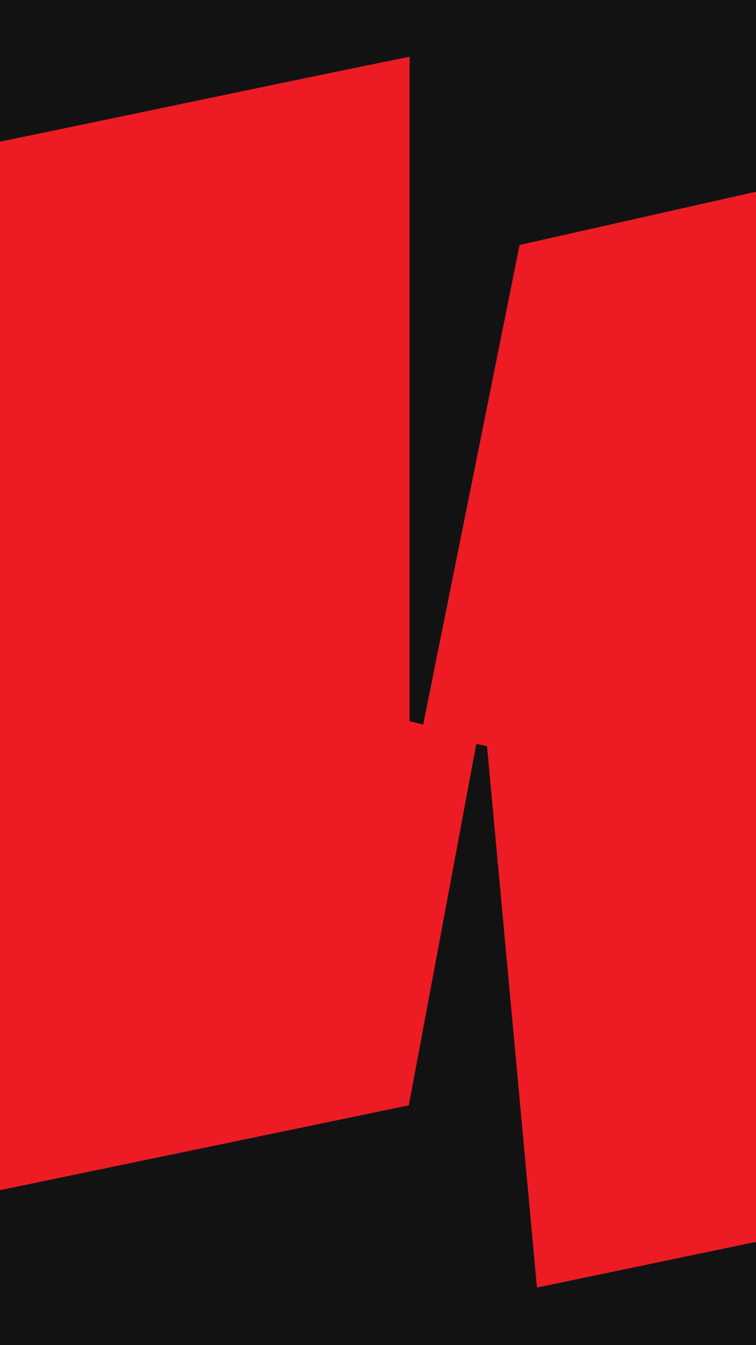
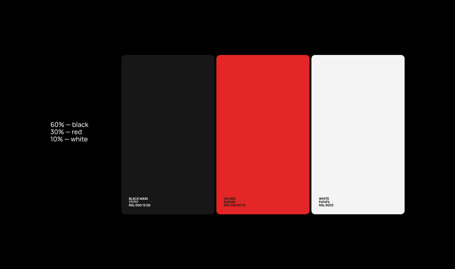
The palette is built on strong contrasts, with black and red playing the key roles in the identity. White and gray appear less often, serving as balance and structure. The pairing of red and black also creates a cinematic effect — bold, sharp, and daring — adding drama and intensity to the brand’s visual language.
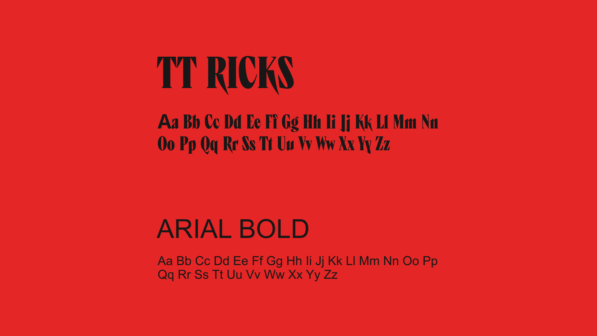
For typography we selected TT Ricks Bold as the headline and accent face — an attention-grabbing display that anchors titles and key messages. While Arial Bold provides a clear, neutral voice for extended copy and functional information.
In practice KIK will gather those who pursue self-expression, experimentation, and a life without borders; the identity speaks to their appetite for new experiences and their readiness to collide ideas together. What started as the idea of a moment now lives as a system — composed, energetic, and always in motion.
↓ project team