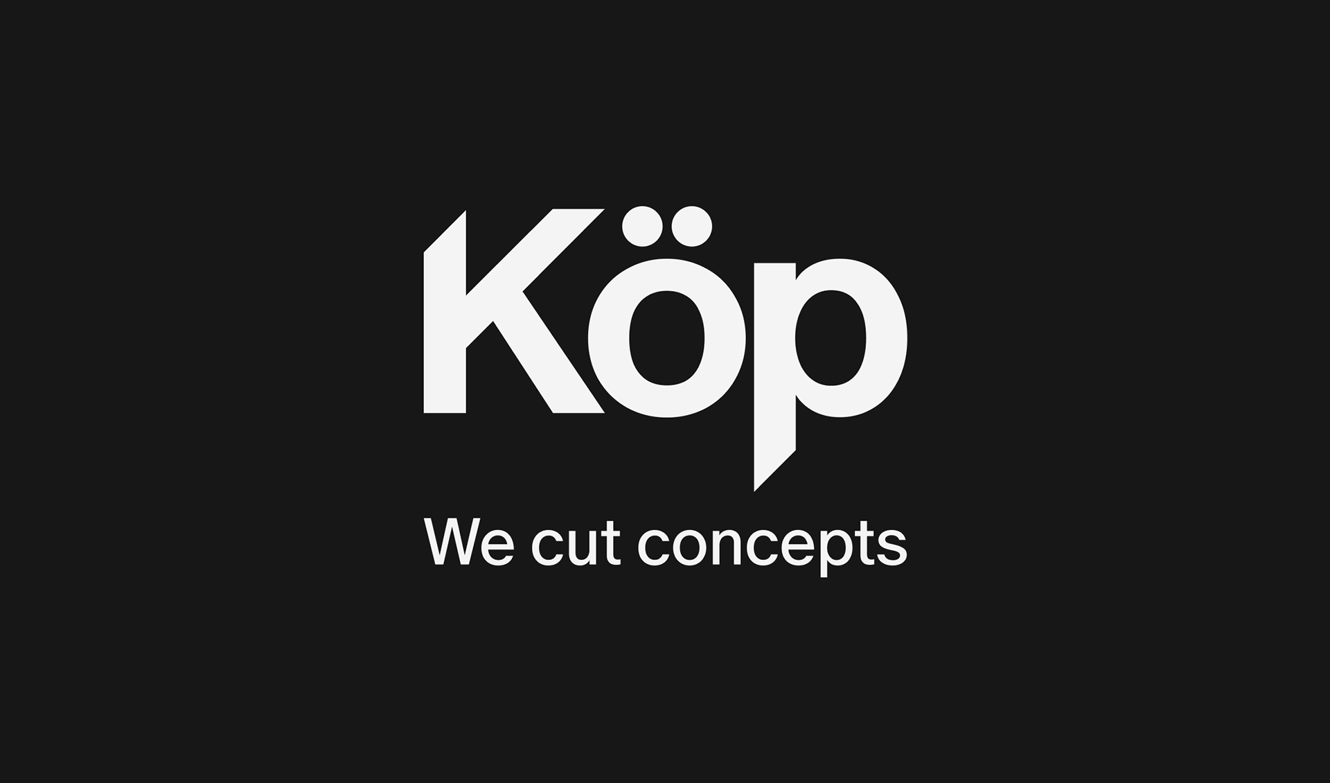
KÖP | Brand Identity
Brand identity for Hair Salon
Team: Dmitrii Mironov, Sonya Anikina, Alexandra Arsenteva
Team: Dmitrii Mironov, Sonya Anikina, Alexandra Arsenteva
2026
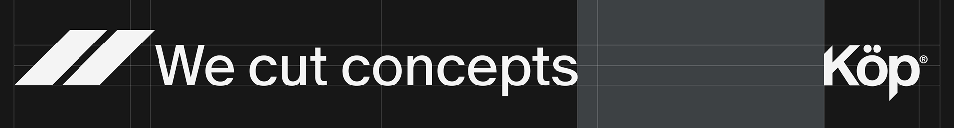
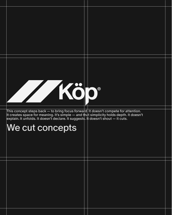
KÖP is a hair studio that approaches hairdressing as a form of conceptual work. Rather than focusing solely on styling, the brand positions each haircut as an intentional act of shaping and redefining form.
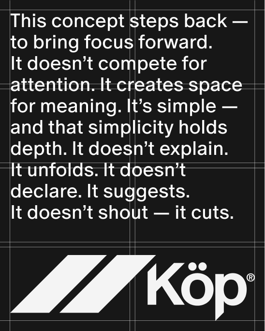
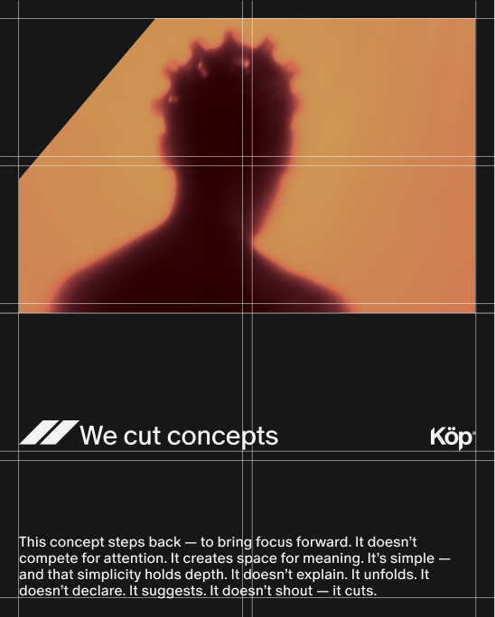
This philosophy is reflected in the studio’s slogan — “We cut concepts.”
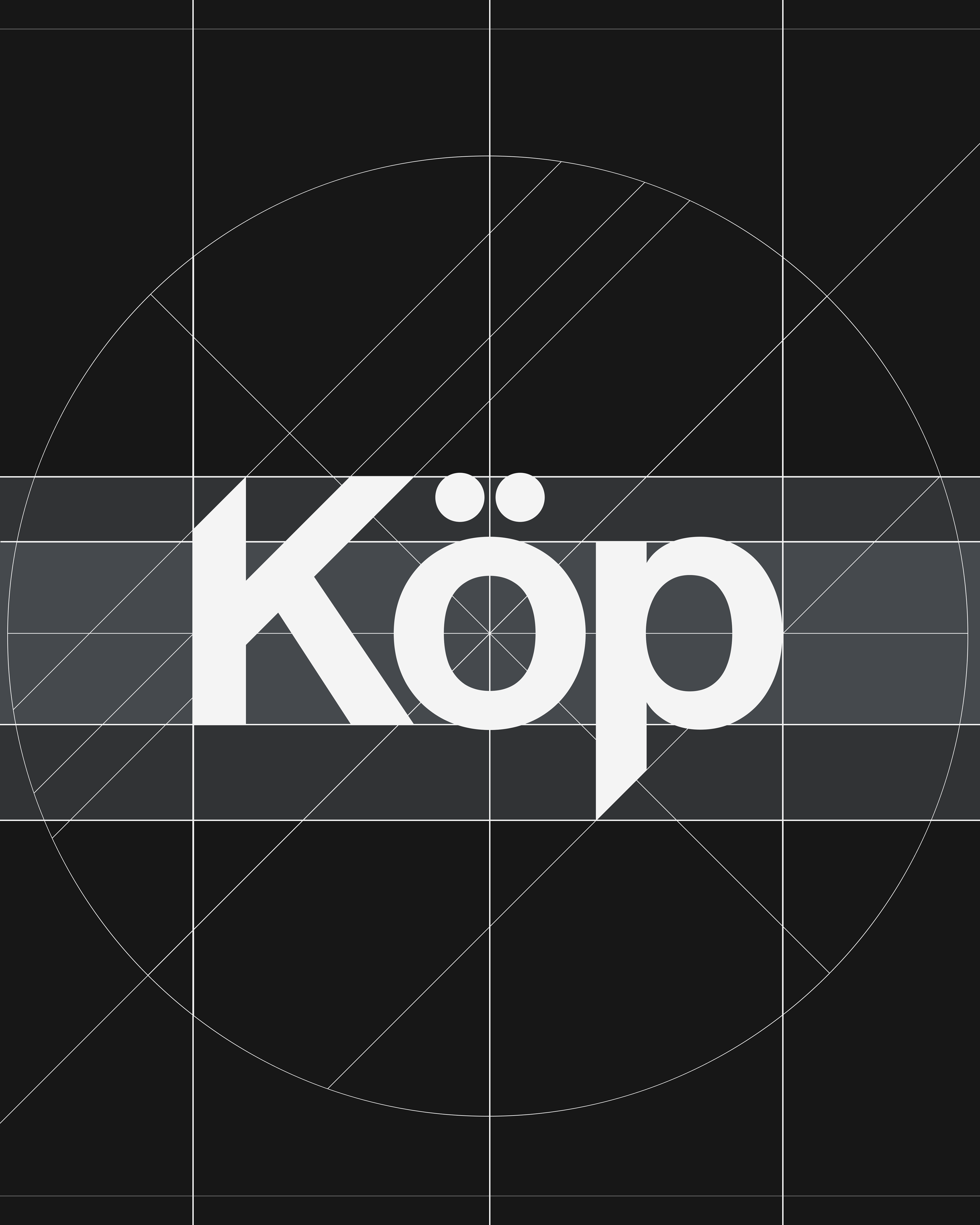
The branding for KÖP was built around one simple idea: the cut ↑
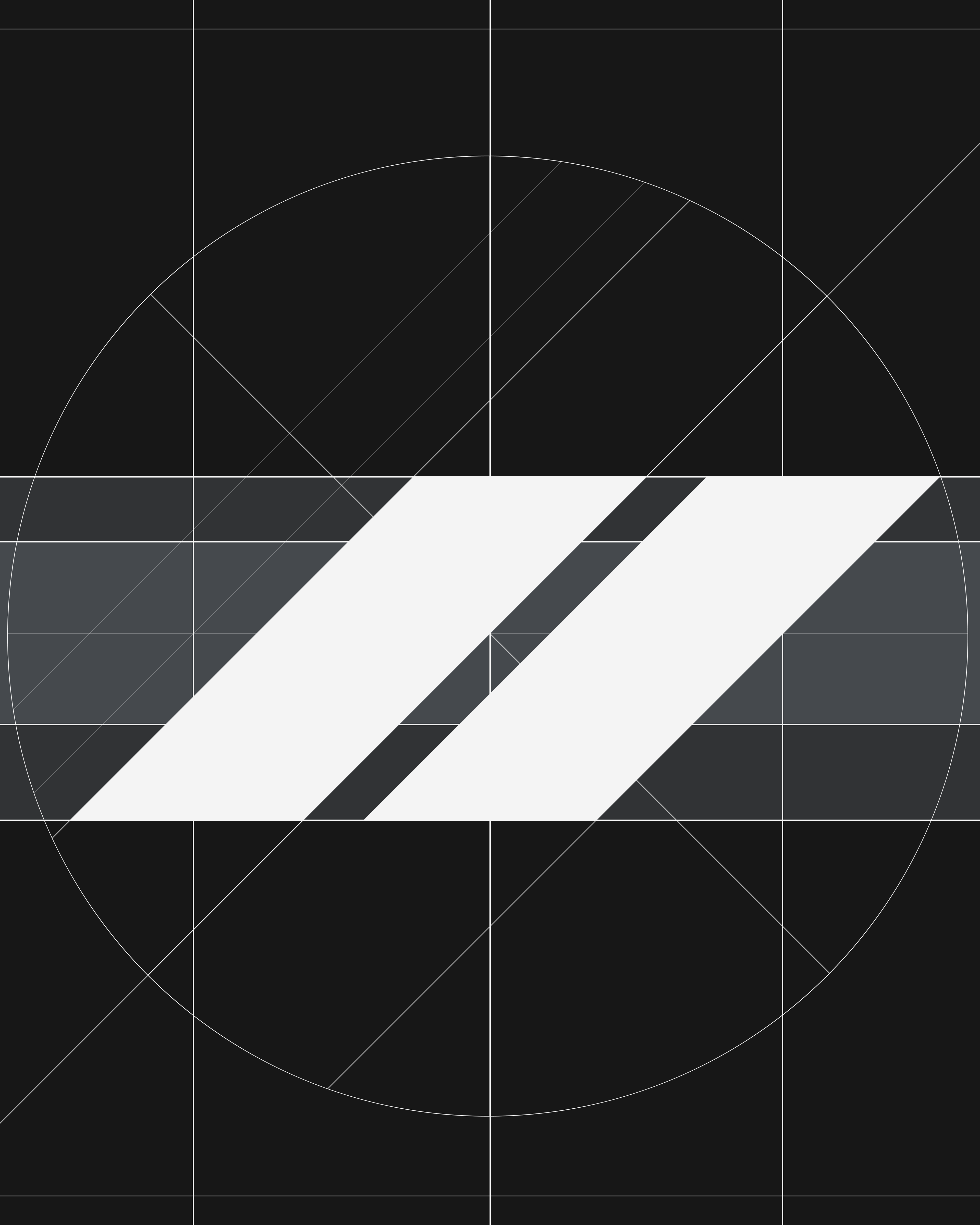
Hairdressing is all about precision and movement. The gesture of scissors slicing through hair became the starting point for the visual system. We translated this action into design, where every element is defined by a 45-degree cut. This angle runs through the entire identity and becomes the structural foundation of the brand.
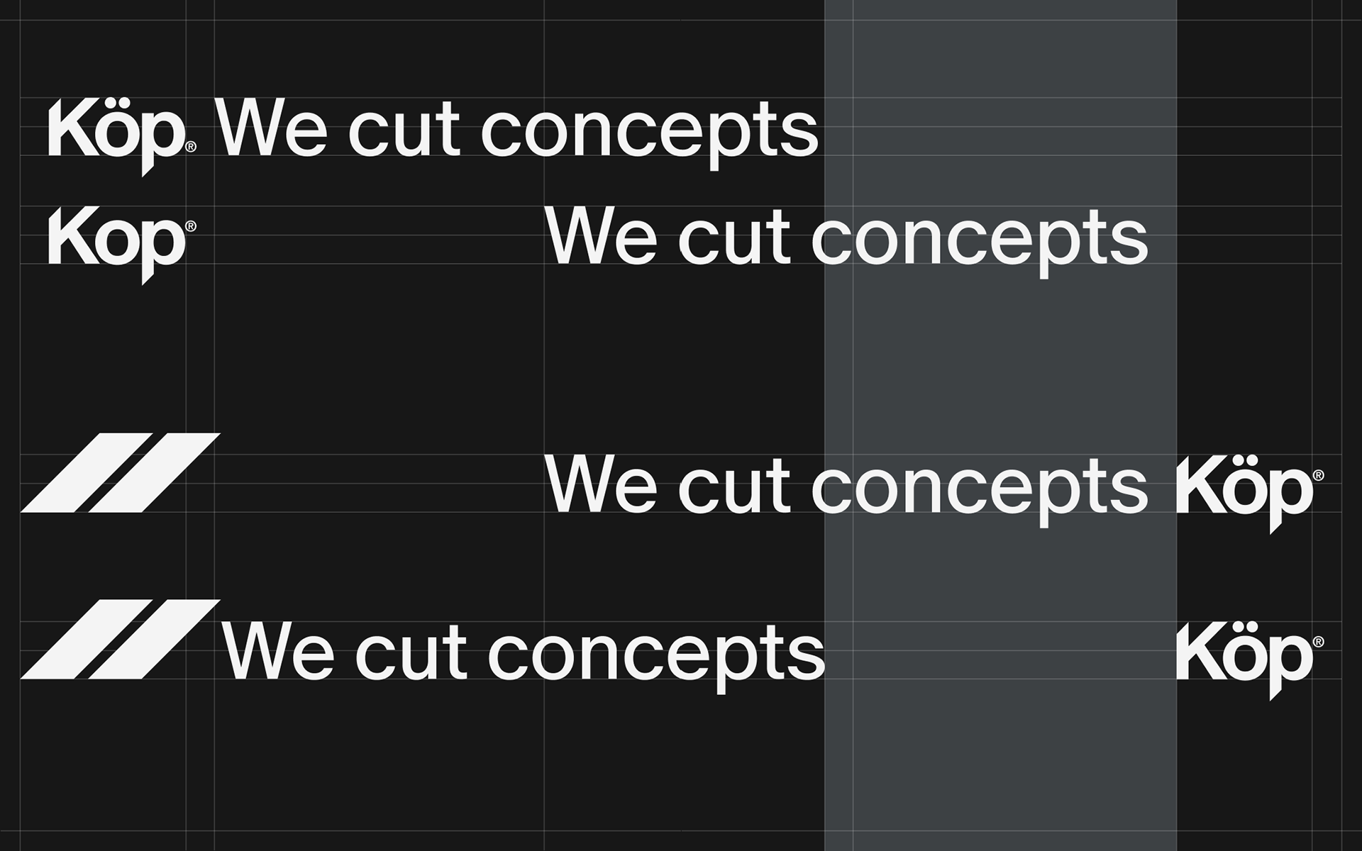
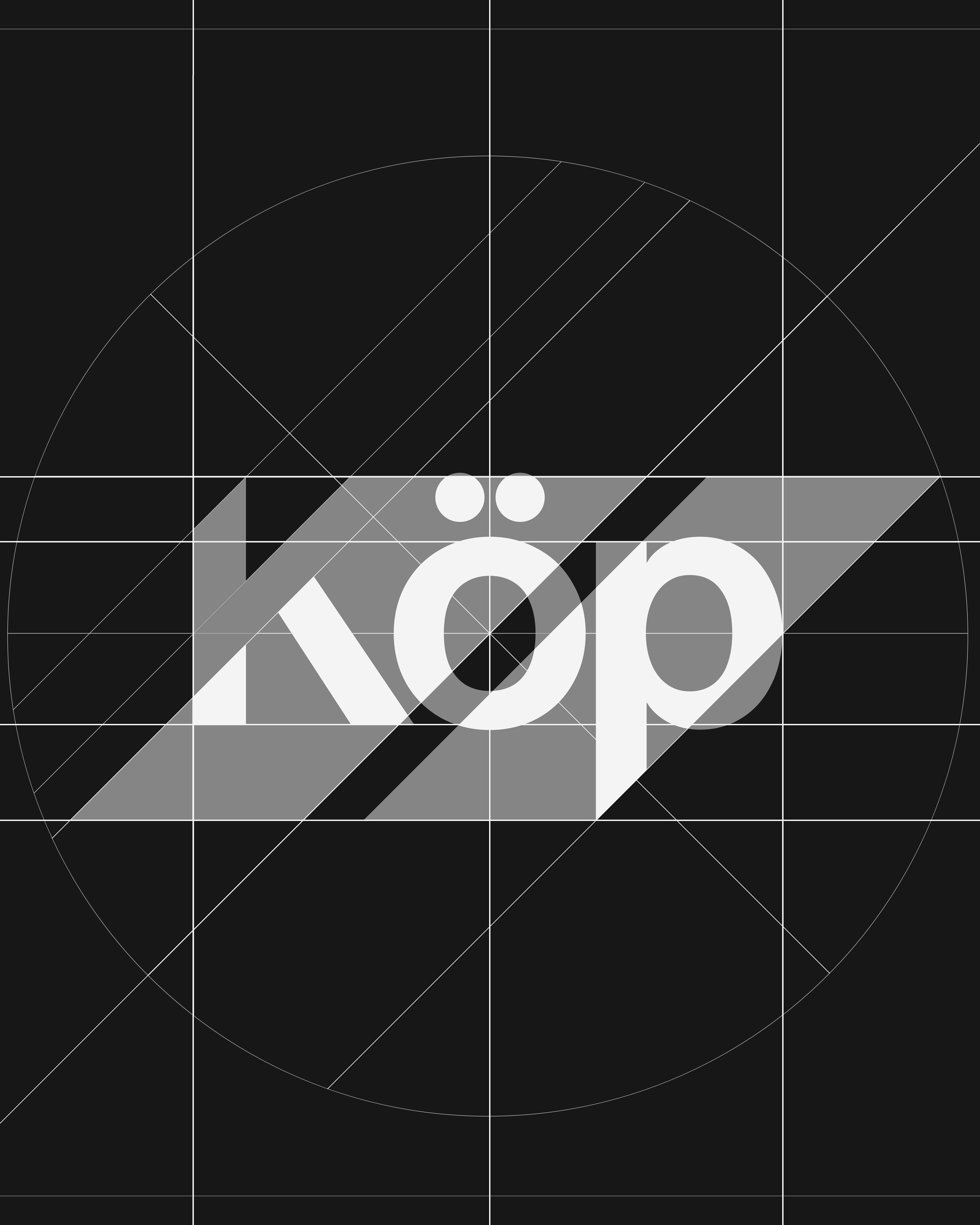
To keep the logo clear and balanced, we introduced a simple spacing rule based on half the height of the letter “K”. The trademark symbol slightly extends below the logotype but remains within this safe area, with its size aligned to other optical details of the mark, such as the umlaut above the “Ö”.

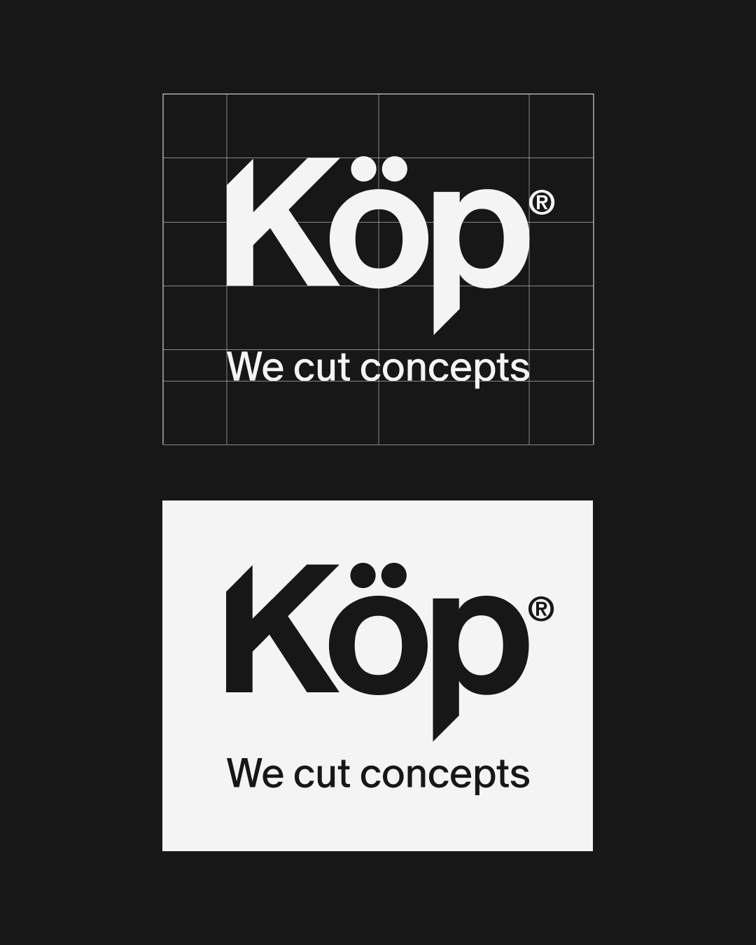
The identity also works with the space between elements. The logo, slogan, and symbol form flexible lockups that can be paired as sign and slogan or slogan and logo. The space between them becomes an active design area where the visual language can develop.
The colour palette is minimal: matte black and pure white, with a soft metallic bluish accent. This metallic feeling continues in the graphic language, where we use complex shapes and gradients inspired by reflections on polished metal.
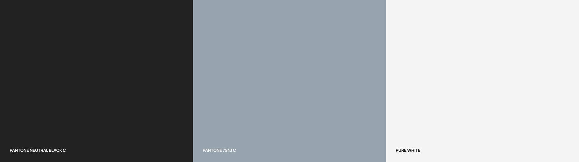
main colors of the project
The motif of the cut appears throughout the entire visual system. It shapes graphic elements, structures layouts, and repeats across different touchpoints, reinforcing the core idea of the brand.
the layout system
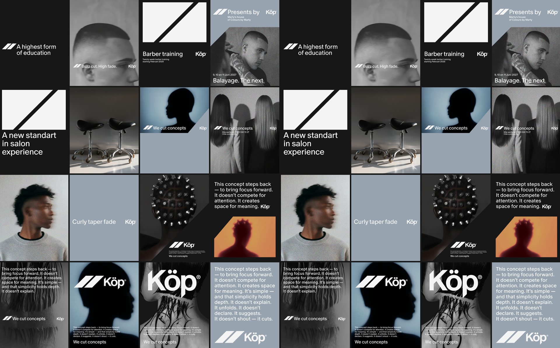
For digital communication we developed a simple but structured layout system. Each post starts with a two-column layout that is then divided into four horizontal rows. This creates a clean 8-block grid for arranging text and images.
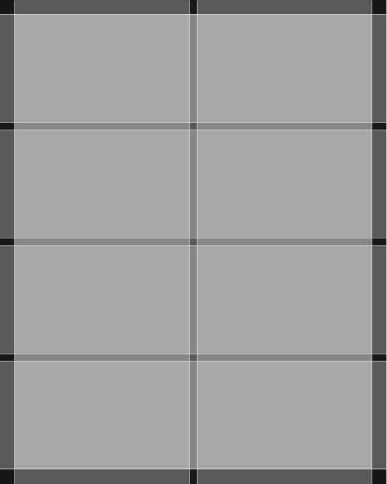
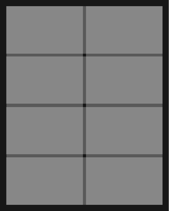
We aim to keep generous white space, ideally at least the size of one block, to maintain a clear and balanced composition.
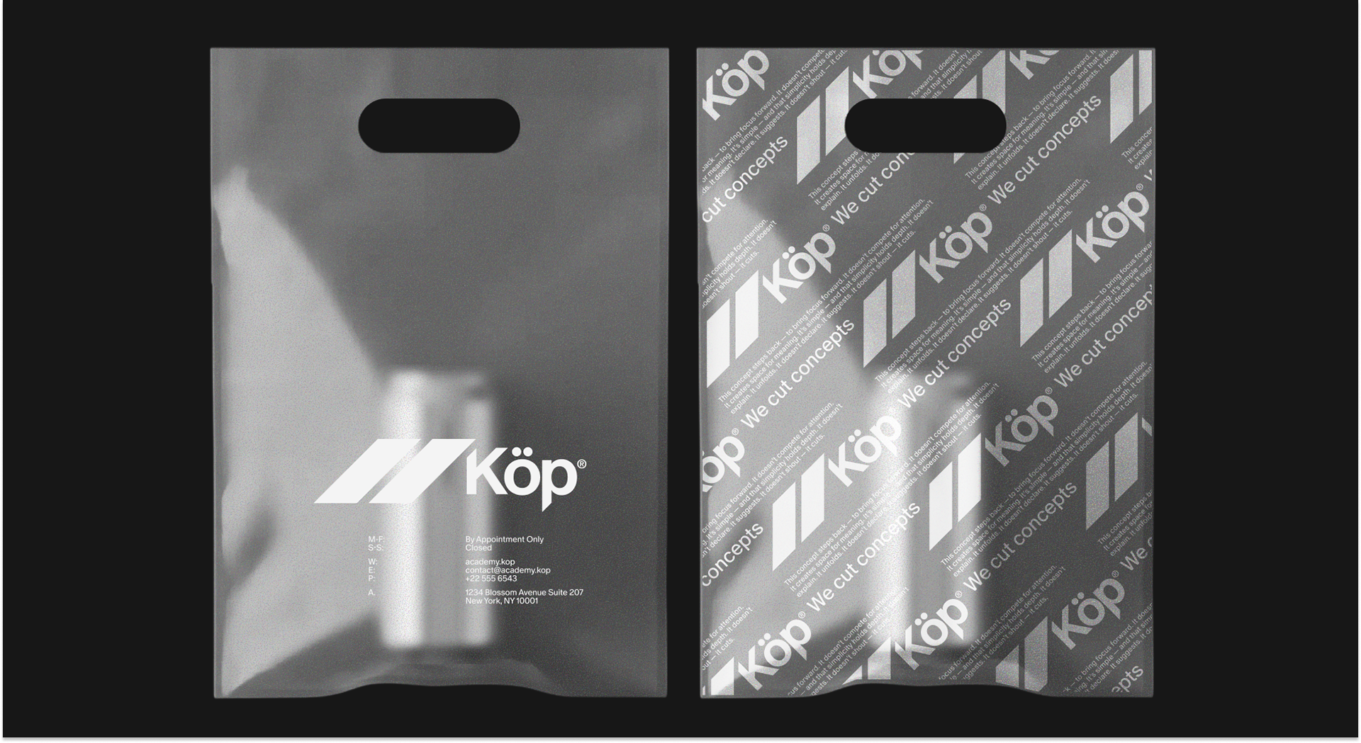
brand touchpoints
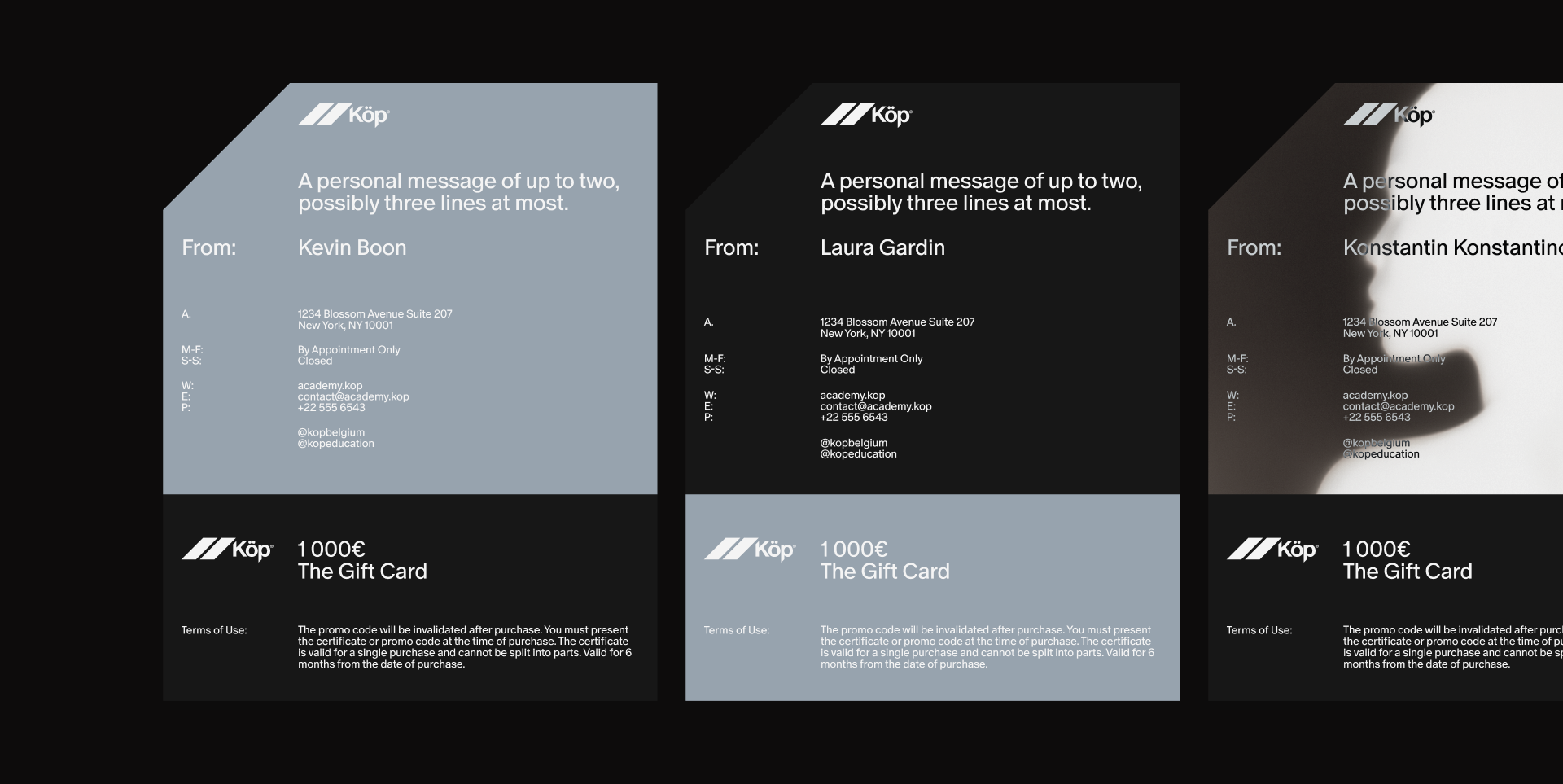
Printed materials such as business cards, appointment cards, and gift certificates use the cut motif as a key compositional element. Angled edges, sharp graphic transitions, and metallic accents reference the gesture of cutting while reinforcing the brand’s precision-driven aesthetic.
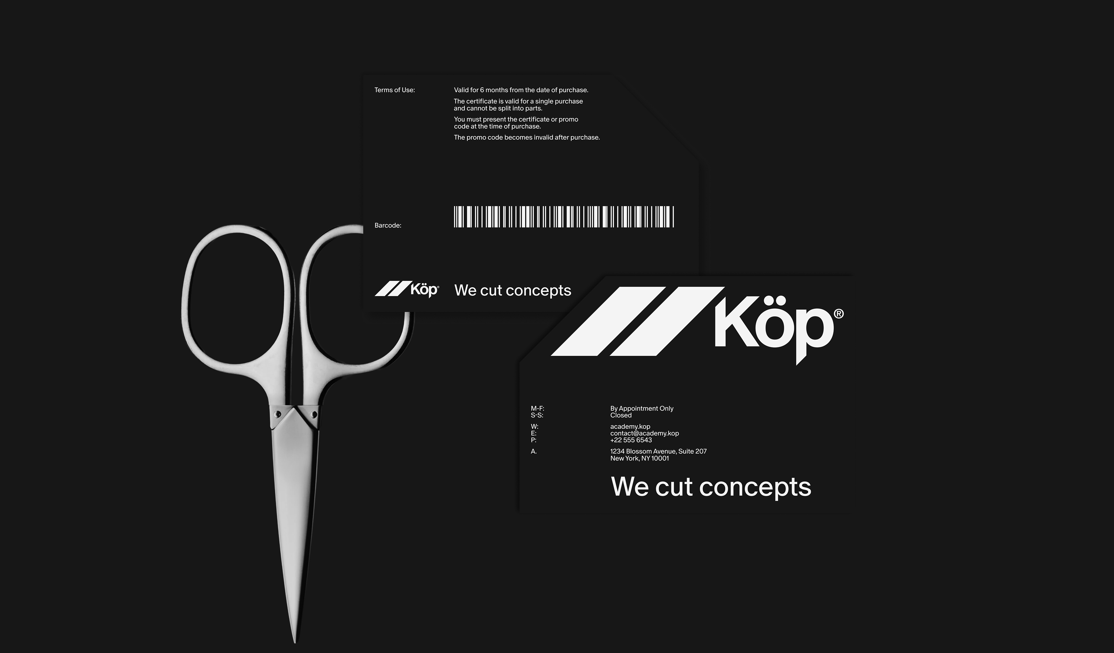
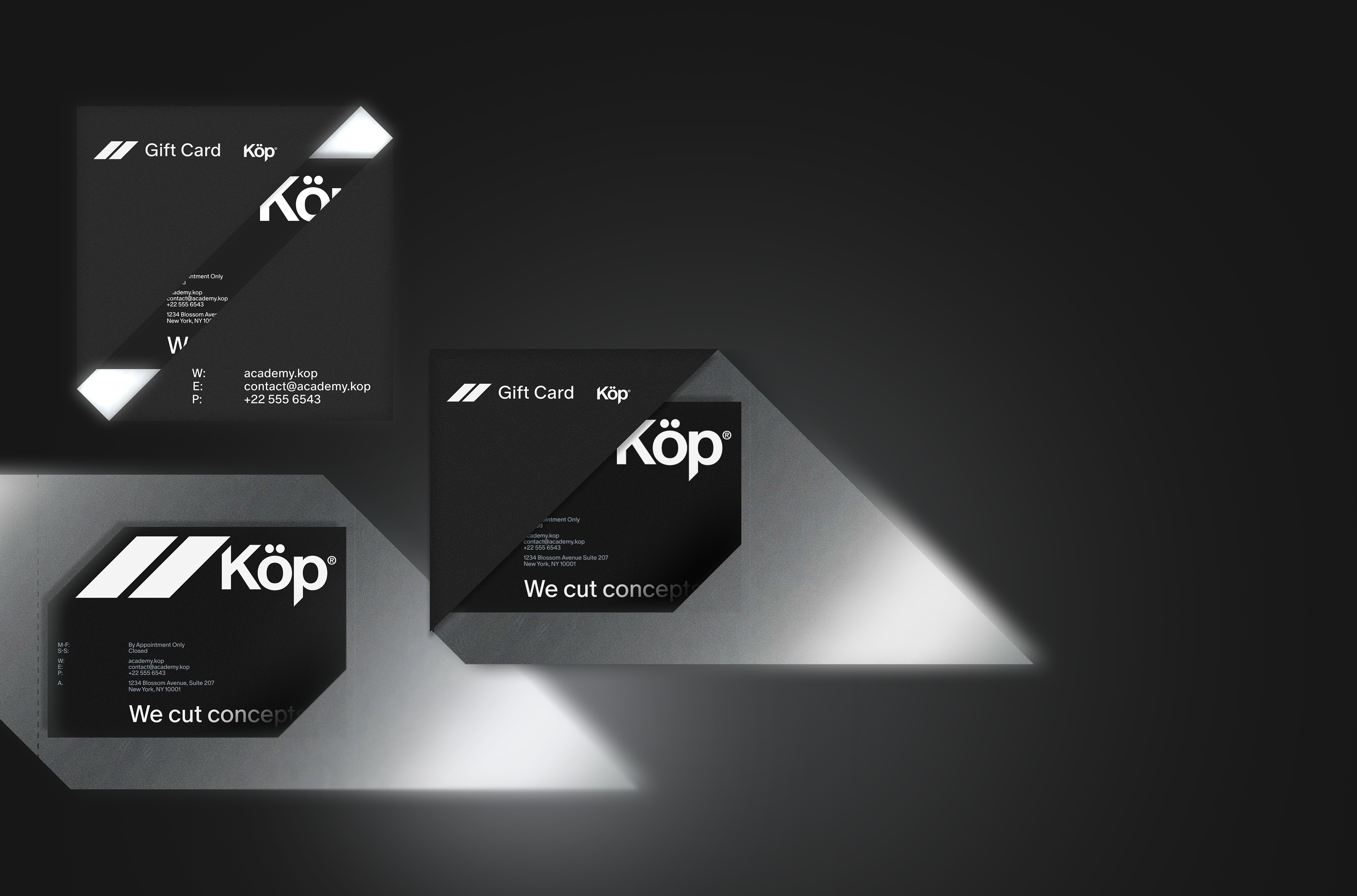
the gift card ↑
Packaging elements were also designed to reflect this idea. The envelope for the gift card integrates the cut motif together with chrome-inspired finishes, turning a simple functional object into a small brand experience.
Across both digital and physical applications, the system remains consistent while allowing flexibility in composition.
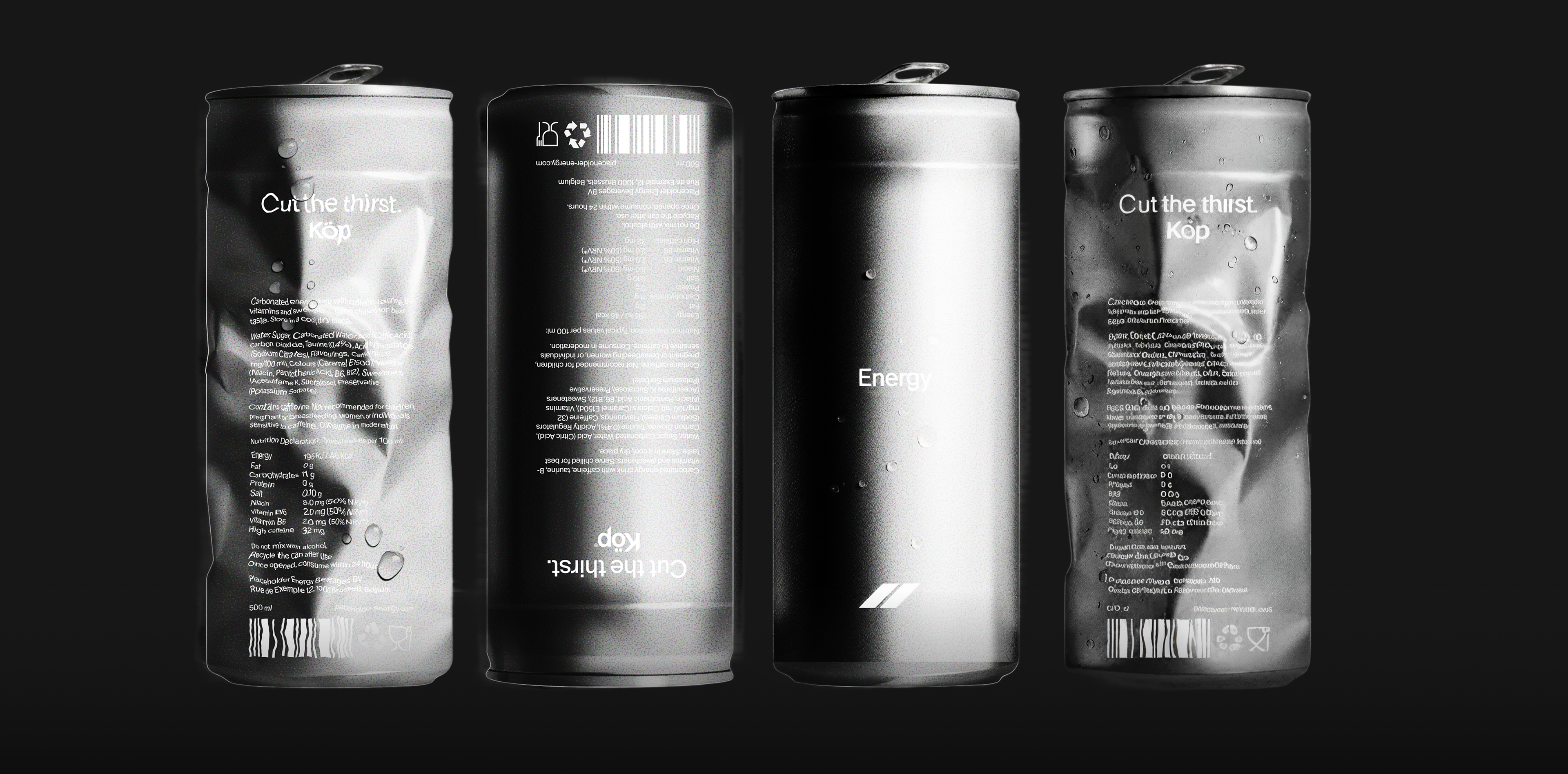
a soda can ↓
The repeated use of cuts, metallic reflections, and structured layouts creates a recognisable visual rhythm that ties all materials together.
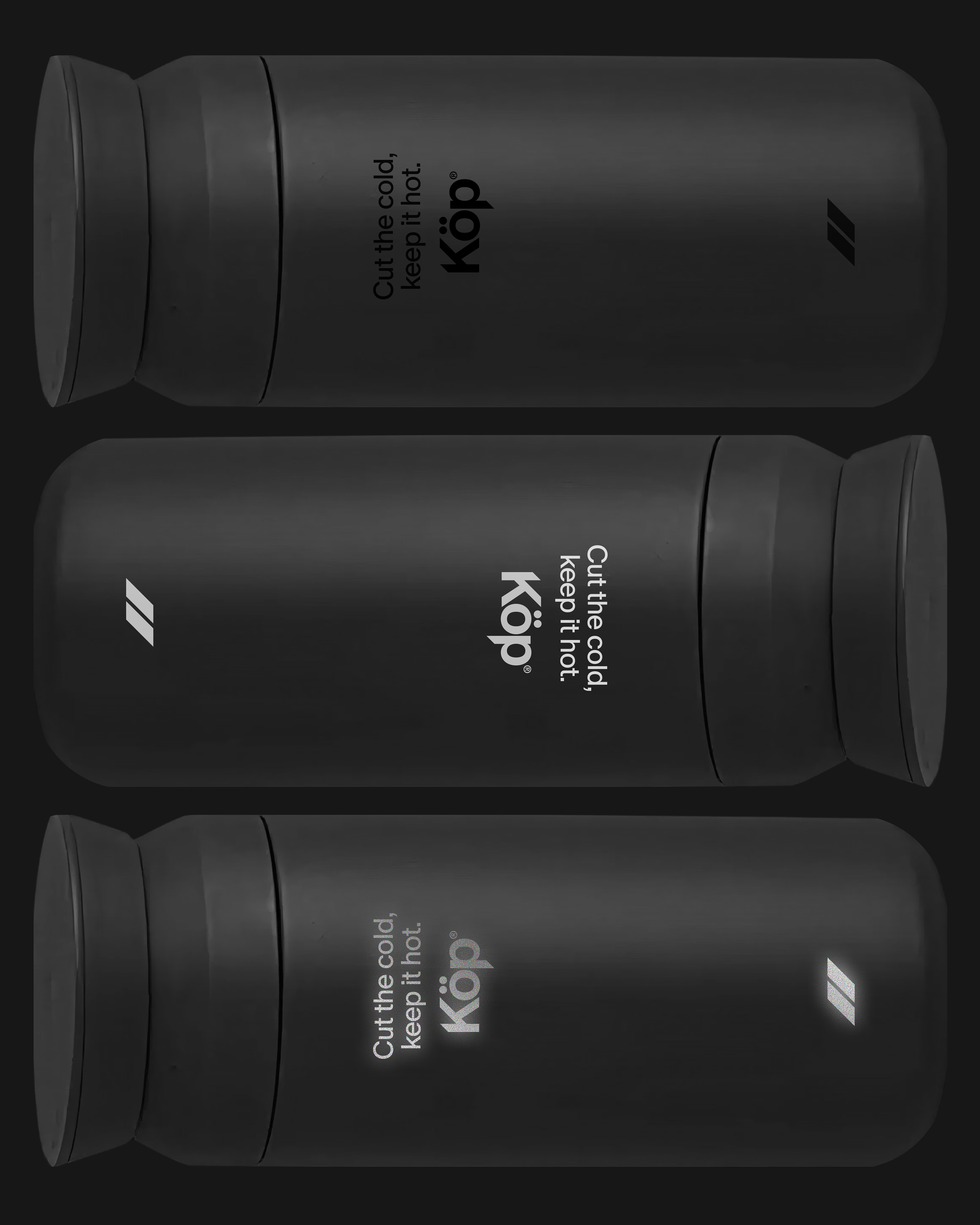
travel mug ↓
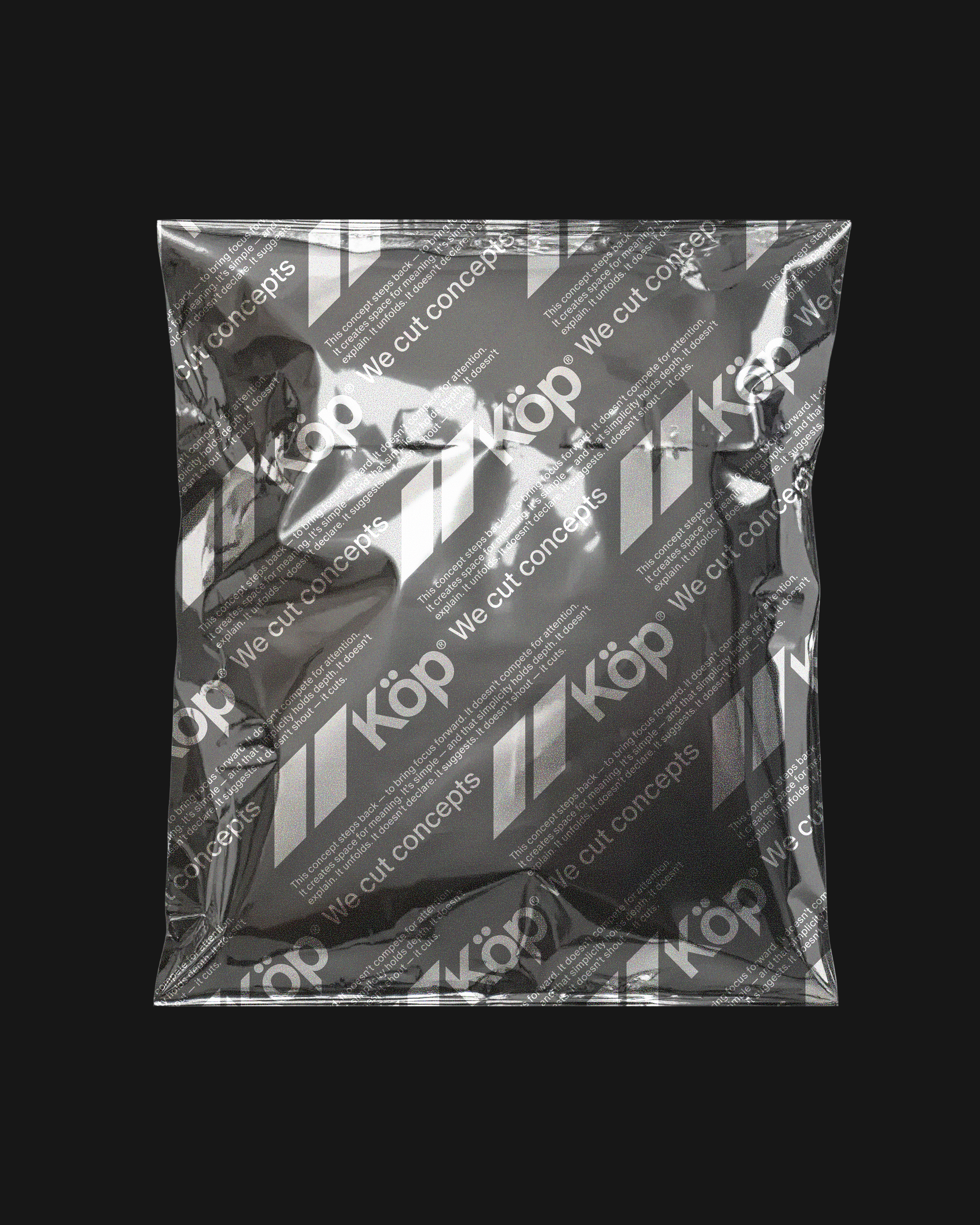
↑ packaging
Together these elements form a cohesive identity where the idea of the cut appears everywhere, from the logo to layouts, graphics, digital media, and physical materials, creating a modern brand language for KÖP.
↓ project team