Mellows | Brand Identity
Brand identity for Cafe in Abu Dhabi
2025
Mellows is a wholesome eatery built around clarity, courage, and care — a place where food fuels not only the body but the mind and soul. Their vision is to spark inner power through meals and spaces that help people reconnect with what makes them feel alive.
For Mellows, strength isn’t just physical — it’s emotional, mental, and intuitive. It evolves through life, just like we do. That’s why the brand stays curious — tuning in, learning, and growing with its community. Because real energy doesn’t come from control. It comes from connection.
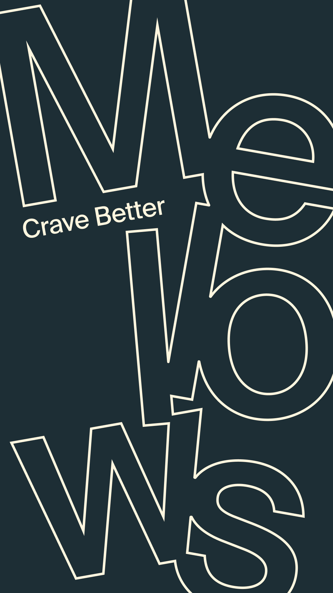
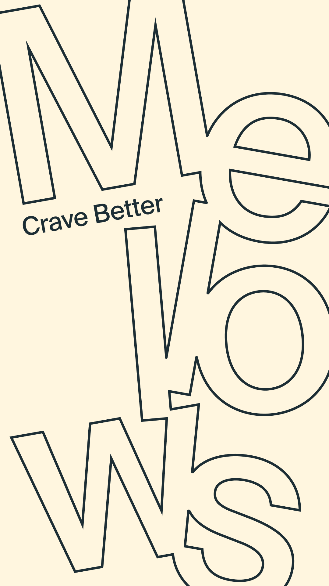
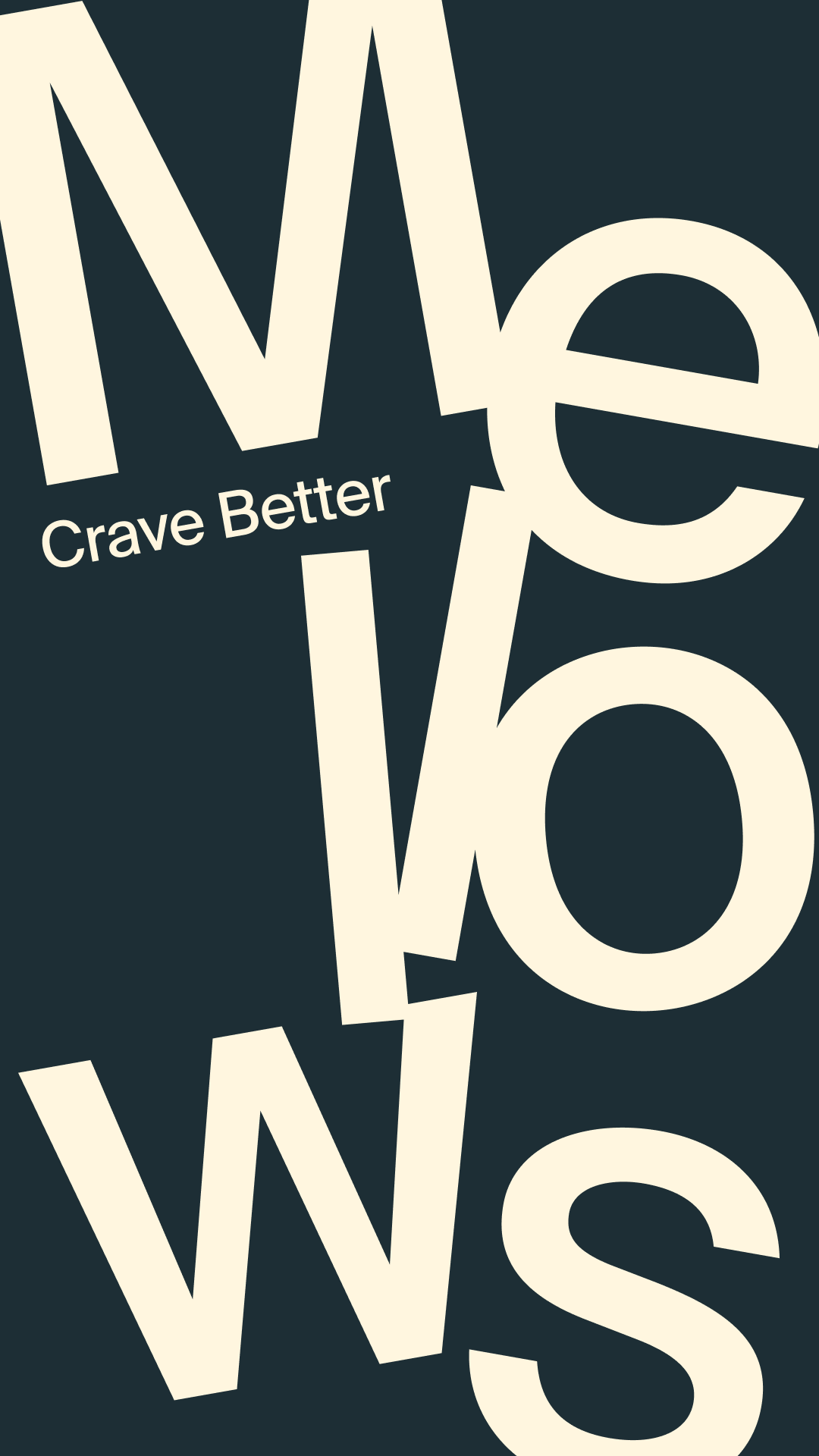
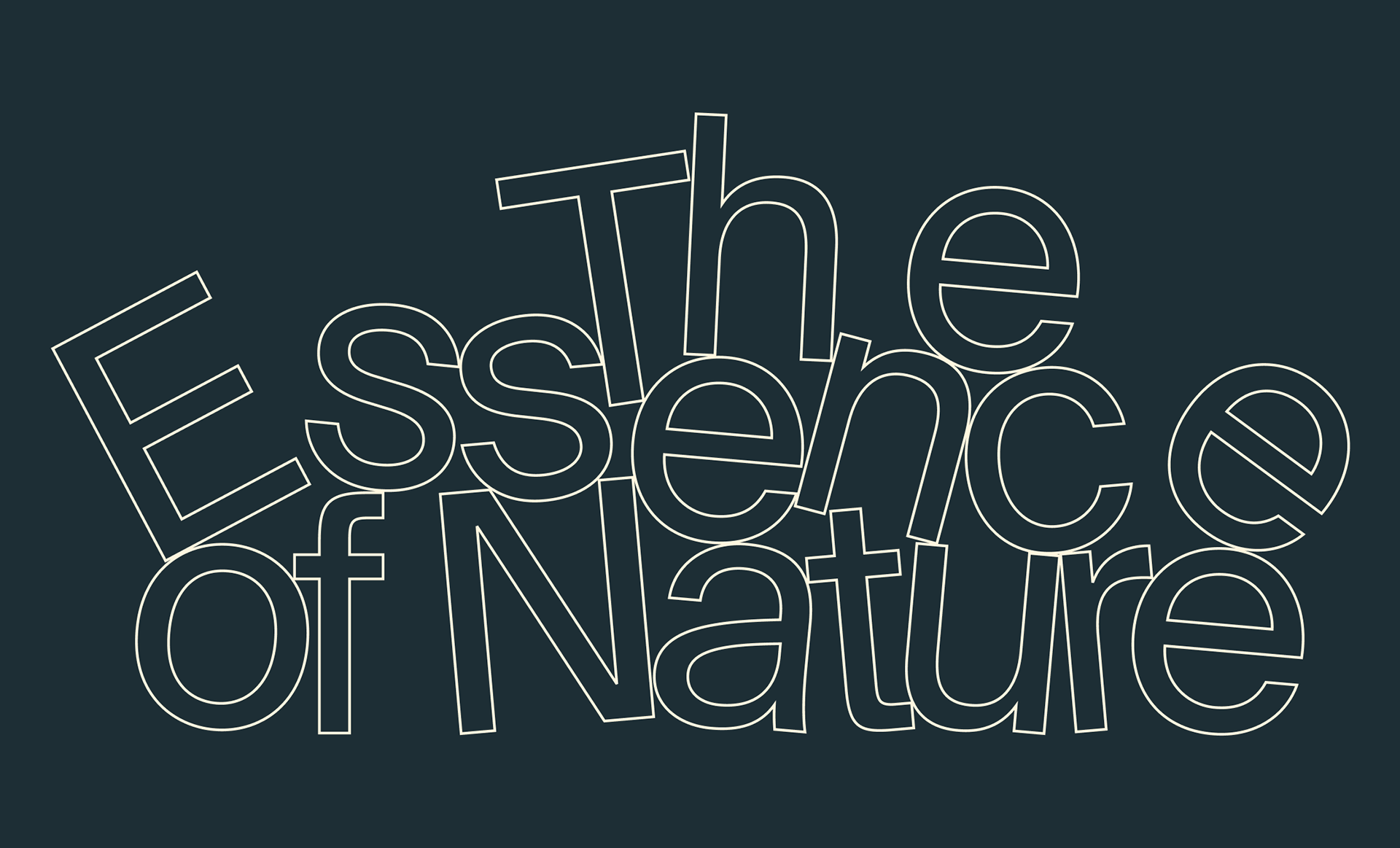
Imagine a brand whose letters obey the natural laws of motion — like leaves swaying under gravity or waves pulled by the tide.
brand Idea ↓
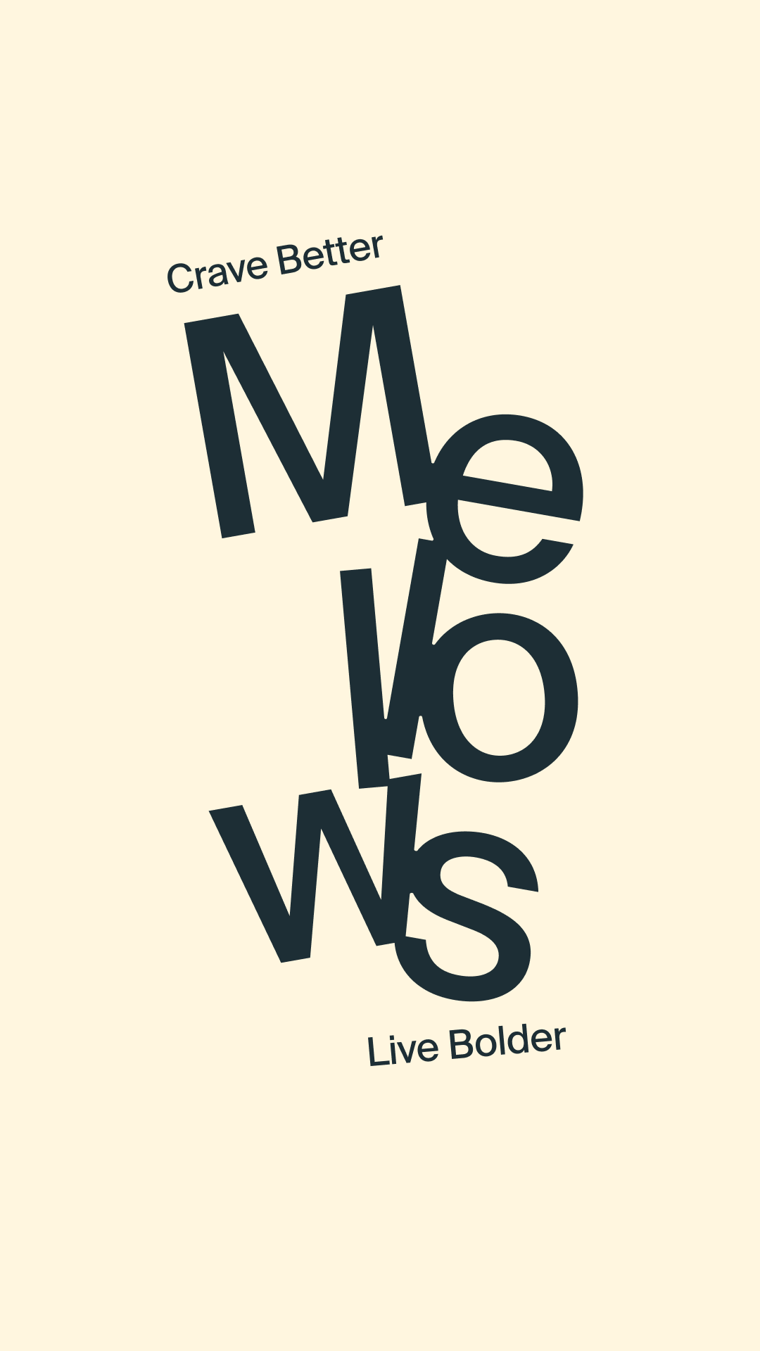
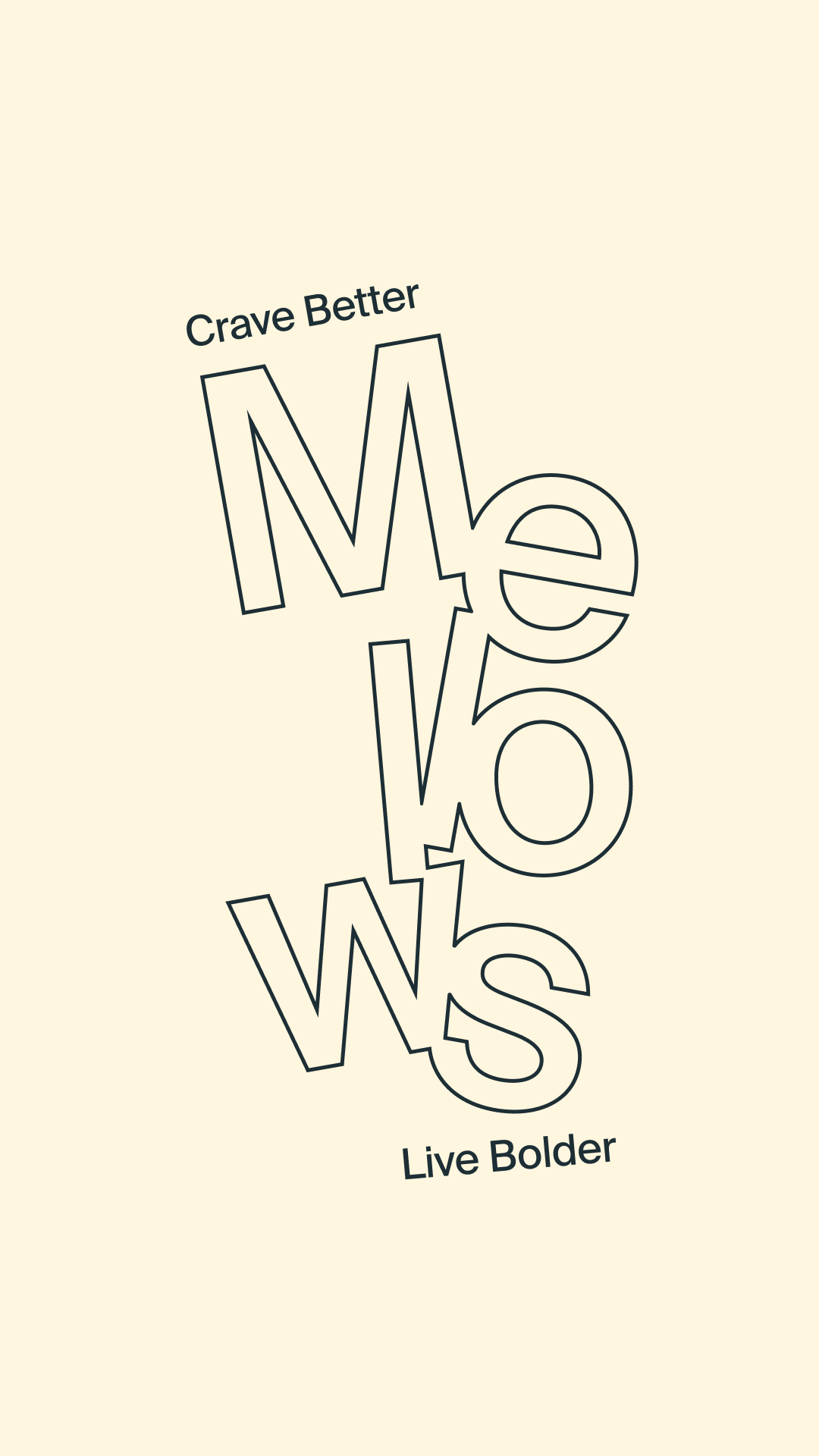
The Mellows identity reflects that movement. Every element feels alive: confident, imperfect, and deeply human.
Just like people, brands have a unique tone. Mellows speaks with calm confidence — grounded, energising, and honest.
The voice tells real stories in simple, thoughtful language — the kind you’d actually want to read. By keeping this tone consistent across every touchpoint, Mellows builds clarity and trust. Over time, that consistency turns into recognition — and recognition becomes impact.
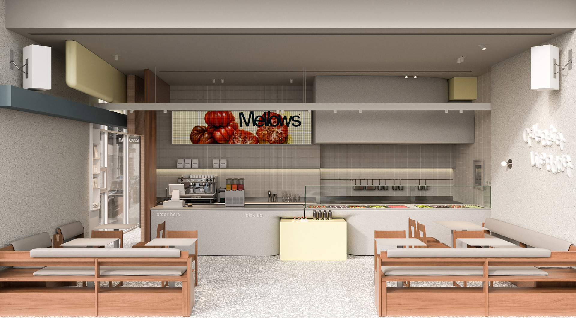
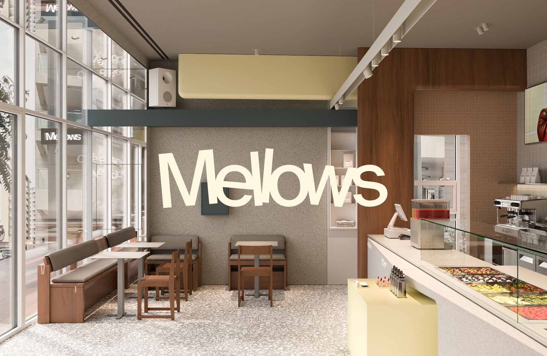
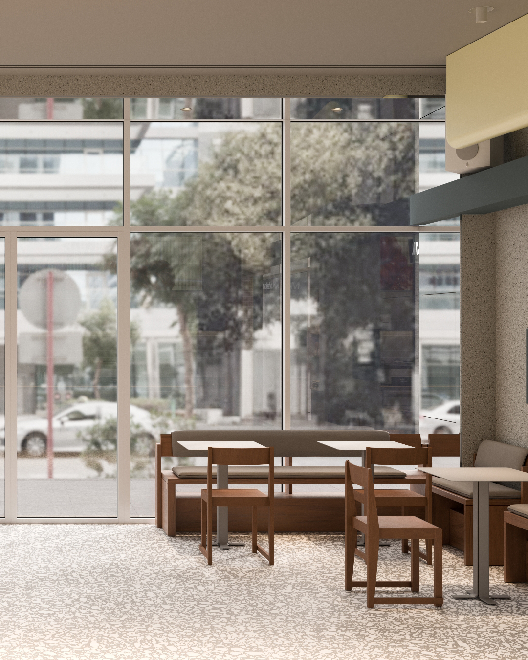
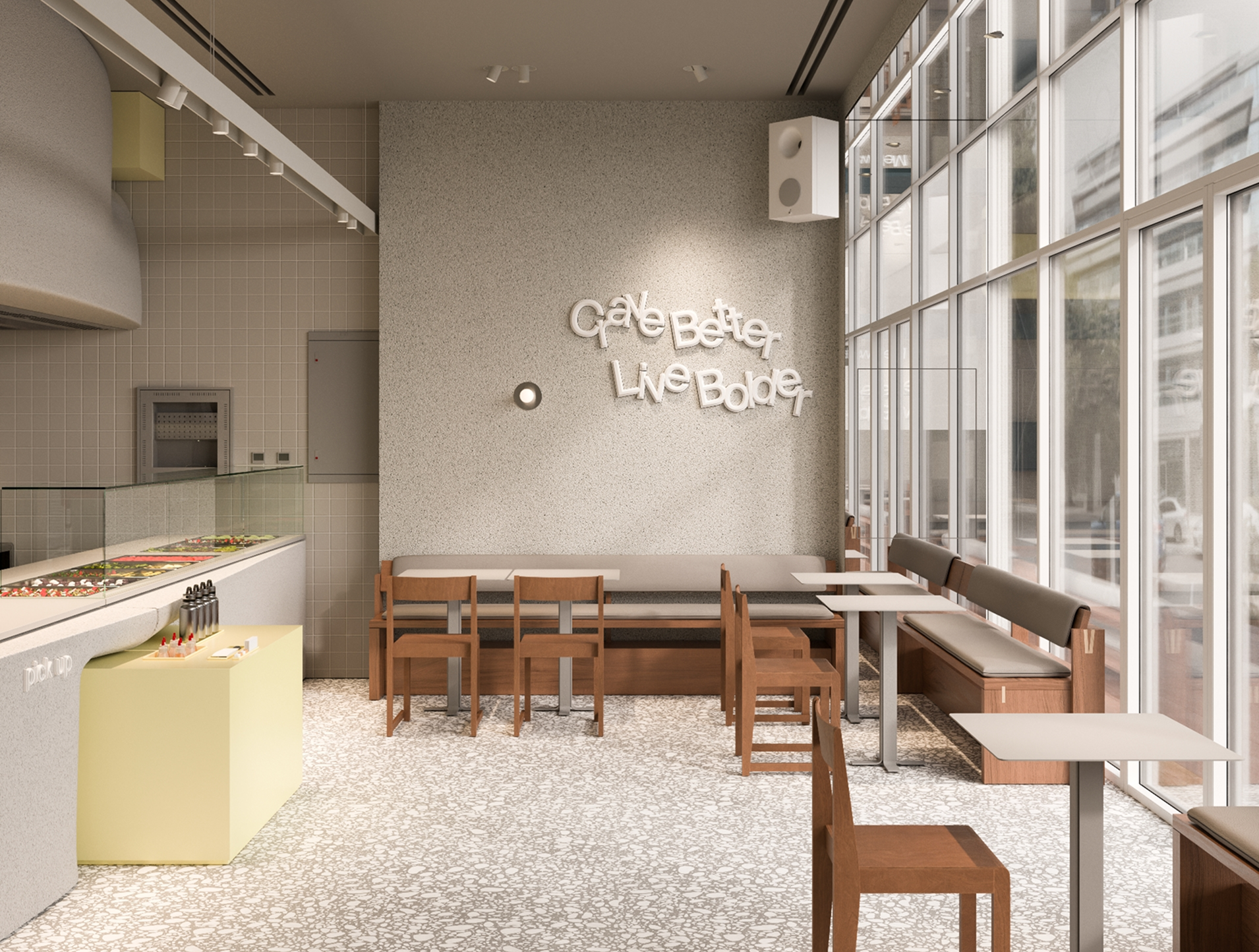
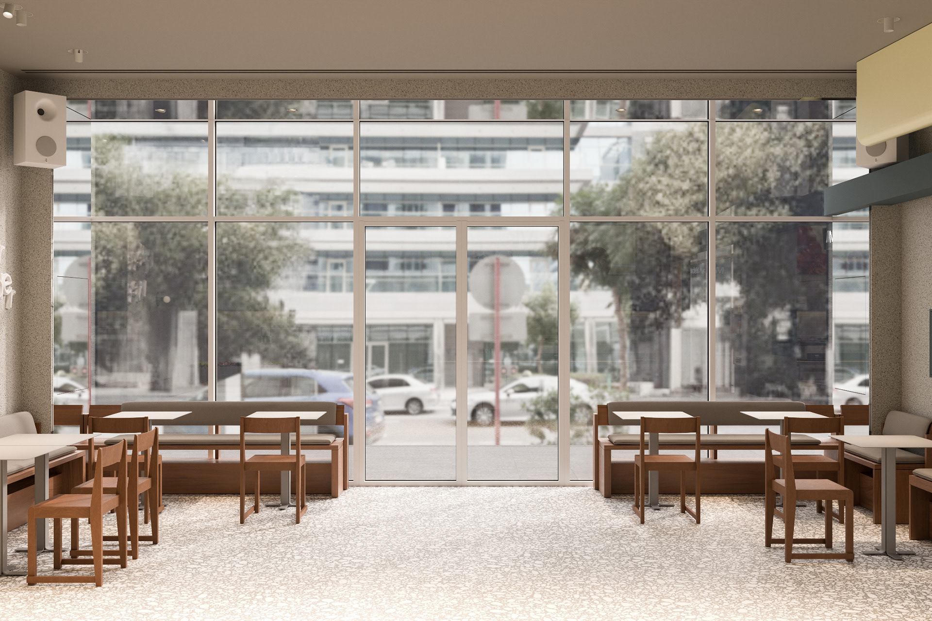
interior visualisation by our team
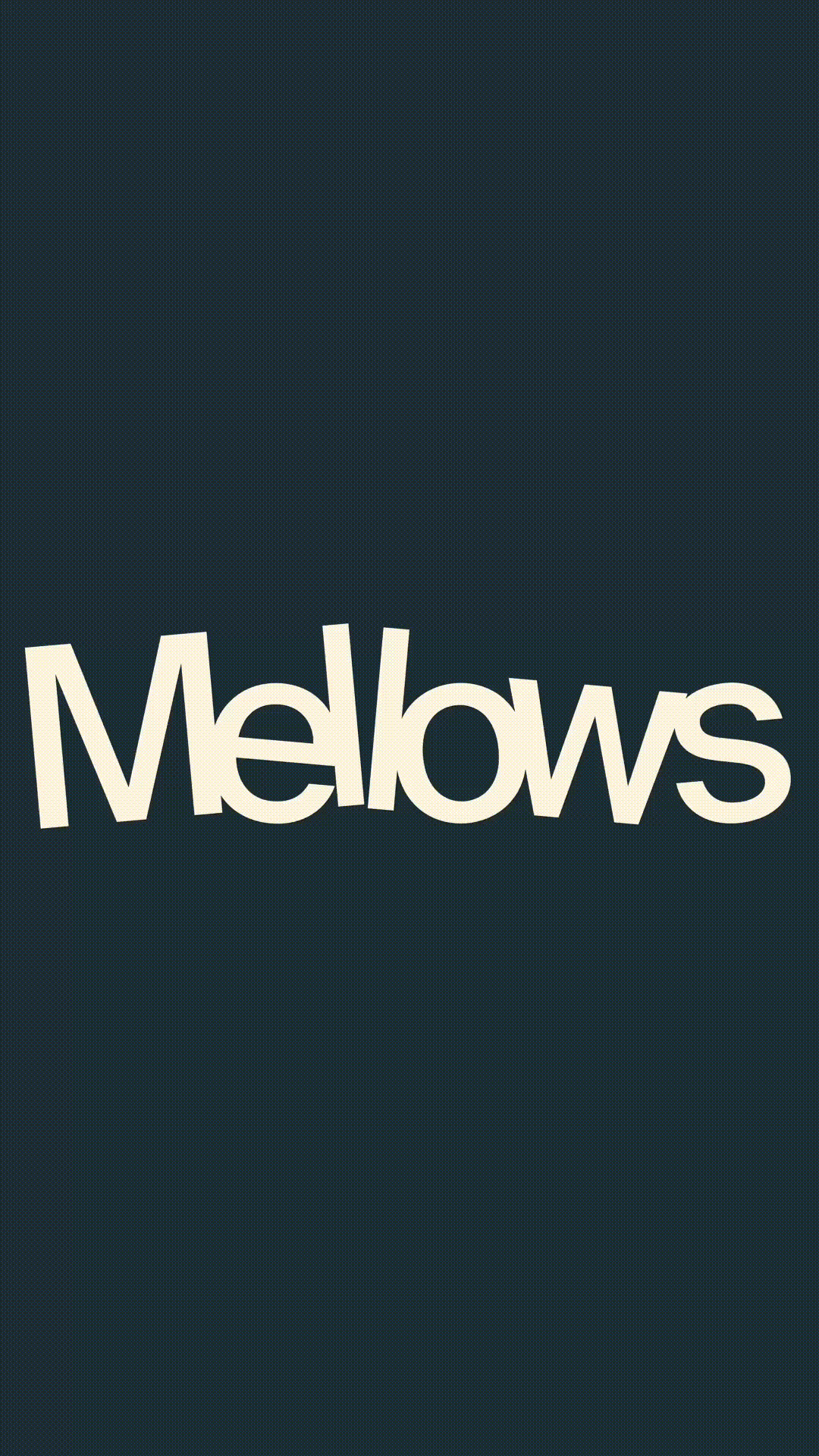
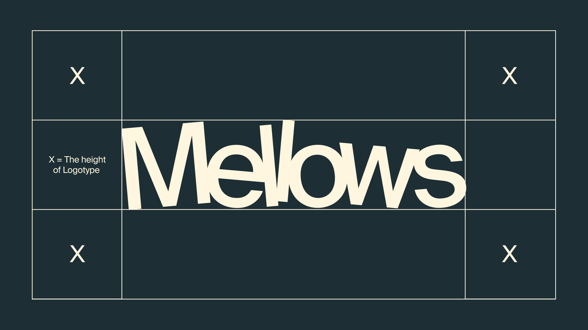
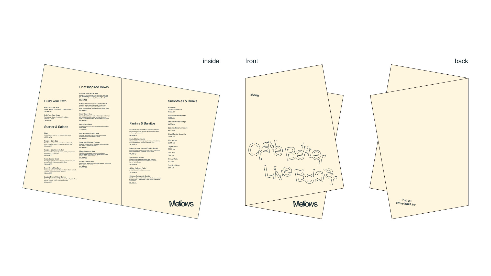
The Mellows logo is its signature — a mark of who the brand is and what it believes in.
It’s clear, confident, and instantly recognisable. When it shows up, people know exactly who’s speaking.
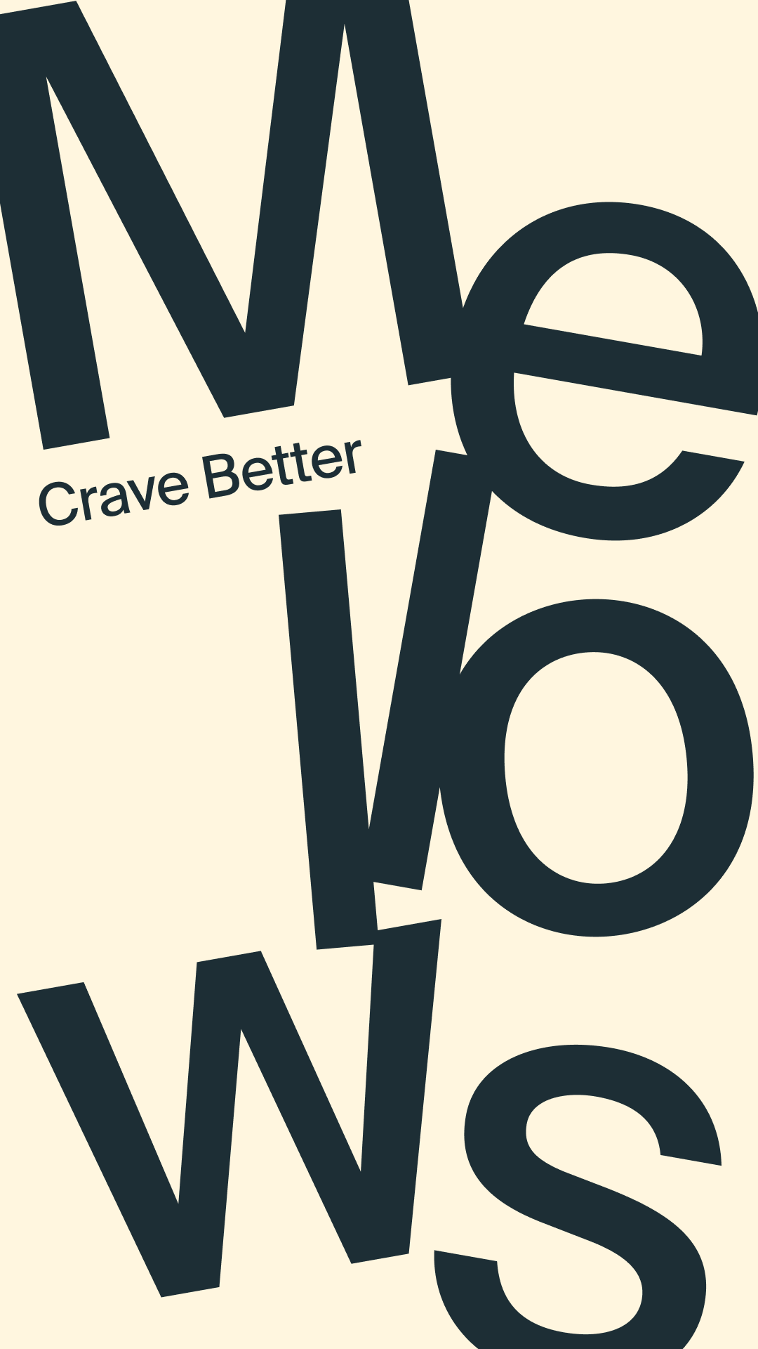
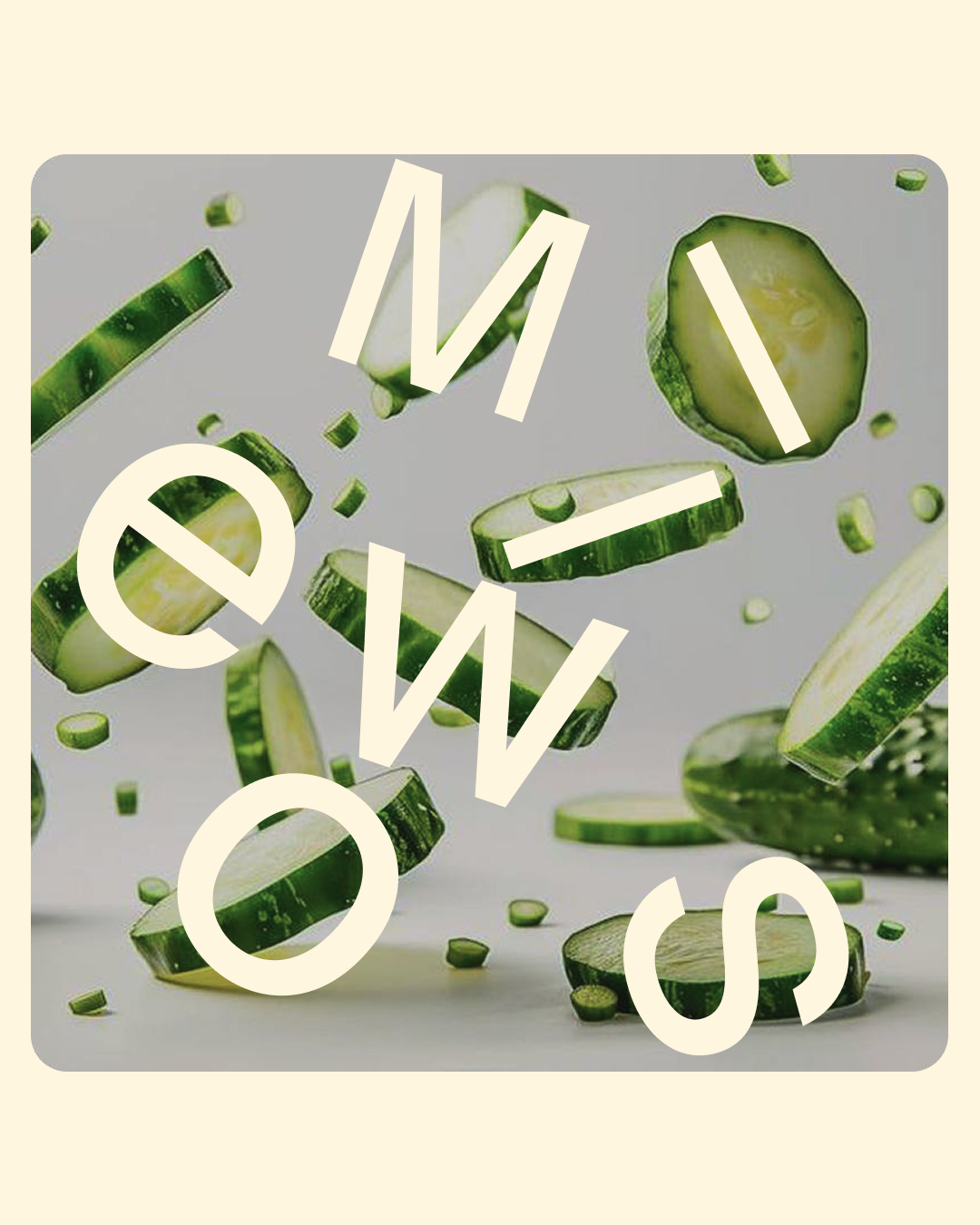
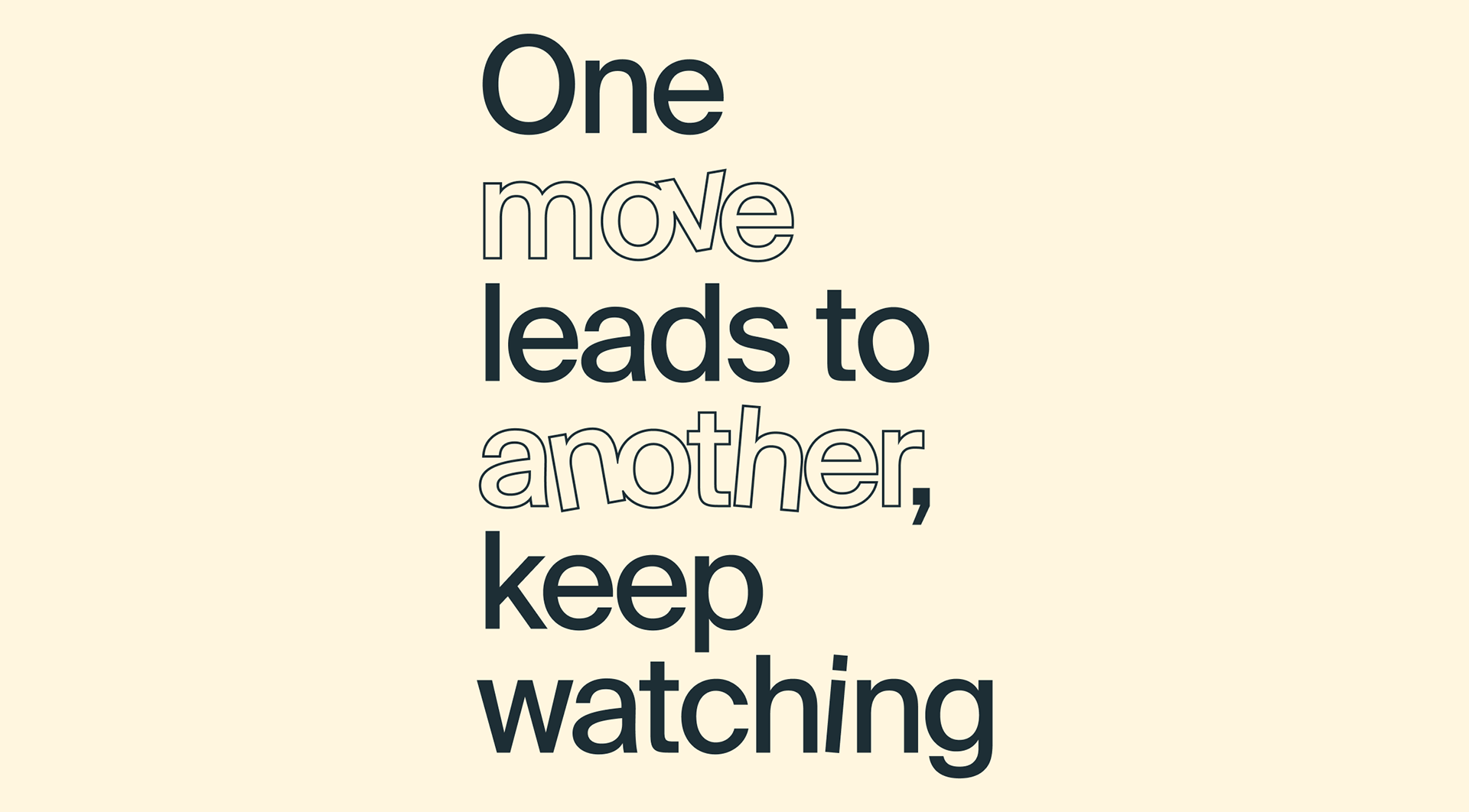
In headlines and key phrases, the letters behave just like Mellows itself — free, bold, and unapologetically their own. Each letter can be tilted at precise angles of –10°, –5°, 5°, or 10°, and may shift slightly along the baseline.
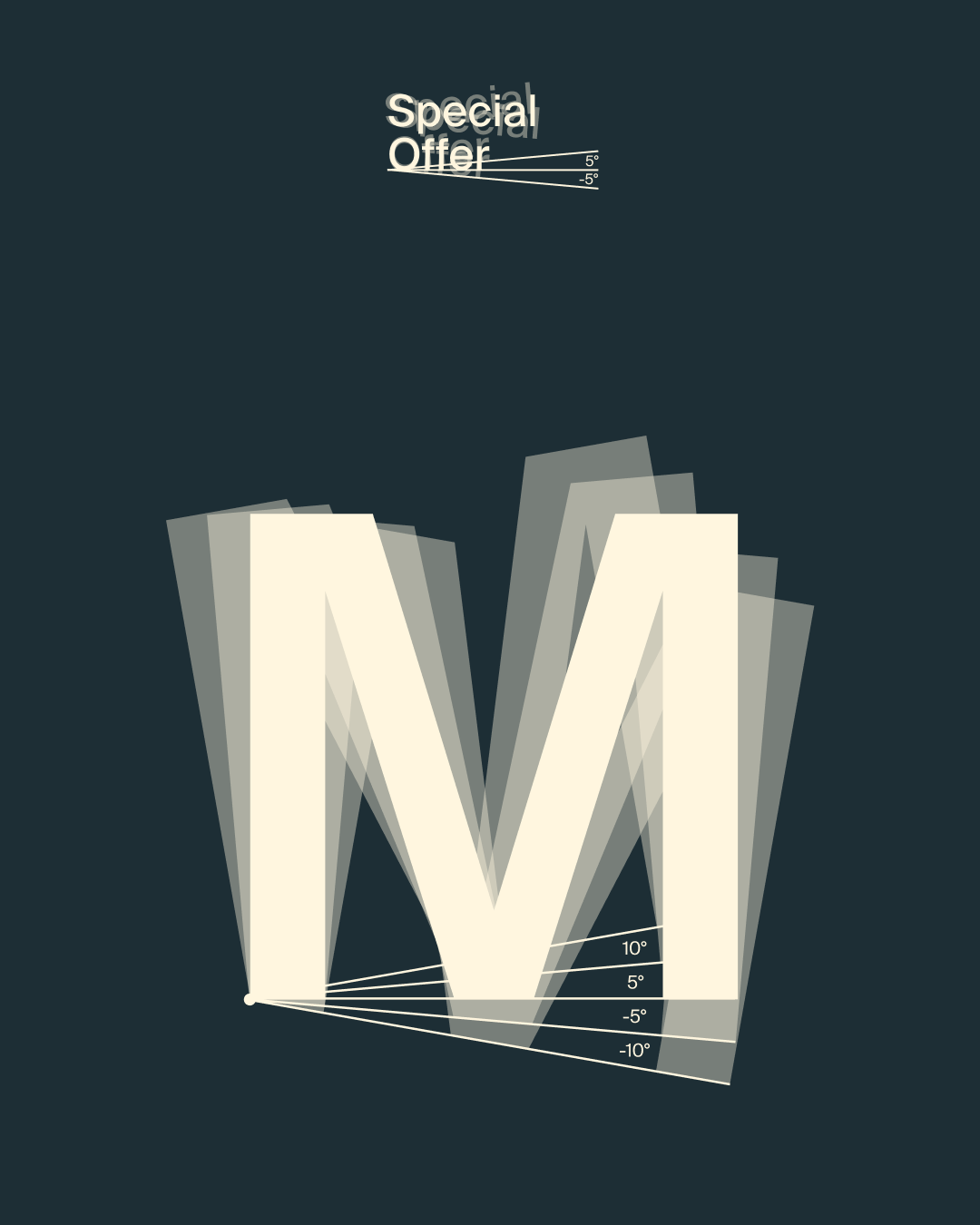
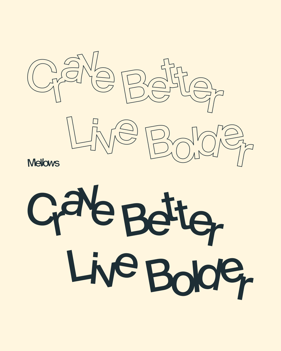
This creates rhythm, movement, and a sense of playfulness — visually echoing Mellows’ spirit. We don’t speak in perfectly straight lines; we speak honestly, with energy and a little edge. Every letter feels like a character: unique, but unmistakably one of us.
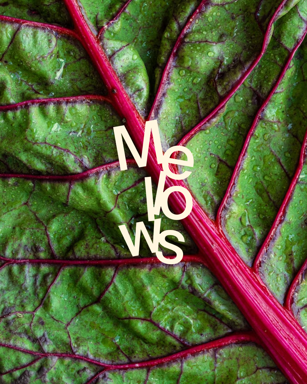
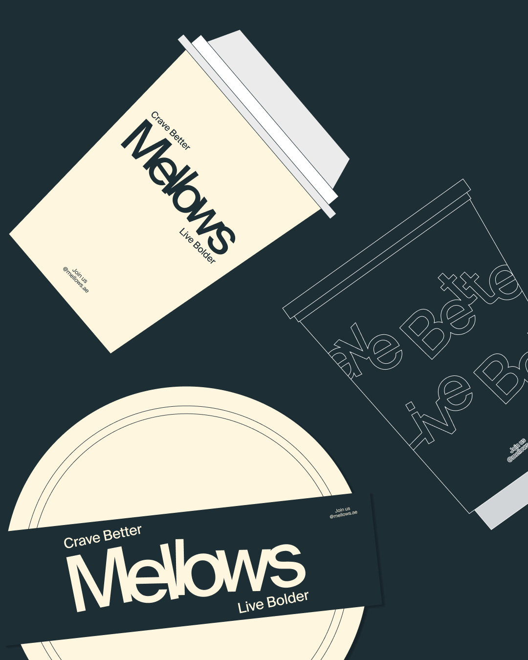
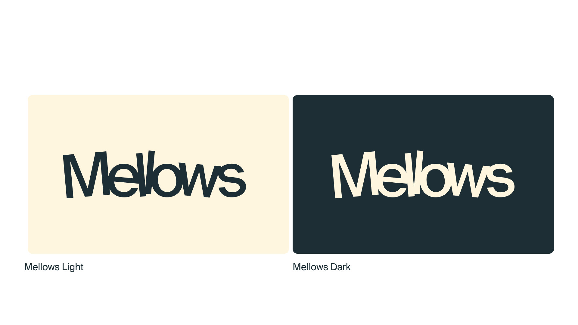
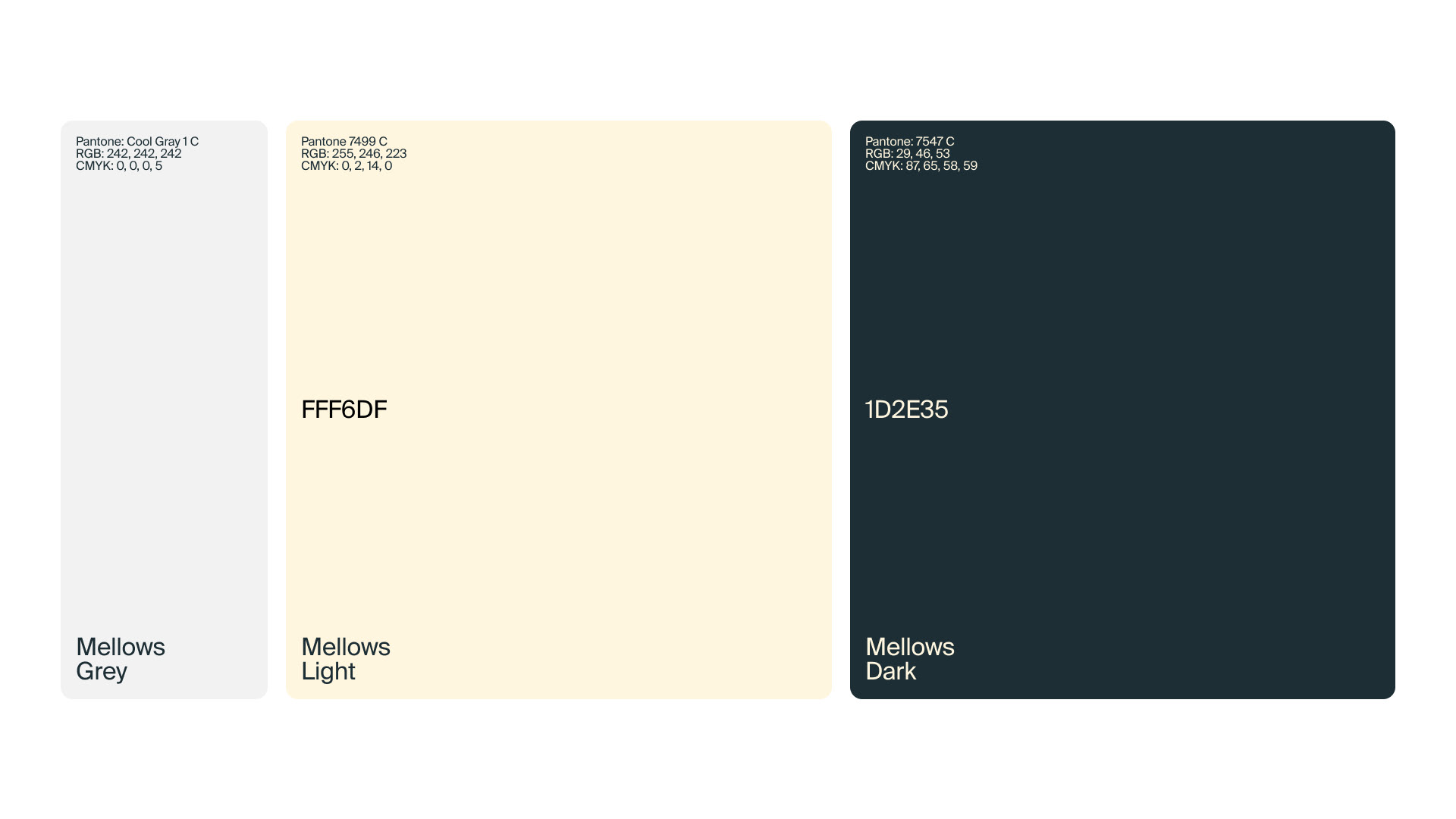
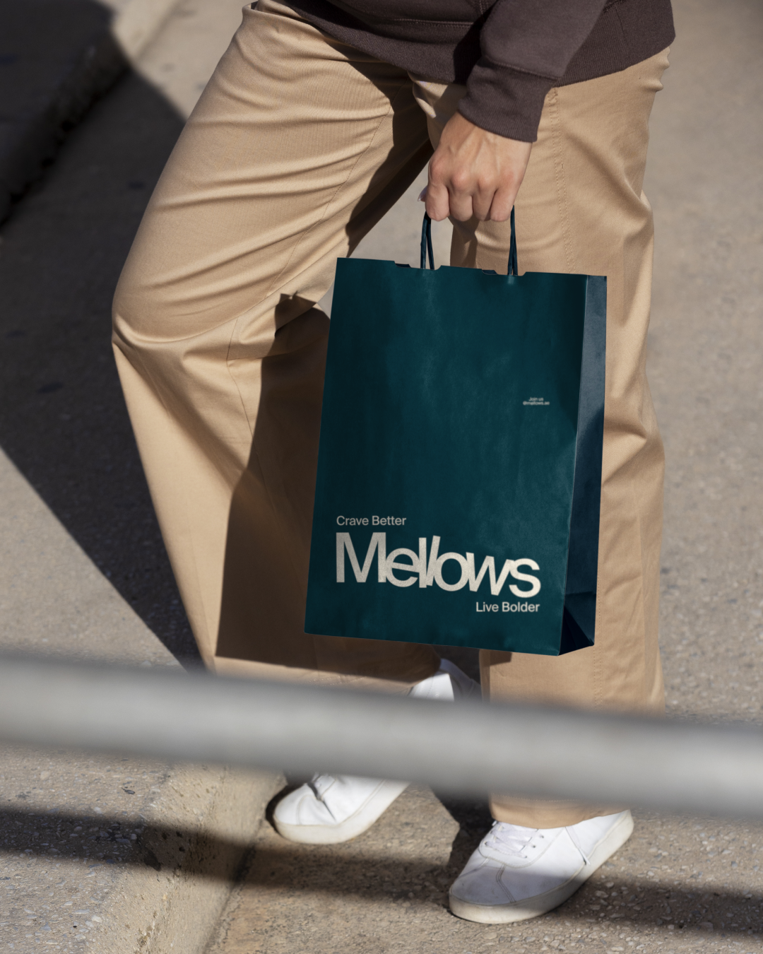
The palette reflects Mellows’ wholesome, grounded energy — soft, natural, and quietly bold. Warm Cream, Pale Yellow-White and Deep Blue-Green — together, these tones create a sense of clarity and warmth — the visual equivalent of a deep breath.
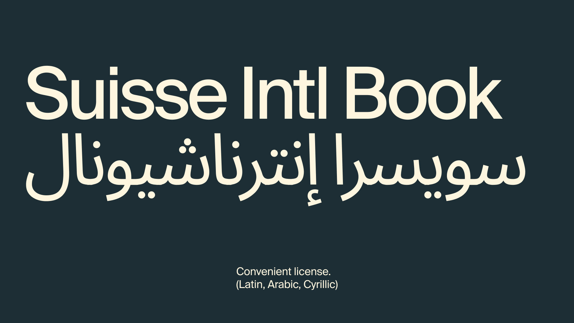
A versatile type system with Latin, Arabic, and Cyrillic support ensures accessibility and inclusivity. Its form is contemporary yet friendly — balancing clarity with motion.
We mix documentary realism with playful surrealism — making even the simplest object feel like a character.
Imperfection is beauty. Energy is authenticity. Mellows doesn’t just sell food — it cultivates a state of mind: Crave better. Live bolder.
paper bag ↓
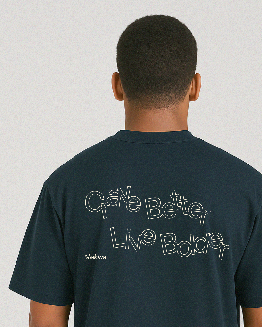
↑ branded oversize T-shirts
↓ project team