
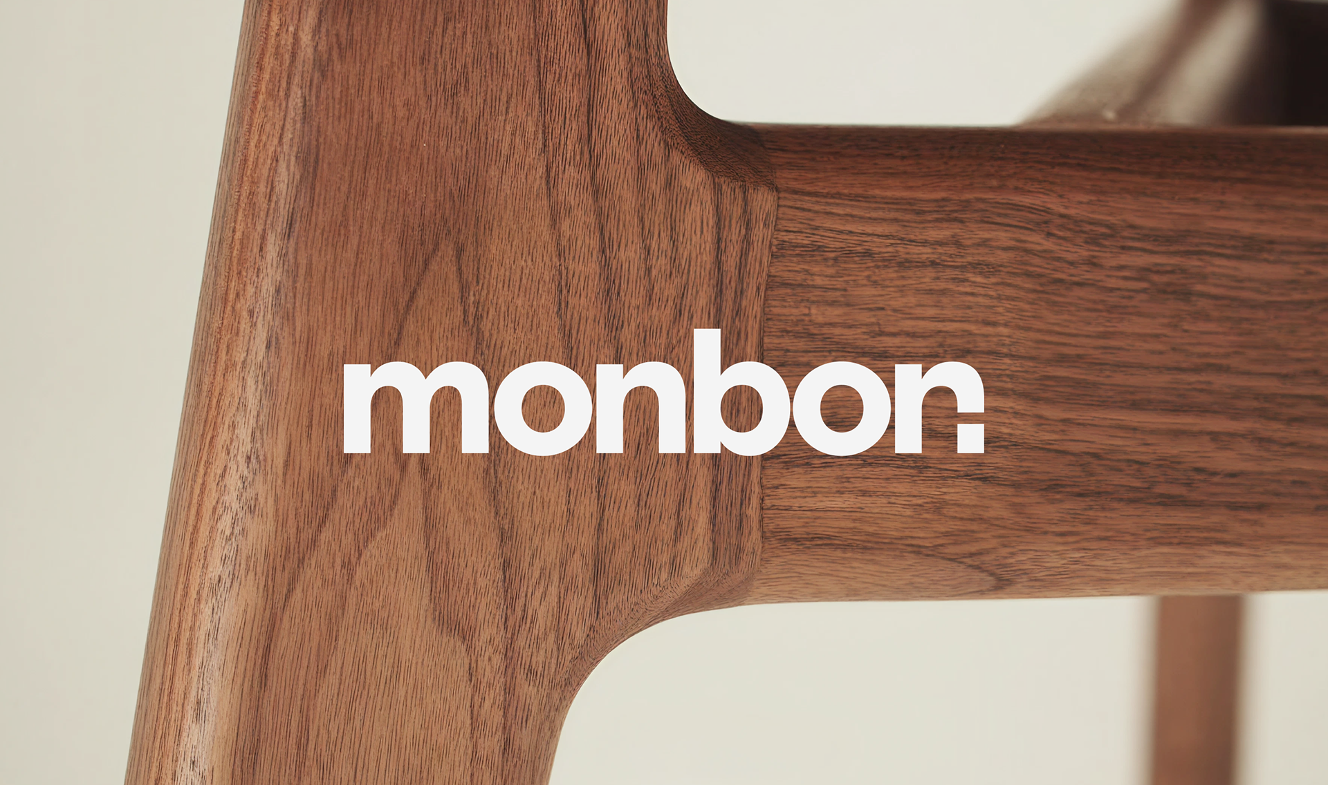
Monbon | Brand Identity
Brand identity for furniture brand
Team: Egor Bogomolov, Valerii Egorov, Dmitrii Mironov, Alexandra Arsenteva, Leonid Basargin, Sonya Anikina
Team: Egor Bogomolov, Valerii Egorov, Dmitrii Mironov, Alexandra Arsenteva, Leonid Basargin, Sonya Anikina
2026
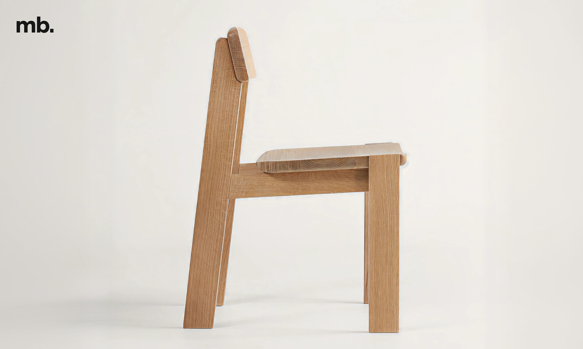
MONBON is a German furniture and interior objects brand with its own production facilities and a strong focus on craftsmanship.
The challenge was to create a distinctive visual identity with a minimal set of tools — one that would feel contemporary and recognisable while reflecting the brand’s structural and architectural approach to design.
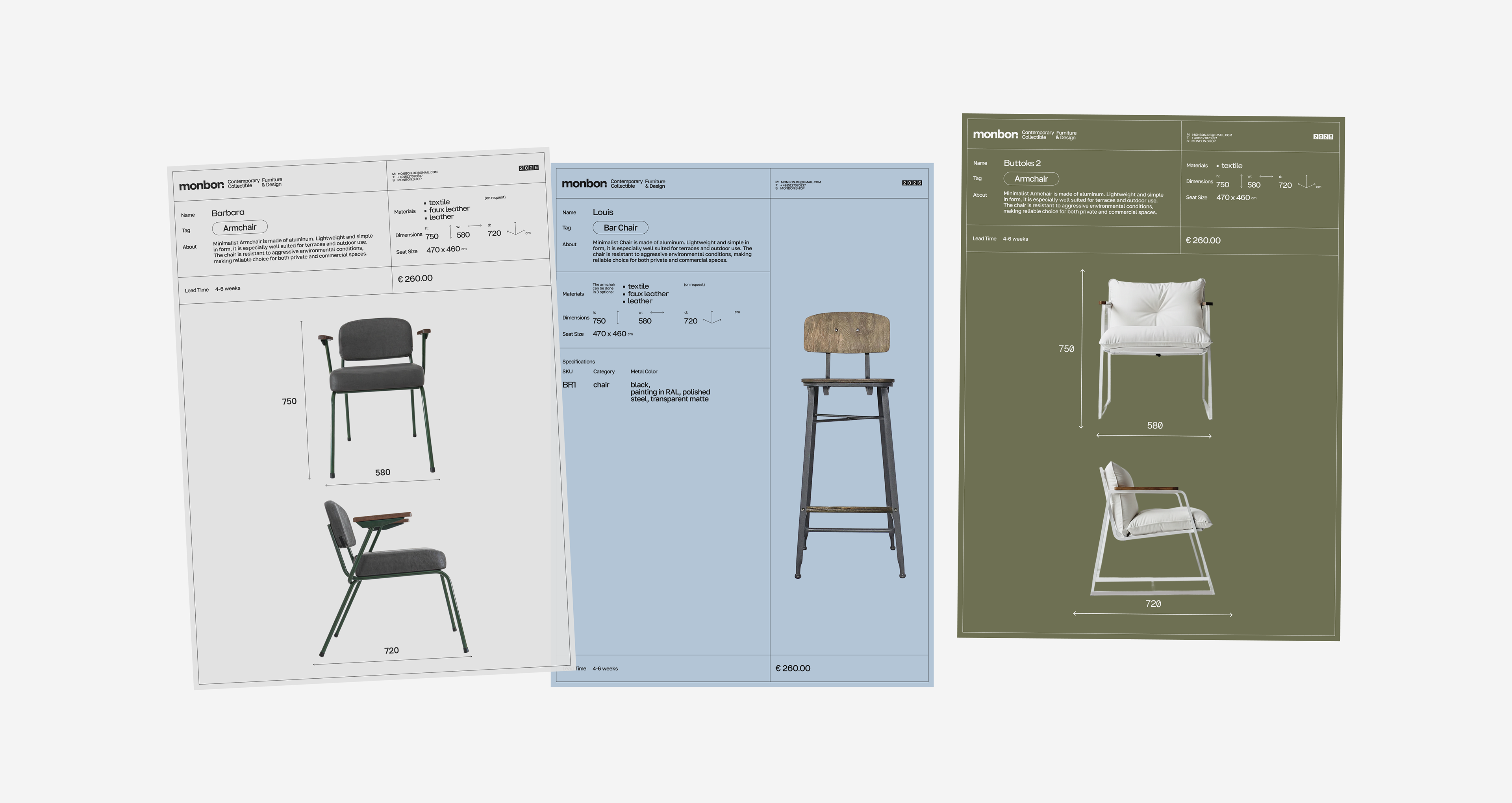
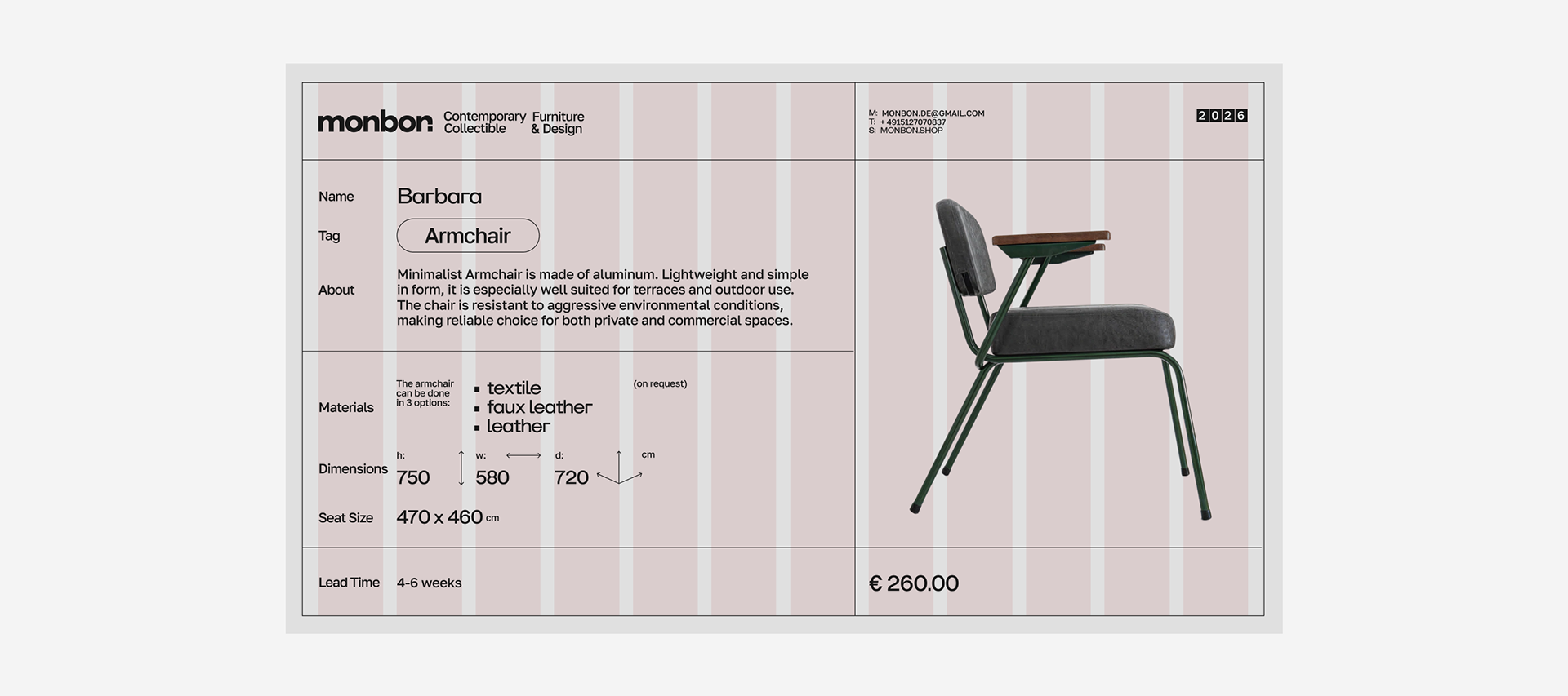
the technical tables ↑
The concept draws subtle inspiration from the Bauhaus movement. Not as a direct stylistic reference, but as a shared philosophy: functional forms, honest materials, architectural thinking, and a close connection between design and making.
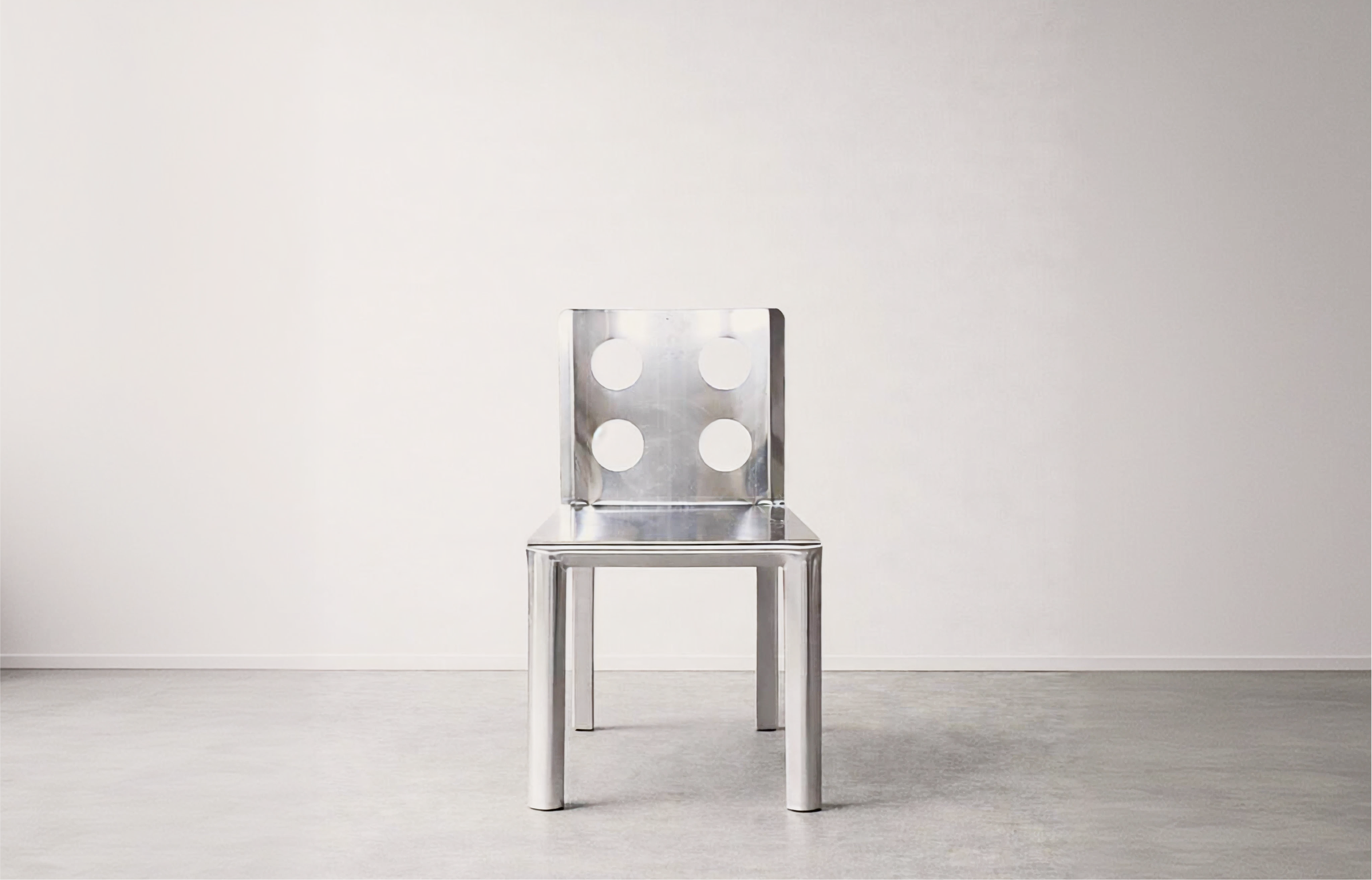
Like the workshops of the Bauhaus, MONBON’s products are created through a combination of precision, structure, and handcraft. The identity exploration resulted in four logo directions, each interpreting the brand through a different lens.

packaging ↑
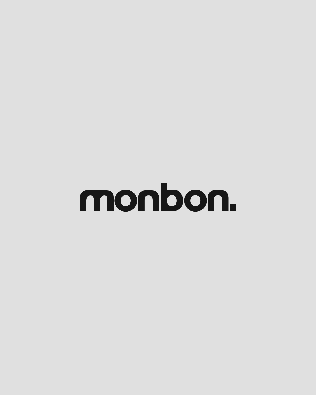
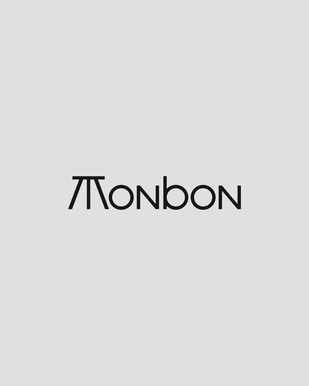
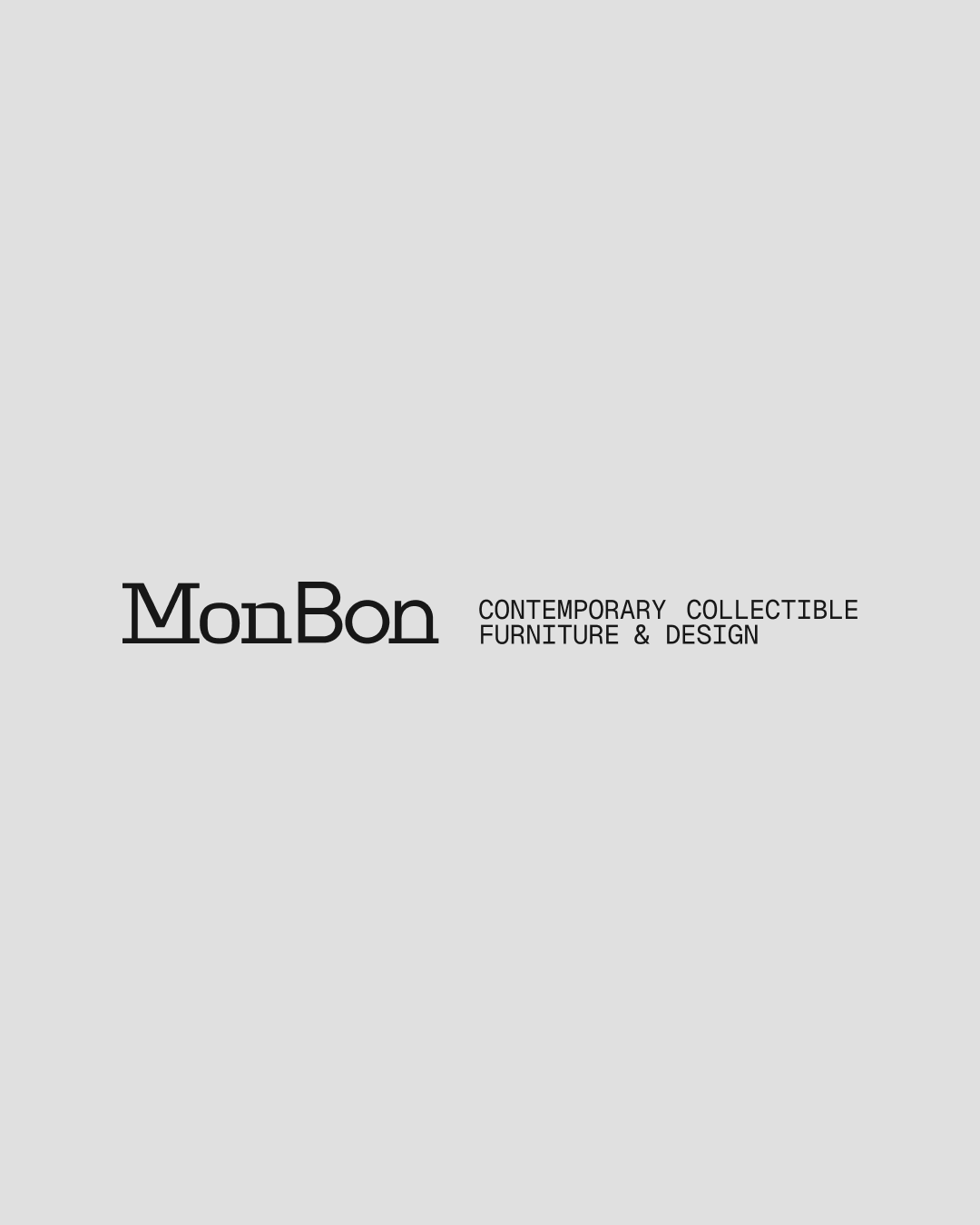
The identity exploration resulted in four distinct directions. The first reflects the brand’s architectural and structural nature, the second emphasizes craftsmanship and a human touch, the third translates furniture forms into a custom geometric lettering system, and the fourth references traditional maker’s marks, as if the name had been permanently imprinted into the material itself.
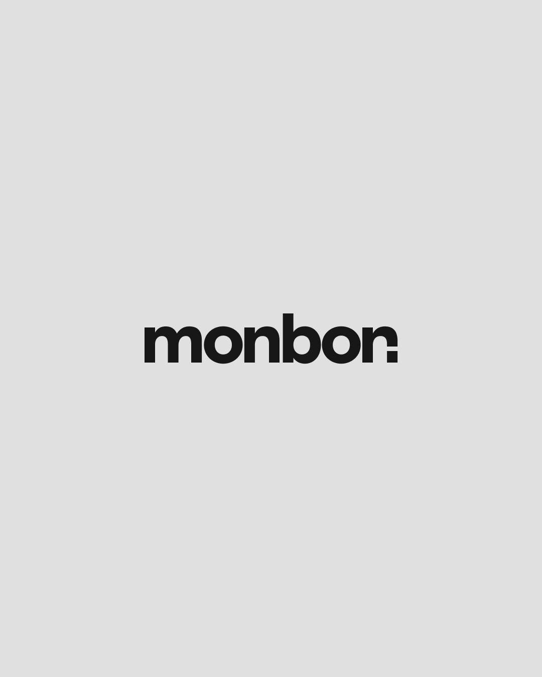
The primary version is built around an architectural grotesque typeface with a distinctive final “N”. This character was designed as an unfinished chair silhouette — a simple form that simultaneously suggests a furniture object and an invitation to continue exploring the collection.

The characteristic dot became a foundation for the broader visual language, evolving into a flexible system of markers, navigation elements, and product identifiers.
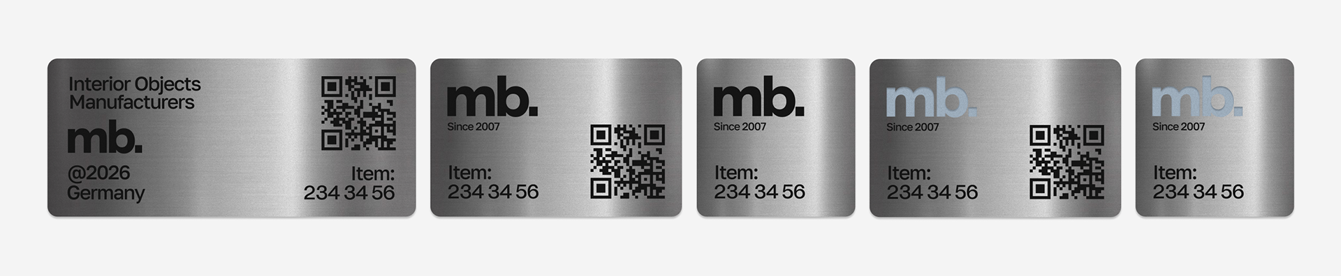
laser printing on metal ↑
The identity system is built around a restrained palette of warm neutrals. Light grey, soft stone, and deep charcoal create a calm foundation.


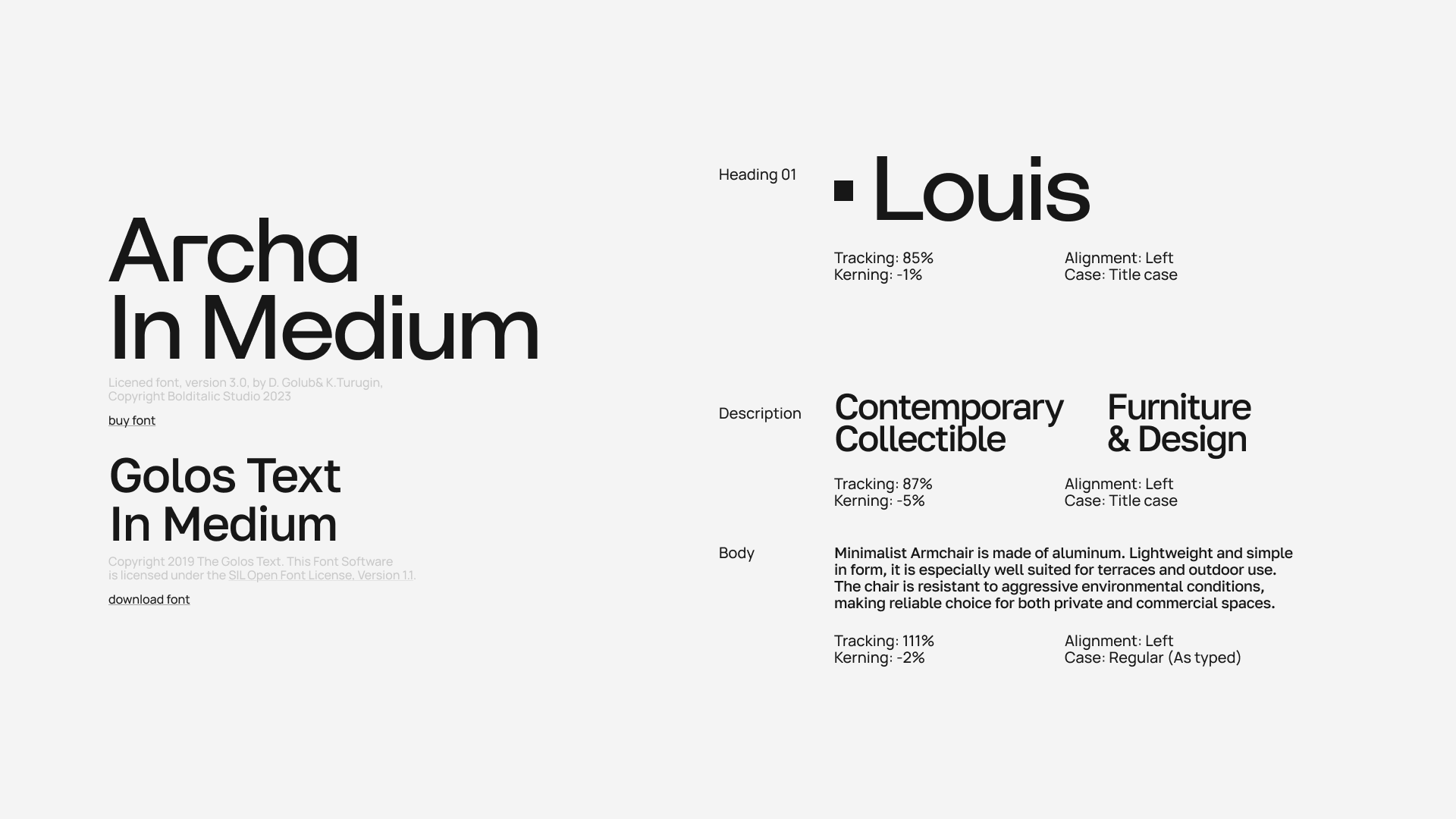
Archa serves as the primary typeface, combining constructivist influences with the heritage of early grotesques. Its geometric forms reinforce the brand’s architectural character, while Golos Text is used for technical and supporting information.
The signature dot extracted from the logo becomes an independent graphic element throughout the identity. Used as an accent, navigation marker, and informational cue, it creates a subtle yet recognizable connection between content and brand. While a selection of muted accent tones introduces flexibility across applications and product categories.
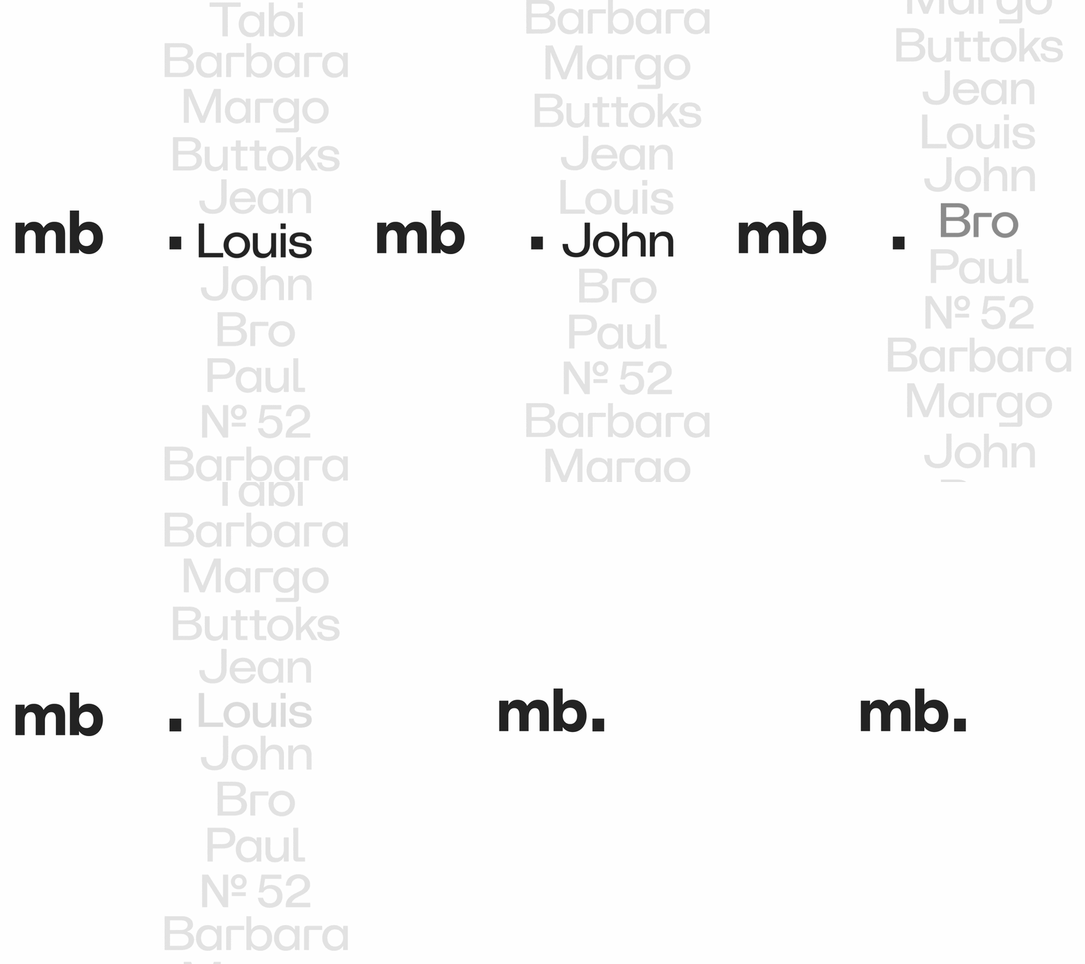
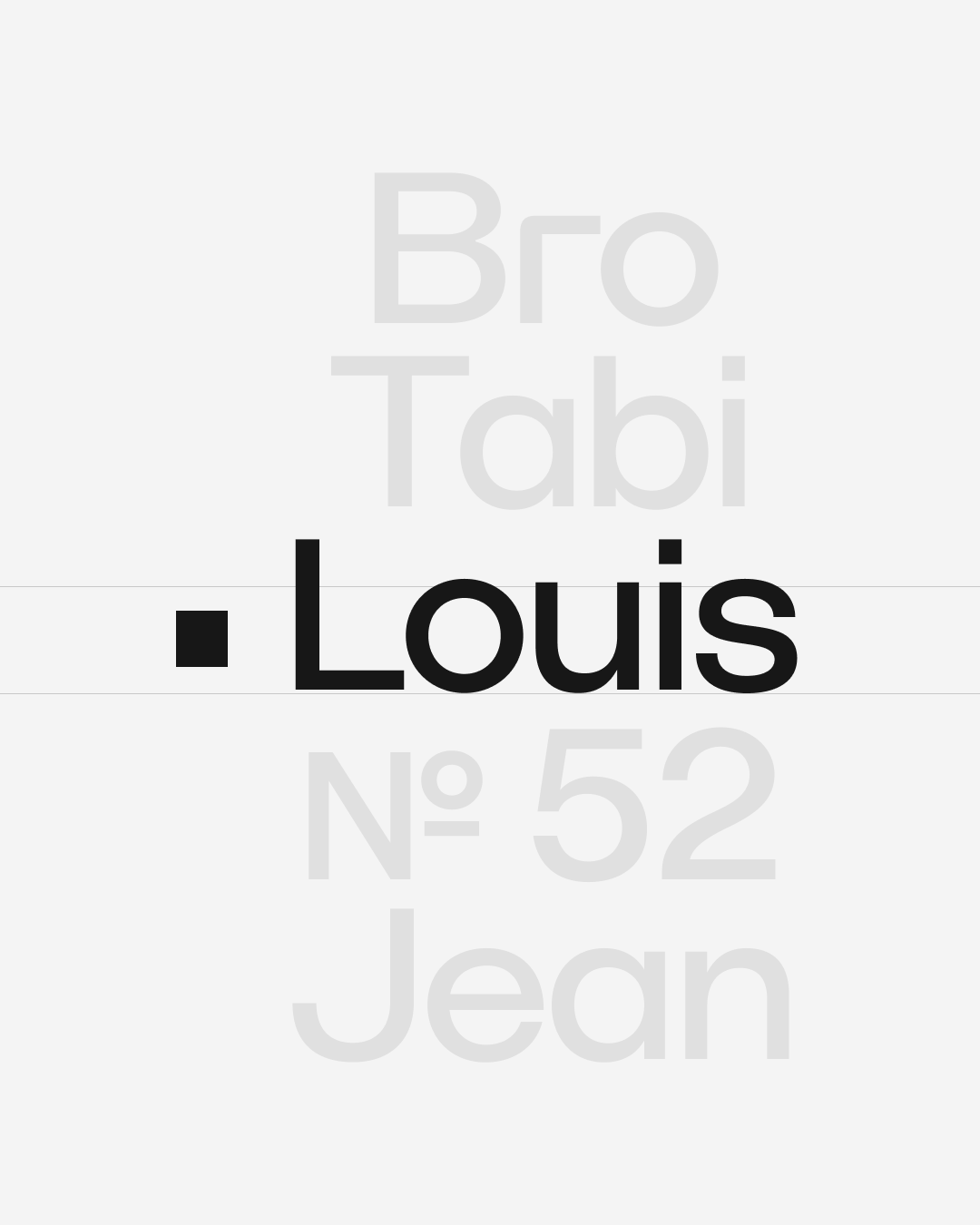
A 12-column grid system provides the foundation for all layouts, balancing generous white space with technical precision. This framework allows the identity to remain flexible while maintaining consistency across different formats.

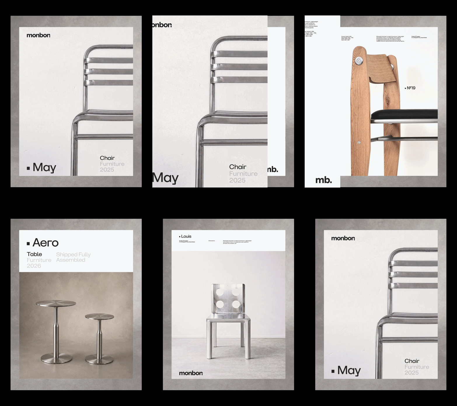
An additional layer of the system is formed by technical specification tables developed for each product. Inspired by engineering archives and production documentation, these tables transform functional information into a recognizable visual asset.
Product data, dimensions, materials, and technical details coexist with object projections, creating a graphic language that feels equally suitable for catalogs, packaging, social media, and digital platforms.
The identity extends naturally into physical applications.
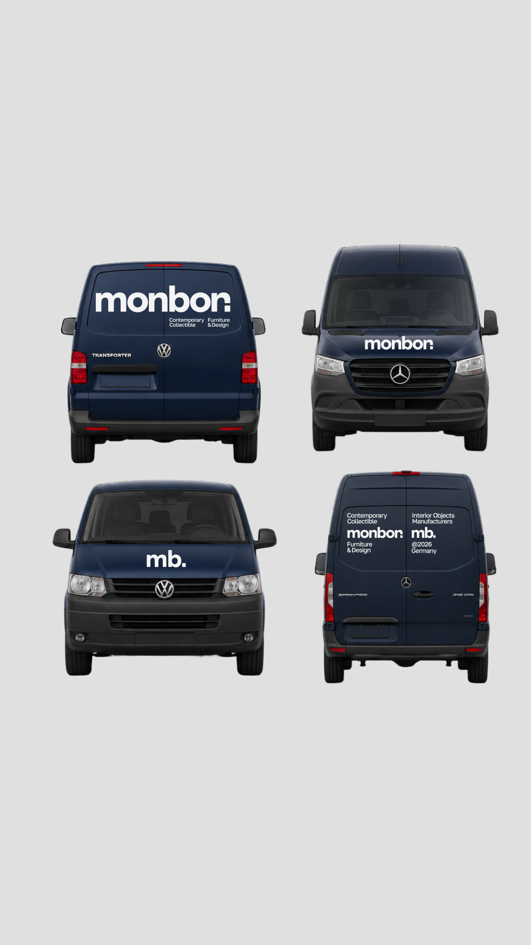
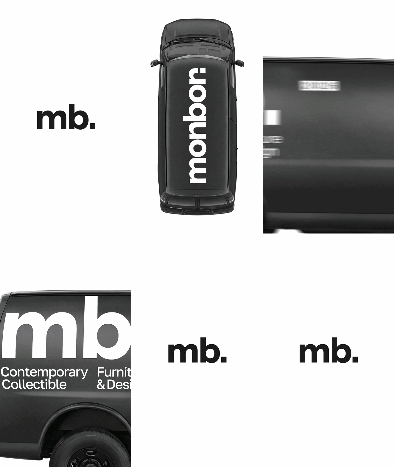
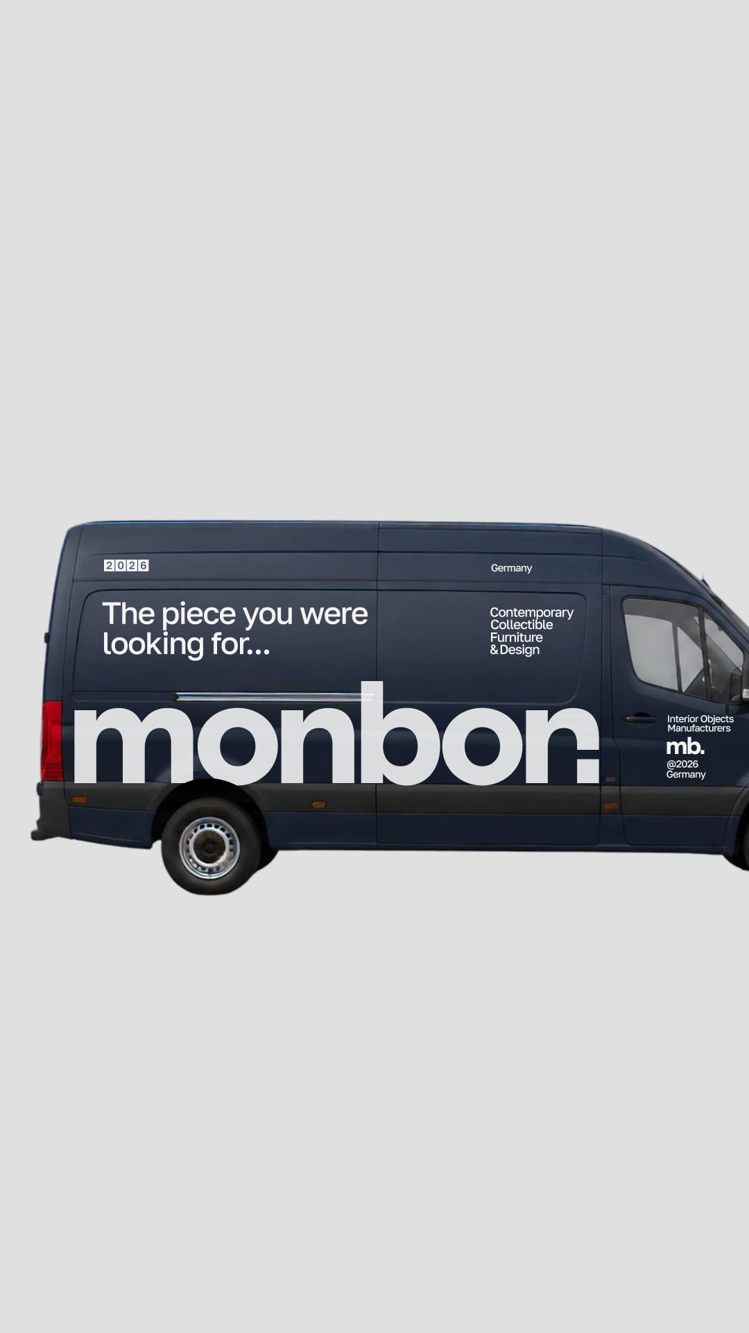
vehicle graphics ↑
Metal plates, laser-engraved markings, and cut-through logos reinforce the connection between branding and manufacturing, turning the identity into a tangible part of every object.
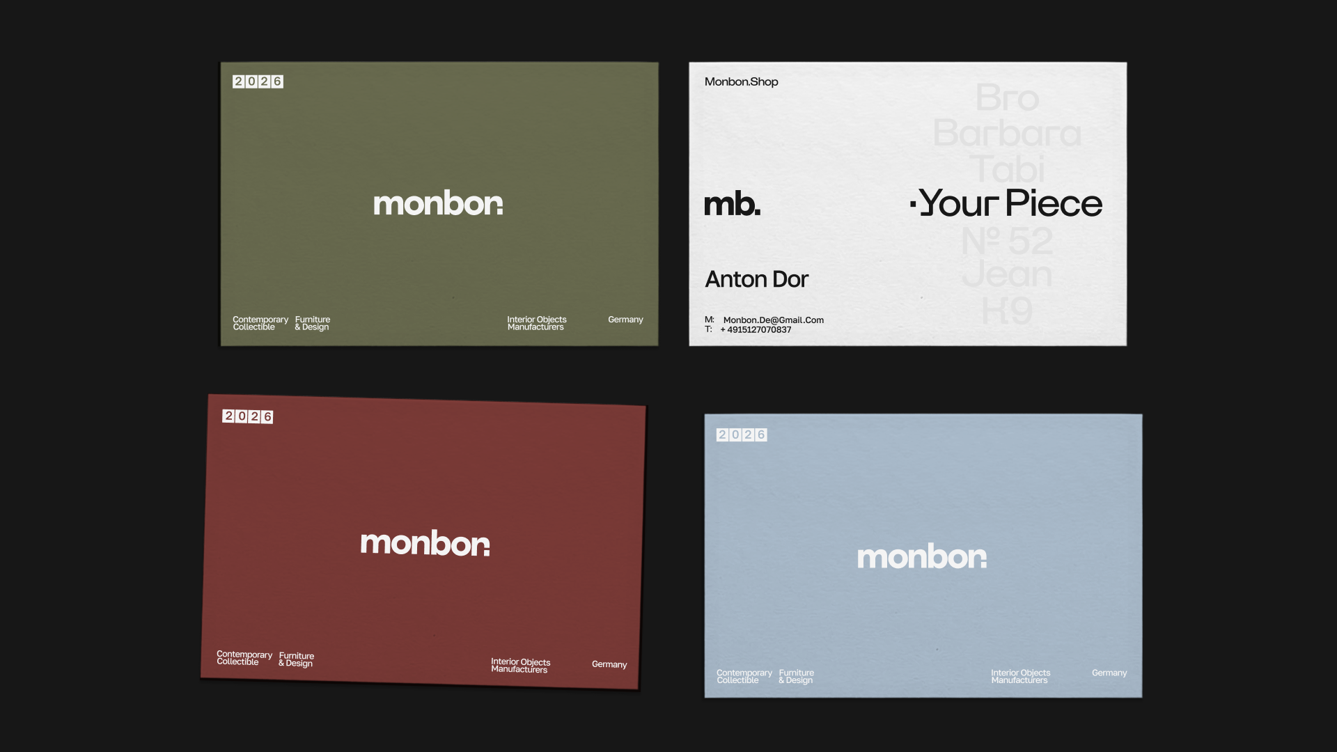
business cards ↑
MONBON is a brand built around contemporary furniture, collectible interior objects, and thoughtful production. The visual identity reflects the same values: structure, clarity, craftsmanship, and timeless simplicity.


↓ project team