Prosvet | Cafe & Bakery
2025 | 128 sq.m
Architects: Valeria Dzhigil, Ekaterina Bologova, Aleksandra Kabashnaya
Visualizations: Polina Dyachenko
Photos by: Varvara Toplennikova
Visualizations: Polina Dyachenko
Photos by: Varvara Toplennikova
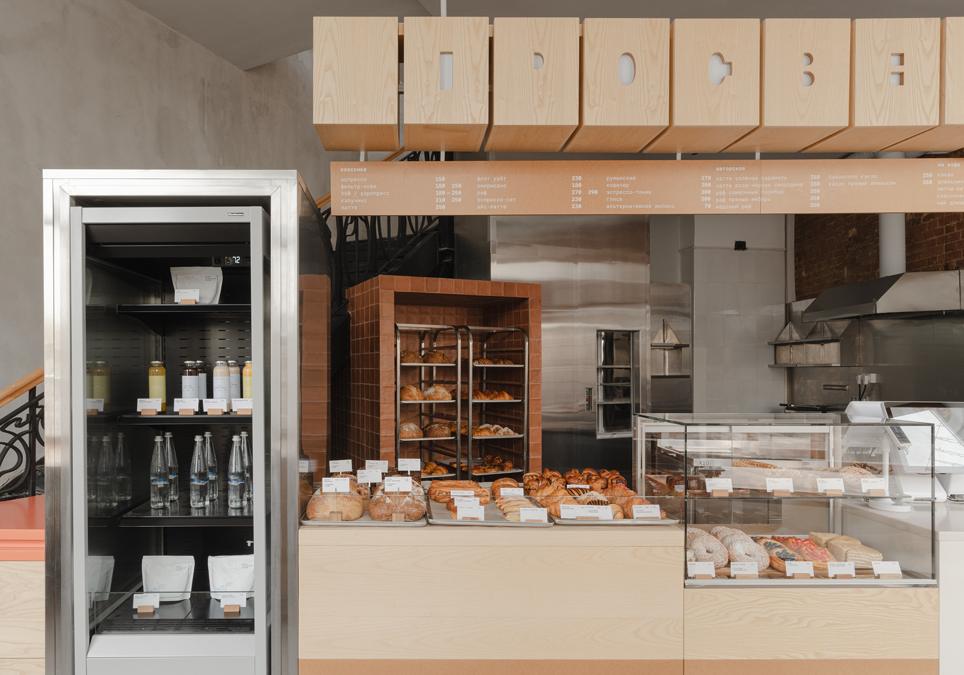
The story of Prosvet began with a simple request: to create a coffee shop and bakery where the idea of craftsmanship is not just a decorative layer, but the core essence. Our goal was to design a place with
character—rooted in the context of its location, but not stuck in the past.
character—rooted in the context of its location, but not stuck in the past.
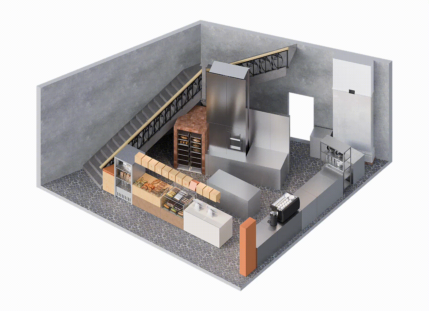
axonometry
We aimed to develop a visual language of our own, one that blends modernity, simplicity, and respect for the existing space.
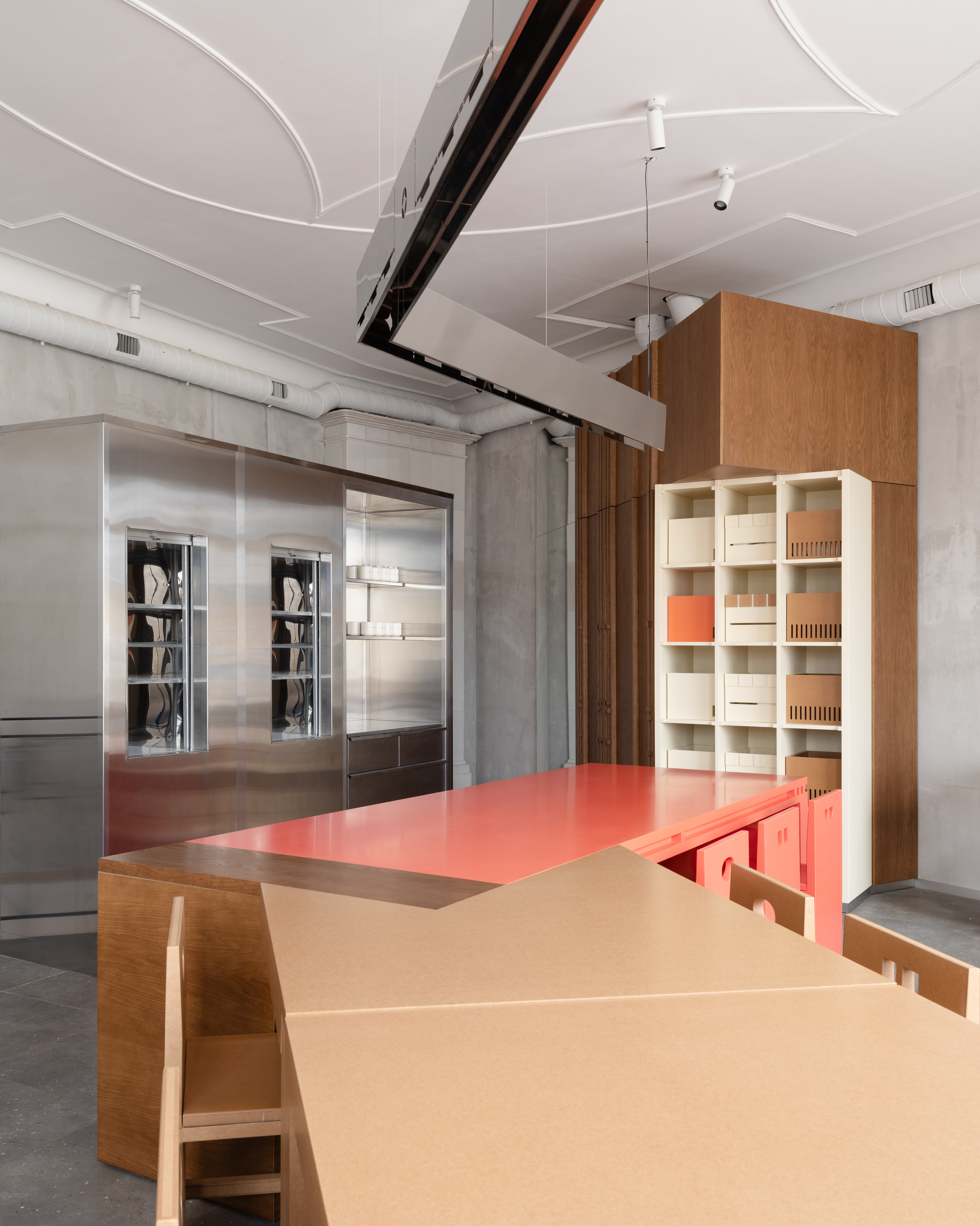
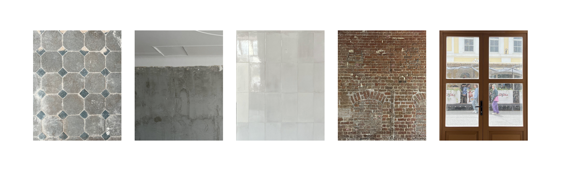
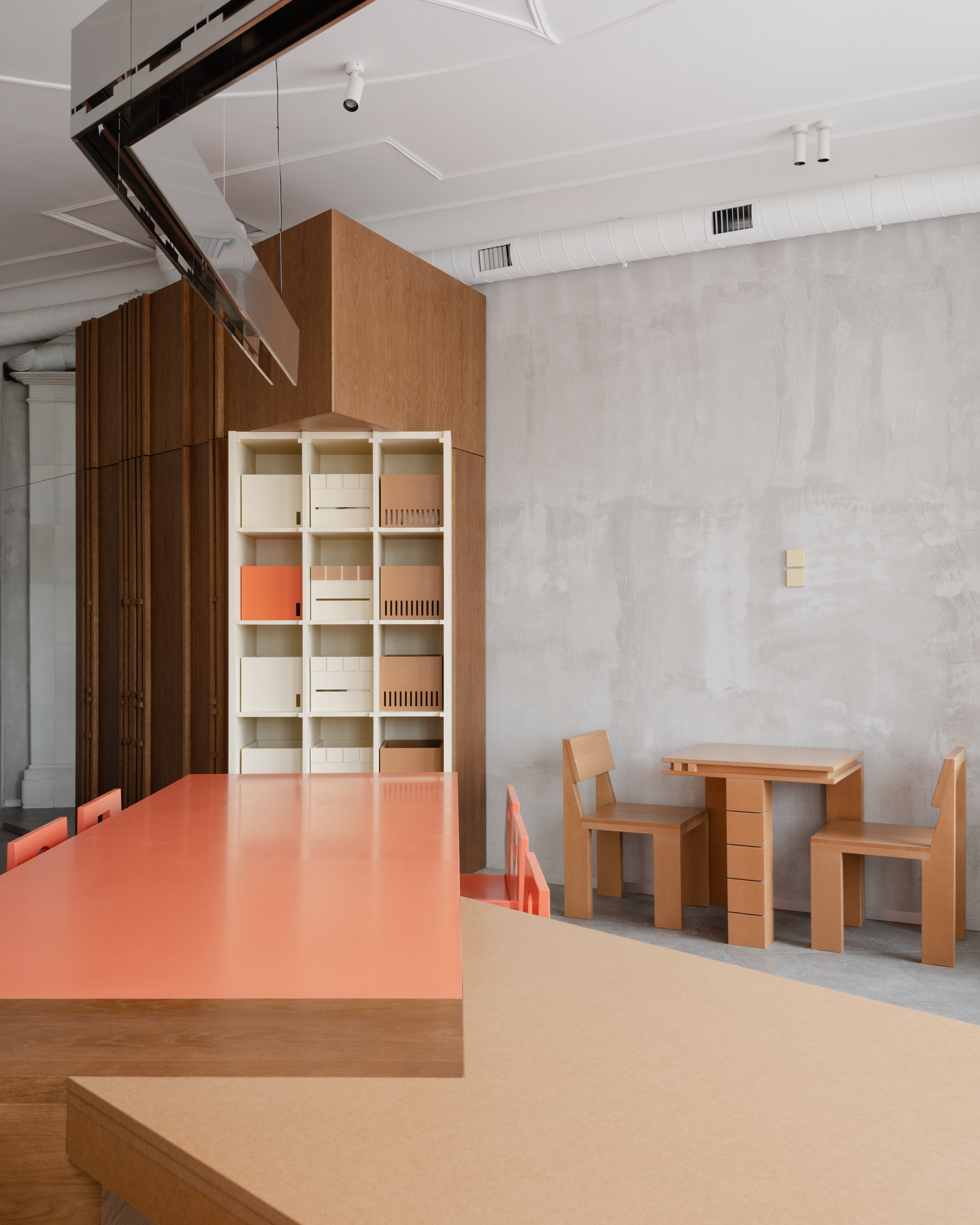
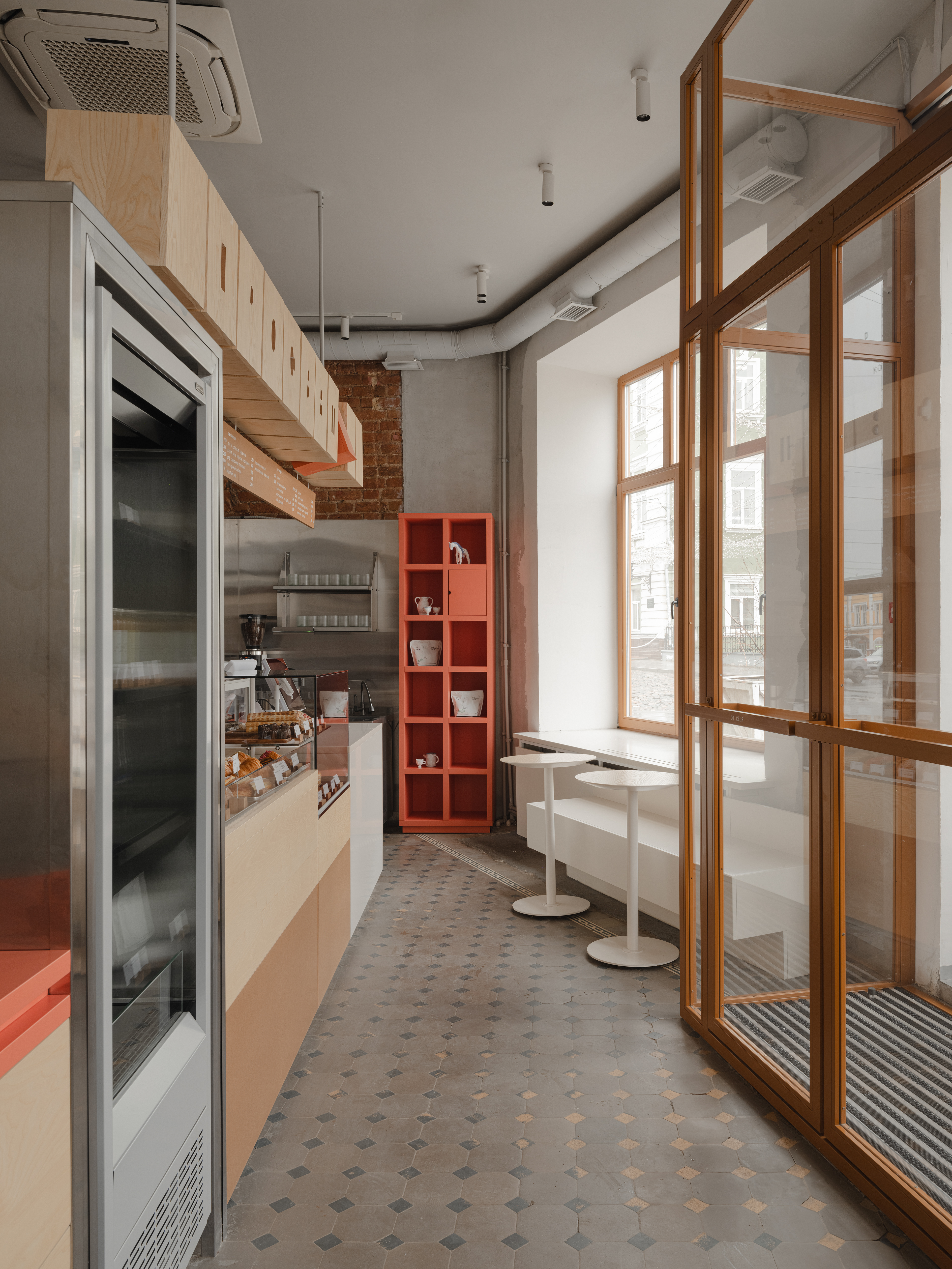
The concept was built around working with the architectural environment as it is. We embraced the uneven walls, rough plaster, exposed brick, and glazed tile. Instead of masking these textures, we carefully built
around them—adding clean, muted volumes that highlight the expressive quality of the original materials.
textures ↓
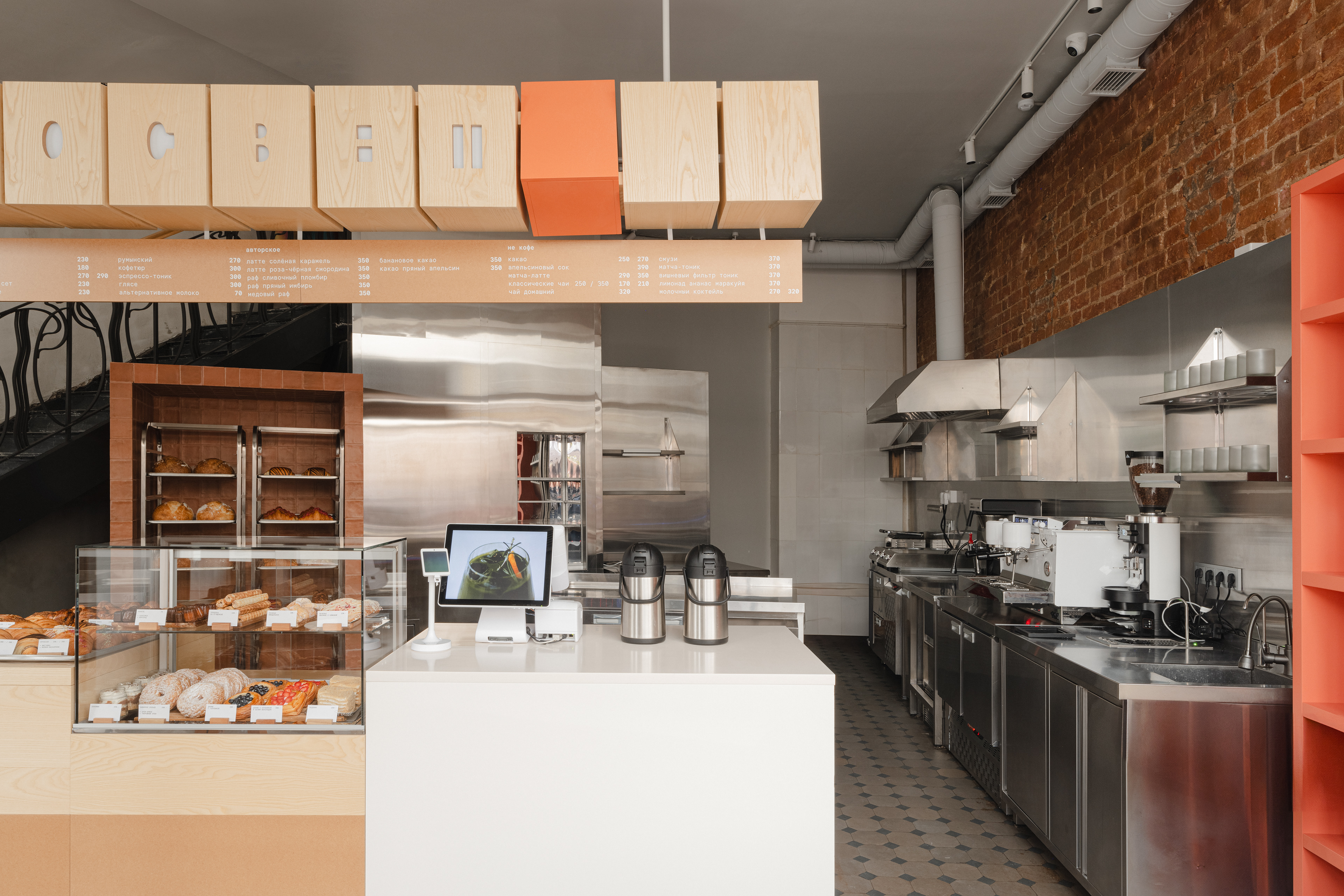
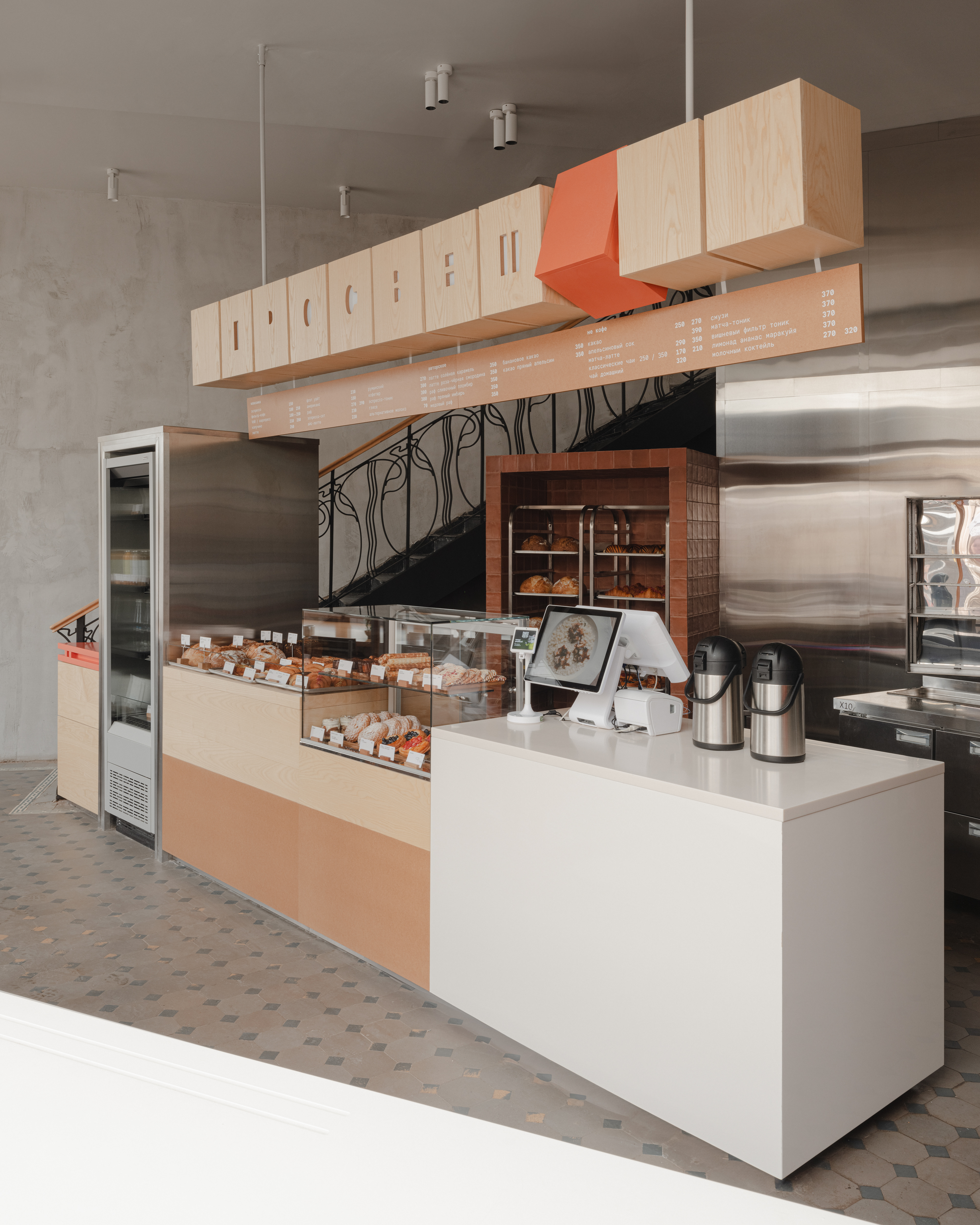
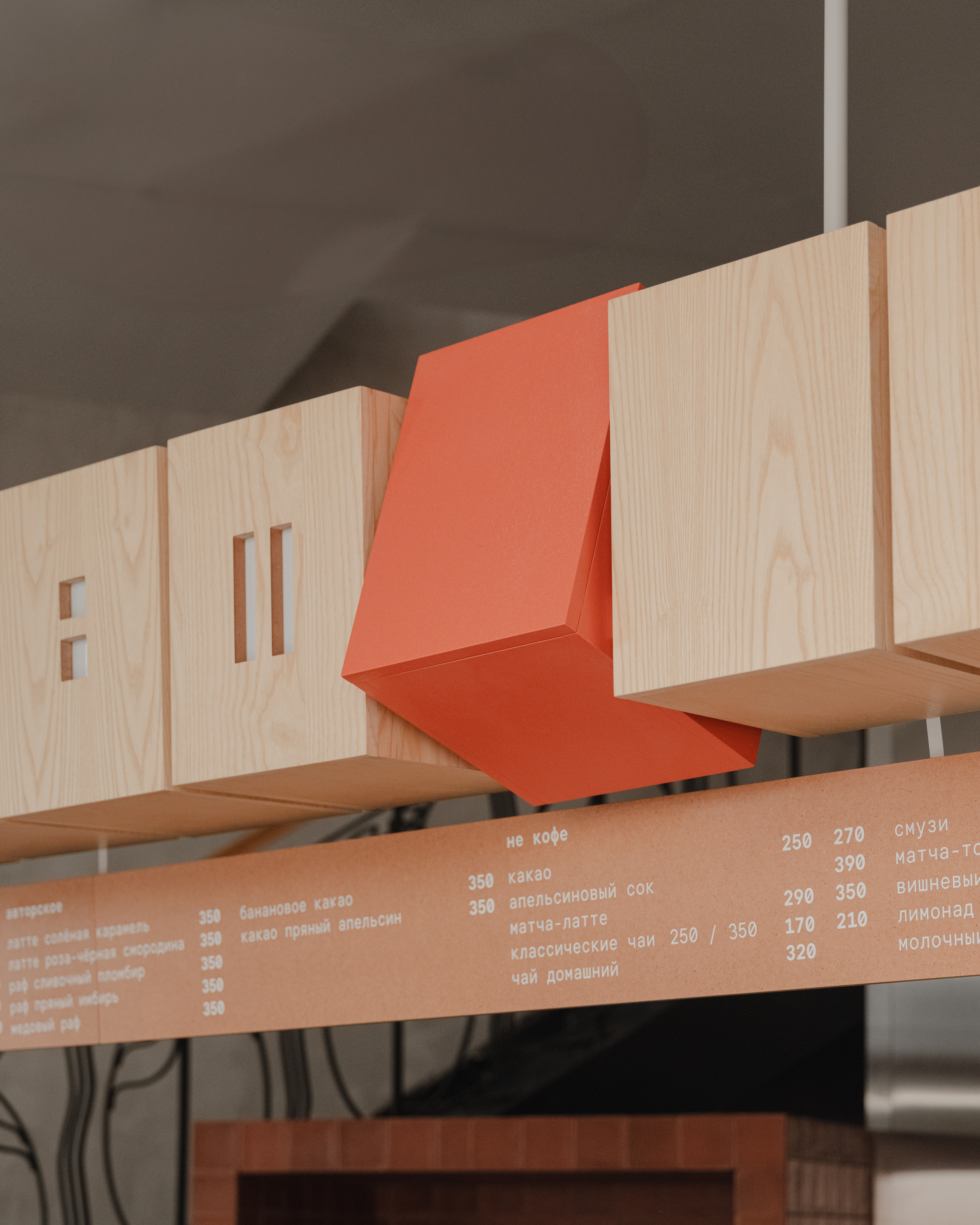
It was important not to overshadow what was already there, but to amplify it through contrast and restraint. A terracotta color became the key accent, tying together the brick, tile, and elements of the brand’s identity.
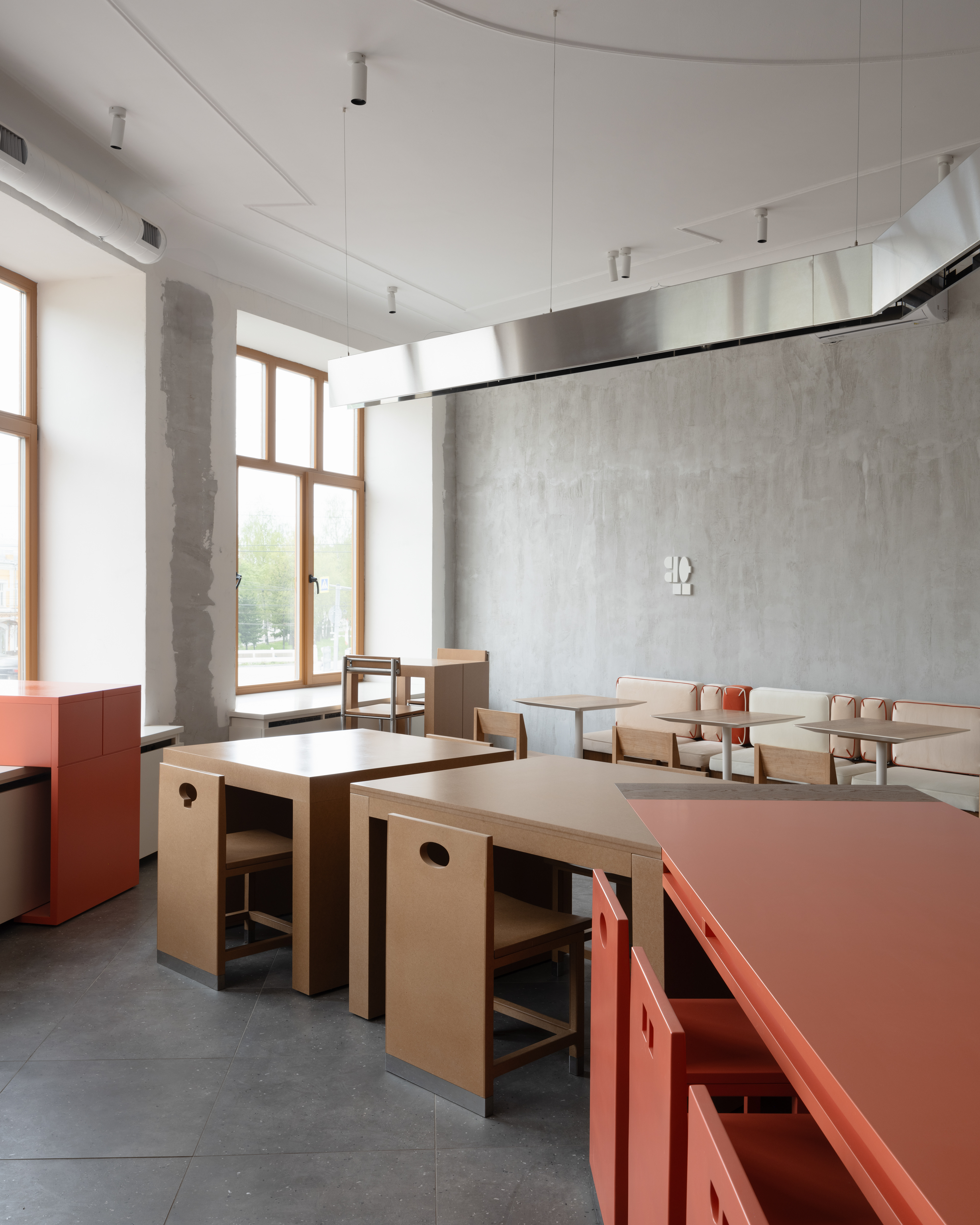
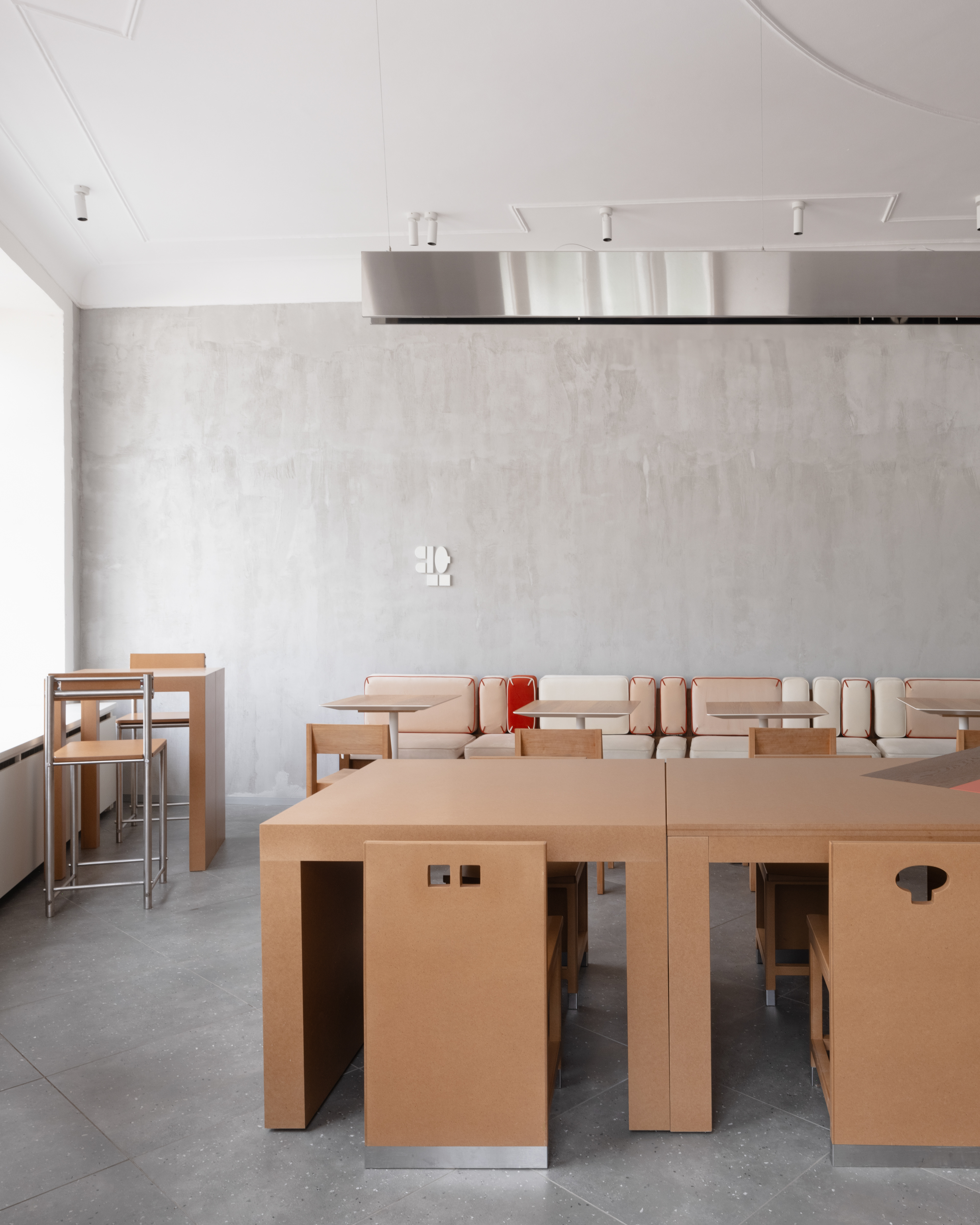
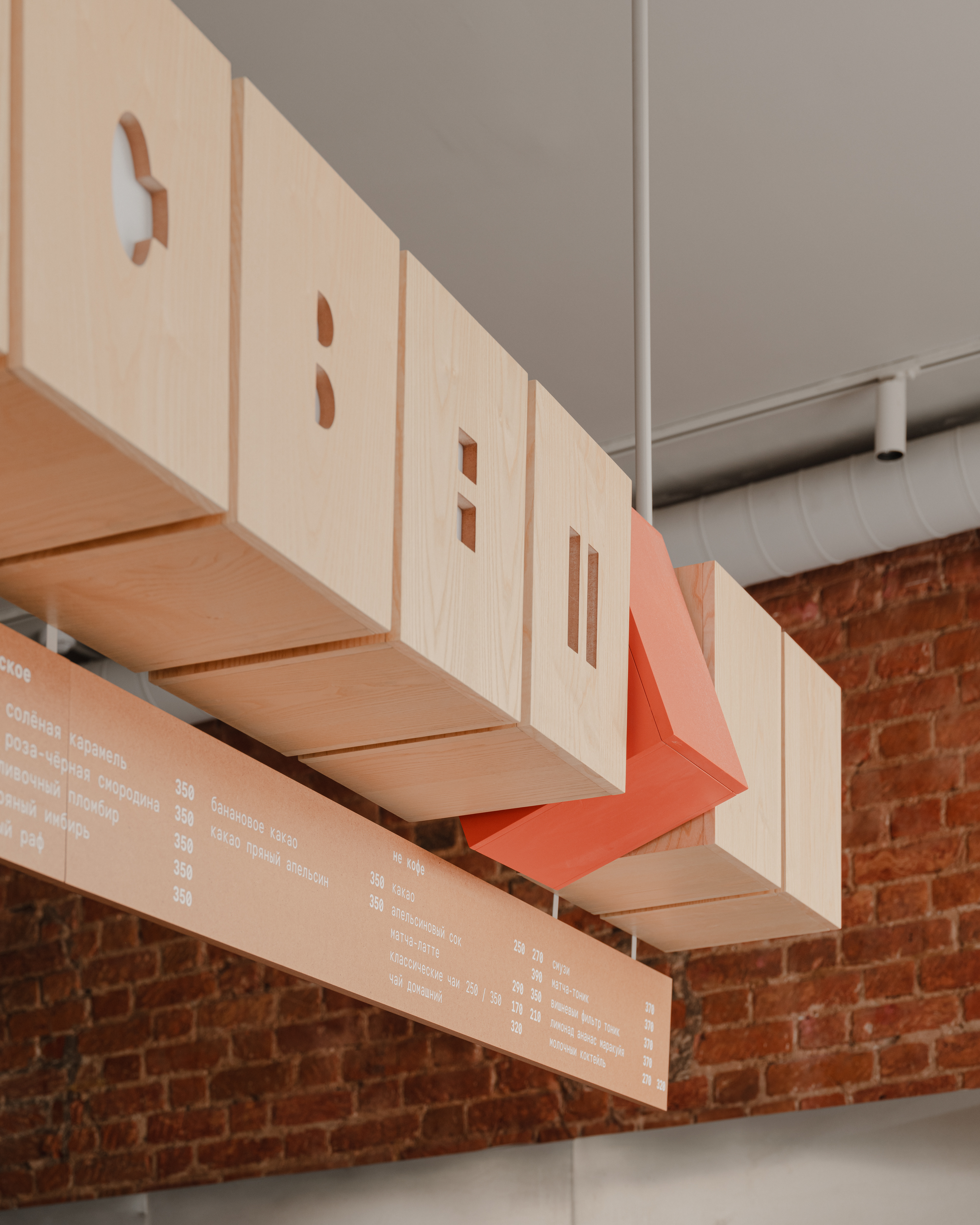
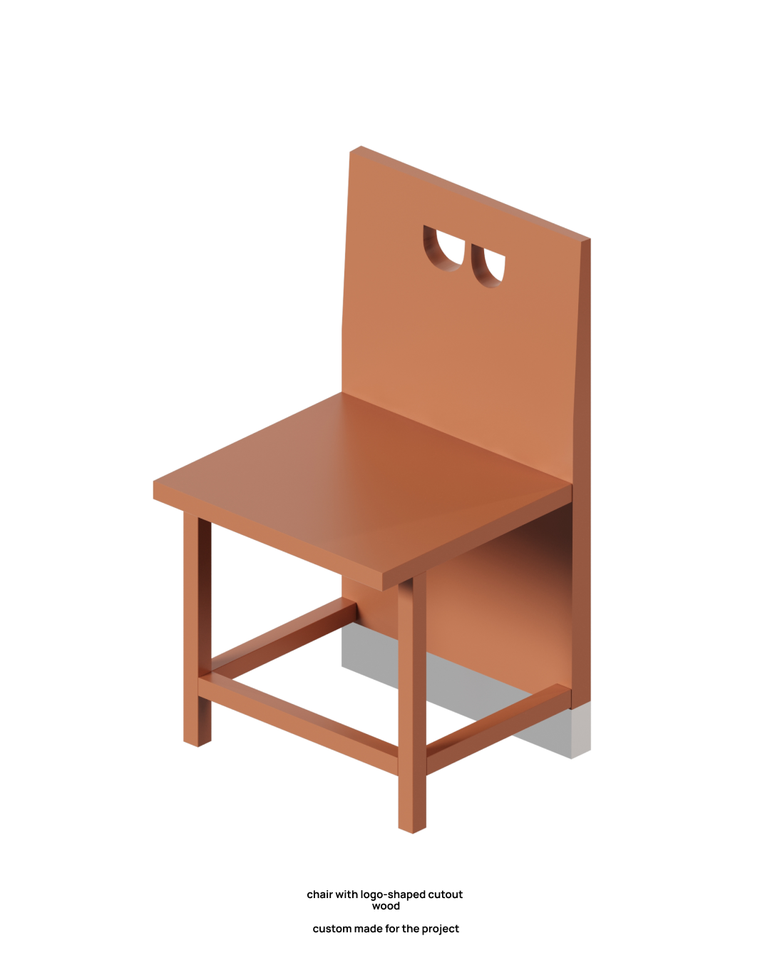
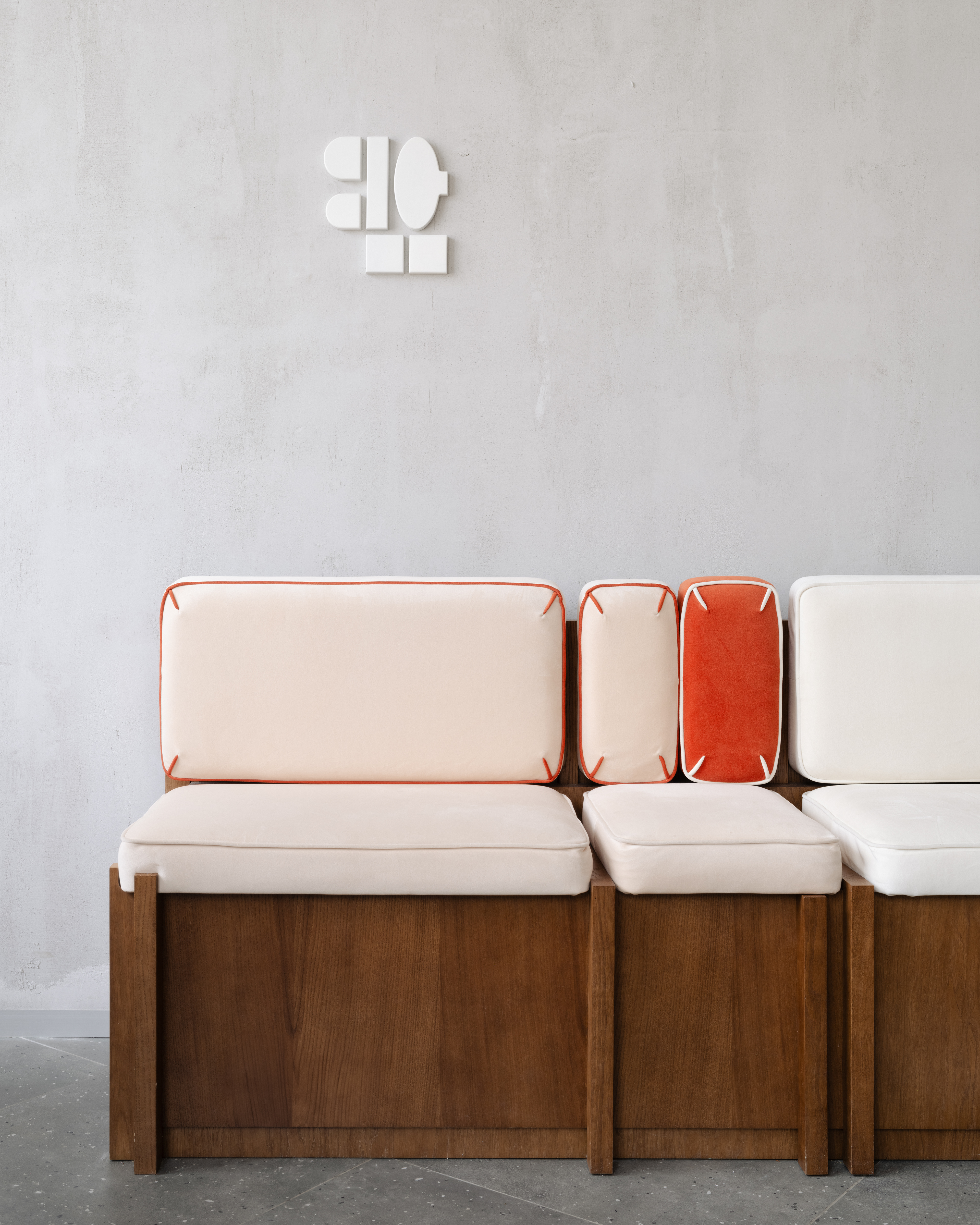
The graphic design by studio öppen became a key reference point, setting the tone and shaping the logic of the forms. We were inspired by the sharp, linear letters of the logo—like “p”, “t”, and “e”—which informed the geometry of furniture, signage, and custom structures.
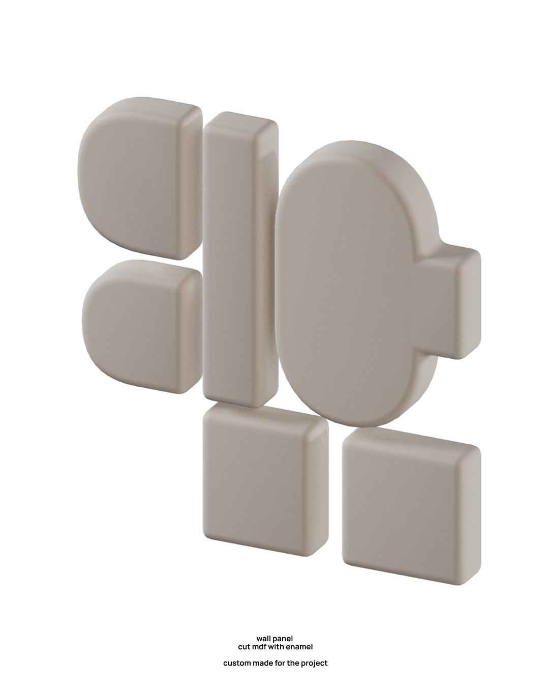
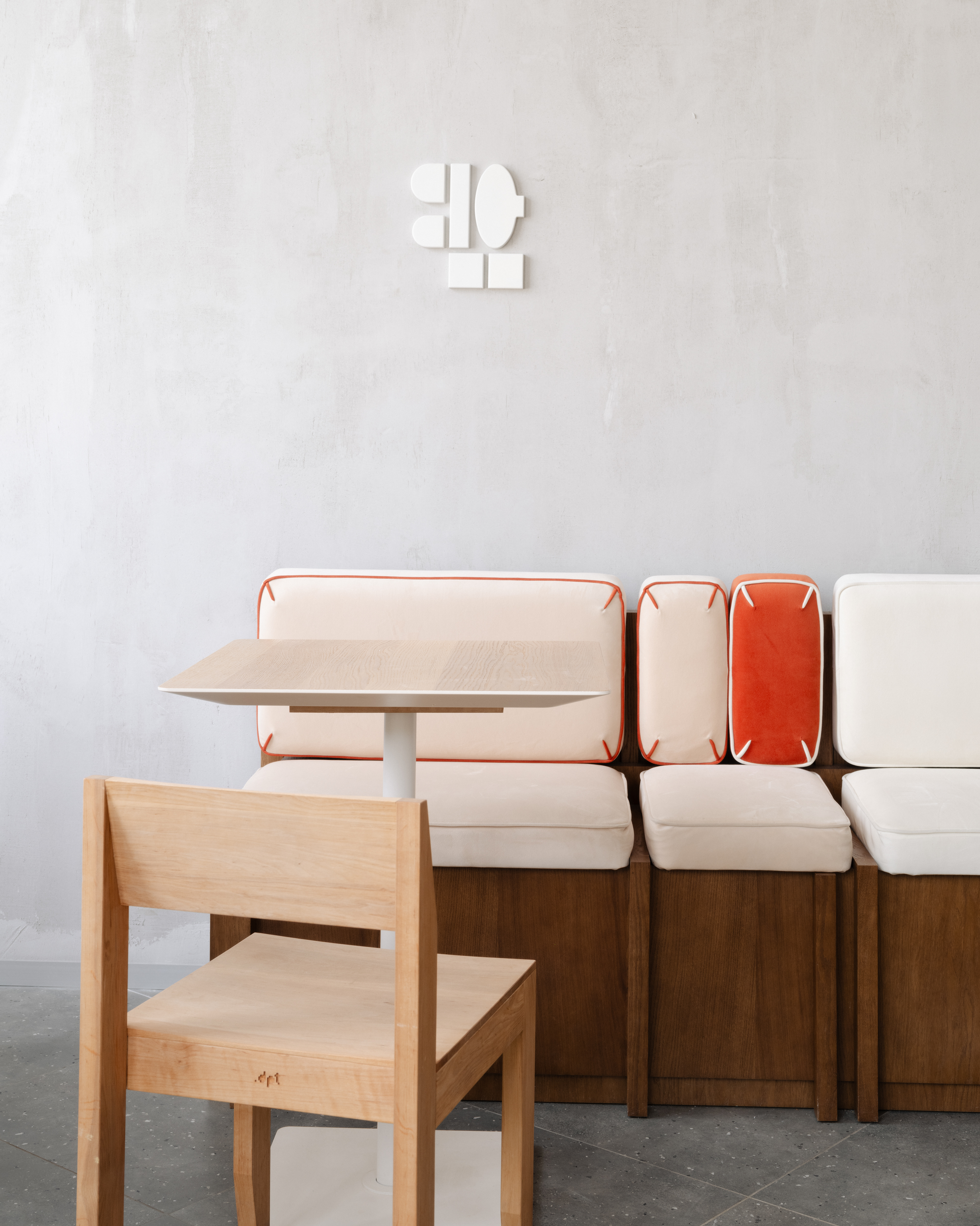
↑ wall panel
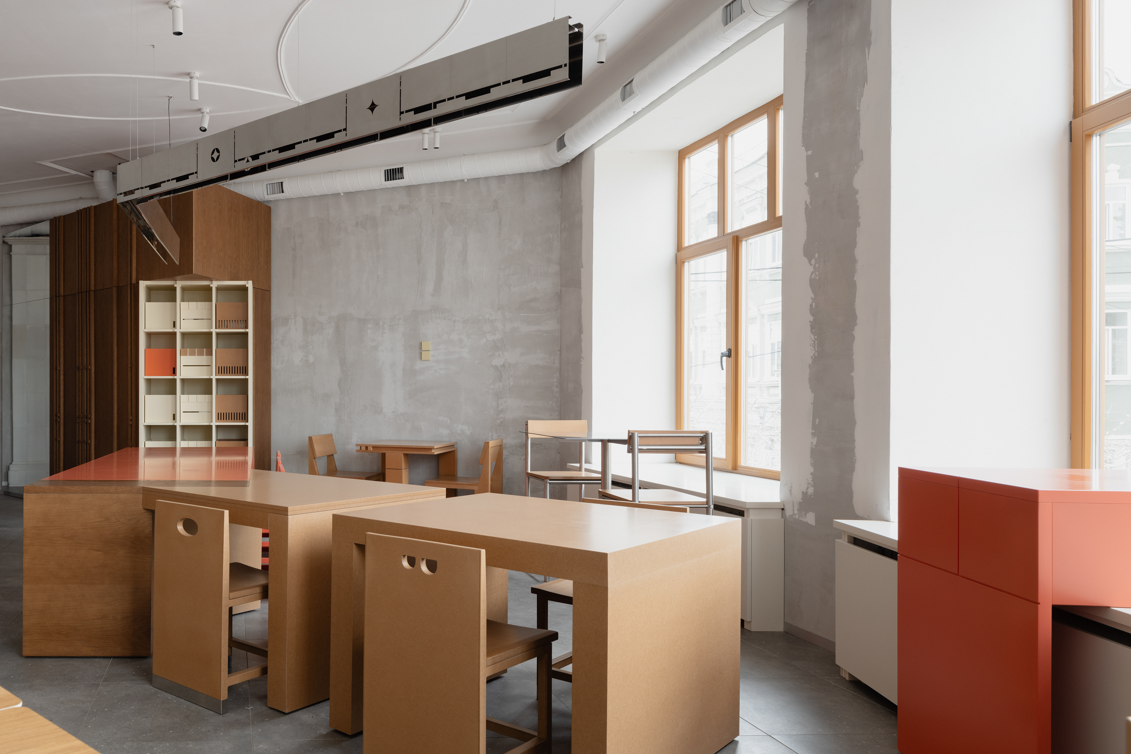
This geometry became a unifying element across interior, graphics, and even art objects.
plan ↓
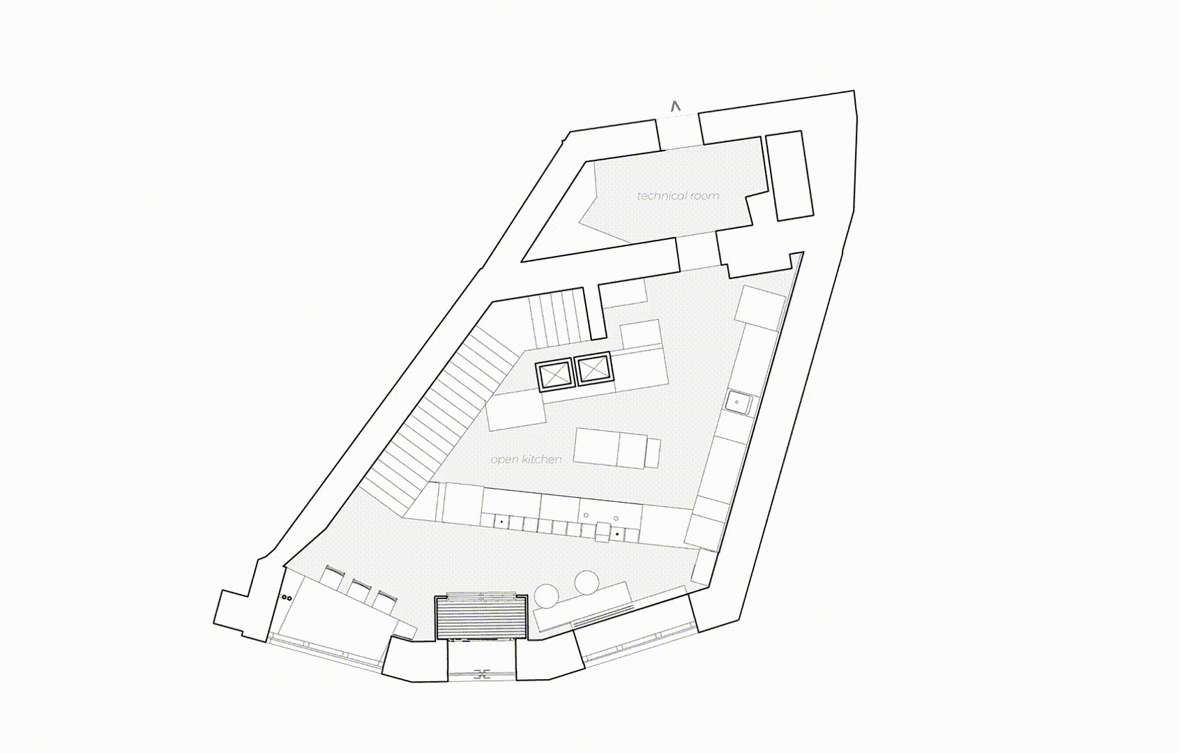
Despite the challenging floor plan, we brought clarity through a strong axial layout. This allowed for a logical flow of functional zones and a coherent spatial experience.
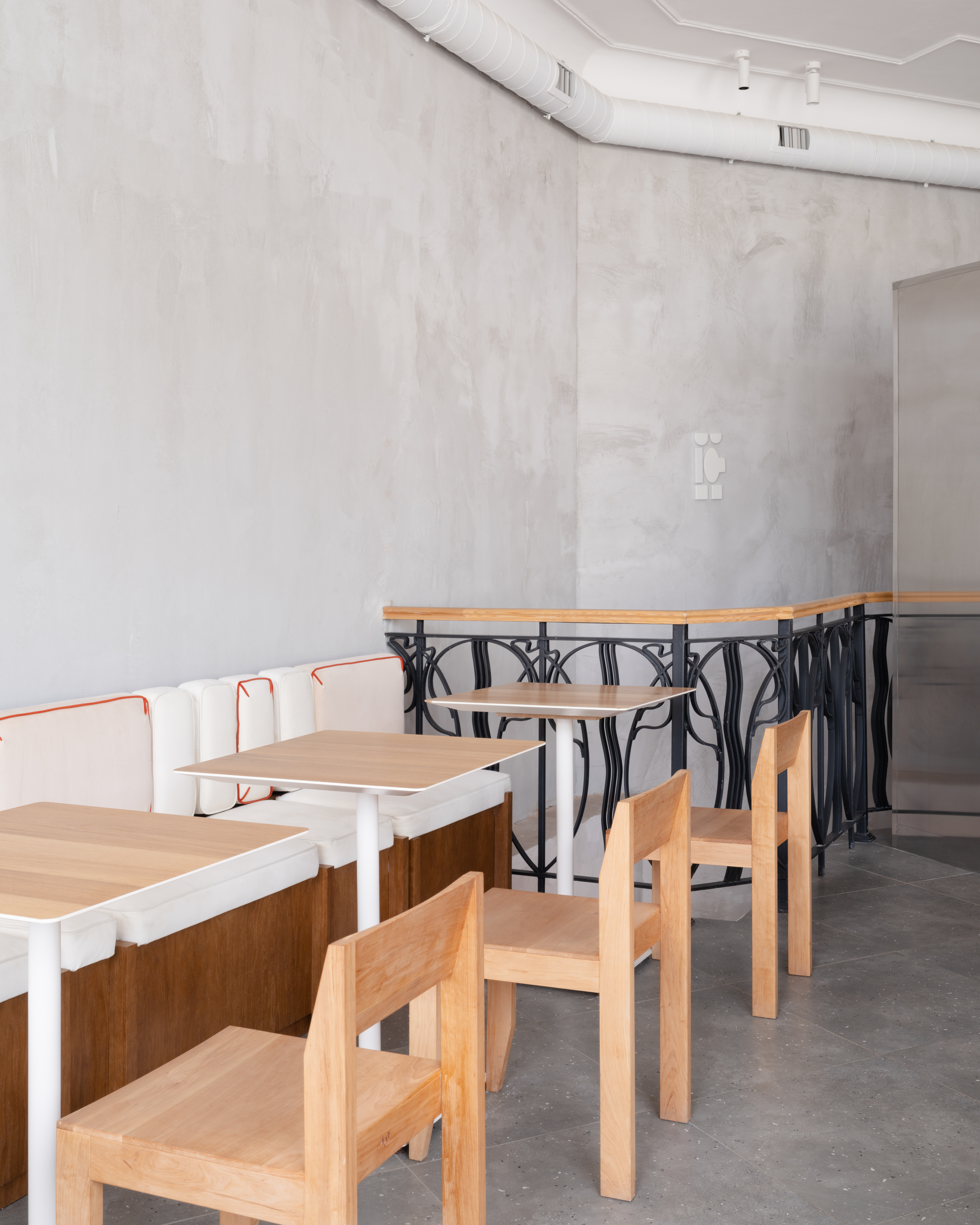
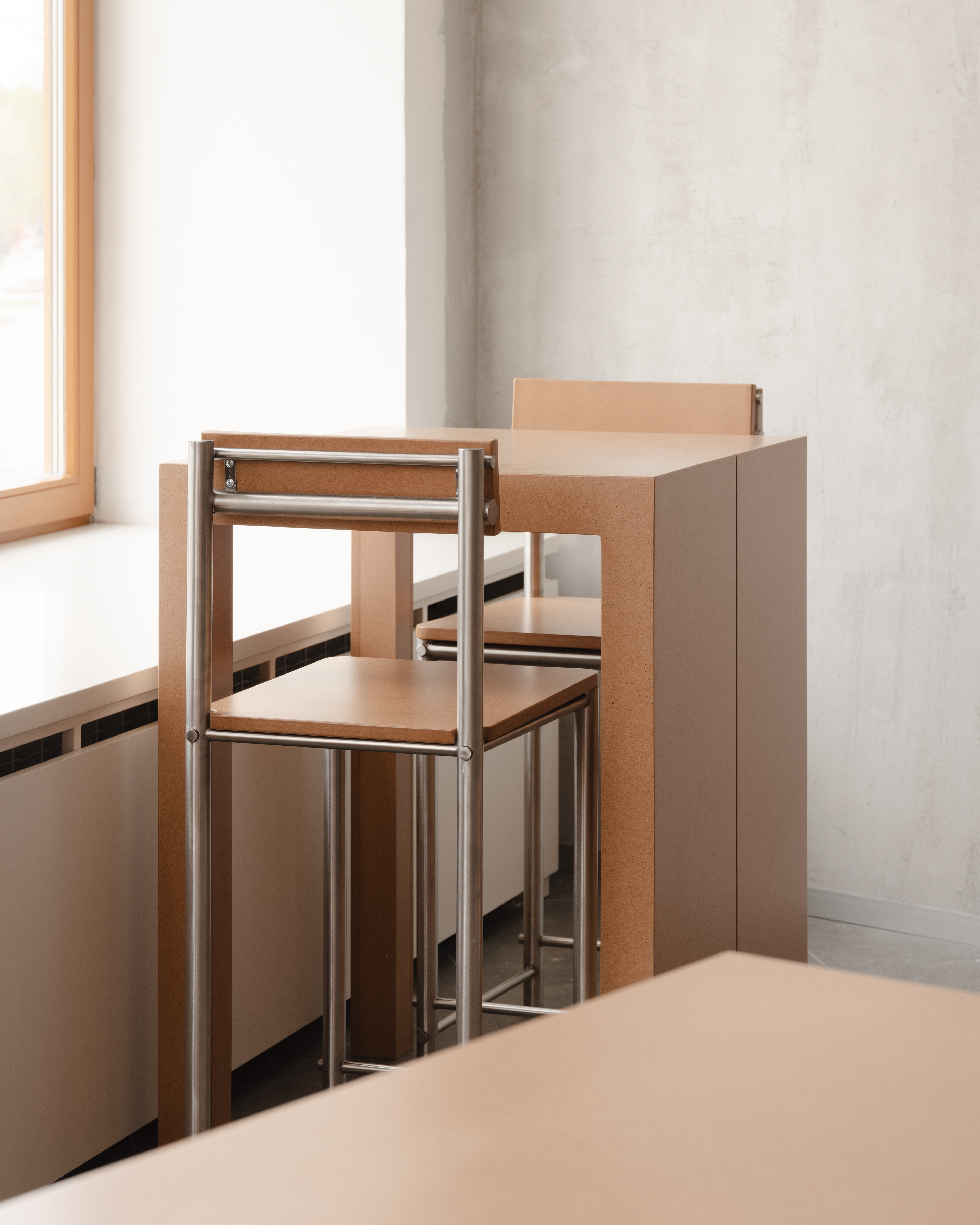
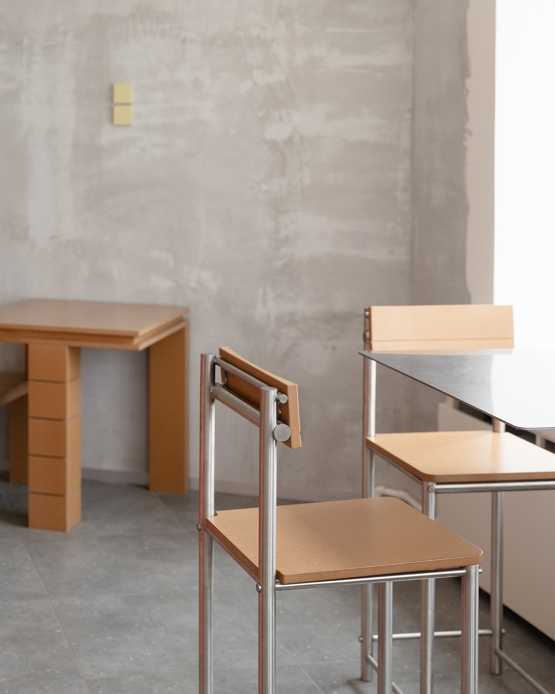
Working within an existing structure required precision and delicacy: we used 3D scanning and laser marking to anchor the furniture and fit new elements into irregular surroundings.
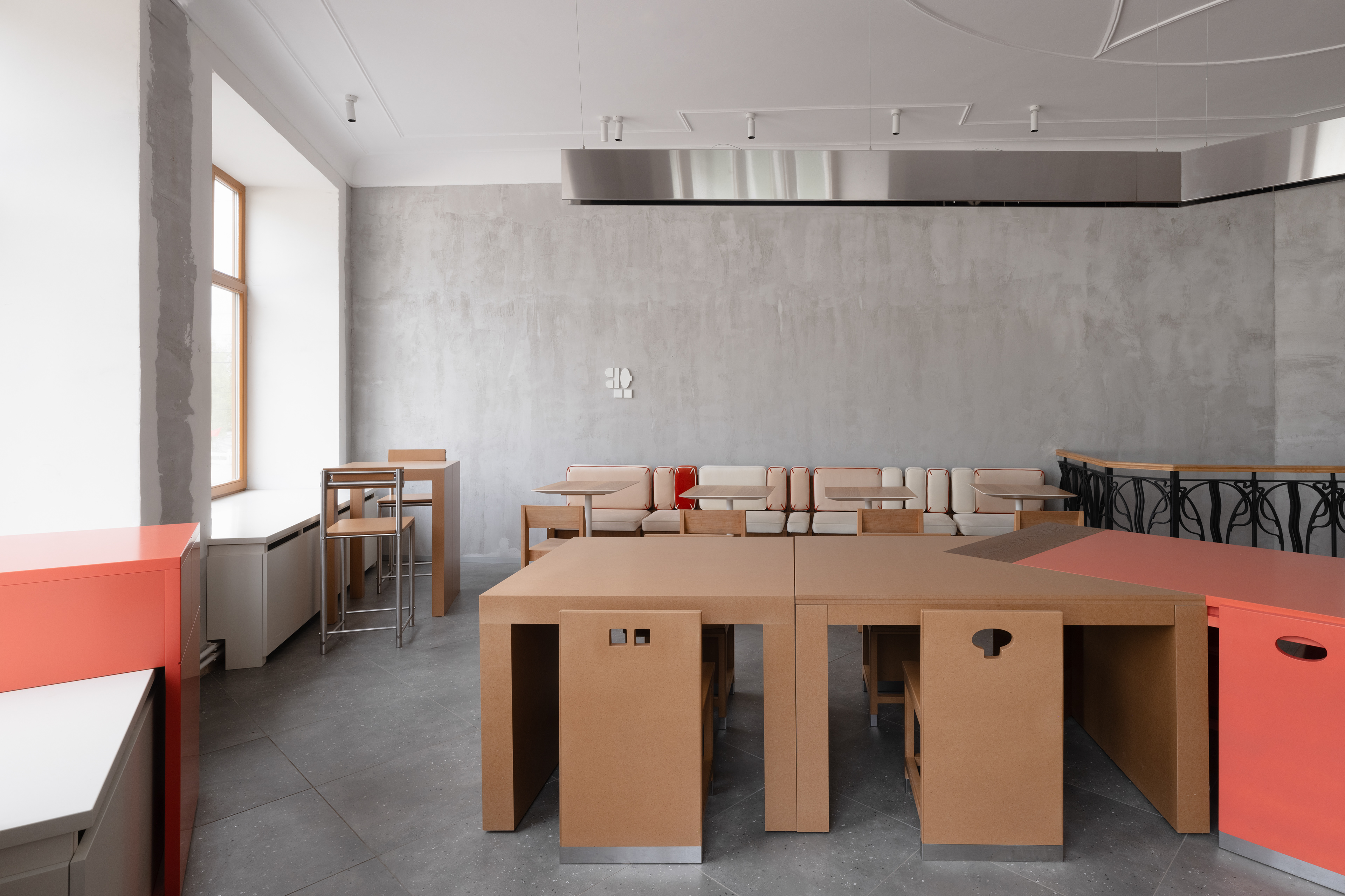
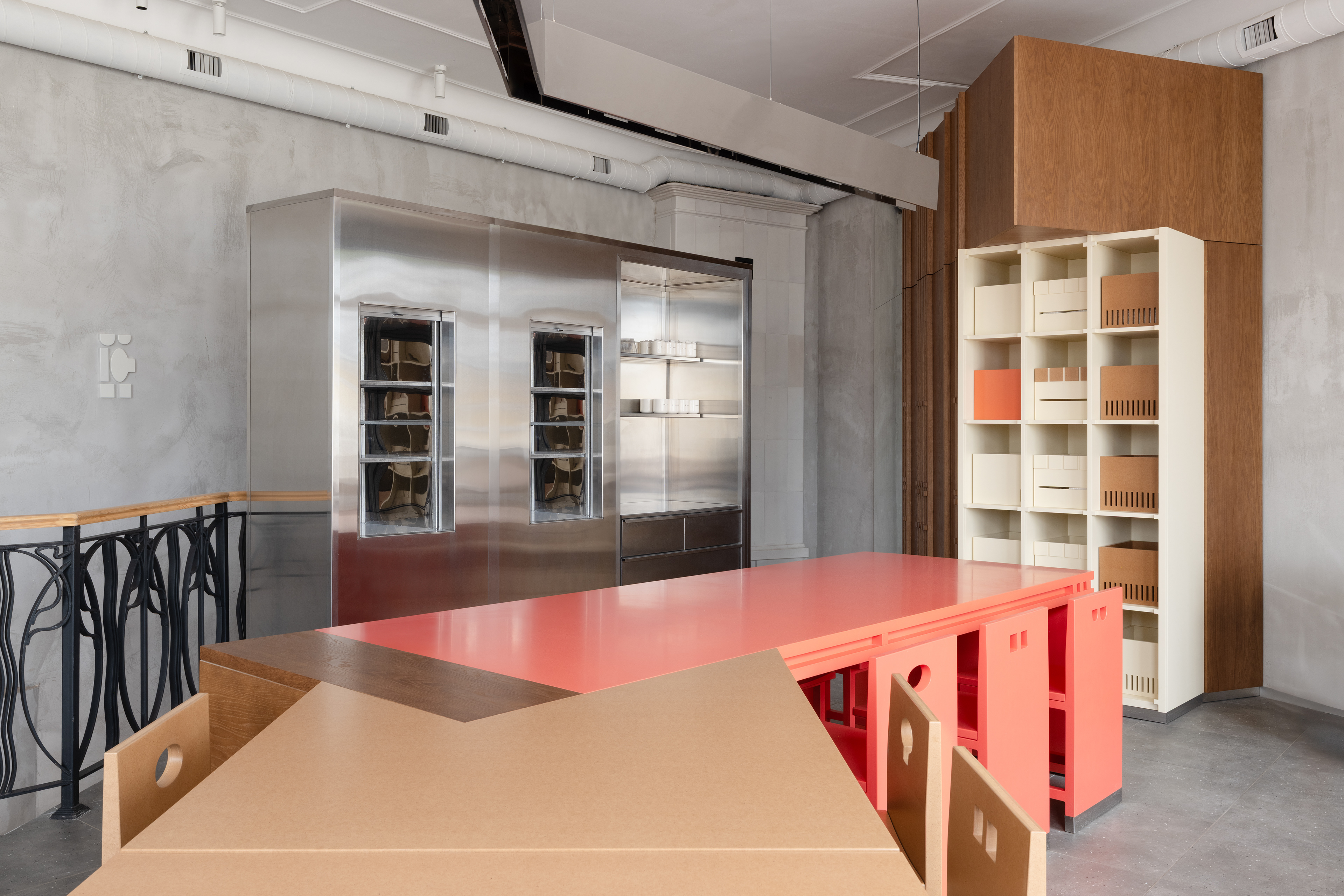
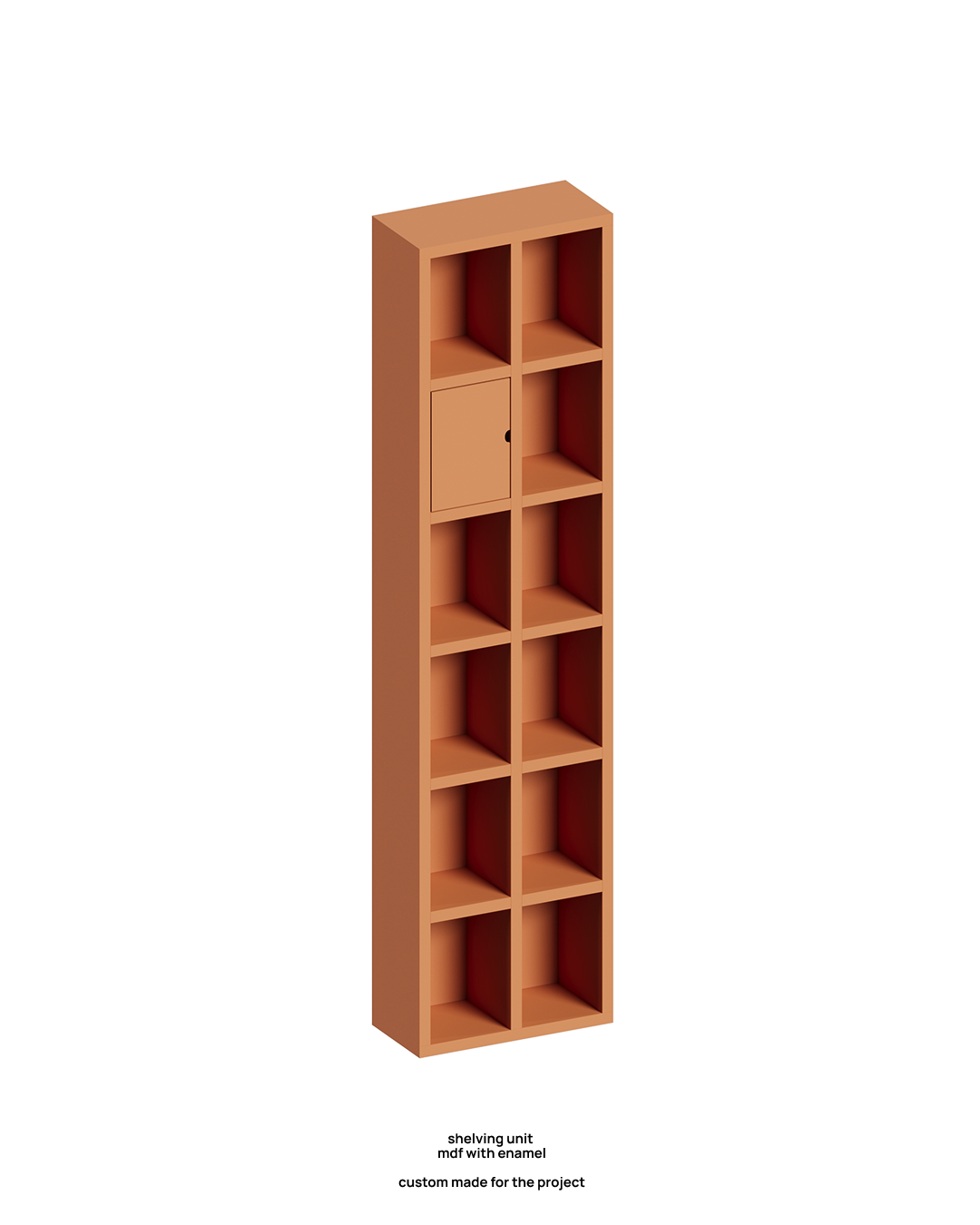
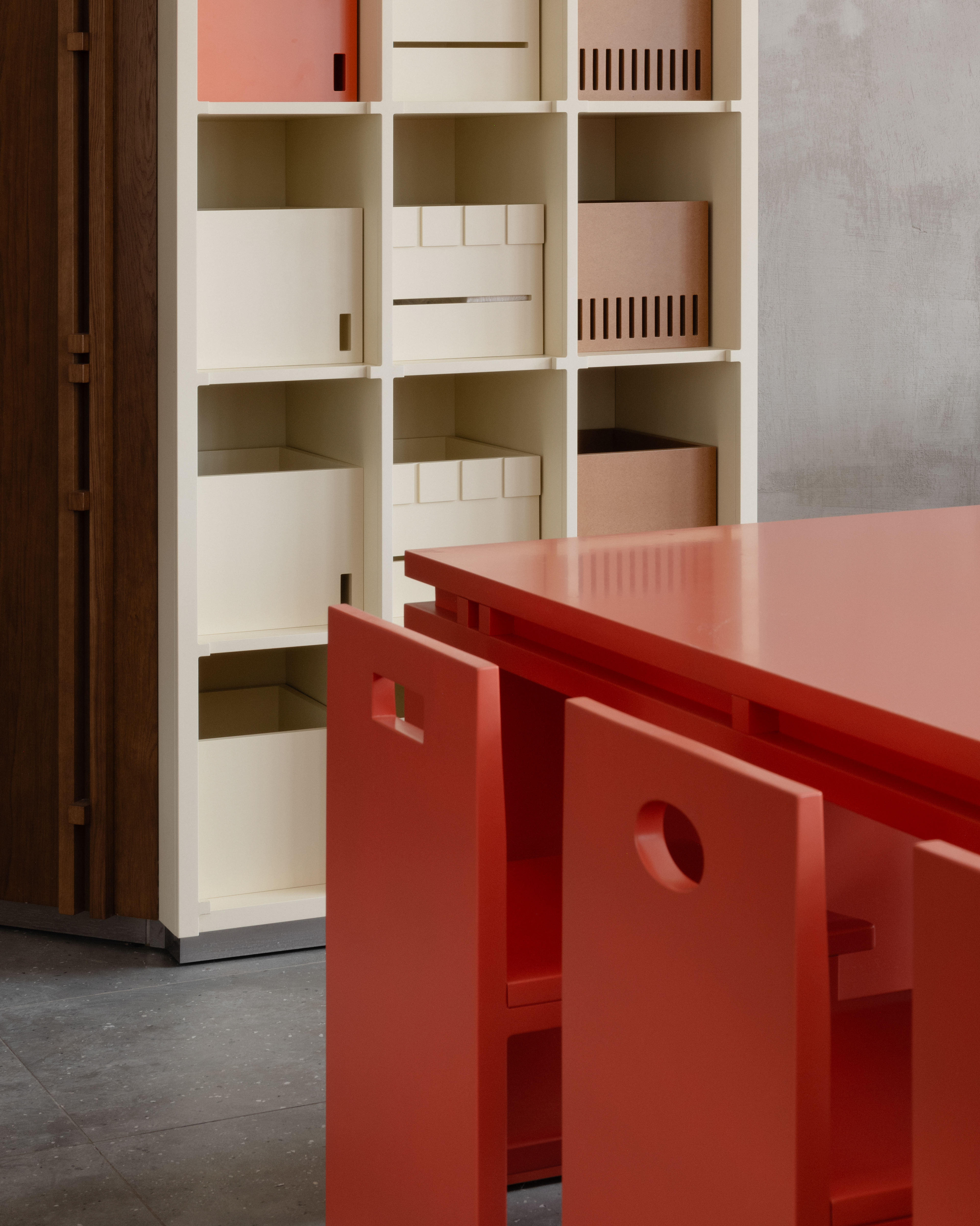
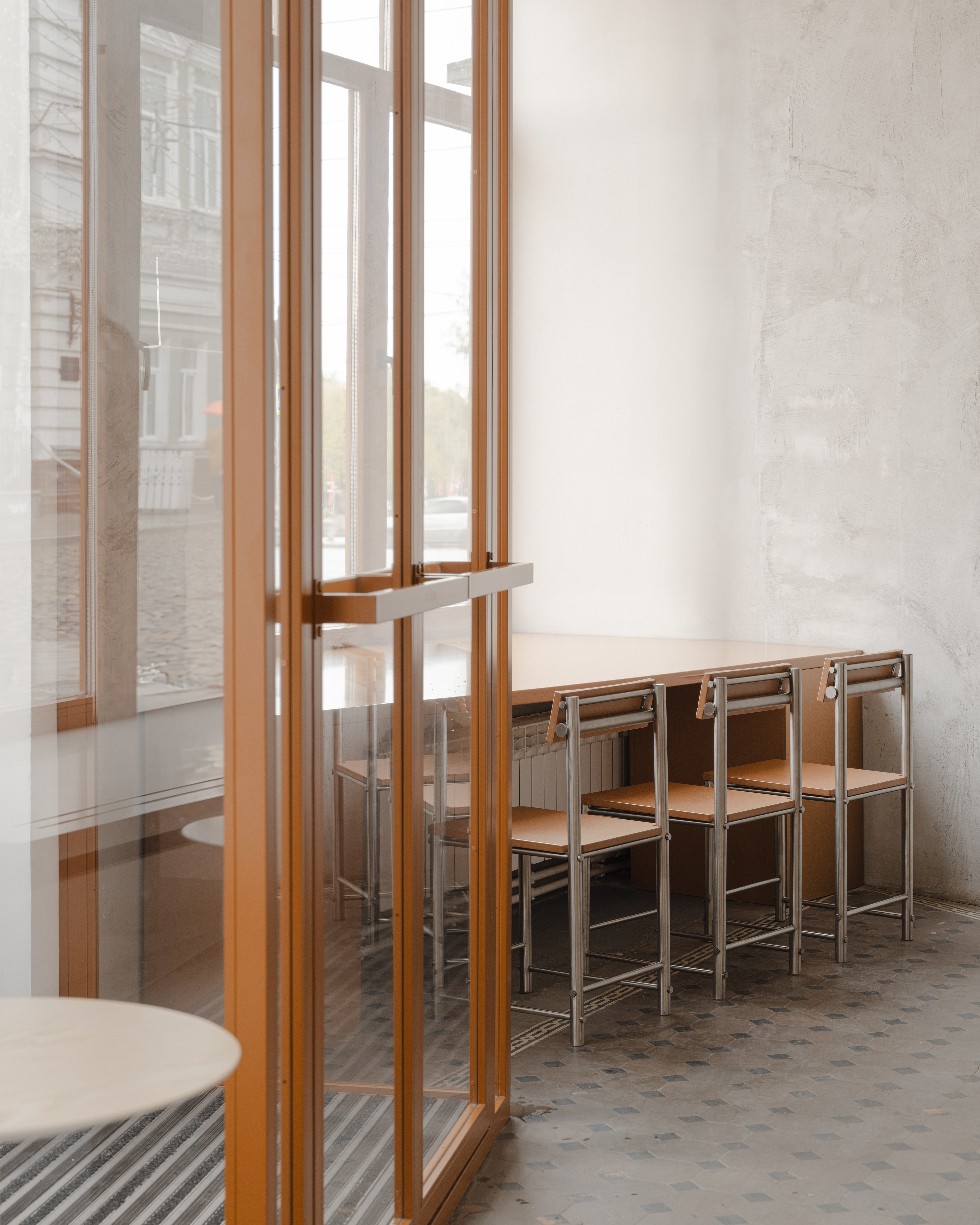
Warm, handcrafted materials formed the foundation of the interior—wood, tile, handmade ceramics. Every detail carries meaning. For instance, the large first-floor sign echoes the modular structure of the merchandise shelving—rhythmic, logical, and clearly structured.
shelving unit ↓
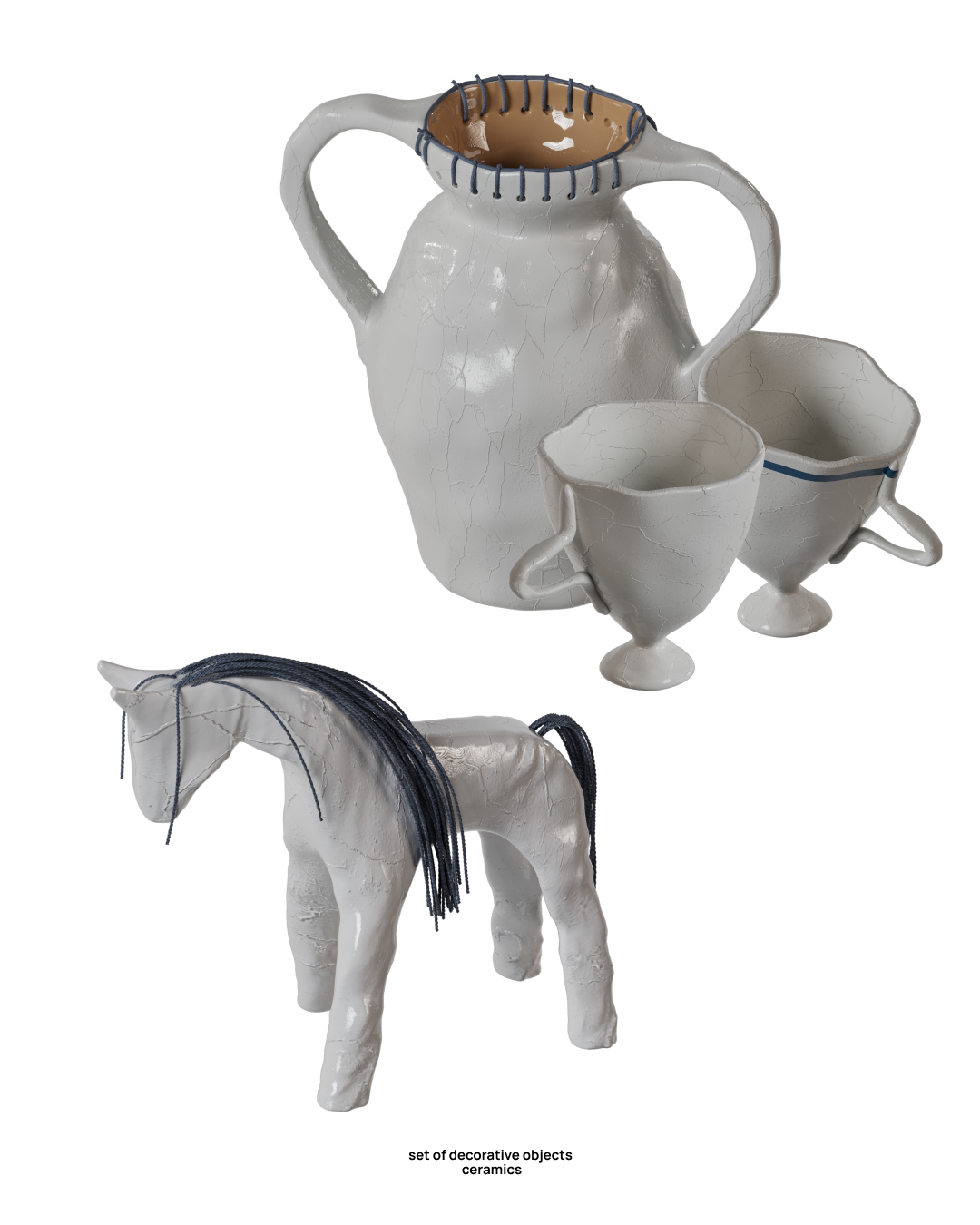
↑ set of decorative objects
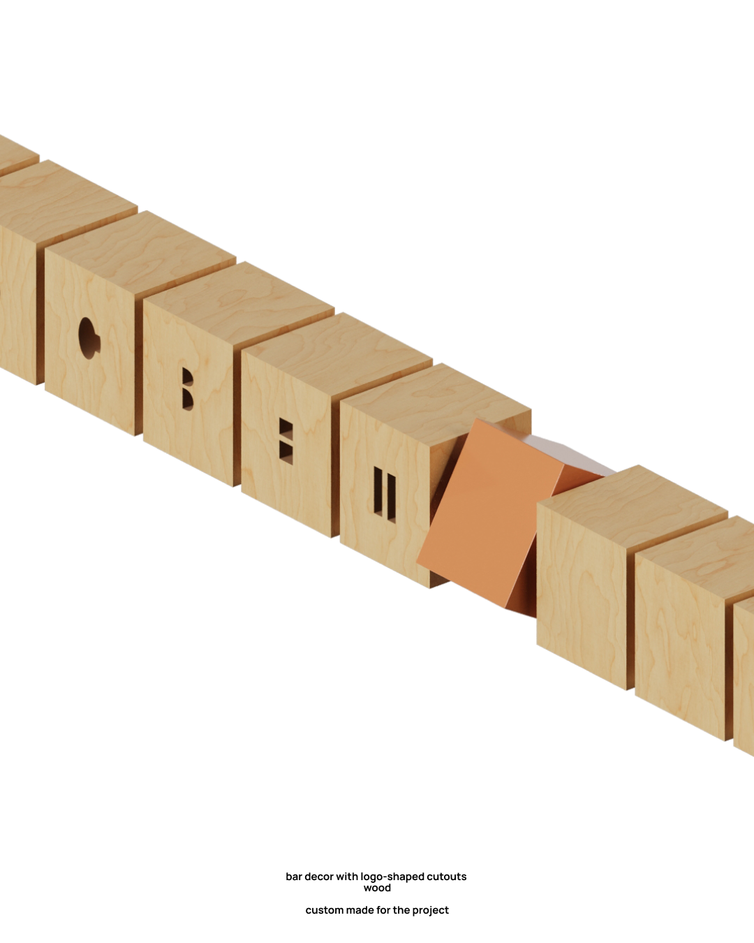
bar decor with logo-shaped cutouts ↑
The backs of some chairs feature cutouts inspired by the Prosvet logo, serving both decorative and functional purposes: they work as practical handles.

We deliberately avoided folkloric or decorative clichés. Instead, we searched for an honest way to speak
a “local language” through contemporary means. There’s no stylization, but there is a deep sensitivity to place and people.
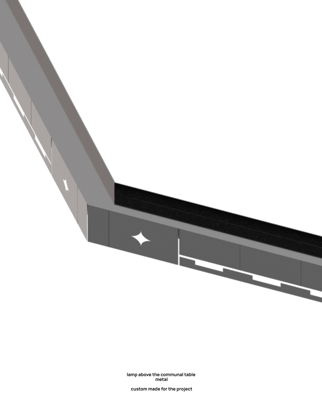
Many elements reference context: the pattern on the pendant light above the communal table, for example, was copied directly from a ceiling motif and integrated into the space.

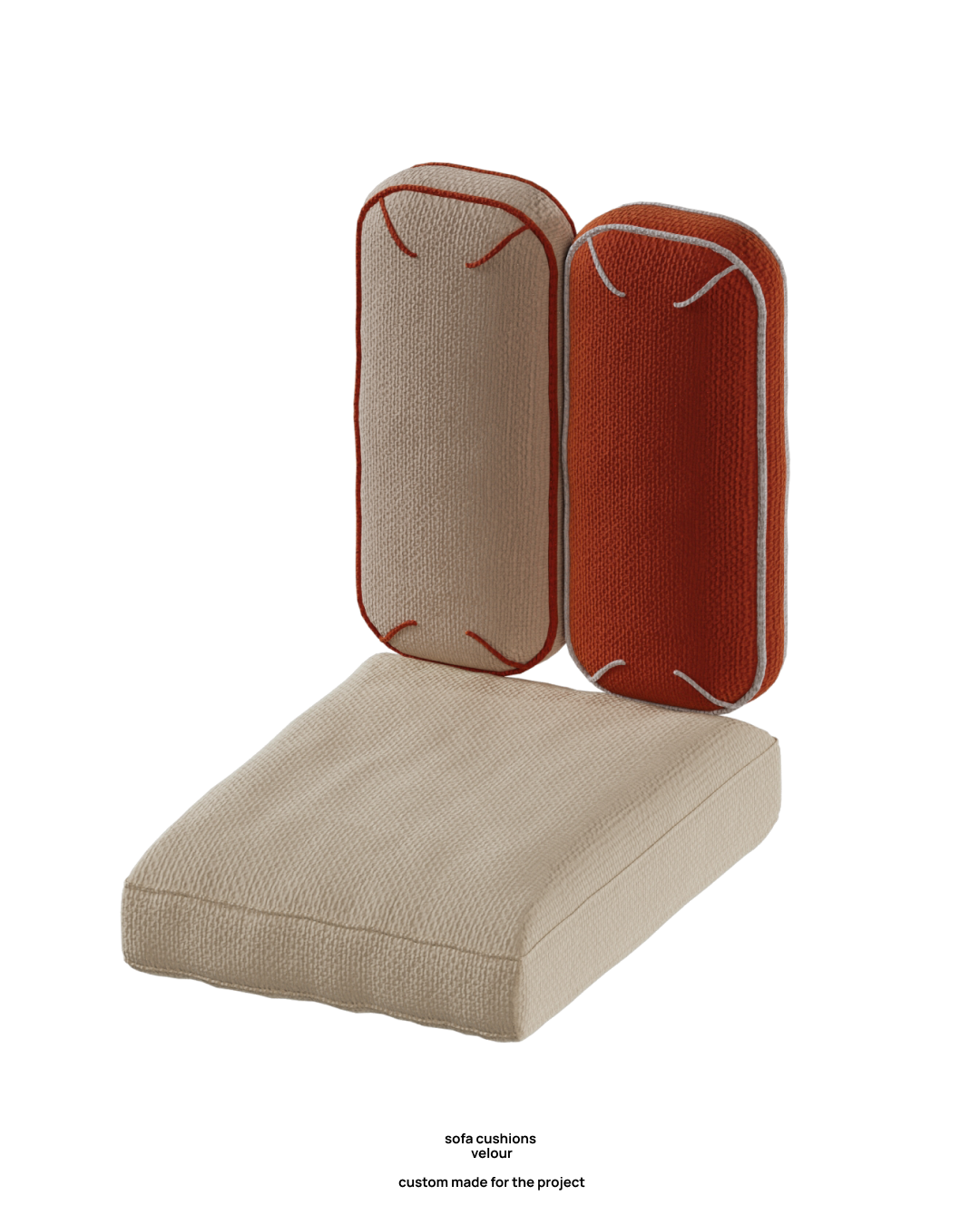
sofa cushions ↓

This project became possible thanks to a large and well-coordinated team—architects, designers, artists, fabricators, contractors, and clients working together to create not just an interior, but a living space where people genuinely want to stay.

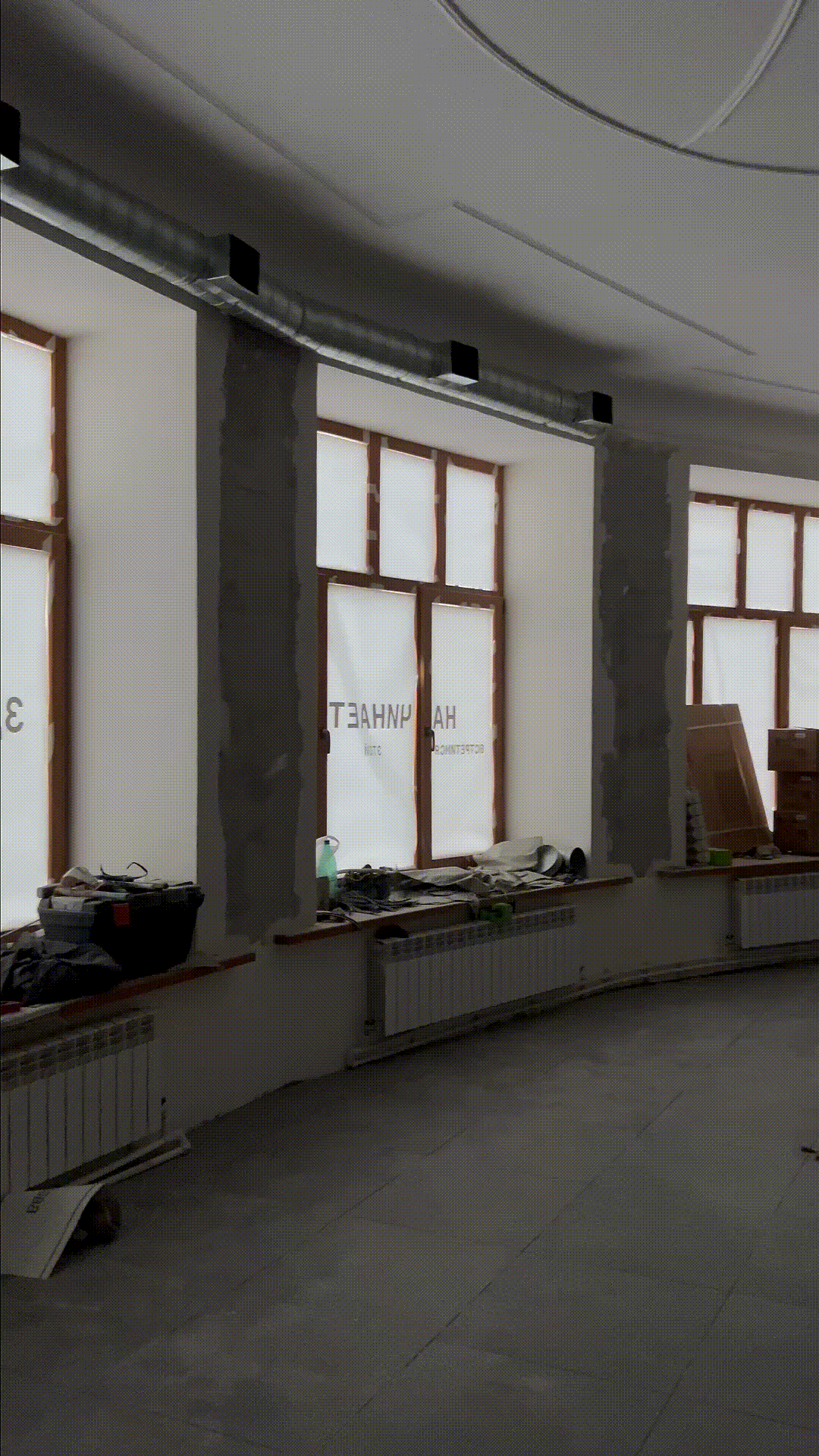
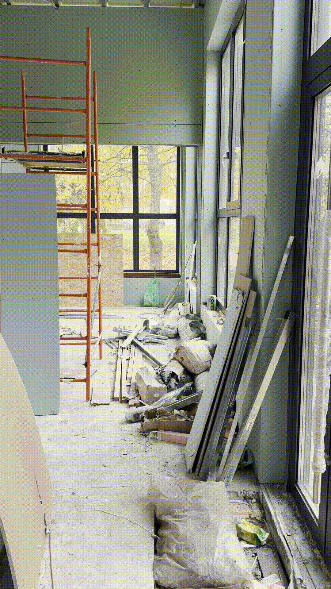
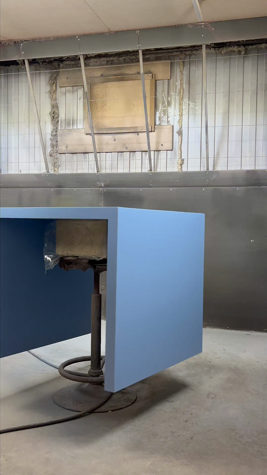
process ↓
↓ project team