Studio 29 | Showroom
2025 | 104 sq. m
Architects: Sonya Plyusnina, Maria Soboleva, Natalia Meleshkina
CG: Alyona Minaeva
Photo: Natalia Bochkova
CG: Alyona Minaeva
Photo: Natalia Bochkova
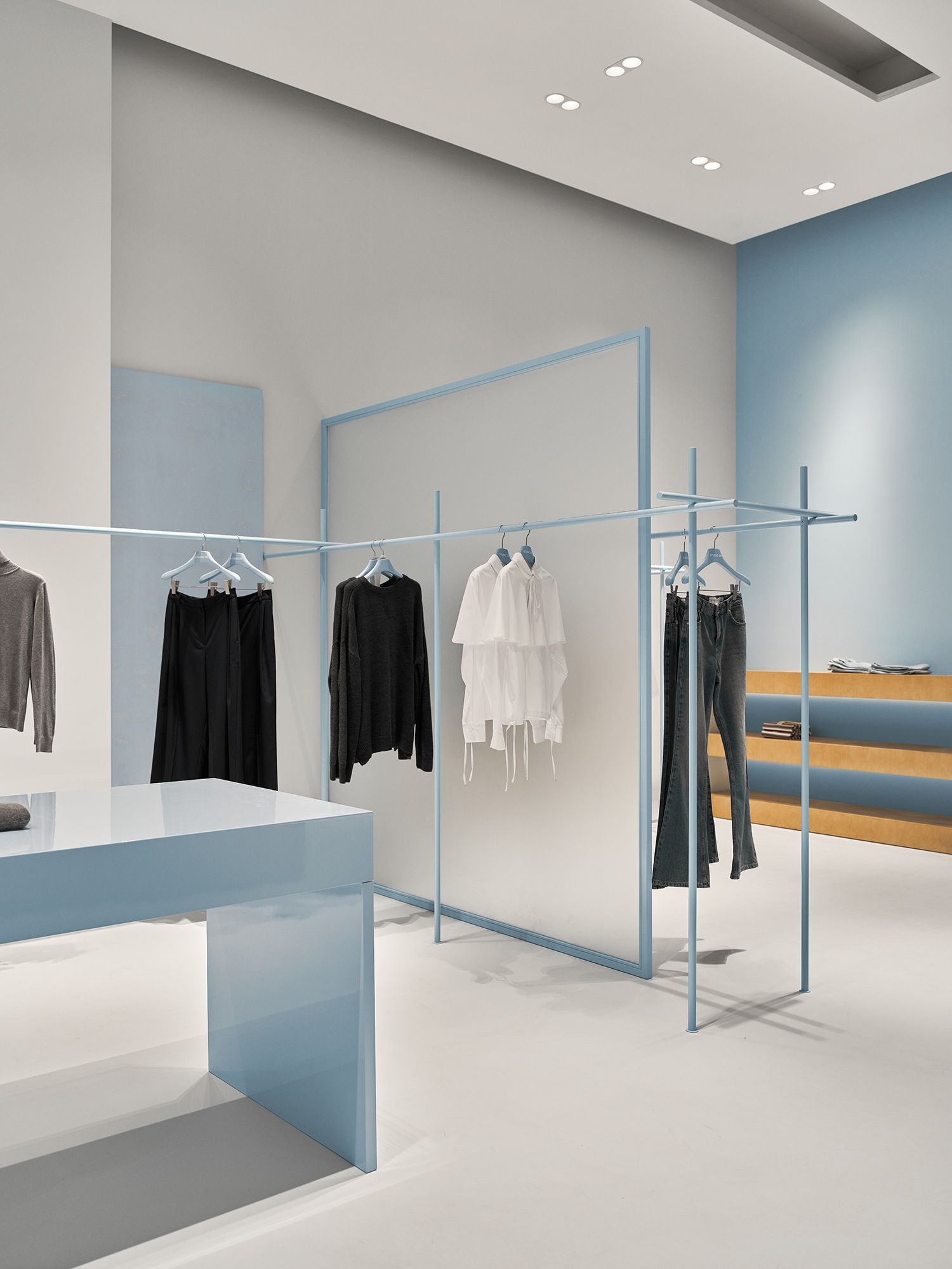
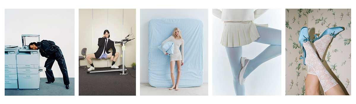
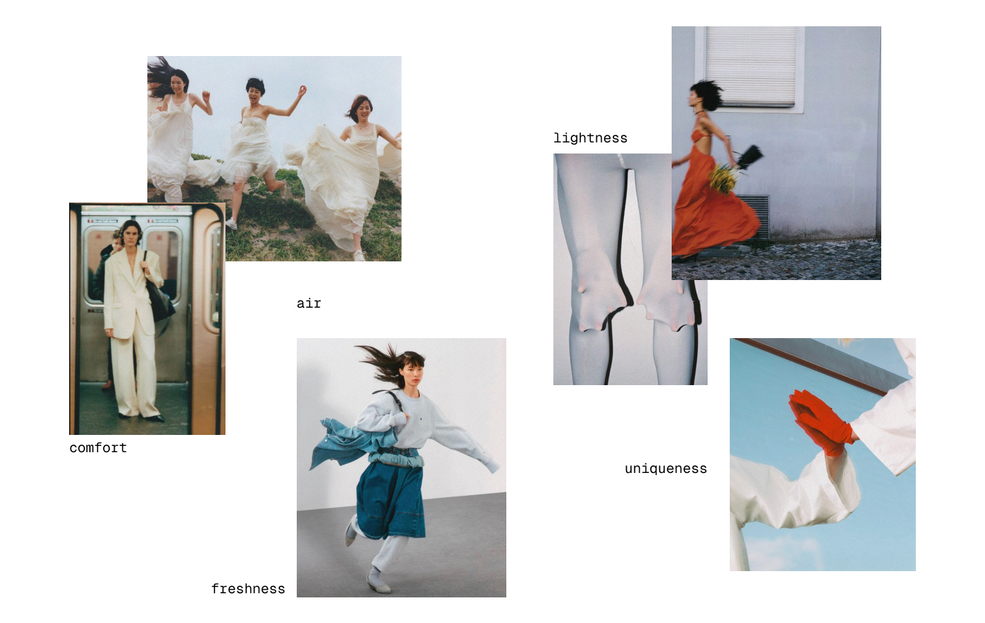
In our project for Studio 29, we started from the emotions and meanings the brand communicates, as well as the way it is perceived by its audience.
It was important for us to translate the core qualities embedded in the brand’s DNA — comfort, versatility, and lightness — while enriching them with a sense of elegance and a subtle step beyond the familiar.
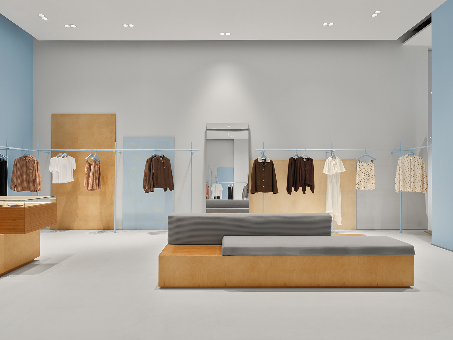
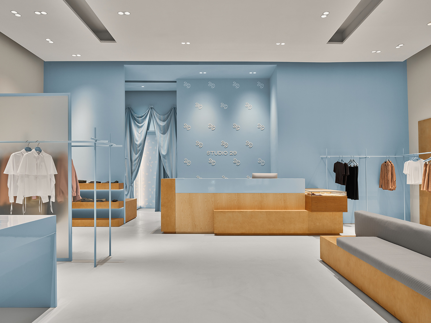
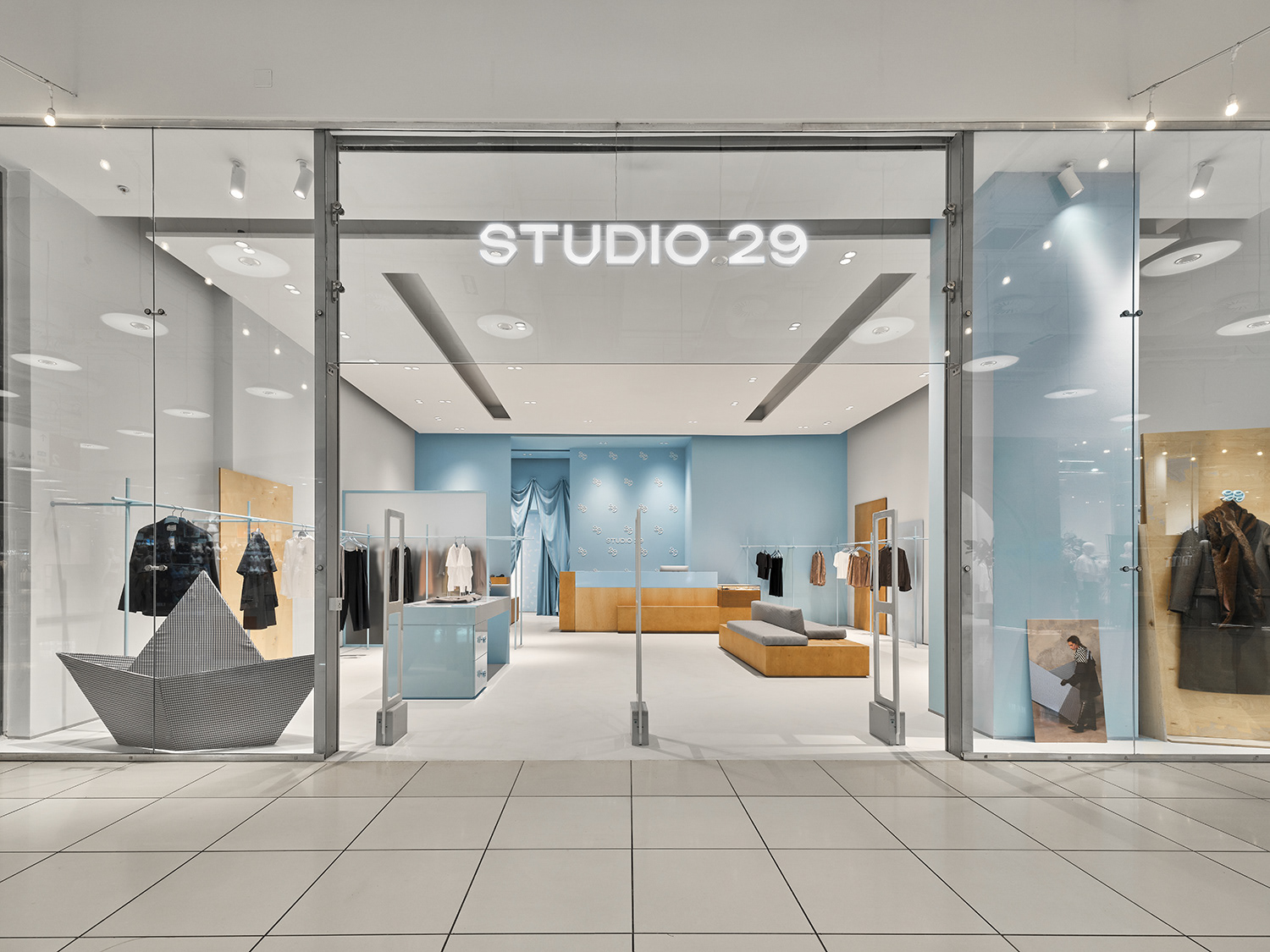
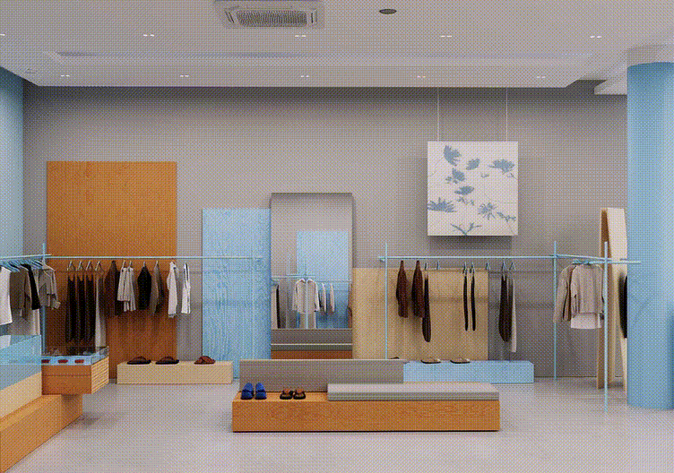
The Studio 29 store reflects the brand’s latest shift in identity.
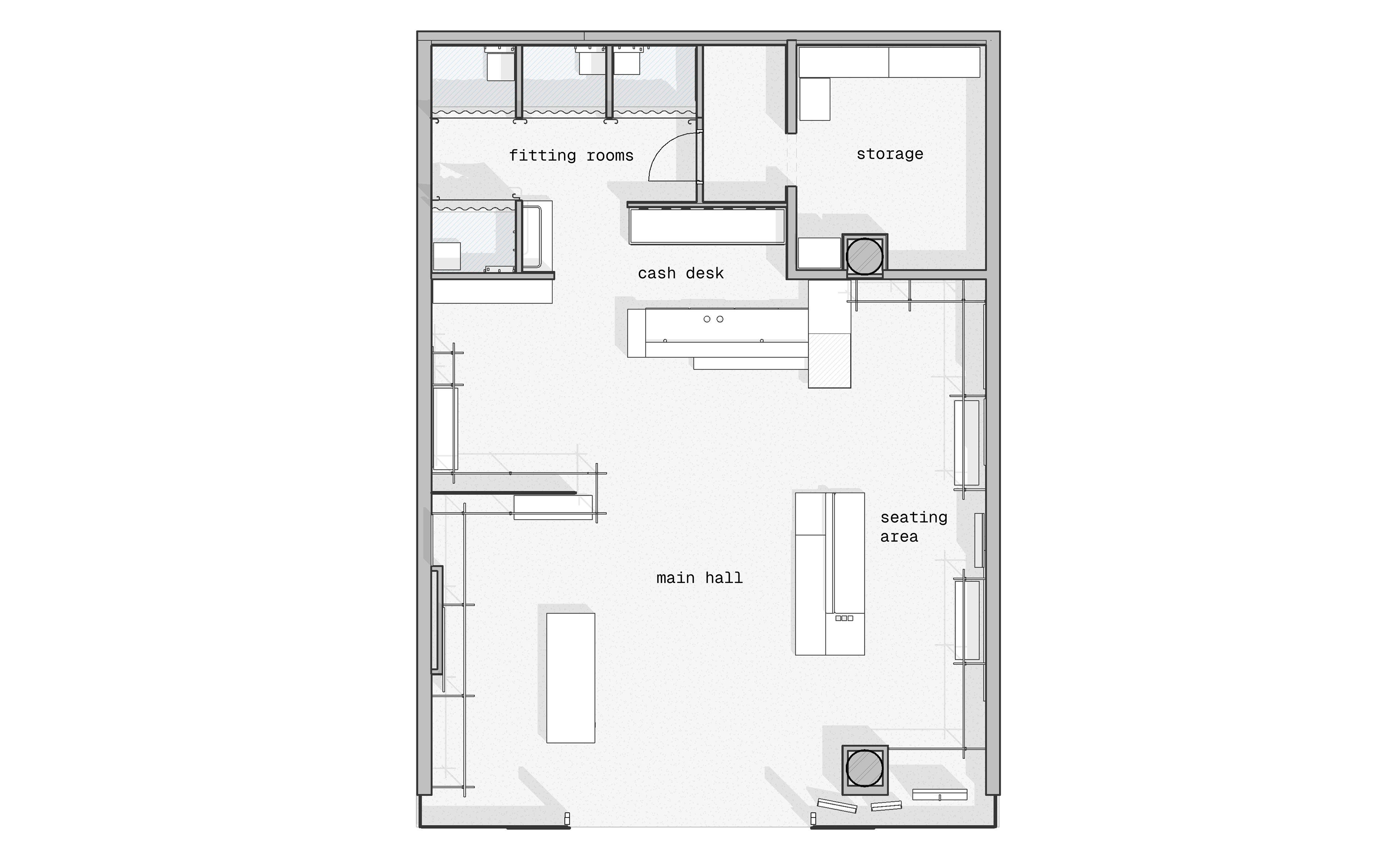
plan ↓
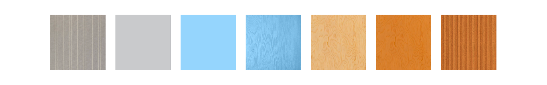
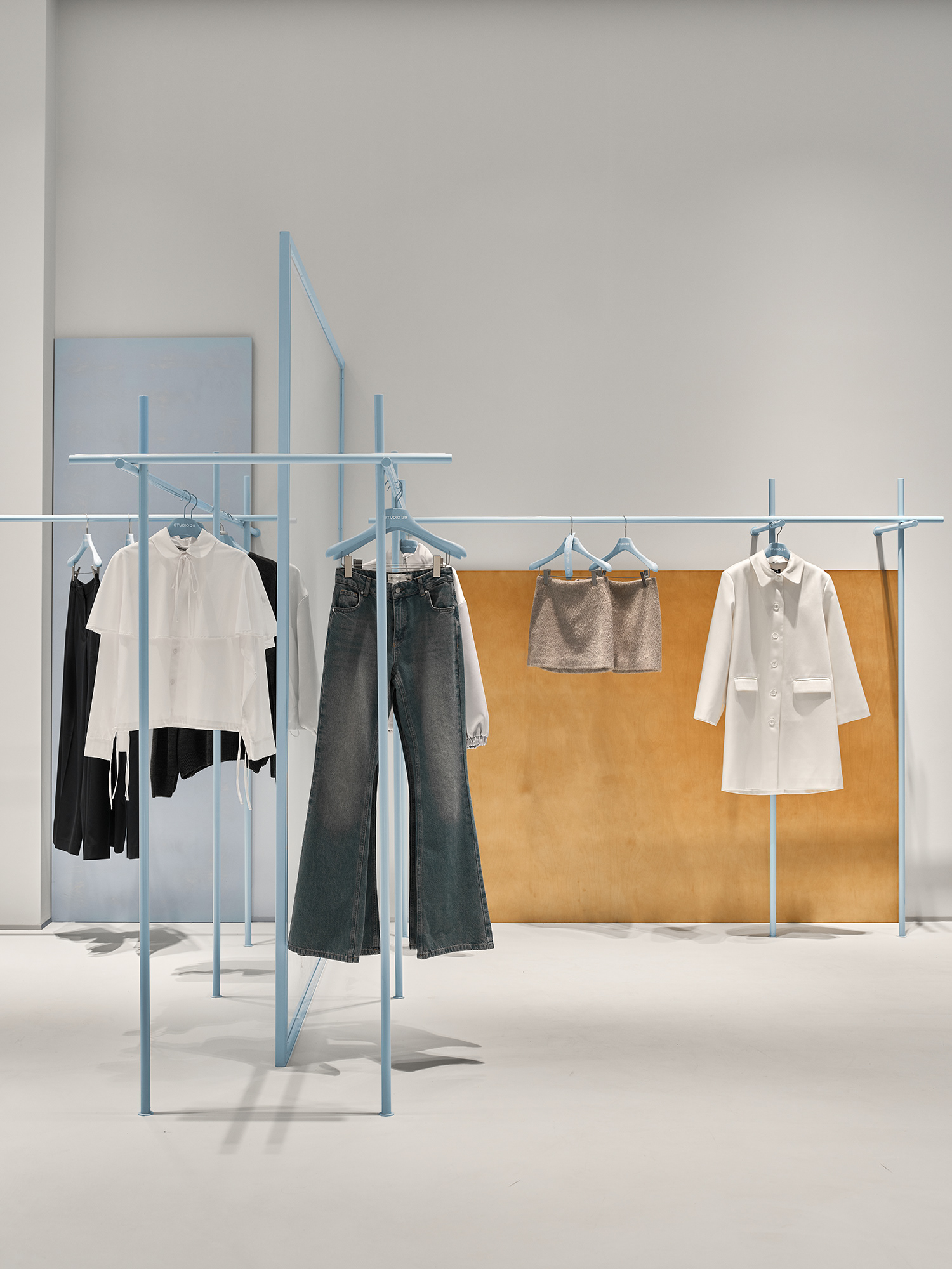
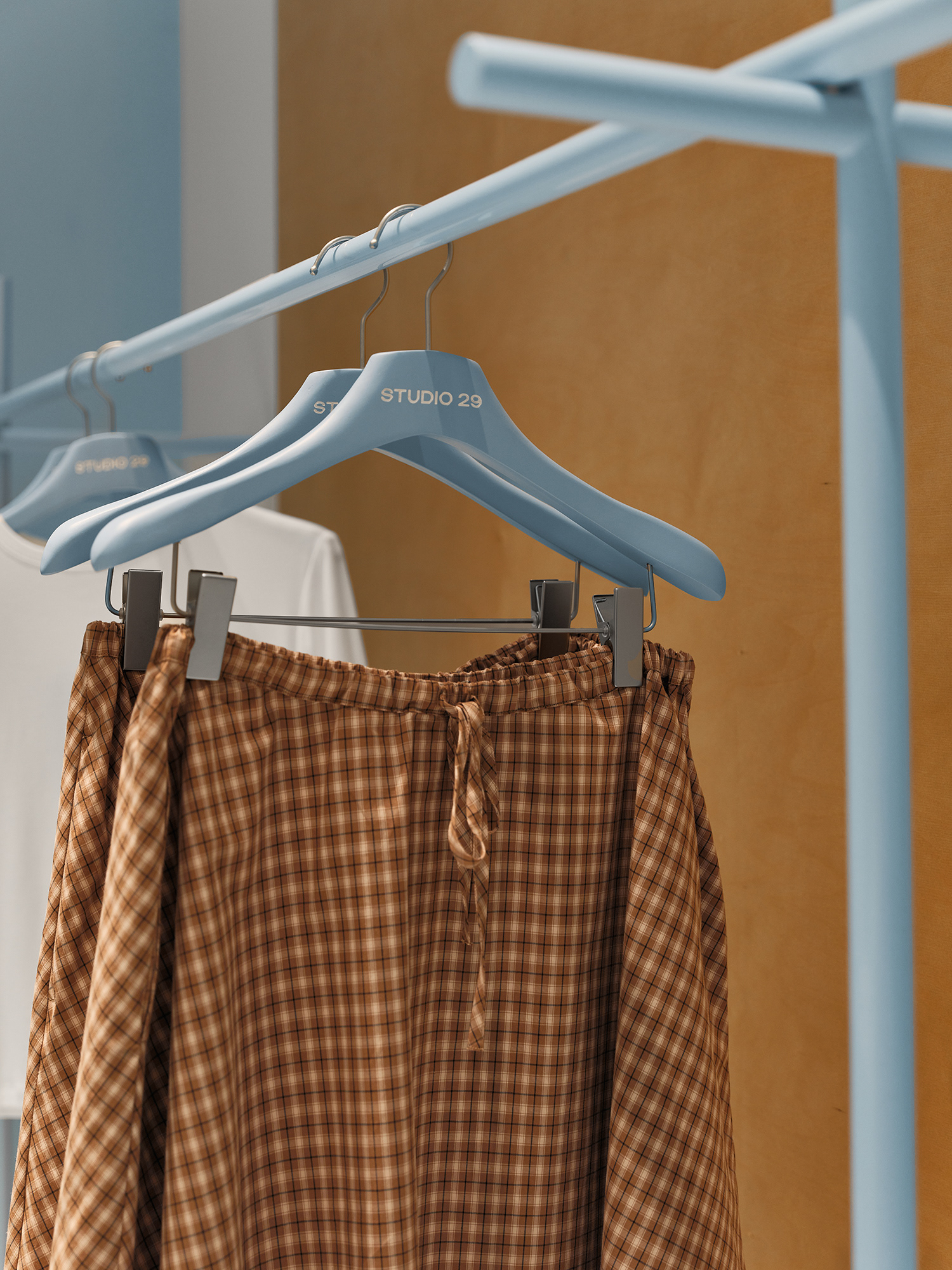
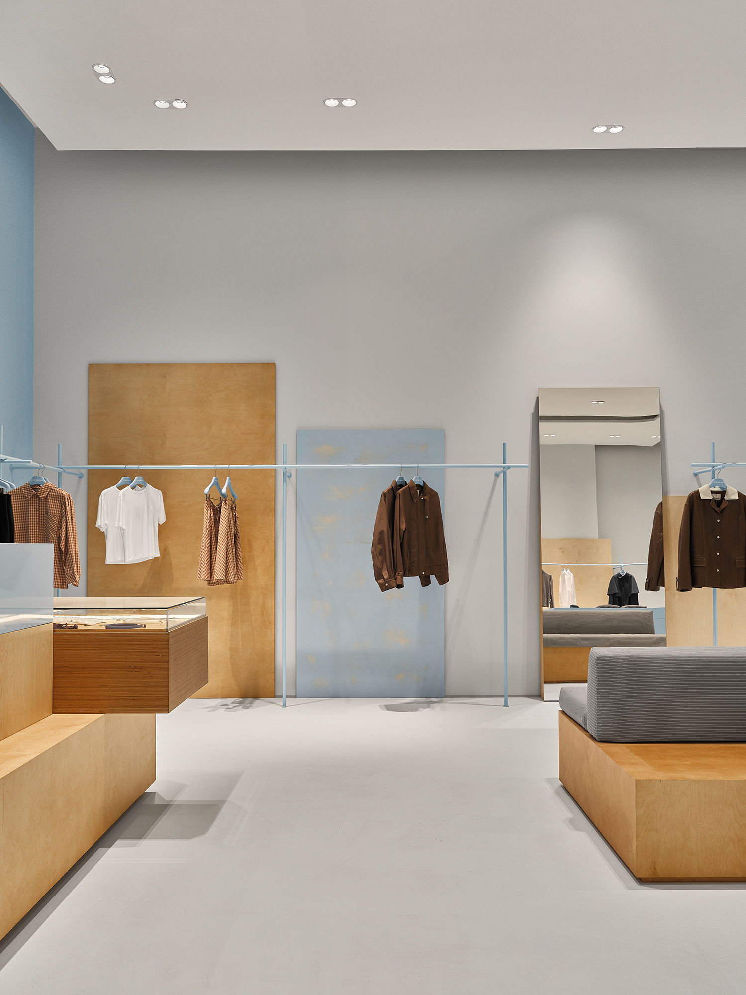
The color palette and material choices are directly connected to the updated branding, where the signature light blue tone of Studio 29’s brand identity plays a central role, complemented by warm, light plywood and neutral grey accents.
The design process was based on materials proposed by the client, which were seamlessly integrated into the overall concept.
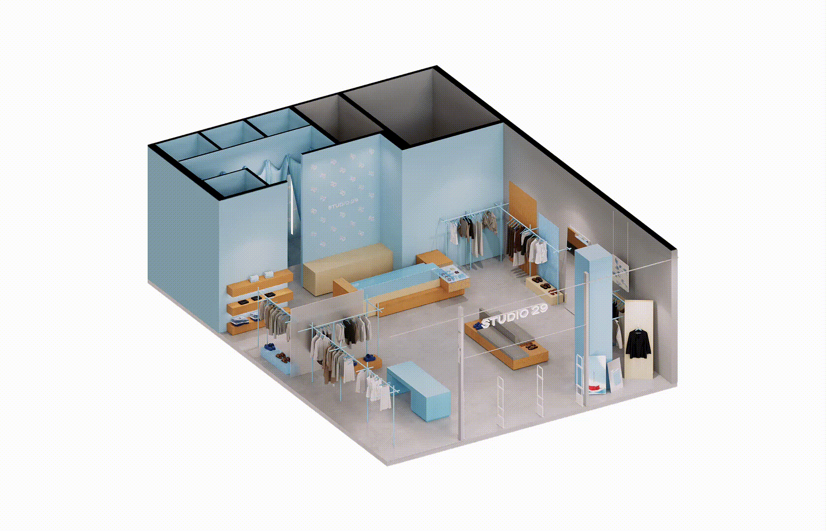
axonometry
Instead of relying on traditional interior references, we analyzed the brand’s lookbooks and visual language, focusing on how Studio 29 expresses itself through fashion and lifestyle.
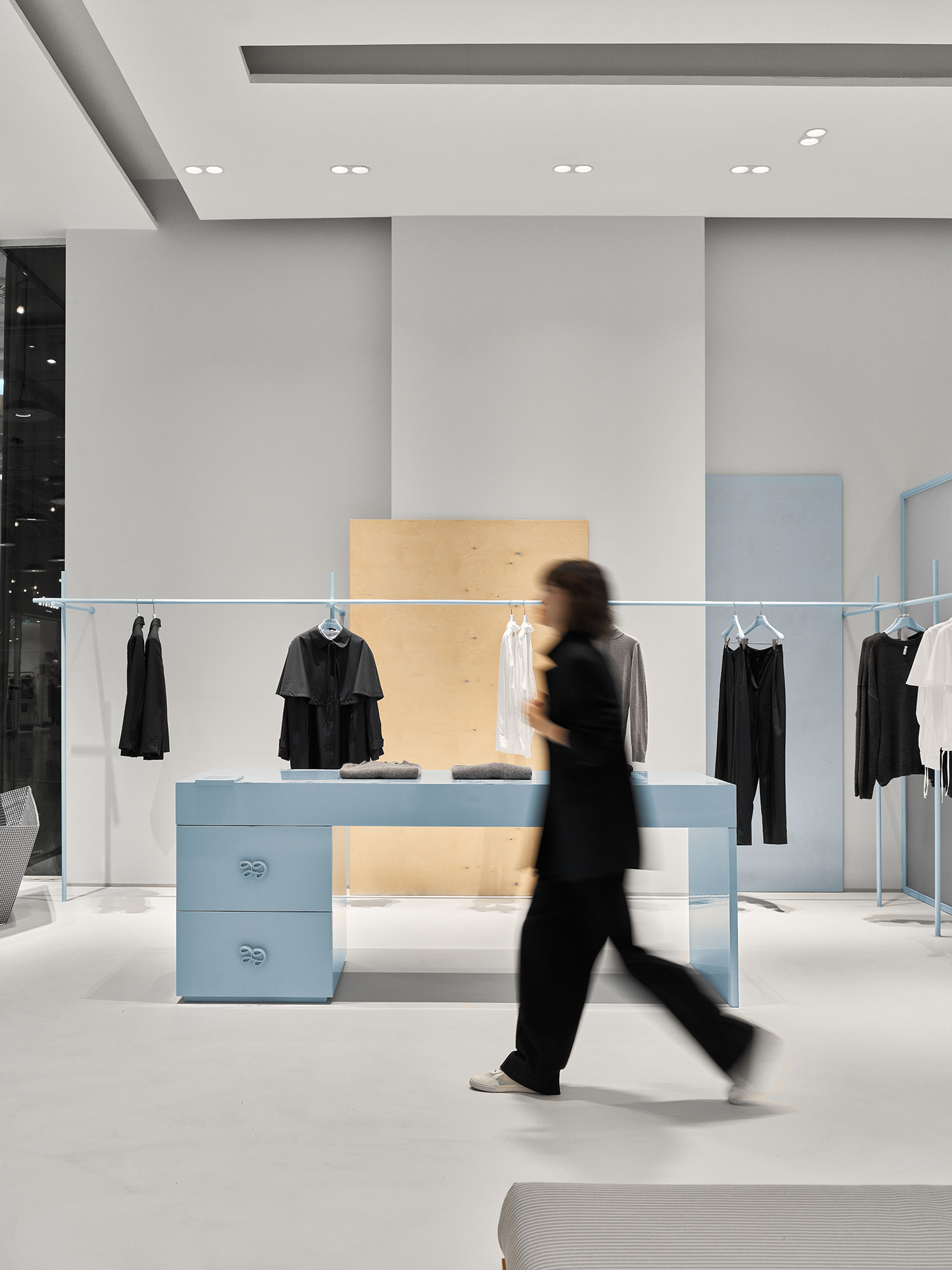
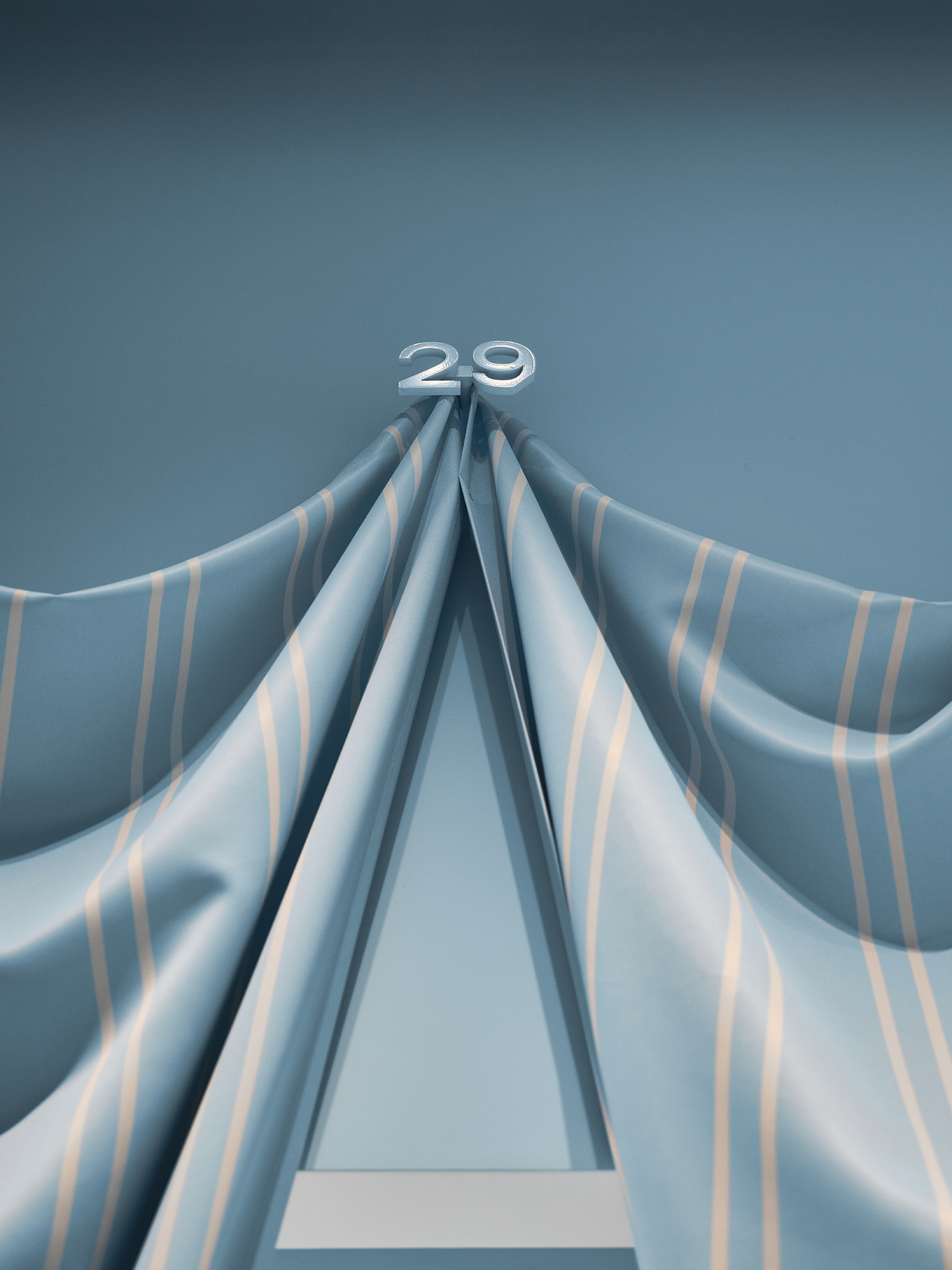
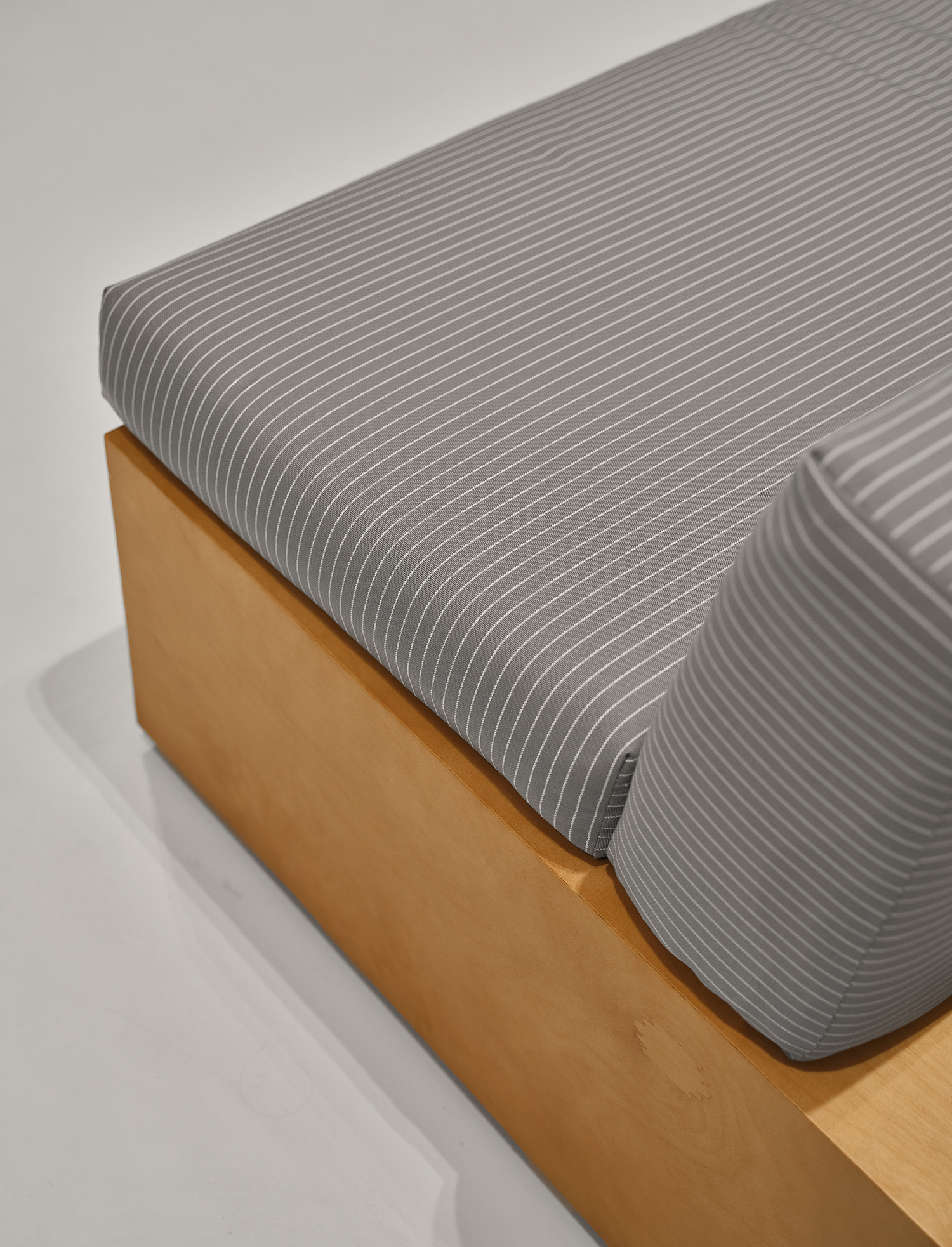
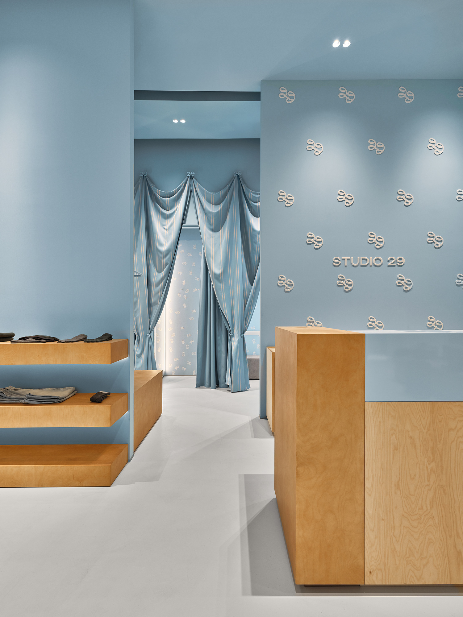
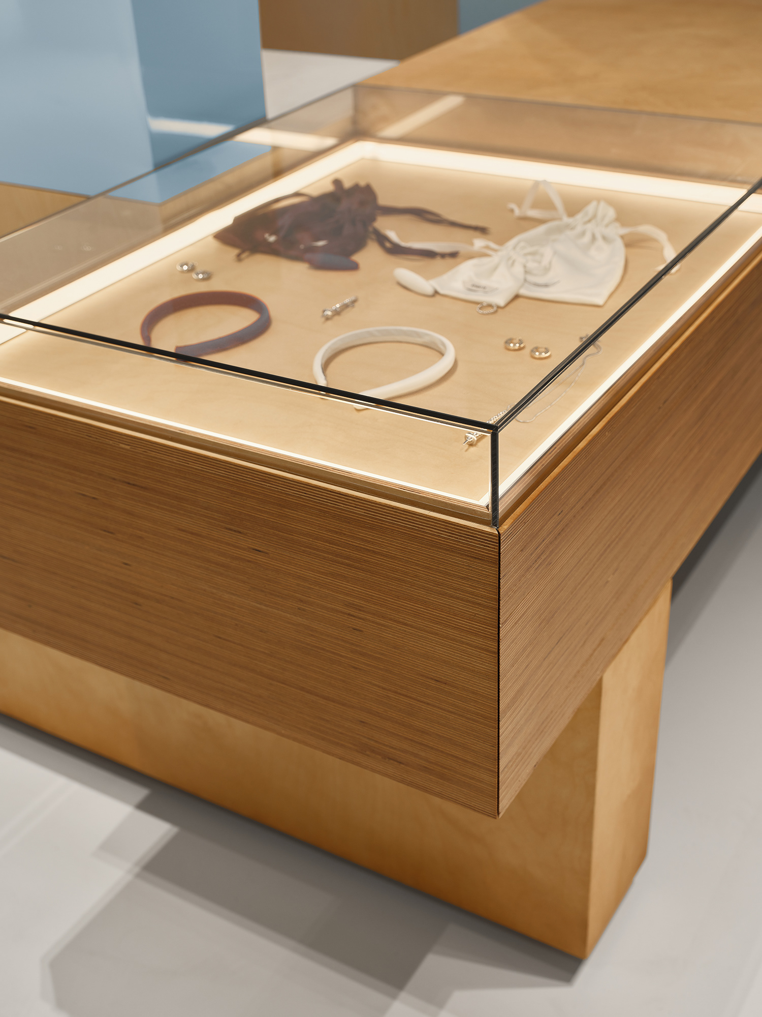
This approach allowed us to introduce direct references to the world of clothing: suiting fabric used in furniture upholstery, and double-layer curtains where one layer serves a functional purpose while the other evokes the softness and expressiveness of drapery. These details bring lightness, freshness, and character to the space, while maintaining clarity and visual comfort.
moodboard ↓
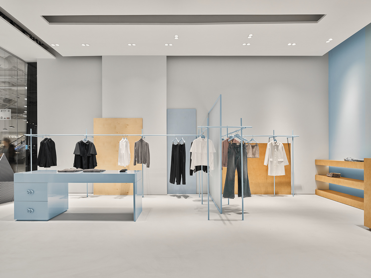
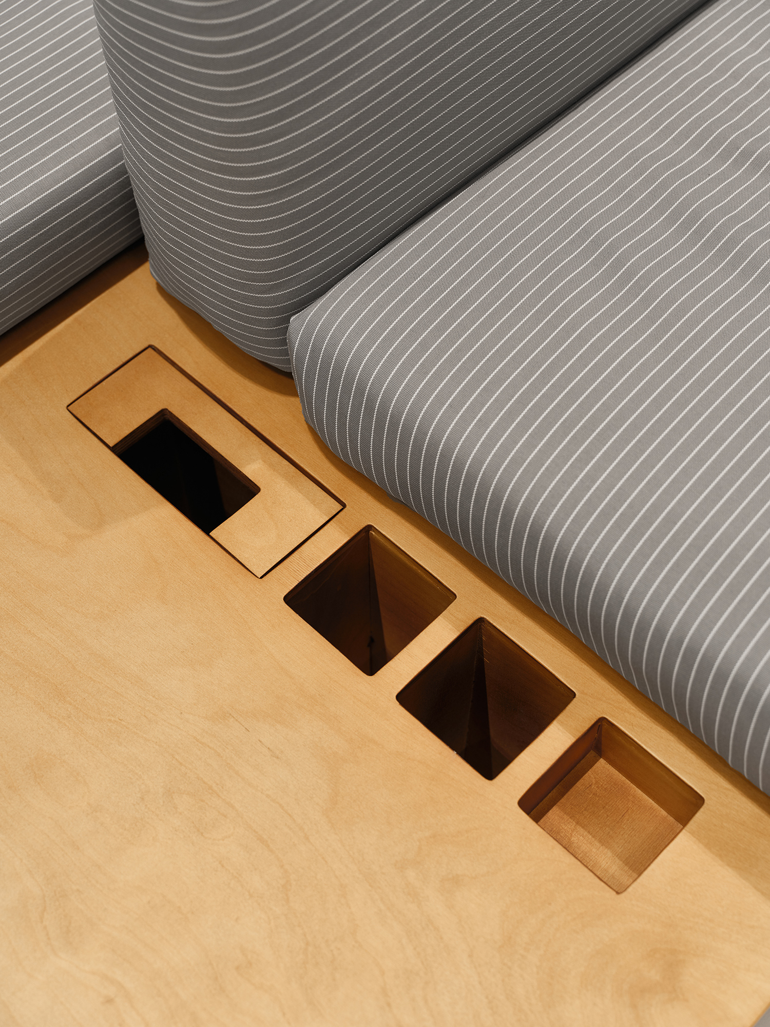
The interior is built on the contrast between natural plywood and blue textiles, which act as the main color accent.
The atmosphere is shaped through materials and details, while the layout prioritizes functionality
and ease of use.
brand character ↑
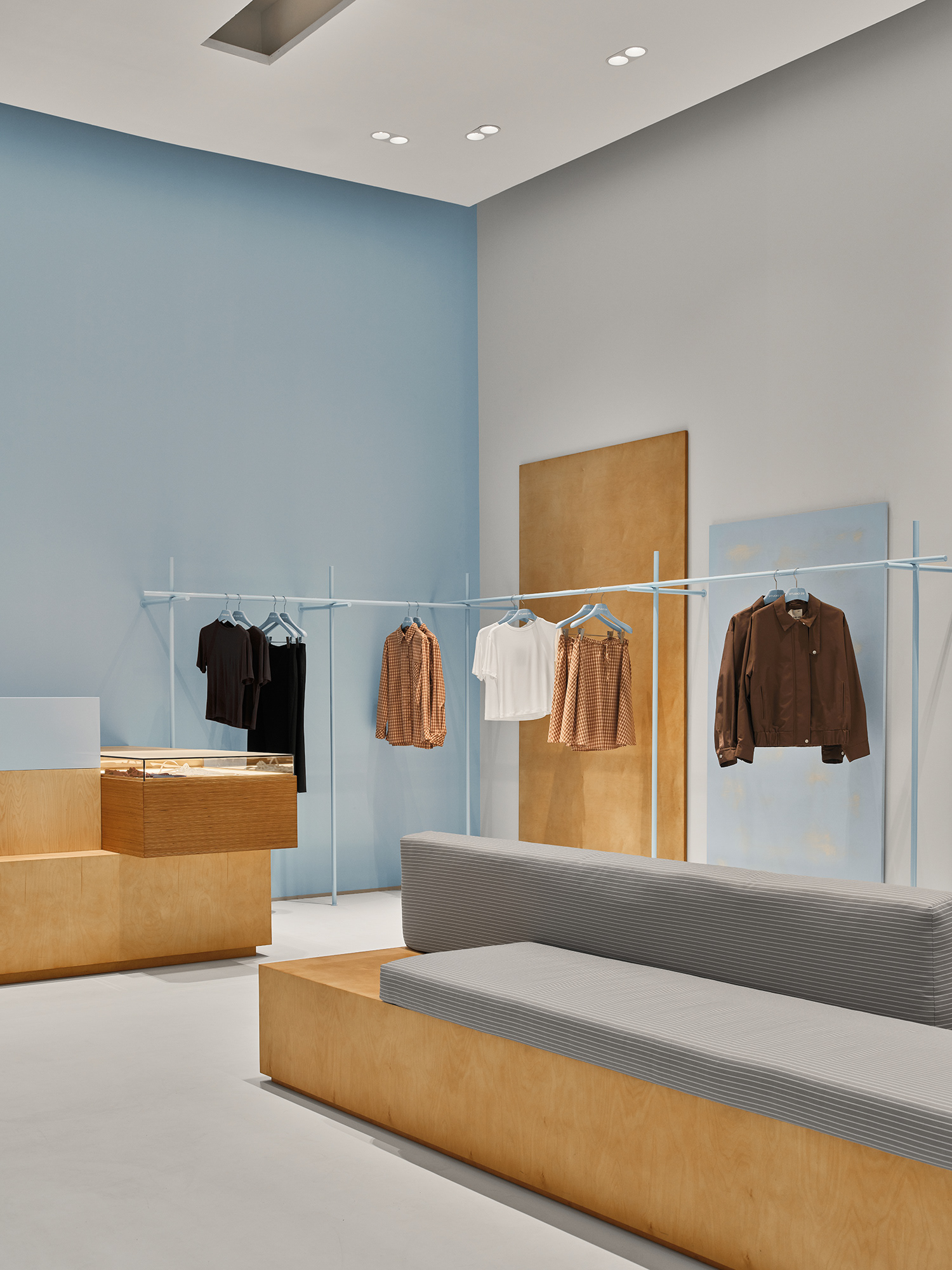
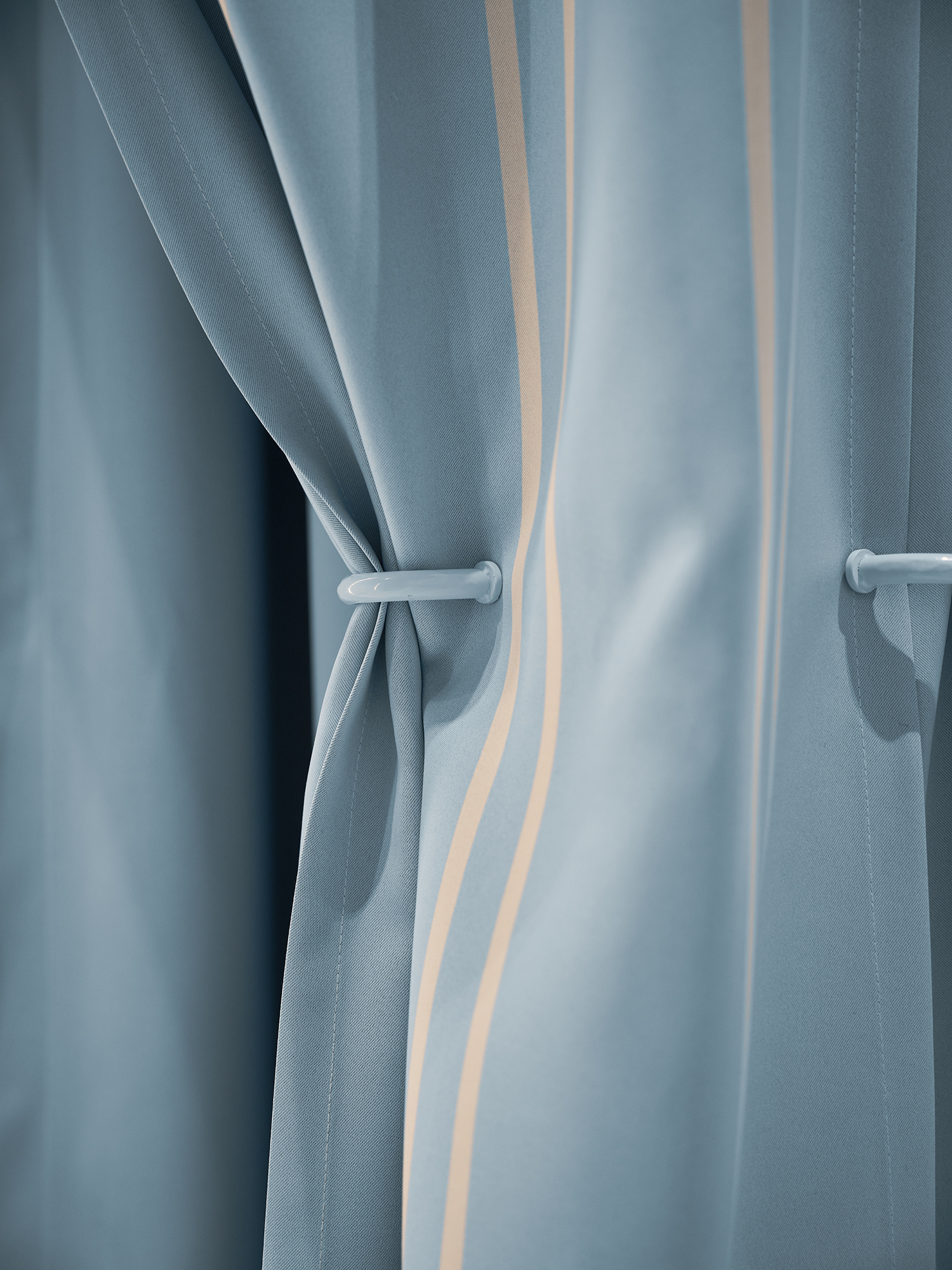
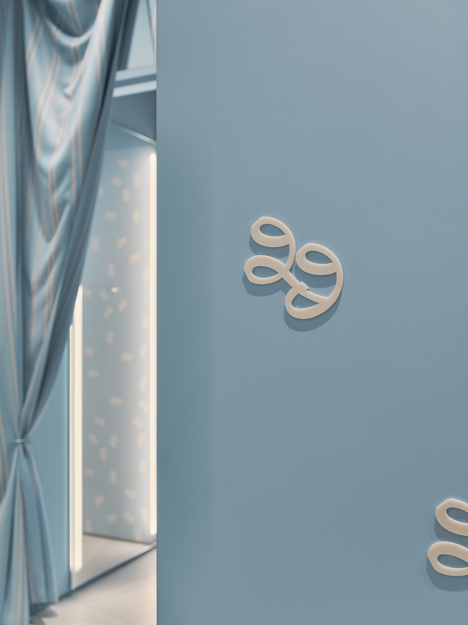
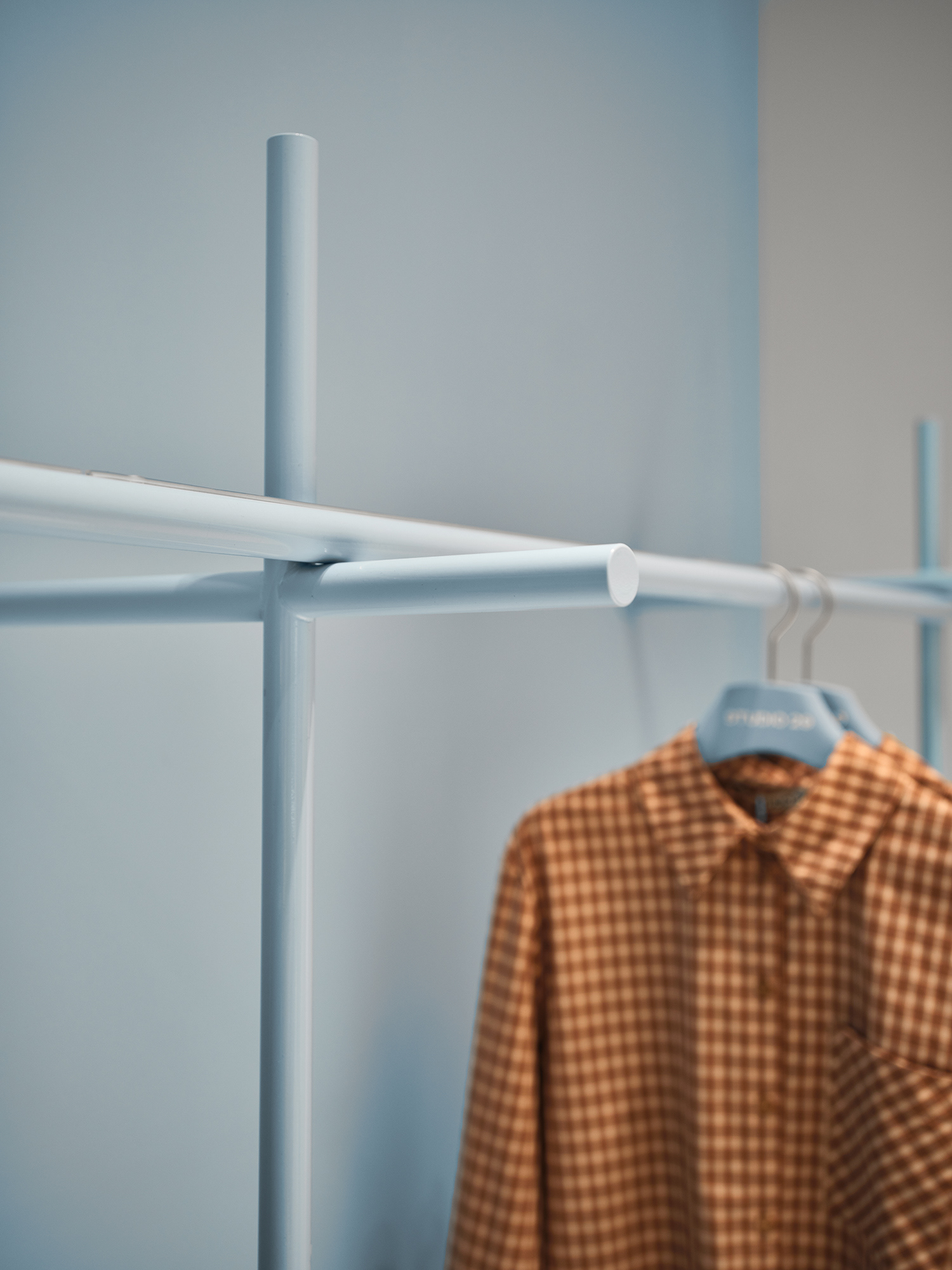
The space contains numerous subtle references to the brand’s identity that reveal themselves through attentive observation: a monogram embedded in handles and hooks, a signature pattern inside the fitting rooms, and a play with the texture of plywood, where exposed edges create a light, striped rhythm.
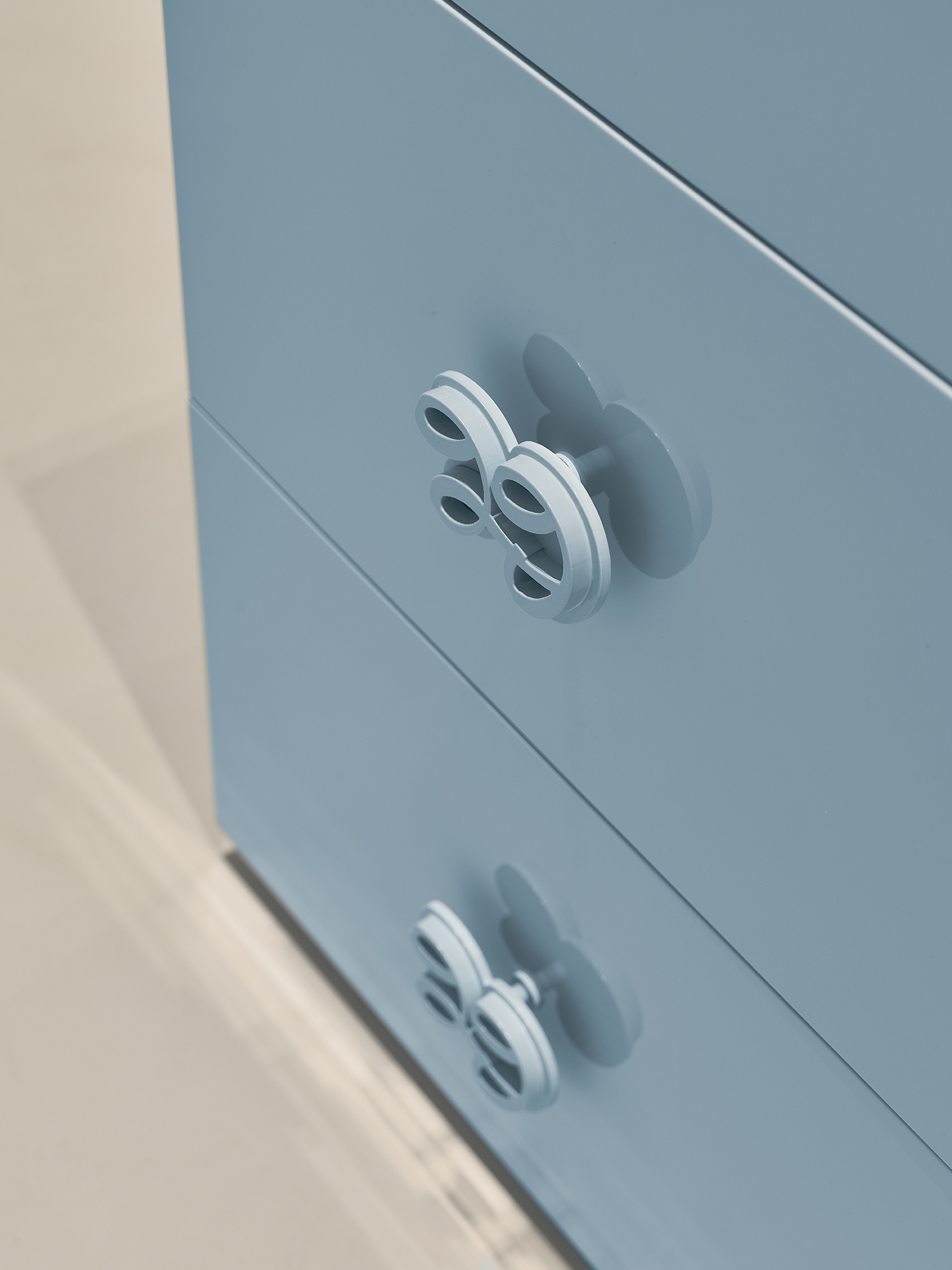
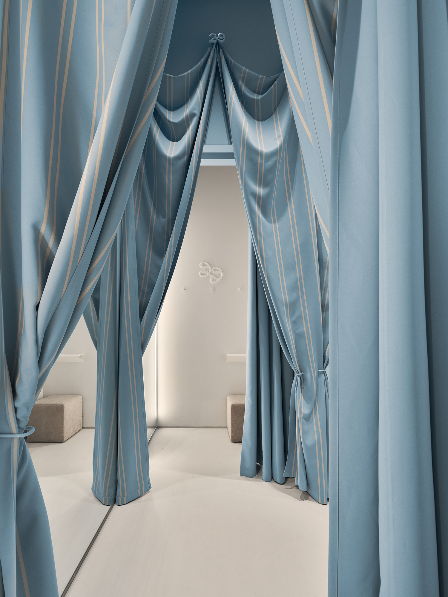
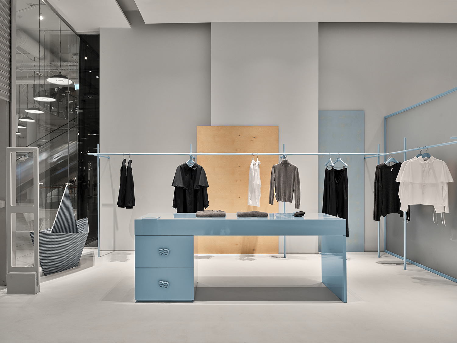
Together, these elements form a cohesive visual language that reflects the essence of Studio 29 — honest, refined, and instantly recognizable.

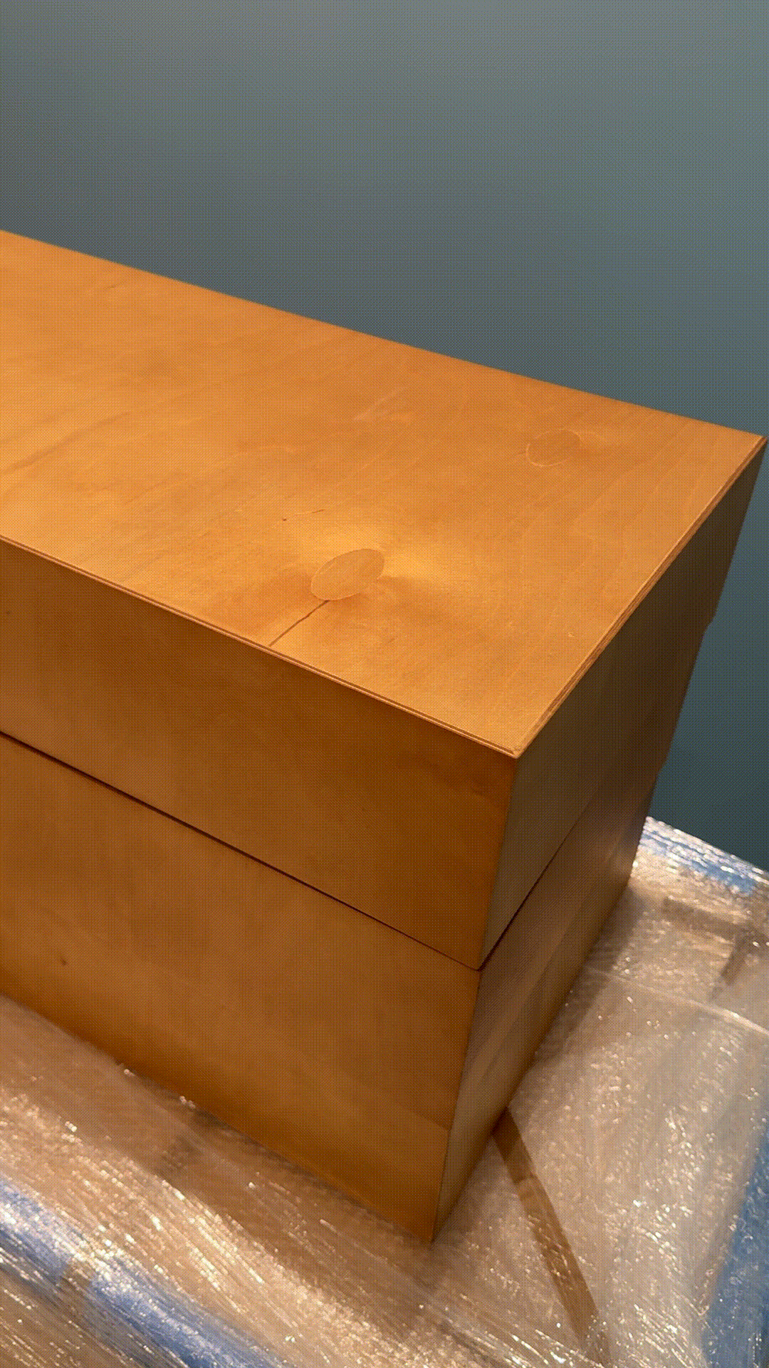
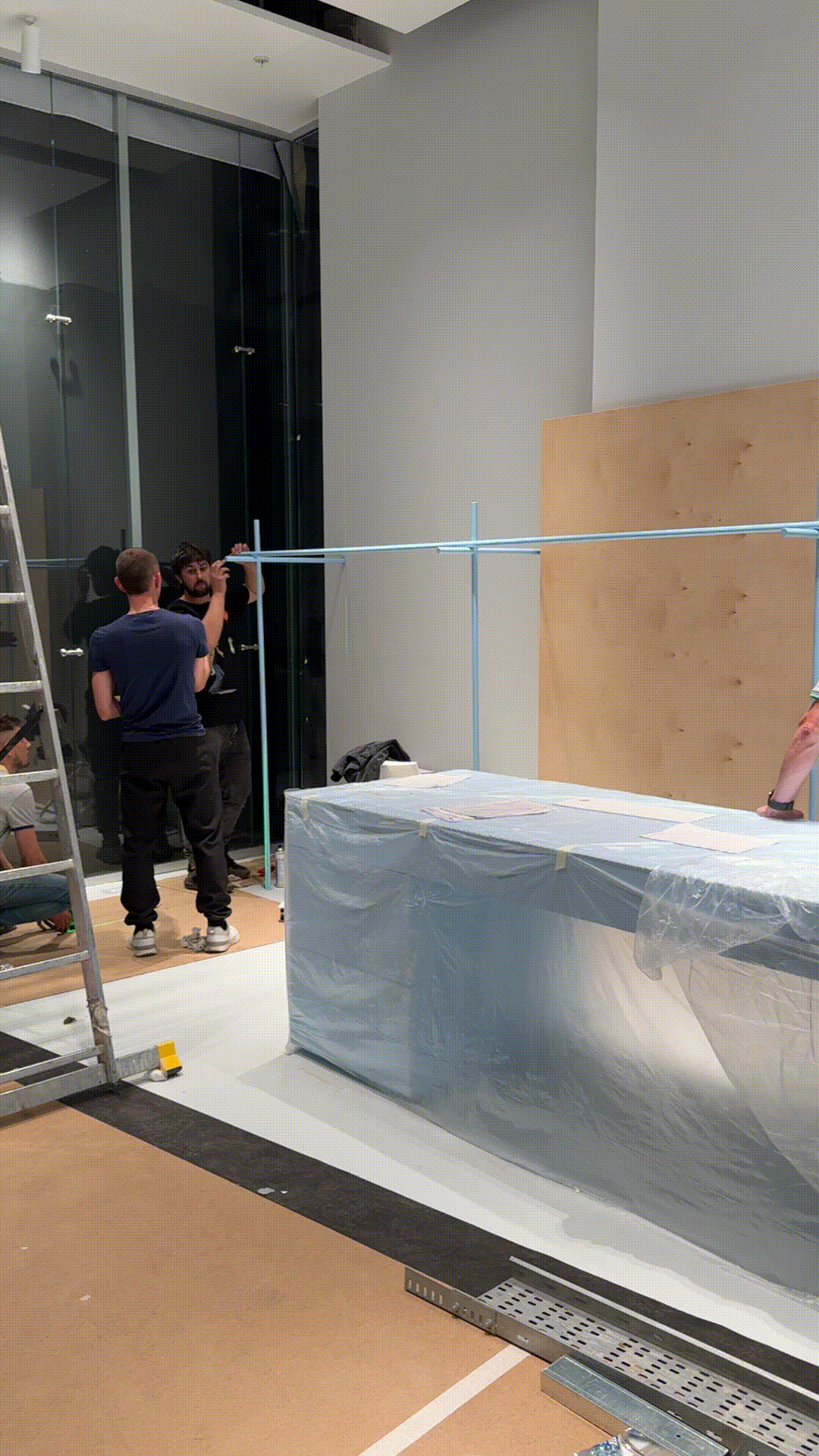
process ↓
↓ project team